The new Disney Plus logo is distinctly underwhelming
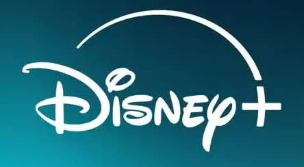
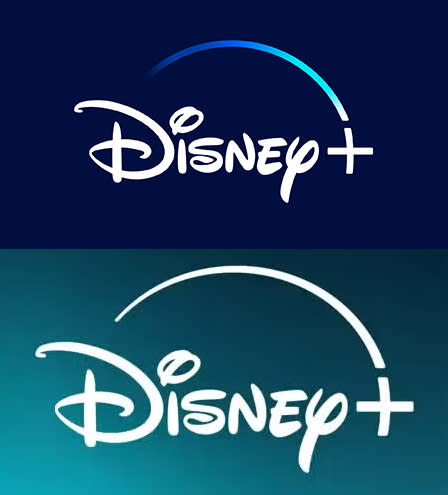
Disney Plus has unveiled a new logo. And it's...underwhelming. The iconic dark blue and white logo with the sweeping gradient leading towards the '+' has been replaced by a white logo (with no sweeping gradient) on a teal background. The reaction on the Creative Bloq team has been muted – we don't think we're gonna have to update our best logo list anytime soon.
The change seems to have rolled out across Apple's app store, the website and TVs, but isn't yet showing up in Google Play.
Disney's own Media Kit is still showing the old logo, and there's no announcement as to why the logo's changed, though some are speculating it's because of Disney Plus' merger with Hulu, which has a green colour in its logo.
Either way, we're a little sad that the classic Disney logo, which brings nostalgia to so many, has now been replaced with this rather bland teal version. It looks like the sort of colour you see on bathroom tiles or shower curtains. One of the CB team actually thought his TV was broken when he saw the new logo last night.
Another possible reason for the new look is to try to stand out among other streaming networks. Paramount, Prime Video and Max all have blue and white in their logos, though Disney Plus' was arguably the most distinctive.
Might this be the beginning of Disney Plus changing its logo periodically? You never know, and we'll be here reporting on it if that does happen. For now though, you can geek out on the logos we love with our best logos of the decade series.

