Designing websites for accessibility: 5 common errors to avoid

The results of a recent survey delivered a stark warning to retailers: the failure to prioritise accessibility could result in billions of pounds in lost online sales, alienating a significant share of UK consumers.
Accessibility issues are causing more than half of UK consumers (55%) to discard purchases at the point of sale – both in store and online. While retailers and their digital teams have made efforts to meet the needs of the disabled market, considerations for the true scope of accessibility are falling short.
Here, we share 5 of the most common mistakes e-commerce merchants are making on their website, and how they can be fixed. (And see our guide to accessible web design.)
Issue 1: Poor descriptions of category pages
We’ve come across this a few times recently and it smacks of laziness: merchants calling category or collections pages ‘Other stuff’ or similar. It might sound kind of playful, but avoid generic terms like this.
Why? One main reason is that for people using screen readers, it means absolutely nothing. If you walked into a store, asked the shop assistant what they sold and their reply was ‘Other stuff’ then you’re walking straight back out. Even for people who aren’t visually impaired, such a category heading isn’t enticing.
Recommendation
Such categories in e-commerce are often a dumping ground for products which don’t fit into one of the website’s main sales areas. These are often the poorest performing products so the first thing to do is to audit your inventory and consider if these items are giving you much value.
If there is value - maybe you’re a pet food brand which sells a few bowls, treats and toys - then be as descriptive as possible with category names. Call this one ‘Pet accessories’ for example.
Issue 2: Insufficient descriptions on buttons, link text and images
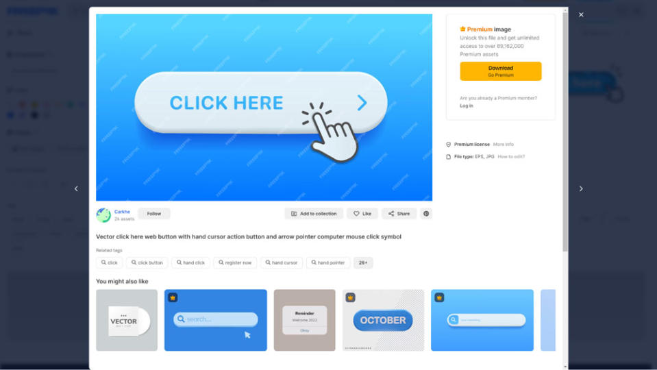
Similar to the nomenclature of categories, many websites fail to accurately label buttons and link text, and don’t provide suitable alt text for images. We call this illogical terminology.
Avoid using link text or button text such as ‘Click here’ or ‘Learn more’. We would even recommend avoiding ‘Shop’ or ‘Shop now’ on buttons.
Recommendation
Think again of how you would describe what the action will achieve for users. Instead of ‘Shop now’, use ‘Shop high heel shoes’; instead of ‘Learn more’ use ‘Learn how we source sustainable food ingredients’.
It’s a similar story for alt text: Describe the item e.g. ‘loose-fitting, boot-cut black jeans’ rather than going with ‘men’s jeans’. Think of alt text as another form of product description - how would you describe it to someone over the phone?
Issue 3: Colour contrast causing concern
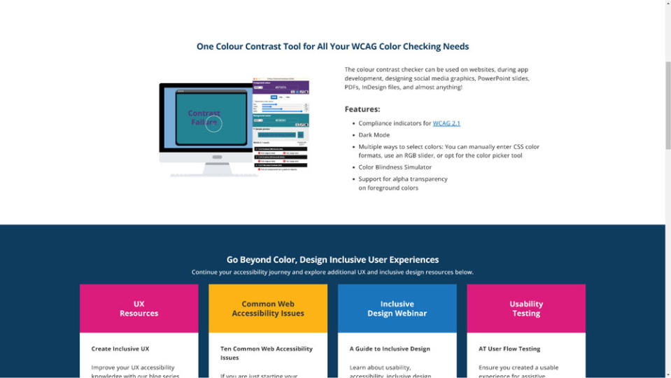
This is a complex area which is subject to a mathematical formula, but is essentially designed to help people with certain vision conditions, including forms of colour blindness, when using websites.
Many sites just use a designer’s own visual judgement to ascertain if colour contrasts work - but that fails to take into account users with impairments. I’ve even read a blog from a designer who suggests occasionally ignoring the Web Content Accessibility Guidelines as, in his opinion, they ‘do not always measure up in practical application’.
Such a comment gets right to the heart of why such guidelines exist: to design websites with all users in mind, not just the majority. Most people might say white text on an orange button is more readable than black text, but if it is unreadable to some then it creates an avoidable problem.
As part of all our Shopify design and build projects, we analyse this area of web accessibility and it can lead to challenging conversations about merchants’ wishes and sometimes even about their brand colours.
Recommendation
Designers can create beautiful websites with contrasting colours which look amazing, but always put it through a tool to make sure it’s accessible. One of the best free ones is TGPI's colour contrast checker.
We always give clients accessible options, or show examples of how we can apply their branding slightly differently, or marginally change a colour to make it more accessible. A small change can make a big difference.
Issue 4: Videos without captions
This is a problem especially with any product instructional videos, blog content or where videos are providing further information - if they don’t contain captions they’re proving useless for some of your customers.
People who are deaf or hard of hearing, rightly, should expect video content to be captioned, but this is also valuable for customers with learning disabilities and neurological disorders.
Recommendation
Auto-caption generation is a start, but it’s not 100 percent accurate so merchants should ensure the information they provide within captions is accurate.
There are a number of platforms on the market which can help with e-commerce video captioning. Many use embedded YouTube videos, which can auto-generate captions but there are invariably errors, so ensure your transcript matches the video content.
Issue 5: Flashing images and iconography
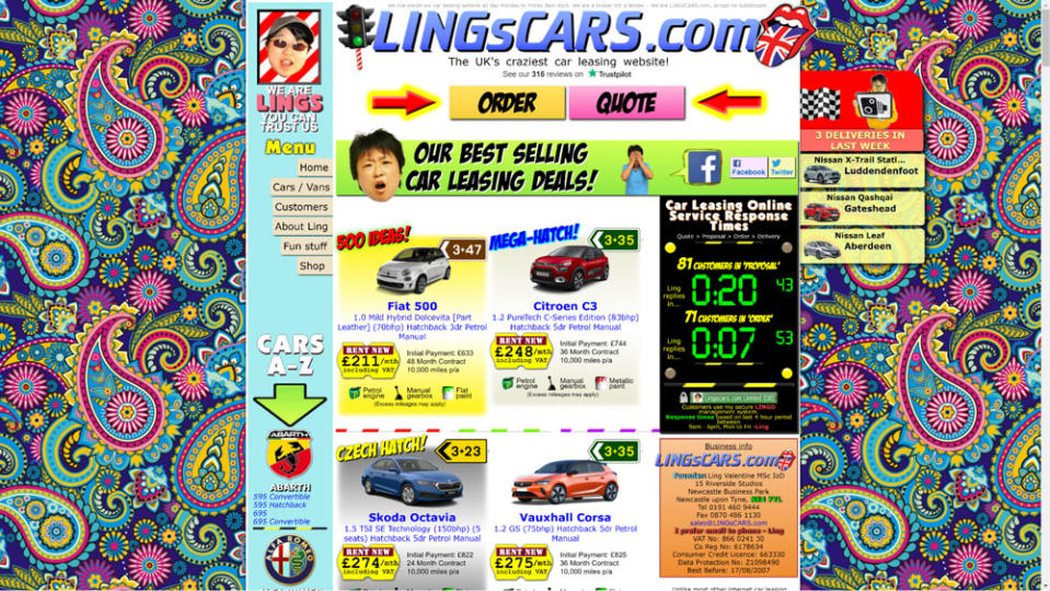
Stimulating, bright content might feel like a way of enticing people to buy, but it can lead to users leaving a website immediately.
In just one example of many, people with Autism Spectrum Disorder can be more susceptible to visually-triggered seizures as a result of flashing lights and images so retailers should carefully consider how such content is handled.
Businesses who run online and offline stores also need to consider the lighting in their shops. Harsh lighting can often be painful for a person with autism.
Recommendation
Marketing and e-commerce departments should ask themselves if flashing images and busy content are really worth turning away a percentage of potential customers.
It’s easy to consider just visual and hearing impairments when approaching web accessibility, but there’s much more to take into account.
In an ideal world, a person would be able to use a button which turned off flashing content and use a simplified version of a website. Maybe it’s something for us in the world of web development to seriously consider.
For more on issues in web design, see how AI is impacting web design.

