Designers Love the "50% Trick" for Creating Custom Paint Blends
Picking a paint can be a frustrating affair. You fall in love with a color on a little paint chip, bring it home and paint a square on the wall, and realize it's not quite right. But so close! “Sometimes I can’t find the exact color I want in a paint deck, and I just have this desire to create something else,” says Florida-based designer Phoebe Howard, whose go-to solution is to then “take the color that I thought I wanted and, just to experiment, cut it to 75, 50, and 25 percent strength with Benjamin Moore Super White." From there, she simply decides which blend she likes.
Cutting a paint with color with white paint can lighten, brighten, and altogether transform it. "Sometimes it looks like a completely different color!" says Howard. And while of course you could experiment with different percentages at home, Howard says the paint store will be happy to blend some test batches for you. If you like a color in the store but aren't sure if it will be too dark, consider going home with test batches of it at 25%, 50%, and 75% strengths. (And yes, these will be different than the "lighter" colors on the same chip, which are all different pigments!) "You’re just taking the color and turning it down,” explains Howard, who says you can use any white paint you like. The tactic was put to use when she renovated the Duck's Nest, the second-oldest house in Palm Beach, Florida, with a whole range of juicy pastel colors.
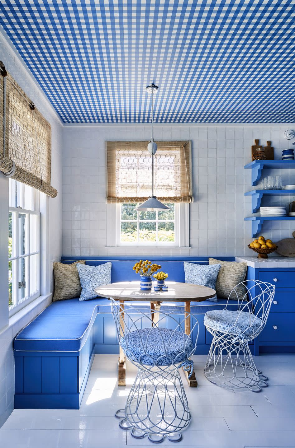
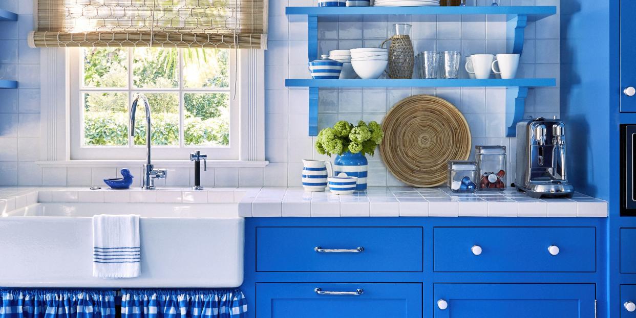
Phoebe chose a bold blue gingham Peter Fasano print for the kitchen—on a wallcovering that would cover the ceiling of the room, and in fabric that would be made into a little skirt under the sink. For the cabinet paint, she took the print to the paint store and had them match the color—and then blended it 50-50 with white paint. The result is cabinets that feel precisely right against the gingham, but are just a hair brighter and lighter, which keeps the very blue look from being dark or overbearing. It's a subtle technique, but one that Howard returns to time and again because it so consistently yields colors that work. Says the designer, "You'd be surprised!"
Follow House Beautiful on Instagram.
You Might Also Like

