Designers say Kamala Harris' 'anti-fashion' paint choice offers a valuable lesson in color trends

Number One Observatory Circle, the vice president's official residence, is among the country's most iconic and influential homes – so naturally, we have high expectations for its interiors.
Glimpses inside the property have hinted at what we might have expected – exhibiting a quintessentially American aesthetic through layered textured and dark wooden furnishings – but her paint choices are slightly more controversial.
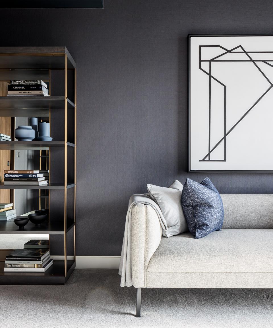
Gray, arguably 2023's most disputed hue, knows precisely how to spark a debate among designers – but a look at Number One Observatory Circle's dining room suggests the vice president has chosen her side – and she's firmly team gray.
A post shared by Kamala Harris (@kamalaharris)
A photo posted by on
The open-plan space boasts a strikingly gray color palette – from the painted walls to the drapes, dining chairs, and large rug atop the wood floor. There is no denying the abundance of this 'anti-fashion' hue – but it's also hard to dispute how well this color works in the room.
The overall space is classic yet contemporary – boasting the elegance we would expect from Number One Observatory Circle while nodding to a recent color trend (however disputed it may be). So, is this our cue to see gray in a new way? Washington-based designer Rachel Waldron suggests so.
'At Waldron Designs, we do not believe in dated colors, only dated color combinations utilized in spaces that they are not well-suited for. Every color has a place and appropriate use. So, if the question is whether gray is a good field color option to use as a neutral, the answer is yes- in the right environment.' she says.
As Rachel explains, 'our interiors should reflect many things, namely our personal style and the context' – and in the case of Number One Observatory Circle, this color scheme fits seamlessly.
'In a Seattle waterfront home with an airy, open environment and rich, warm wood accents, gray may provide the perfect backdrop. That same home located in Arizona would likely be out of place and might want to pick up on red rock surroundings,' Rachel says. And, when used in the right spaces, she's not alone in her support for this tone.
'Like with anything – overuse or dated use of a color or material can quickly slide past its expiration date. I believe that when you use gray in an updated way, it is still very much a relevant color,' says Andrea Seymour of Springdale Custom Builders & Design.
To ensure our gray impresses beyond 2023, Andrea encourages us to paint with a more monochromic scheme in mind.
'For instance, if you utilize a shade of gray with a lot of saturation (say, Farrow and Ball's Downpipe or Benjamin Moore's Pale Smoke) and apply the paint in a monochromatic fashion (walls, time, and doors the same color), you add drama and well thought out design to a space.'
Is it time we see gray in a new light? Color lessons from Number One Observatory Circle suggest so. We're reading up about the home's history via this book (available on Amazon) below.

Number One Observatory Circle by Charles Denyer | $45.50 on Amazon
This book offers a rare glimpse inside the 'home like no other – including a beautiful collection of never-before-seen photos and insider stories behind one of the country's most powerful homes. View Deal

