These Are Designers' Favorite Colors to Use With Light Blue
"Hearst Magazines and Yahoo may earn commission or revenue on some items through these links."
There are so many beautiful colors that go with light blue it's easy to see why it's such a classic. Light blue crosses aesthetic boundaries and outlasts trends decade after decade. Still, when you're designing a room, it can be intimidating to decide what other colors to pair with blue. Depending on the furniture, textiles, and fixtures—not to mention the other paint colors—light blue can look elevated, cozy, feminine, modern, you name it. Your design choices can take it in practically any direction.
In color psychology and color theory, light blue is said to promote a calming atmosphere and soothe the nervous system (no, really). Check the color wheel and you'll see that blue is a cool-toned hue with orange as its complementary color. That means you can pair it with a warm-toned hue for contrast or with another cool tone like green or purple to lean into its tranquil energy. But that's just the beginning. There's a huge number of different shades of blue and just as many great colors pairings.
To help you build a color palette you love, we've gathered spaces that prove any room can benefit from a splash of light blue. Below, you'll see examples of light blue kitchen cabinets, spa-like bathrooms, modern primary bedrooms, and so many more uses of this versatile color. Learn why designers are obsessed with it and what colors go with light blue beautifully.
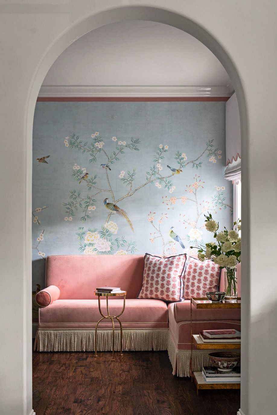
Peony Pink
In this Dallas, Texas home by Carla Fonts of Dunbar Road Design, a previously unused coffee bar leading into the owners' suite became a pretty-in-pink sitting area. The light blue Mural Sources wallcovering is set off by salmon tape from Samuel & Sons, which matches the custom banquette perfectly.
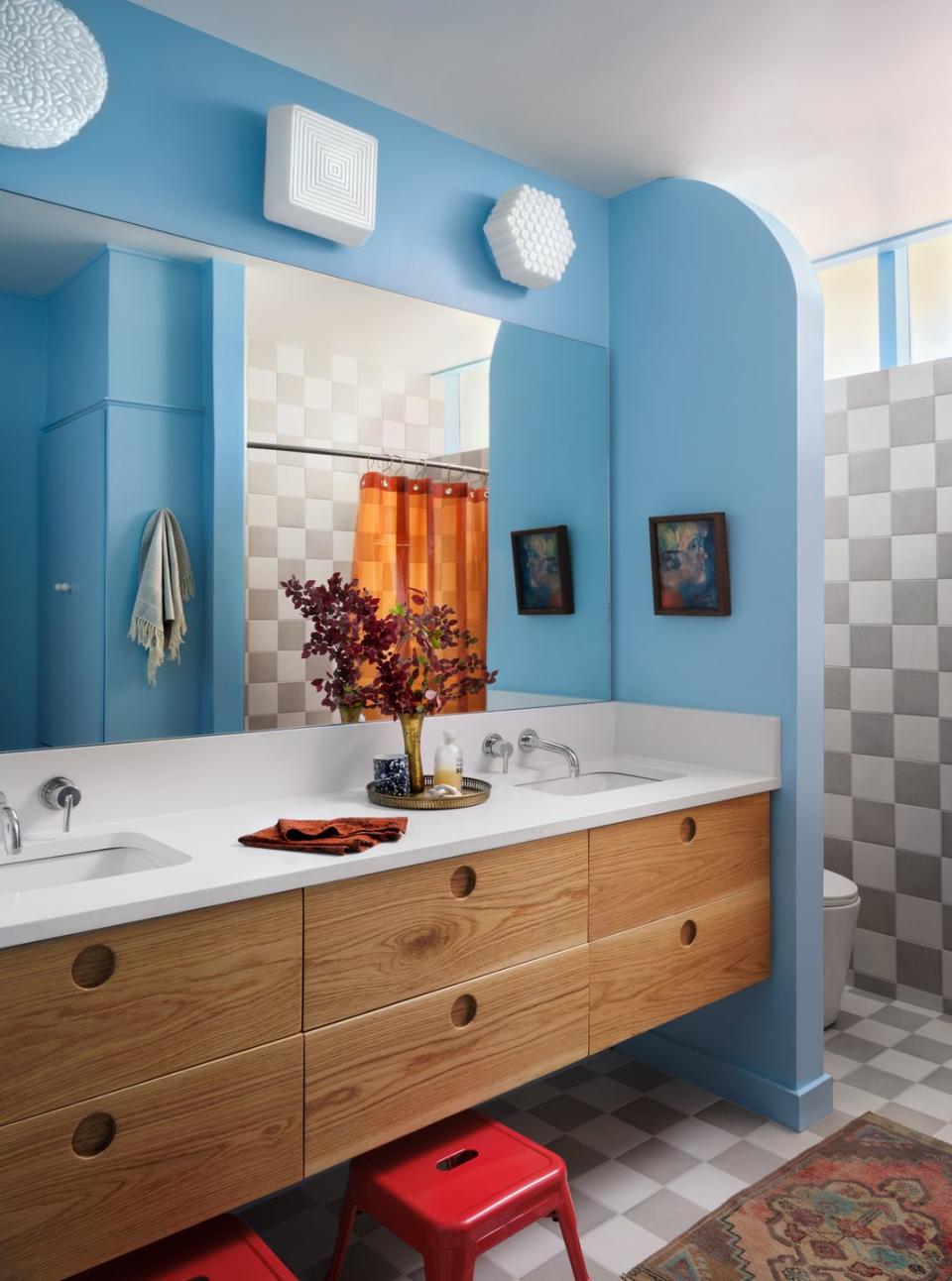
Grounding Gray
"Because it's a small space for children, this felt like the right moment to have fun," Hilary Walker says of the cheerful kids' bathroom in her friend Ashley Maddox's home in Waco, Texas. Gray checkerboard tile stands out against and grounds the bright light blue paint color, keeping it from feeling overwhelming.
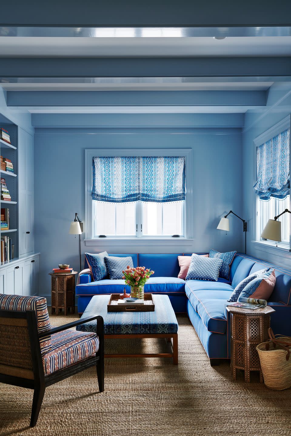
Cobalt Blue
Looking for a shortcut to a cohesive color palette? Pick one color and use a variety of shades. The monochrome sitting room of this Kansas City home by Mark D. Sikes proves that tonal blues go great together. The cobalt sectional adds depth to the light blue walls.
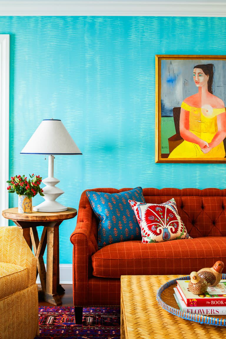
Terra-cotta Orange
Orange and blue are natural complements, so using them both in equal intensities is a recipe for success—especially if you love bright colors. In this 1910 farmhouse, Robin Henry opted for patterned textiles to create maximum visual depth.
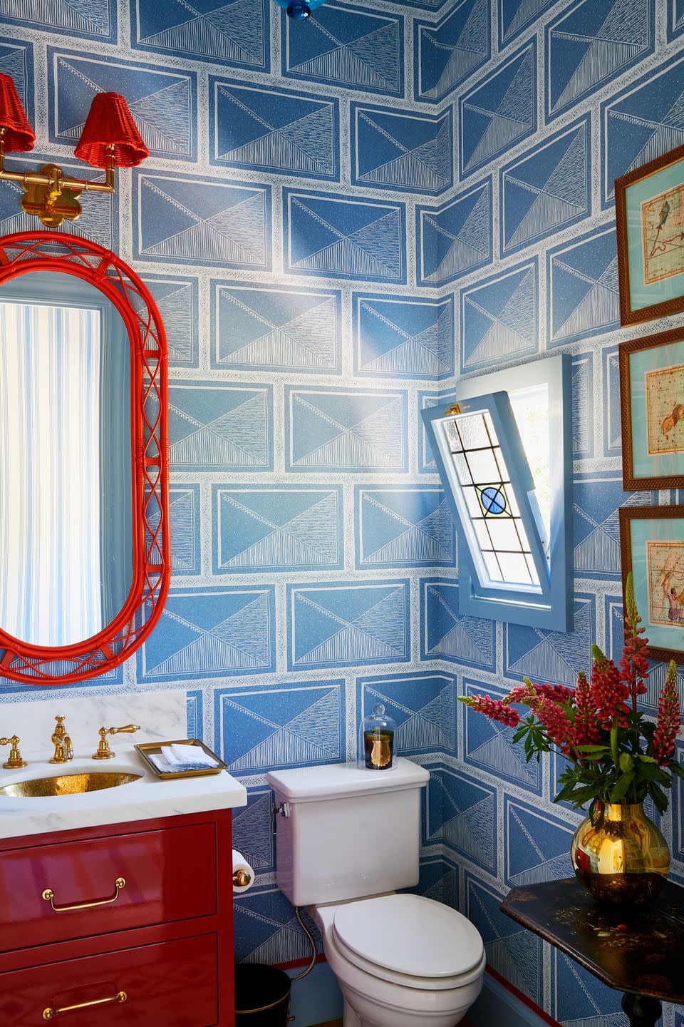
Fire Truck Red
One of the easiest ways to make a bold impact is to choose a shade directly across the color wheel from the one you're already working with. In the powder room of this historic California home, Mark D. Sikes picked a classic red to play against the light blue Katie Ridder wallpaper. The wicker mirror is by Soane Britain.
Mustard Yellow
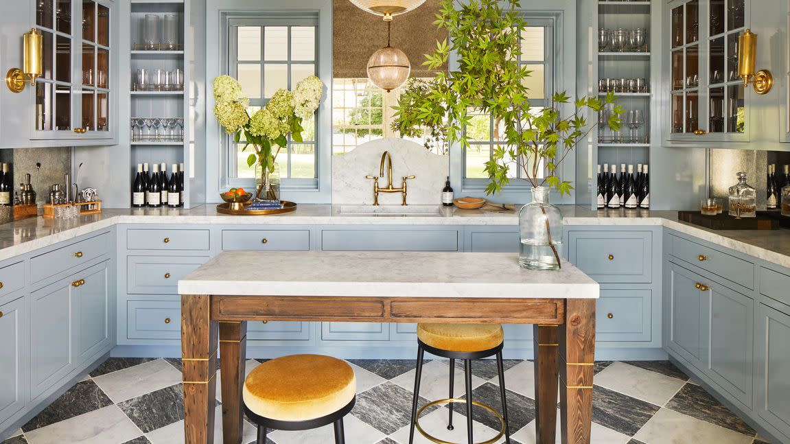
Jess Weeth chose bar stools in a mustard yellow velvet for the kitchen of this Maryland beach house to flatter the island's warm wood and contrast with the sky blue cabinetry.

Brick Red
To soften the stark brick exterior of this Fort Worth, Texas, home, Meredith McBrearty went for shutters in a subtle light blue. The color not only welcomes guests with enthusiasm but adds a boho feel to the home's architecture.

Rich Purples
Lisa Tharp decided to pair a light blue sofa with a pale purple rug. The cool-toned colors work together to give this Boston pied-à-terre a calm, relaxed vibe.

Kelly Green
A stormy gray-blue can calm and soothe a space, but it can come across as dreary if not paired with the right hues. These kelly green pendant lights bring just the right brightness and fun to the kitchen of this Texas home.

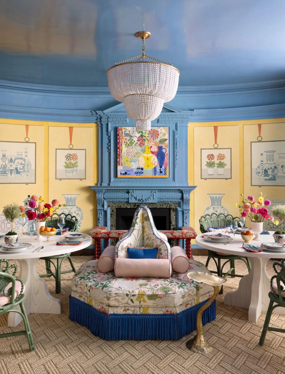
Sunshine Yellow
An age-old combination, yellow and blue are both primary colors. When paired, they bring a cheerful energy to a space. Seen here in the dining room of our 2023 Whole Home, created by Colordrunk Designs, the vibrant hues give off a friendly, conversational energy.
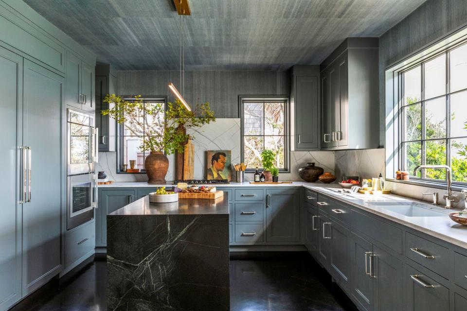
Moody Black
"The owner wasn't looking for a typical 'beach' look—he wanted his house to be different from everything else in the area," says Kelly Cook, owner of Orangerie Home, of the kitchen in this Florida home. To add a bit of edge to the traditional coastal palette, Cook opted for deep grays and blacks with a pale, smoky blue.
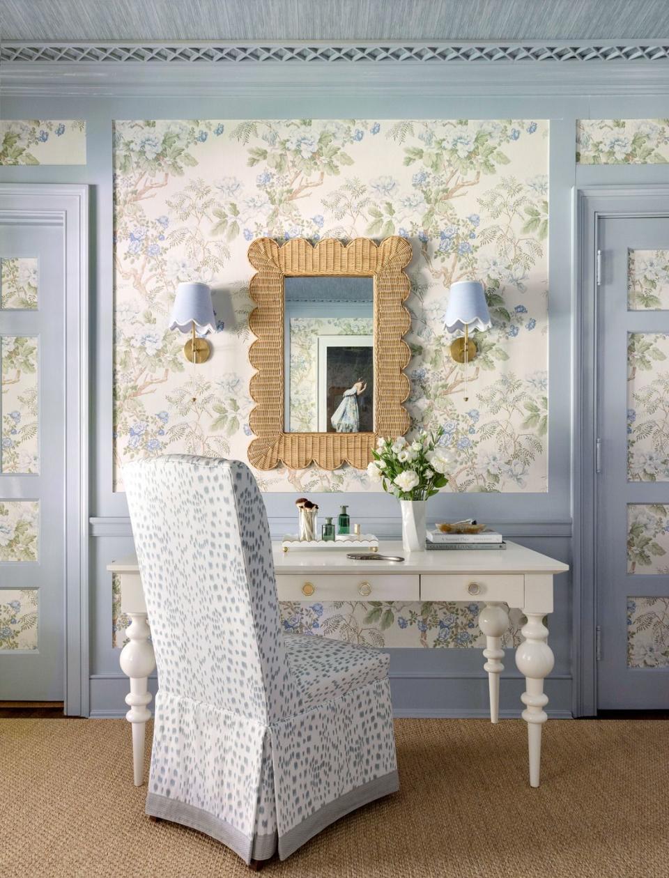
Pastel Florals
Roxy Owens of Society Social turned a once-dreary spare room in our 2023 Whole Home into a dreamy destination for guests. She kept the original paneling and had it painted in Farrow & Ball Parma Gray to frame the Lee Jofa chintz wallpaper—otherwise, she remarks, the room would be "very trippy" and not relaxing at all.
You Might Also Like

