Designers decide on the 5 best paint colors for a dining room - 'atmospheric spaces'
When it comes to choosing a color scheme in your home, finalising the palette for the dining room should be at the top of the priority list. After all, as Madison Popper, Founder of Chill Casa, tells us: 'It sets the tone and atmosphere of the space where people gather to share meals and conversations. A well-chosen color complements furniture and accessories, impacting the overall mood, conversation and even appetite.'
We have designers on hand who can share from their portfolio, some of their go-to paint shades for a dining room which will have the whole neighbourhood wanting to come over for dinner.
1. ALYSSUM BY SHERWIN WILLIAMS
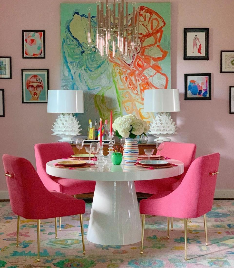
Pink has long been known as the most flattering wall color - whatever your skin tone it brings out a certain sense of health in your cheeks. Shauna Glenn of Shauna Glenn Design in Fort Worth, Texas is known for her brightly colored spaces and says pink is a great color for accentuating a room adorned with artwork. 'We used Alyssum because it's a great neutral pink,' Glenn says. 'Not too bubble gum and not too blush. I love the way the art just pops off the walls and we get a monochromatic effect with the chairs and rug.'
With a bright color like Alyssum by Sherwin Williams you can amplify with other bright shades or tone down with neutral furniture according to your taste.
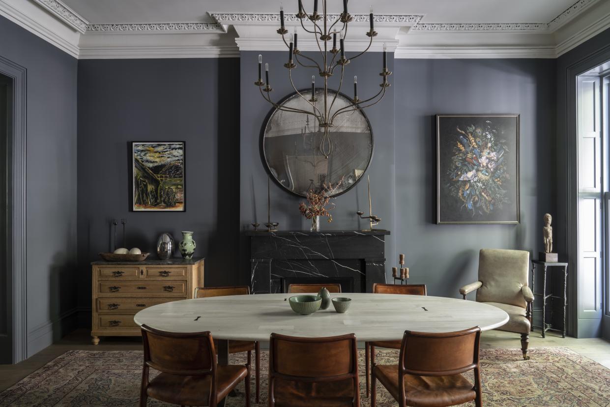
2. DOWN PIPE BY FARROW AND BALL

Deciding what color to paint your dining room comes down to its function, says Farrow and Ball's Brand Ambassador, Patrick O'Donnell. 'Is this your only dining space for all the family or is this primarily for large gatherings and informal dinner parties in the evening?', asks O'Donnell. 'If the latter, be as brave as you dare, especially if mainly used at night as the lighting will be the key player in how the colour works, from the gentle glow of candles down the table, to wall lights and table lamps.'
For this purpose, O'Donnell recommends Down Pipe. He tells us: 'Down Pipe, one of our very first colors, creates an atmospheric space and will be a flattering backdrop to a traditional space or for a modernist approach. Thankfully it never feels chilly, with its gentle green note running through it.'
However, if this is your only dining space, O'Donnell recommends a lighter shade: 'The rich, earthy note of Templeton Pink will flatter all who enter and work two ways depending on the light - bringing warmth when poorly lit and bleaching to a rich neutral in full sunshine.'
3. BONA FIDE BEIGE BY SHERWIN WILLIAMS
If a bright color is a little out of your comfort zone, neutrals can be relied upon to create a calm, timeless dining room. Devin Shaffer of Decorilla recommends taking the neutral wall shade from adjoining rooms and painting your dining room in the same shade. 'Dining rooms are far too often forgotten about and I love to see the overall paint color of the home pulled into the dining room for this very reason because there's a psychological effect that pulls people into the room due to the easy transition of the wall color,' Shaffer explains.
'There's no denying that grays, beiges, and greiges are fabulous colors for interiors,' he continues. 'Beige often carries warm undertones, while gray can vary from cool to warm shades - and neither of the two are a bad choice; it just might take a paint job or two to decide on which you love best. You'll be amazed by how the subtle warmth of these color families will make you feel cozy and want to host more events because your family and friends feel the same way.' Order Bona Fide Beige by Sherwin Williams here.
4. PINEAPPLE FLAN AND STRAWBERRY SHADE BY DUTCH BOY PAINTS
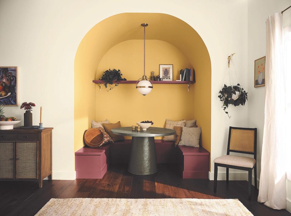
If your dining area is less a room and more of a nook, colors can be used in an intentional way to ensure the area feels like a feature in its own right. As a space that is more intimate than a space with a large dining table, a nook needs to feel inviting and for this, Dutch Boy® Paints' Color Marketing Manager and Interior Designer Ashley Banbury says to 'use traditional hues in an expected way to create a fun cozy dining nook that sparks conversation.'
Banbury tells us: 'Dutch Boy Paints’ Pineapple Flan (214-3DB) and Strawberry Shade (302-6DB) are uplifting hues, creating a focal point in a space - this unexpected color combination perfectly ties together fun accent pillows and décor for a cohesive look!'.
5. CHANTILLY LACE BY BENJAMIN MOORE
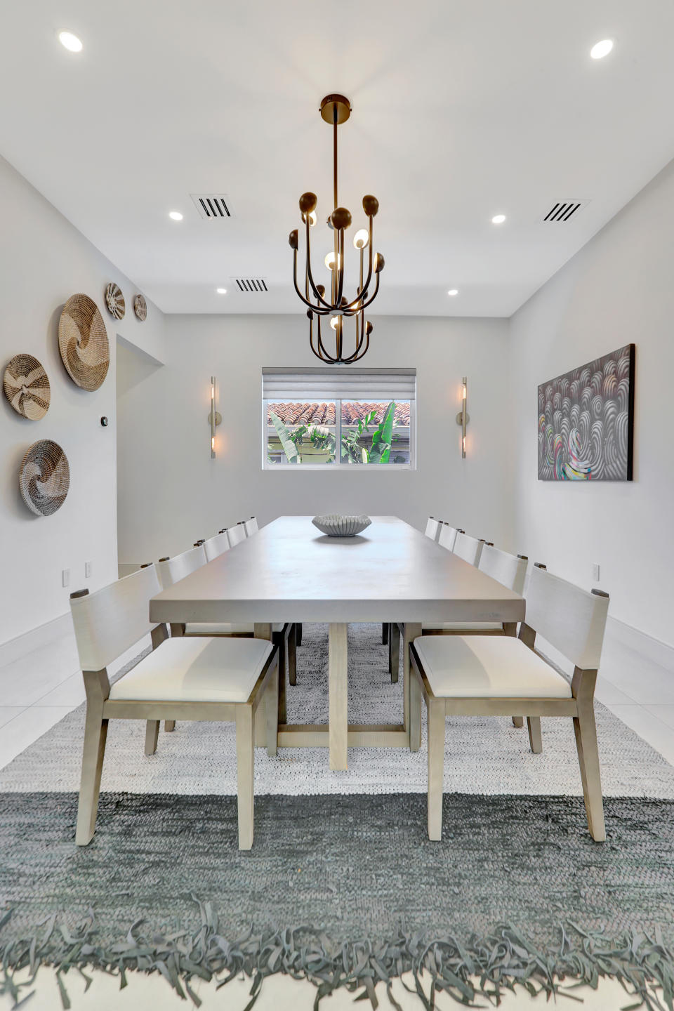
If the rest of your home takes on a minimalist esthetic, there is no reason why your dining room should be any different. Madison Popper, Founder of Chill Casa, recommends Benjamin Moore's Chantilly Lace. This shade provides a neutral backdrop meaning you can add statement neutral pieces like an unusual light fitting or you can go minimalist in its truest form and keep the space feeling clean for a relaxed effect.
If you feel a feature wall against Benjamin Moore's Chantilly Lace would add visual interest to a large open dining room, Popper has particular paints in his back pocket that never fail him. 'Revere Pewter [by Benjamin Moore] offers versatility and warmth, while Notable Hue [by Sherwin Williams] brings a pop of color. Domino [by Sherwin Williams] sets a calming tone to the room, China White [by Benjamin Moore] is just timeless and classic and Naval [by Sherwin Williams] adds a touch of sophistication and drama. Each color option creates an inviting and elegant dining experience.'
Designer Amanda Reynal tells us 'dining rooms are the stars of the evening, when it's dark outside, they can sparkle and shine.' It is for this reason that choosing a color which you feel you can accessorize with the perfect table and soft furnishings is the most important step in designing your dining room, whether you're hosting large dinner parties or intimate family meals.

