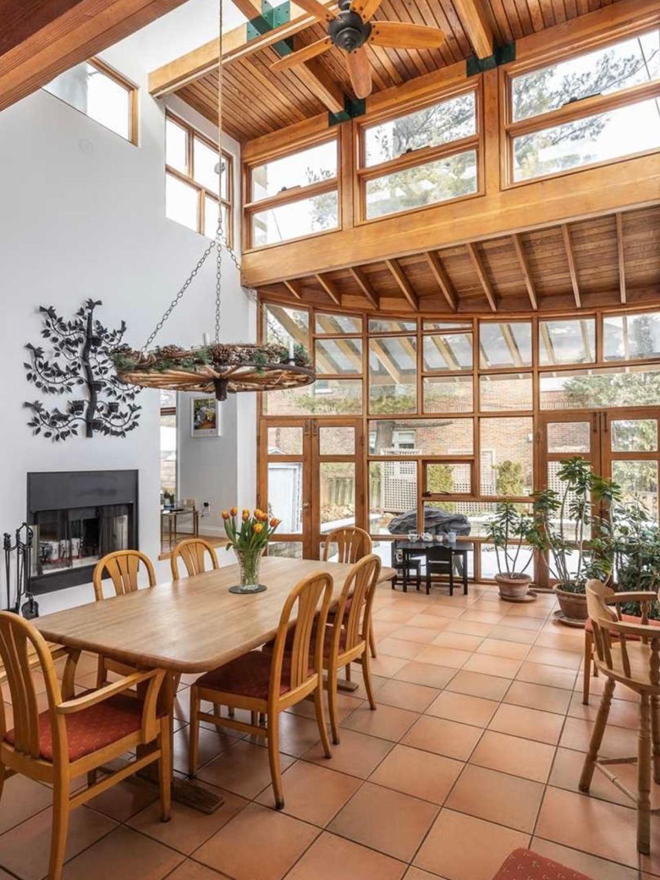
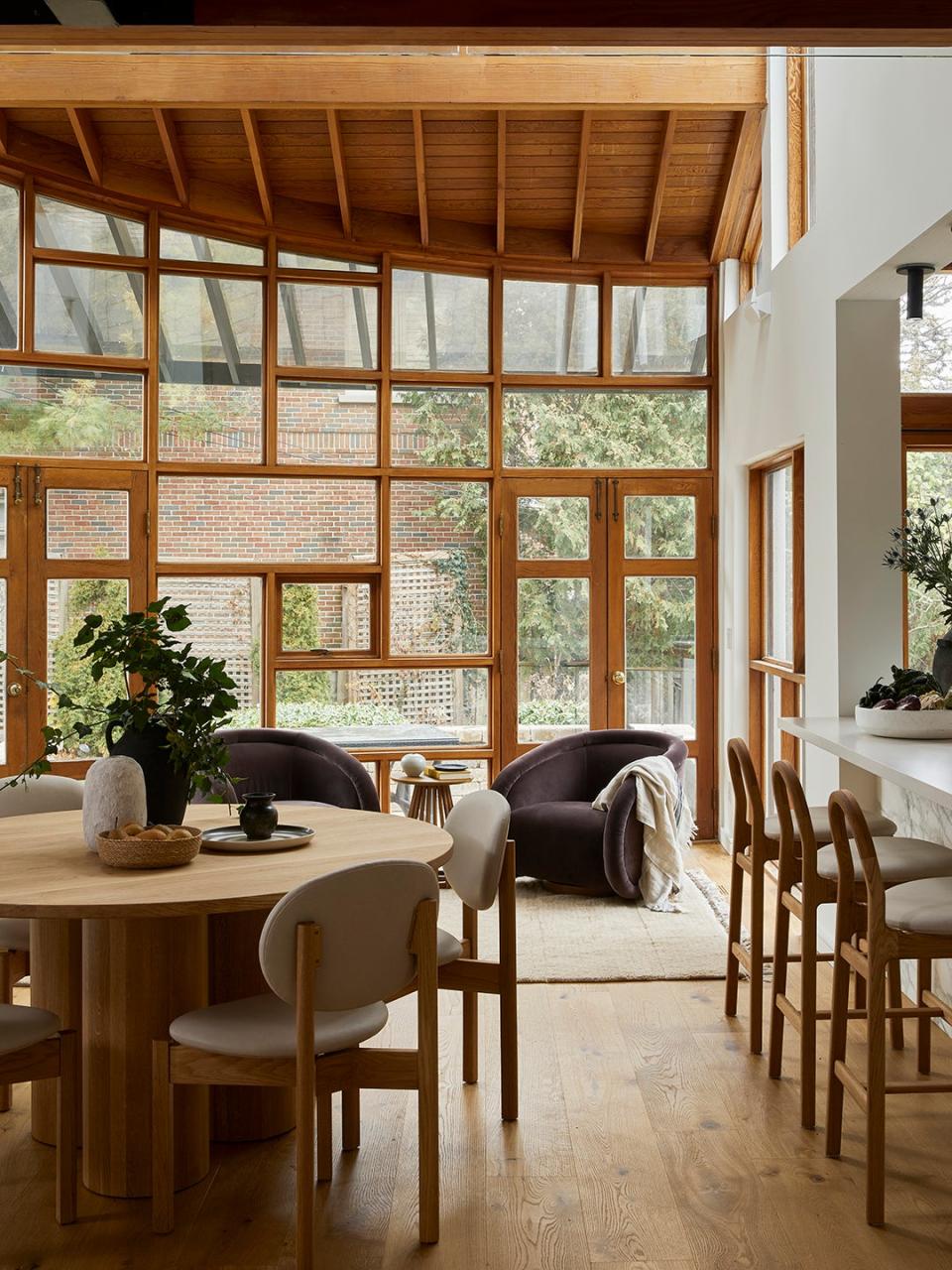
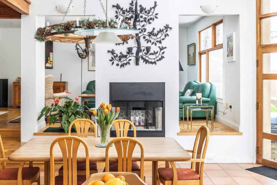
How a Designer Worked With, Not Against, a Wall of 34 Windows
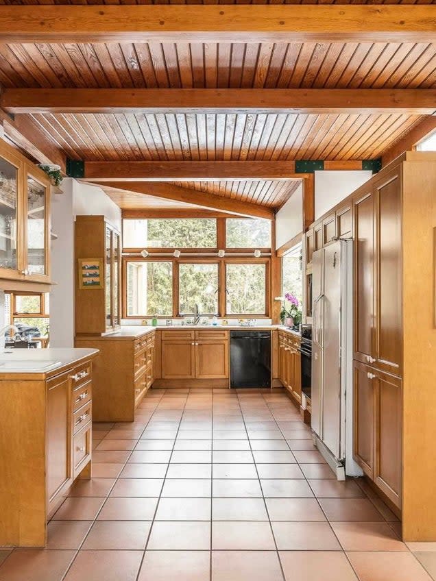
There’s only one place your eyes can go when you walk into this Toronto home. At the very end of a long and grand living area, there is a wall with exactly 34 windows, and they’re framed in an orange-hued wood that tells you exactly when they were added: the 1980s. They're quirky, a little bit random, and there was no way Jaime Zimmerman, the founder of JPZ Interiors, was getting rid of them. Even when her contractor floated the idea of painting the windows, she shut it down. “If you look up close at them, you can see some are losing color, have faded here and there, but it really is what brings that natural feel and character to the house,” she says. “That makes it so special; that’s what I wanted to maintain.”
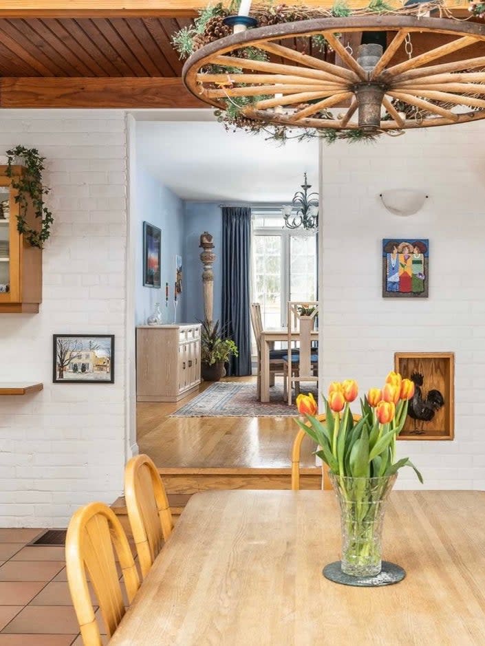
The outdoorsy homeowners also fell in love at first sight: They had a picture-perfect view of their backyard—what more could they ask for? The problem was that the great room and the surrounding areas (kitchen, mudroom, family room, and dining area) weren’t doing the windows justice. “Everything was really wonky,” recalls Zimmerman. Very few spaces were on the same level. The formal dining room was a few steps up, the entryway was a few steps down—really, there should have been bright yellow "Watch Your Step" signs hanging in every room. Here’s how Zimmerman found calm in the home’s chaotic layout.
Reduce Tripping Hazards
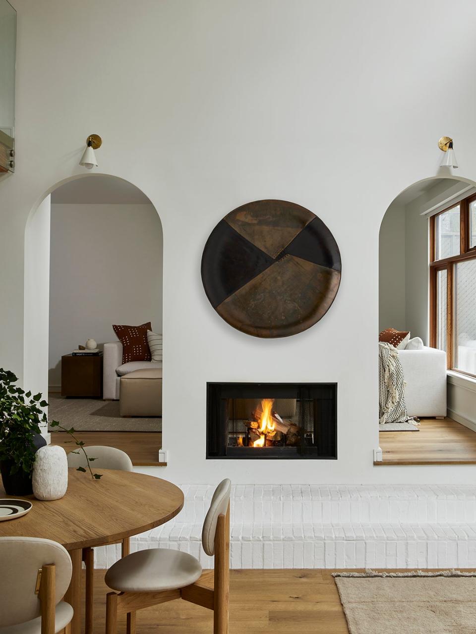
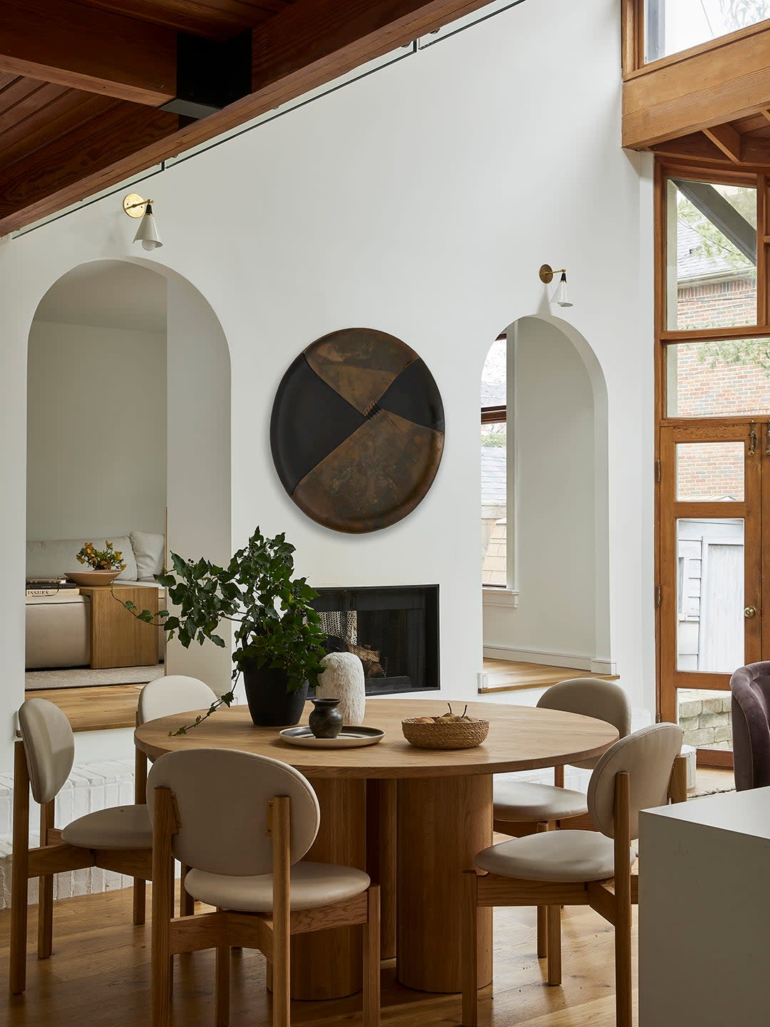
Lowering the family and dining room level to be even with the rest of the ground floor would have been a construction nightmare, but Zimmerman wanted to at least address one glaring safety issue: the drop off on either side of the fireplace. “They have kids,” the designer points out. “You can’t have an open space here without a step.” She elongated the steps to the left of the thresholds and built them out of white-painted brick, which felt cohesive with some of the room’s existing white brick walls.
Don't Give the Neighbors Something to Talk About
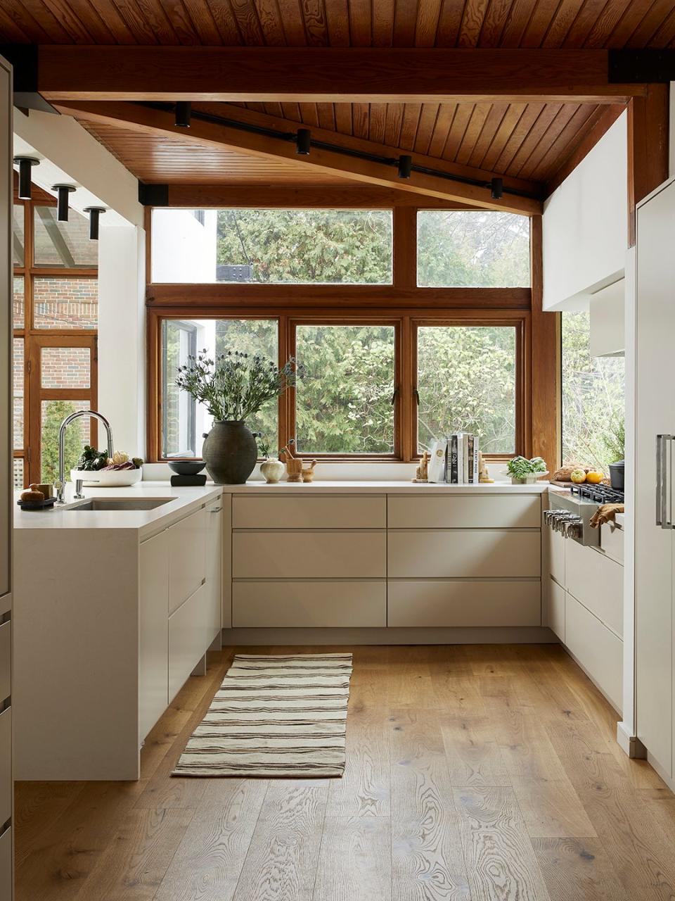
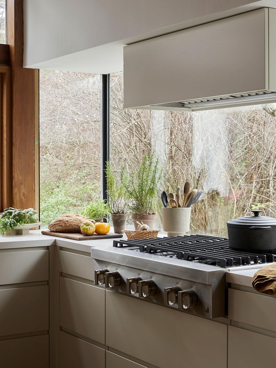
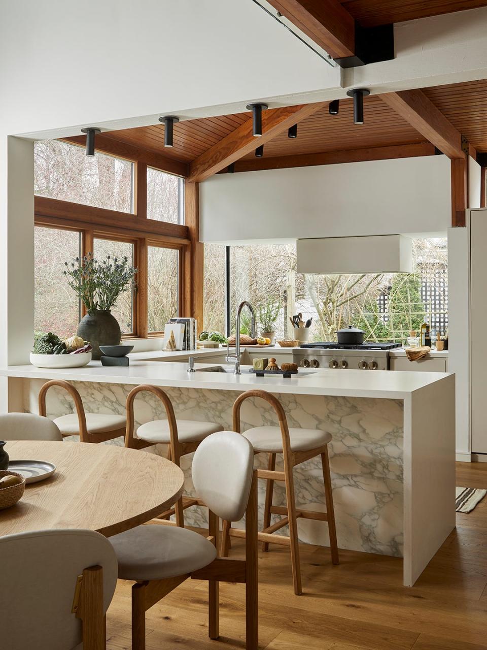
In an effort to streamline the layout, Zimmerman opened up the existing peninsula even further so that the kitchen was truly one with the great room. She stayed true to her word on not touching the windows in this space either, even if it meant the owners would have very few upper cabinets. “I really needed to maximize storage as much as possible because the husband loves to cook,” she says. Zimmerman tasked the cabinetmaker with integrating custom organizers for his pots and pans in the drawers closest to the range.
The only thing obstructing the windows is the vent hood. Of course, Zimmerman couldn’t get rid of it, but she wanted to at least ensure it looked good from all angles by painting its boxy frame the same color of the new flat-slab cabinets. "I wanted it to just float there and not to be too impactful," she says.
Pick Your Wood Tones Wisely
One of Zimmerman’s main challenges was navigating all the wood in the space. She wanted to update the flooring by replacing the terracotta tiles with engineered hardwood but “it was hard to find that perfect match,” she admits. She leaned toward a honey-hued option that exudes the same level of warmth as the existing orangey tones of the window frames and ceiling panels.
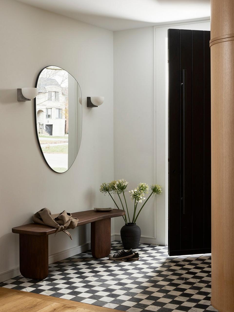
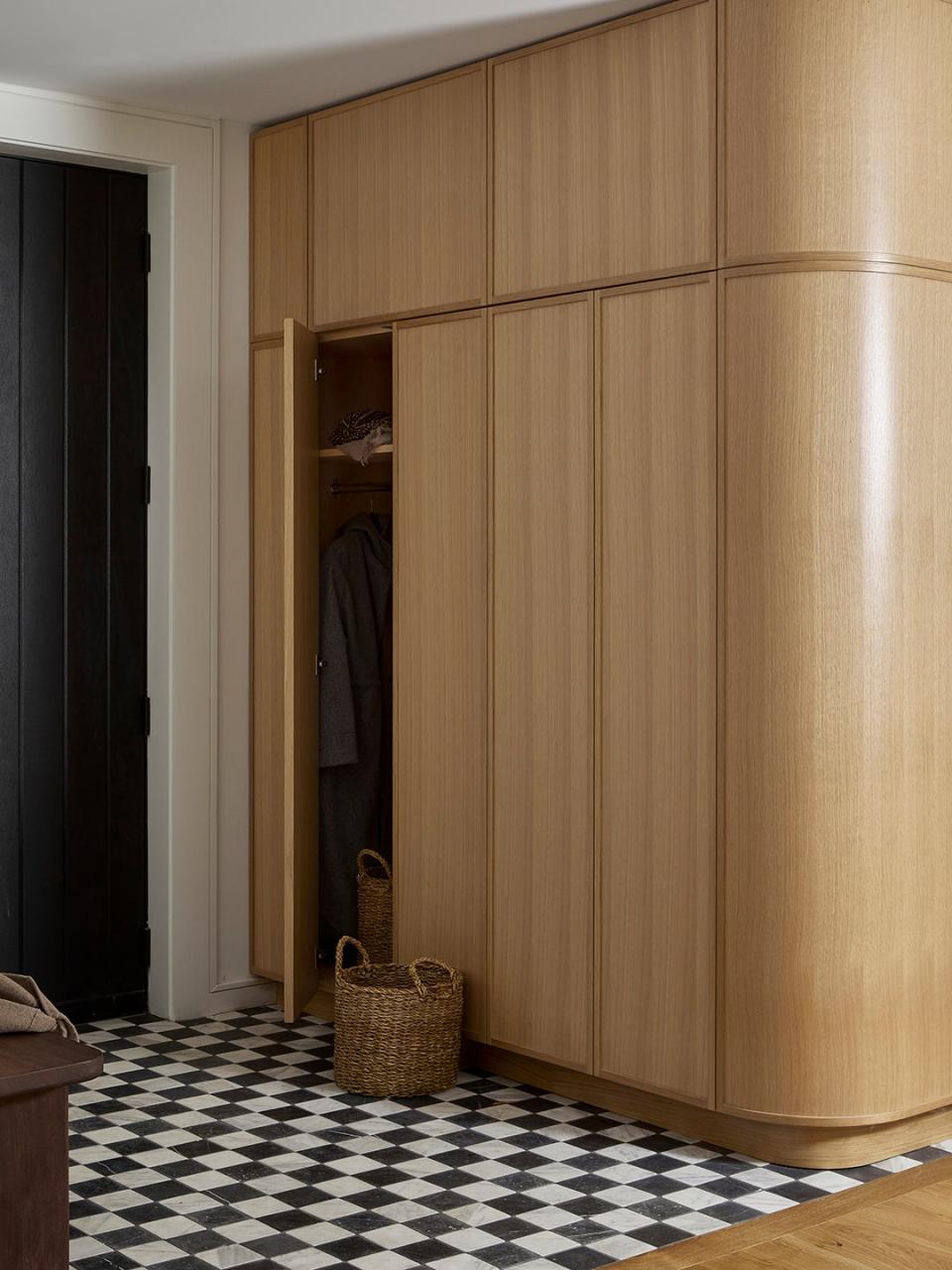
She departed from the wood flooring in the new front entryway with a checkerboard tile and an oak coat closet. For wood furniture and built-ins, her rule of thumb was to opt for lighter stains and species so “they didn’t feel so heavy,” she says. You'd never know looking at the space today that it used to be part of the living room.
Pick Lighting That Doesn't Shine Too Bright
While the wall of windows maximizes natural light in the house, there’s no getting around dreary winters in Toronto, where the sun goes down as early as 4:45 p.m. Zimmerman’s lighting plan had to be functional, but it couldn't be too busy. The designer steered clear of grand chandeliers and introduced simple track lights over the central round dining table and mono-point flush mounts above the peninsula. She even lit the way to the family room with simple sconces marking the new arched thresholds and steps.
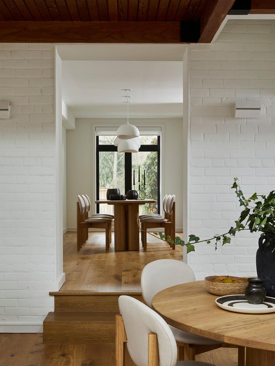
The formal dining room is the only place she opted for long-hanging fixtures, and even the pieces nearly blend into the backdrop with their textured white shells. “It’s a long and narrow [space], so I felt that adding a series of three was the right move,” she shares. "It played into the linear feel."
Level the Playing Field
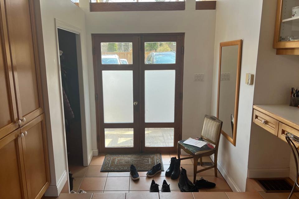
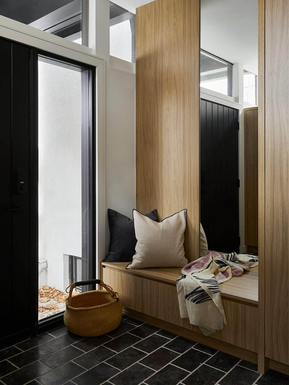
The old front entrance now functions as more of a mudroom. Zimmerman raised the floor so that it is fully level with the nearby kitchen and ditched the double door for a single opening with sidelight windows. Now the owners can pop in and out of the house with their stroller and not have to fuss over lifting it up.

