This Designer Rule for Selecting Curtains Has a 100% Success Rate
Curtains are a constant in design, probably because they’re both pretty and practical. Not only do they provide privacy, some insulation from the cold, and light filtering, but they’re also a feature where you can make a major decorative statement, thanks to bold patterns, trims, and tassels.
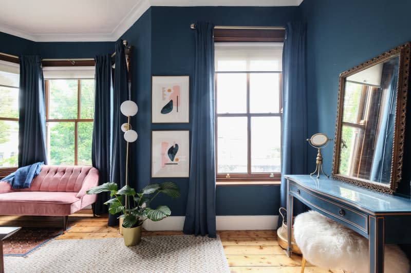
The options for doing that, though, can seem endless. And if you’re anything like me, when faced with too many choices, it can be hard to make a decision on what curtains to buy. That’s why I wanted to drop this little bit of designer knowledge, in case you hadn’t heard it yet. If you’re struggling to pick out window treatments, you know what works 100% of the time? Matching your curtains to your wall color.
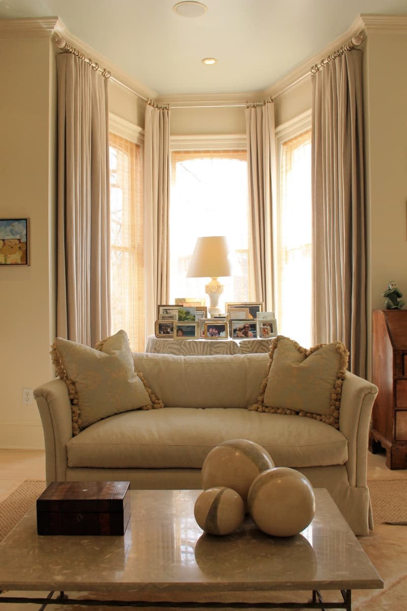
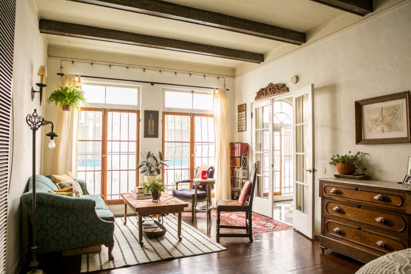
Designers use this trick that utilizes monochromatic colors all the time — it works for neutrals like white or beige, and it’s relevant for bolder, saturated hues, as well as everything in between. And while your drapery isn’t ever going to take center stage this way as it would, say, if you found a stunning block print, I’d argue that’s not necessarily a bad thing. A well-balanced room requires some features that whisper so that others can command attention, and curtains don’t have to be the place where you dial up the drama. You could leave that for decorative pillows, a rug, or your countertops.
This rule can work anywhere you’re at a loss as to what print or pattern to pick for your curtains or fabric shades. It’s also relevant if you can’t figure out which contrasting hue might be best to pull from a room’s palette to have your drapery serve as an accent.
The whole point is that it’s an easy, foolproof way to choose window treatments, but I’d still suggest keeping a few things in mind when putting it into practice. First, it’ll look best when there’s a visual contrast between your fabric and the walls. To create that touch of variance, choose a material that’s slightly lighter or darker than the wall color — think a shade or so up or down on a paint chip color card, which you can actually use when window treatment shopping (if you still have yours).
Second, texture’s never really a bad thing in design, so don’t be afraid to try a classic linen, something with a little bit of sheen, or even a heavier woven fabric to mix things up a bit, particularly if you have flat finished walls.
Finally, you have to get the length of your window treatments right, even when you’re going monochromatic. Shorter curtains may be having a moment right now, but that’s a hard look to pull off and depends on woodwork and other architectural features as a reason to deliberately truncate the length. The matching look seems to be at its best when you use drapery that kisses the floor, but Roman shades and cafe curtains can be options, too, depending on the setting.
And maybe the best added bonus about this rule? In general, solid fabrics tend to be cheaper than patterns, so you may save some money by going this route without even trying.

