How web design trends have evolved

The evolution of web design presents a captivating narrative of innovation and creativity, from the early days of basic HTML coding to the present era of engaging and visually immersive interfaces.
In this piece, we delve into a chronological exploration, uncovering the notable trends that have played a pivotal role in shaping the trajectory of web design's evolution. Each modern trend reflects not only the state of innovation at a particular time but also users' changing needs and desires.
To stay up-to-date on all things web design, see our UX course and visit our web design tools page.
The birth of the world wide web: early HTML days

During the initial stages of the World Wide Web's development, simplicity was the prevailing ethos. Websites predominantly feature text-based content constructed using fundamental HTML components.
Limited by technological constraints, designers focused on delivering information rather than aesthetics. Although rudimentary by today's standards, these designs laid the foundation for what was to come.
The rise of Flash and animation
With the advent of Flash technology, web designers gained the ability to incorporate animations and interactive elements. Flash allowed dynamic transitions, engaging intros, and even multimedia experiences.
Websites became more immersive and engaging, catering to users' desire for interactive content. However, Flash's downfall came with its compatibility issues and the rise of mobile devices, leading to its eventual decline.
The era of minimalism
The minimalist trend brought a breath of fresh air to web design. With clean layouts, abundant white space, and focused content, minimalist websites prioritised enhancing user experience and ensuring swift loading times. This trend improved usability and highlighted the importance of content hierarchy and clarity.
Mobile responsiveness
As smartphones and tablets became ubiquitous, the need for mobile-responsive design emerged. Websites had to adapt to varying screen sizes, ensuring seamless device functionality. Responsive design created flexible grids, scalable images, and fluid layouts, enhancing user experiences and optimising SEO.
Parallax scrolling

Parallax scrolling added an element of depth and interactivity to web pages. By moving background and foreground elements at different speeds as users scrolled, designers created captivating visual experiences. This trend not only engaged users but also allowed brands to convey their narratives more dynamically and visually appealingly.
Material design: aesthetic and functional harmony
Modern Material Design by Google introduced a design language that combined aesthetics with functionality. Based on the principles of tangible materials and real-world physics, this trend brought in elements like shadows, layering, and responsive animations. The result was visually pleasing interfaces that also provided intuitive user experiences.
Video backgrounds
Video backgrounds became a way to capture users' attention immediately. Whether showcasing a product, a brand story, or an ambiance, videos add a dynamic element to websites. This trend allowed for creative storytelling while considering loading times and user engagement.
The advent of dark mode
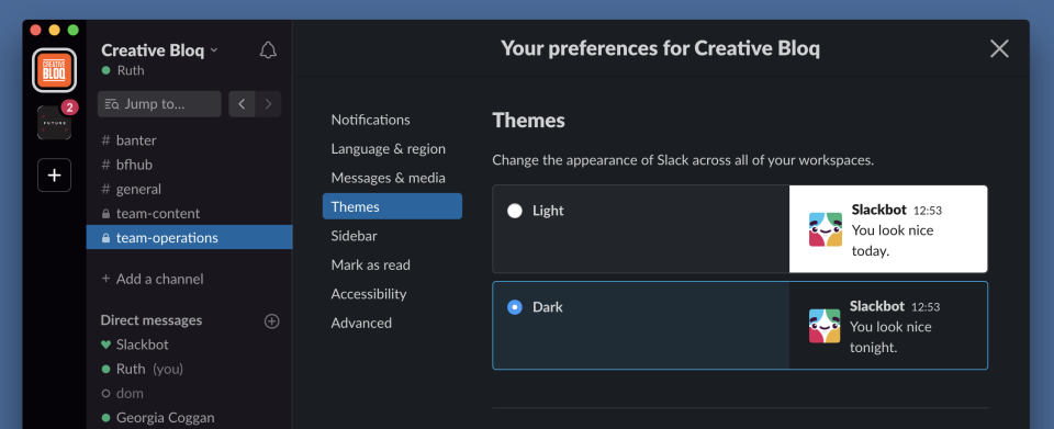
Dark mode emerged as a response to both aesthetic preferences and energy-saving concerns. Dark backgrounds with light text reduced eye strain and enhanced readability in low-light conditions. This trend gained popularity across platforms, offering users a more comfortable browsing experience.
As we move forward, the evolution of web design will undoubtedly continue, adapting to emerging technologies and user expectations and shaping the digital experiences of tomorrow.

