How to Design With Color If You Can't Actually See It
"Hearst Magazines and Yahoo may earn commission or revenue on some items through these links."
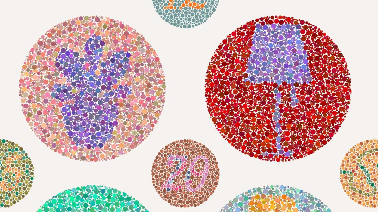
Ask any interior designer and they'll tell you that one of the most important aspects of any home is color. Not only is finding the perfect hue important in determining the energy of a room—blue, for instance, can have a calming effect—but it's also an extremely personal decision that most of us have strong opinions about. As a designophile, you likely know your favorite paint color by name (my mother's, for example, is currently Sea Salt by Sherwin-Williams) and, even more likely, have a list of colors you simply couldn't imagine using. However, when you're living with or designing for someone who's color-blind, you have to rethink not just the way you use color but the way you do a lot of other things too. And as when you're considering any specific need, be it sensory sensitivity, accessibility, or a tight budget, that can lead to some of the most creative—and beautiful—solutions.
"We were a lot more intentional and thoughtful about what he could see," Lina Galvão, interior designer and cofounder of Curated Nest Interiors, says of the color-blind husband in a couple she recently worked with on a redecorating project. It's a condition that's much more prevalent in men: About one in 12 men have a type of color blindness, while only about one in 200 women do, according to the nonprofit Colour Blind Awareness. Galvão's client had deuteranomaly, which meant he couldn't see the difference between red and green easily.
Meghan Jay, founder of her eponymous design firm, also worked with a husband-and-wife pair in which the husband had similar issues with red and green, though to him both of the hues looked more gray and he had difficulty distinguishing between other colors at all. And Louis Duncan-He, founder of his eponymous design firm, worked with another couple in which the husband was color-blind. However, while both Galvão and Jay worked with people who had a type of red-green color blindness, Duncan-He's client likely had a type of blue-yellow color blindness. "[The husband] has a certain type of color blindness where he can only really differentiate red, blue, and yellow, very primary tones," Duncan-He says.
Galvão, Jay, and Duncan-He share their experiences working with people who are color-blind and explain how they changed their designs, their approach, and most important their communication style to create the home they wanted. Read on for tips on what to expect when designing a home with color blindness in mind.
How to Design With Color Blindness in Mind
Don't expect someone who has any type of color deficiency to sit back on the sidelines and let everyone else make design decisions for them. Whether you're the designer who's working with a color-blind person or you're the partner of a color-blind person, be prepared to come up with a vision for the space together. Your approach may not look the same as it normally does, but as long as you're willing to listen and be collaborative, then this type of project really shouldn't feel too different in the long run.
Communication Is Key
Chicago-based designer Jay had to shift her usual presentation style due to the types of questions her client was asking. "He would say things like, 'Well, how would you describe this color? What would you call this color?' And at first, I was like, 'Is he just pushing back? Is this his way of communicating to me that he doesn't like the design?'" she says. It was only after she switched to "using the Socratic method" and asking how he would describe the color to her that he explained he couldn't see certain colors.
While communication is important in any relationship, it becomes absolutely integral in the decorating process when you're designing a space with or for someone who can't see color the way you do. "I found that it required more verbalization from me about what the overarching scheme was and how the color was going to be laid out, and then helping him visualize the room while giving him reassurance that it would look great," Jay says.
Be Prepared to Pivot
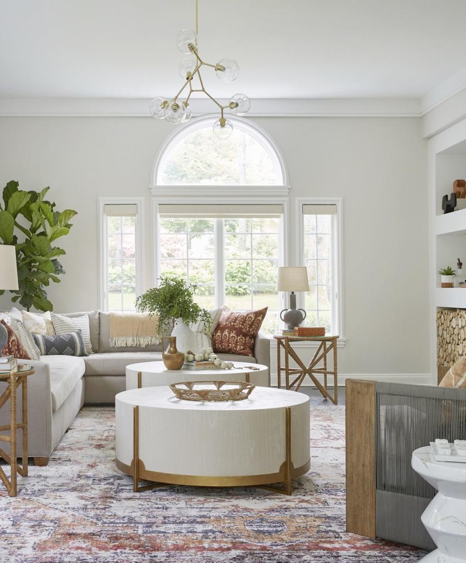
Jay isn't one of those designers who chooses neutrals over bright hues, so her initial vision board for her clients included a lot of color. Finding out about the husband's color blindness caused her to switch things up. "I definitely went more tame with the scheme. I could tell that it was a little bit intimidating to say yes to something that felt like there was potential for it to be too bold, and I think there was this intimidation about saying yes to something he couldn't fully visualize," she says. "I really shifted my focus and thought more about the experience that one could still have, even if you couldn't fully see all of the color."
For Galvão, pivoting meant bringing in a lot of options whenever she would meet with her clients. "We brought a lot of backups in case he didn't react well to something," she says. "There were definitely some patterns that he did not react well to. He's obviously seeing them differently than we are in terms of the patterns, so having either contrast or texture was really helpful. Even though we always select our ideal color scheme and fabric scheme, we had to make changes because he just didn't react well to some of them."
Create a Color Story
The client couple Duncan-He was working with knew they wanted to incorporate bold, mainly primary colors in their scheme, but they also didn't want it to look so high contrast that it would make your head hurt when you walked in. "So [our communication process] was more about educating them on why we did what, because we know that for the wife, she did want things to not feel so high contrast all the time where it can be a little bit startling," Duncan-He says.
With such a bold a color scheme, you have to use secondary and tertiary colors in the space. "We're going to be using blue, red, and yellow. Okay, how do we do that without having it be super high contrast again? Obviously a lot of secondary and tertiary transition colors going from a strong blue to a white," Duncan-He explains. While he wasn't used to clients asking for three very strong colors in one space, he and his team found a way to appease both the color-blind husband and his serenity-loving wife by having the house be tiered when it came to boldness of the hues. The top floor was more natural and organic, the main level was a bit more bold, and the basement went very high contrast.
Lean Into Texture
Galvão puts it simply: "Obviously, design is not all about color. And when you're working with someone who's color-blind, you really want to put an extra emphasis on texture and pattern and what degree of contrast you're using because those are things that they can see and appreciate." Texture adds dimension to a space, so for someone who's unable to see certain colors or who sees them differently, it's essential to be very intentional with where you're adding texture and why you're doing so.
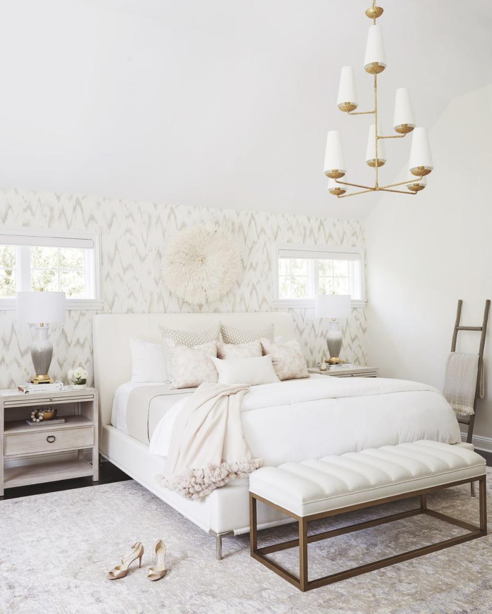
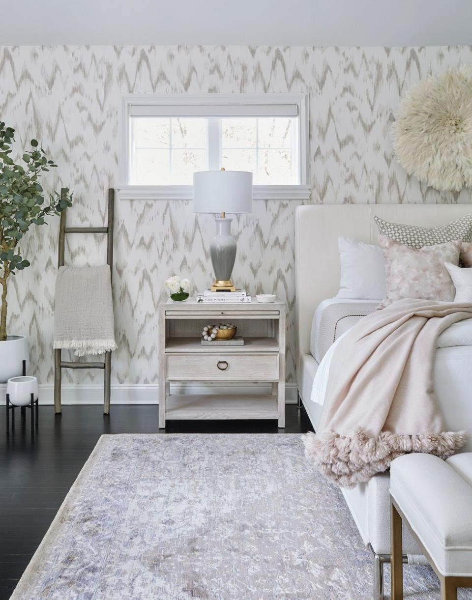
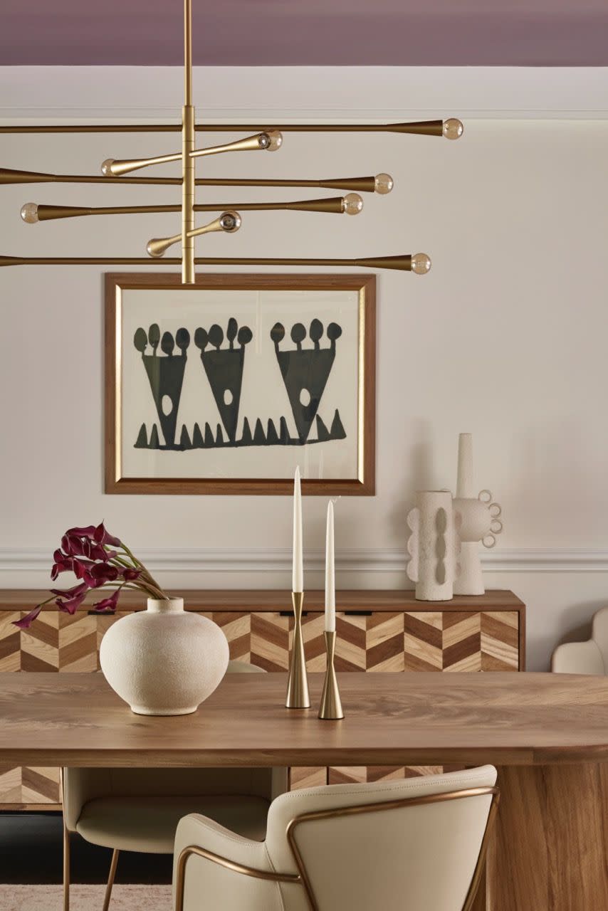
All three designers leaned very heavily into different tactile textures, finishes, and patterns throughout their projects, giving their color-blind clients non-visual ways to experience the spaces. Galvão did so with a plum-colored lacquered ceiling in the dining room and a lot of linens, knits, and leather for the decor. "I loved that it just added so much shine," she says of the ceiling. "It makes it so when they light candles—and even with the light fixture too, because it has exposed bulbs—everything reflects off of the ceiling, so you get this wonderful warm glow."
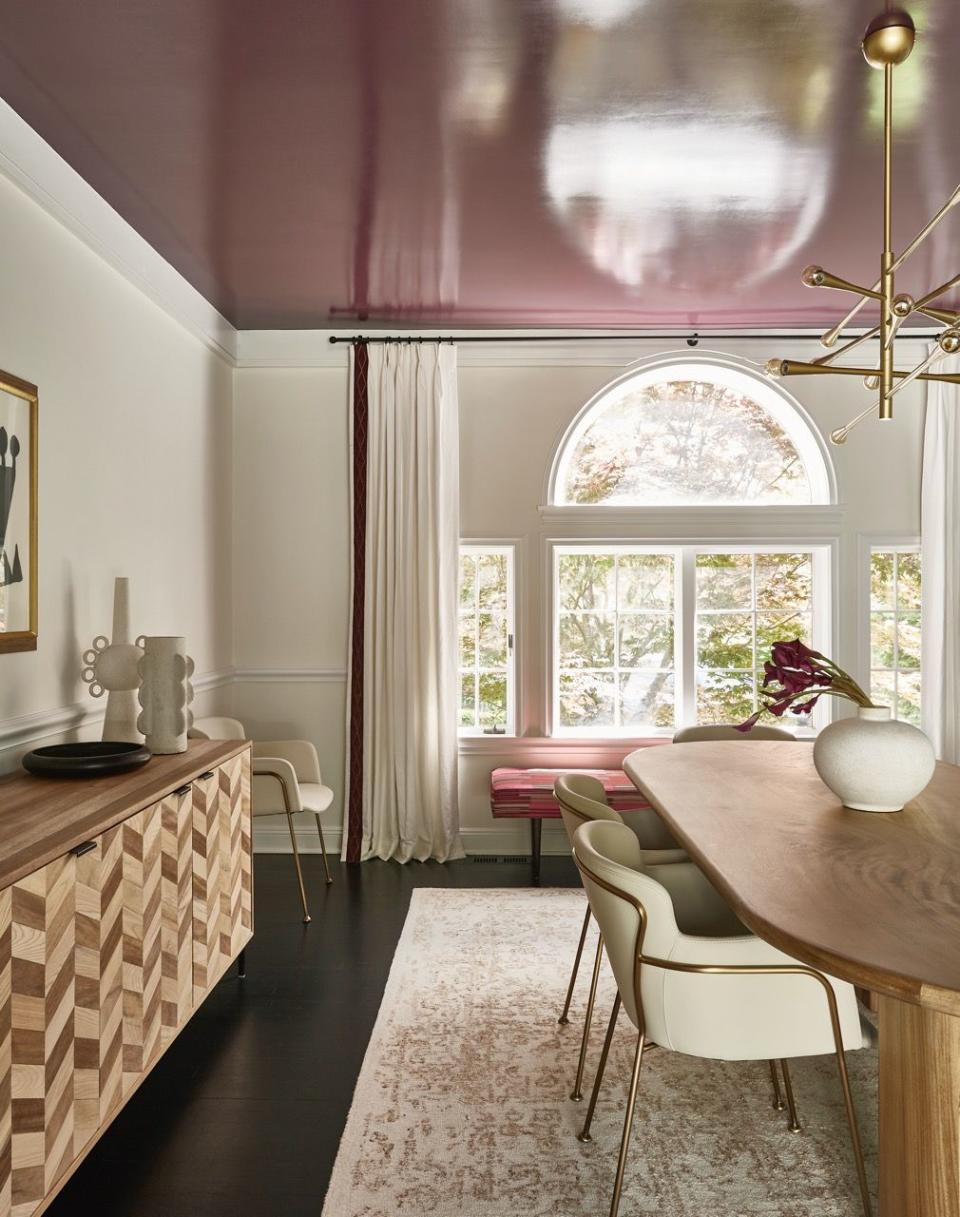
Curated Nest.
Curated Nest.
Jay opted to add a lot of texture on the walls, ceiling, and, of course, in the furniture, choosing grasscloth wallcoverings, lacquered touches, and mohair chairs, to list a few. She also played with opacity of the drapery to create a heightened sense of depth.
Play With Pattern
While texture was also on Duncan-He's mind, he dabbled more with patterns to make the space dynamic. "We did a variety of different wallcoverings, ranging from more classic and botanical inspired downstairs and sort of tropical to almost kind of graffiti inspired," he says. They hired a muralist to create artwork using only blue, red, and yellow to add dimension to a hidden wine room in the basement and to paint a dramatic red-and-ivory checkerboard pattern on the floor in the home gym. "I actually think that the way you find balance with a very, very dramatic space is just leaning into it 200 percent," he says.
Working on a design project? Let us help!
Follow House Beautiful on Instagram and TikTok.
You Might Also Like

