Denver Nuggets vs Miami Heat: battle of the logos

The NBA Finals are reaching crunch time with Denver Nuggets vs Miami Heat game 5 of 7 taking place at Denver's Ball Arena tonight. The Nuggets are now favourites, having won three of the four games so far, leaving Heat in need of a win tonight.
But how do the teams compare off the court in a battle of the logos? We compare the design and history of the basketball team's emblems in Denver Nuggets vs Miami Heat: a battle of the logos (see our pick of the best sports logos of all time for more gems).
The Denver Nuggets logo
Now favourites to win the 2023 NBA finals, the Denver Nuggets was founded as the Rockets in 1967, changing their name in 1974. They have yet to win a championship.
The Denver Nuggets logo today has a reserved classic look, with a neat roundel badge. It features a tribute to the history of the club and the state of Colorado with the crossed pickaxes being a reference to the Gold Rush (also the source of the team's name). Below the axes, there's a basketball that also looks like a globe with meridians and parallels.
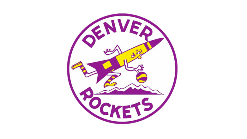
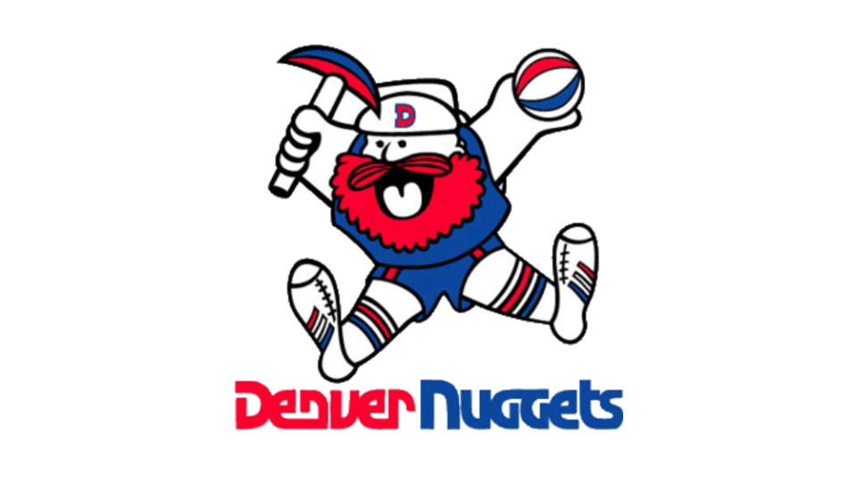
But the Denver Nuggets logo was not always so sober. The Denver Rockets logo featured a basketball-playing rocket bouncing a ball over the Rockies, and this fun character-based approach was carried over into the early Denver Nuggets logos, which featured Maxie the Miner. The red, blue and white character, who wouldn't have looked out of place in an 80s video game, was based on the explorer Yukon Cornelius from the 1964 Rankin/Bass television special Rudolph the Red-Nosed Reindeer.
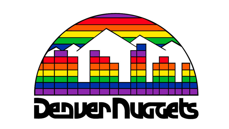
Then, in 1982, the Denver Nuggets adopted perhaps one of the most unusual and distinctive logos in the history of the NBA: a semicircle design with Tetris-like rainbow-coloured buildings under a rainbow skyline. No, it wasn't a Pride month logo, but a reference to Denver's growth and vibrancy in the 1980s that adorned the team's jerseys in various forms for a decade.
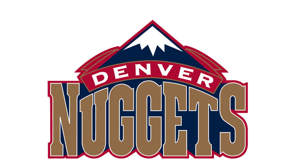
The subsequent logo introduced in the 1990s was relatively reserved (i.e., boring), putting Denver's mountain backdrop at the centre of the design, with 'Nuggets' in huge type. It could be a design for a chocolate bar. The colours were tweaked a couple of times before the current Denver Nuggets logo was introduced in 2019.
The Miami Heat logo
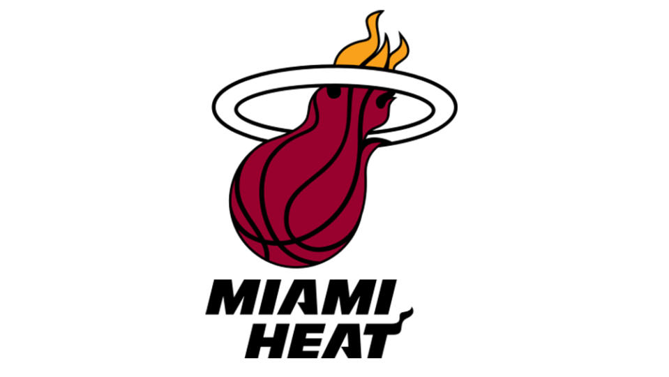
If the Nuggets (currently) represent tradition in our Miami Heat vs Denver Nuggets logo faceoff, the Heat represents a more radical and modern approach. The Miami Heat only began playing in the NBA's 1988–89 season and only really gained relevance from the mid-1990s. Despite that, they've since gone on to win three NBA championships (2006, 2012, 2013) against the Nuggets' zero.
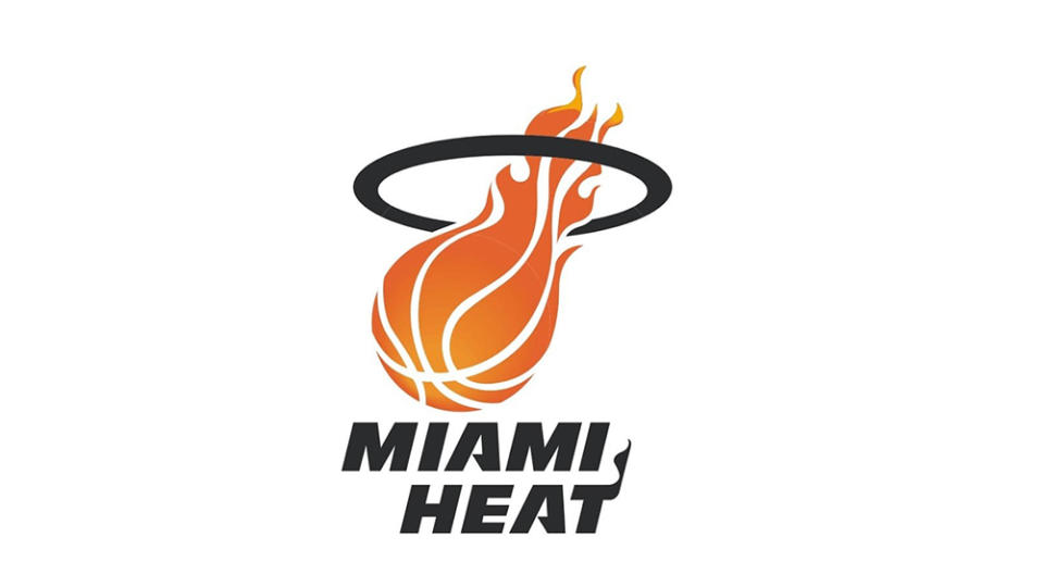
But we feel that when it comes to design, the Miami Heat logo suffers a little in terms of legibility. Sure, anyone who knows what sport the team plays will recognise that the logo design shows a flaming basketball passing through a hoop. The ball's on fire (or is melting) because Miami Heat is hot, you see? Even the 'T' in 'Heat' is ablaze.
But if you don't know who Miami Heat is, you might be thinking this is an angelic peanut with a quiff. As a relatively recent team, Miami Heat has only had two logo designs, and they were fairly similar. The 1999 update attempted to make the basketball look a bit more like a basketball (and less like a firebolt), and the flame on the 'T' was made clearer, but we're not convinced it improved things massively.
So sorry, Miami. We're awarding this Miami Heat vs Denver Nuggets logo playoff to the Nuggets. The team's current design might not be the most exciting, it's clear and clean while still paying reference to the team and state's history. And it's backed up by a legacy of more wild designs that are great to revisit (the rainbow design was brought back on jerseys in 2019).
For more intriguing sports team logos, make sure you've not missed the Minnesota Wild logo optical illusion from the NHL.

