Deliveroo elevates its identity in tasty brand refresh
Food delivery service Deliveroo has recently unveiled a tasteful visual refresh, featuring an evolved brand identity that celebrates the simple pleasure of food. Created by Deliveroo's in-house design team, the new look embraces the company's already prominent visual identity, elevating established brand identifiers like its Roo logo and teal colourway.
The refreshed look celebrates the diversity of food that the service provides, playfully embracing a spirit of exploration through its new range of typography and slogans. (Looking for more logo inspiration? Check out our collection of the best logos of all time.)
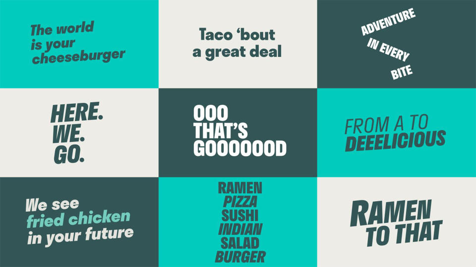
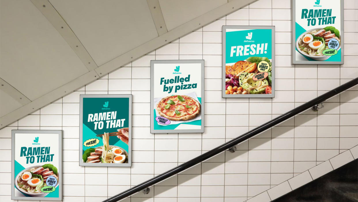
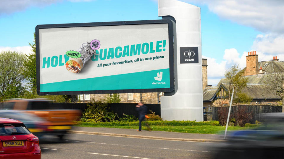
One of the biggest updates is a fresh set of typographic stickers, which display snappy quips such as "Tasty vibes only" and "Bag a bargain." Moving away from the teal colourway, the stickers offer a colourful splash against the brand's strong colour palette. Each sticker is designed with an ergonomic shape that contrasts the sharp typography seen throughout the refreshed identity.
The reimagined look maintains many of the company's identifiable features, such as the Roo logo, original wordmark and teal colour palette. While a sense of cohesion is reinforced by implementing these familiar motifs, it evolves by shifting its focus towards more dynamic and playful imagery and copy. According to Creative Boom, the new brand positioning aims to "connect people, businesses, and communities through a shared love of food."
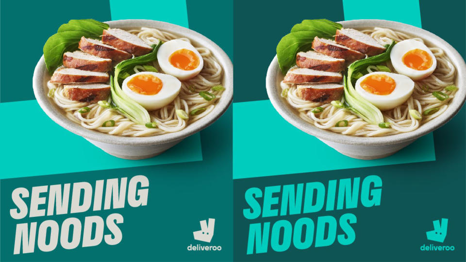
It appears the brand is repositioning towards the Gen Z market, with playful puns such as "Send noods," and slogans reading "Adventure in every bite" and "Take your tastebuds on a tour" – opening users to a world of culinary exploration. The brand's refocussed evolution takes inspiration from what they've coined the "Rooute" – a graphic device inspired by the teal line within the app, that lets you know when your grub is impending. "This is Deliveroo's visual expression of connection," the brand explains.
Deliveroo's in-house team says that the organic shapes are "a nod to the handmade nature of [their] customer journey. From the chefs who hand-make the food, the rider who hand-delivers it, and the customer who eats it" – unifying all elements of the delivery service and celebrating the individuals that drive the brand forward.
While on the surface, it may seem that Deliveroo's new identity hasn't transformed the company's image in any grand manner, the small tweaks and new additions have reinforced the brand's identity and created a sense of cohesion across its visuals. The result is a thoroughly modern design that reflects the brand's contemporary nature while integrating a human touch that helps it appear distinct from competitors.
Hungry for more branding news? Check out this ingenious insurance rebrand from Ragged Edge, or take a look at Patreon's new logo that's giving us major modern design fatigue.

