With a curated palette of storied paints, Little Greene is coming to America
Partnership | Sep 28, 2023
When it comes to color, Little Greene lives large. “We put 40 percent more pigment into our paints. That’s why other brands can’t match them,” says Ruth Mottershead, creative director at the company, pointing out one of the key factors that makes its competitors suitably chartreuse with envy. “Our red is the same lightfast, high-quality color used by Ferrari.” A reputation for a precisely curated palette of bold hues that have their roots in British design history has gained the independent brand many devotees in the 20-plus years since its founding in 2001. Now, having established its bona fides in England and across the Continent—and by popular demand from globe-trotting designers who collect the company’s color cards at international trade shows—Little Greene is coming to America. In October, it opens its first stateside showroom in Greenwich, Connecticut, with orders to be processed by its corresponding warehouse in nearby Stamford. “It’s the right moment,” says Mottershead of the move.
Operating from a formerly industrial area of Manchester not far from the original location of its 18th century namesake, Little Greene Dye Works, Little Greene Paint & Paper has already made a big impact on the industry in its native land. A family affair, the business was built by Mottershead’s father, David, a chemist with a penchant for color, in anticipation of mass redundancies at the mainstream U.K. paint company he was working at in the mid-1990s. Starting as a protective coatings company that made tough industrial paints for pools and parking lots, in short order the brand transitioned to toll manufacturing, producing custom palettes for such hallowed home labels as William Morris and Ralph Lauren. “It was my mum who had the idea of creating more of a luxury paint and wallpaper brand that offered a premium, sustainable product and patterns with a heritage,” recalls Mottershead, who works alongside her brother, Ben, director of operations, while their father remains managing director.
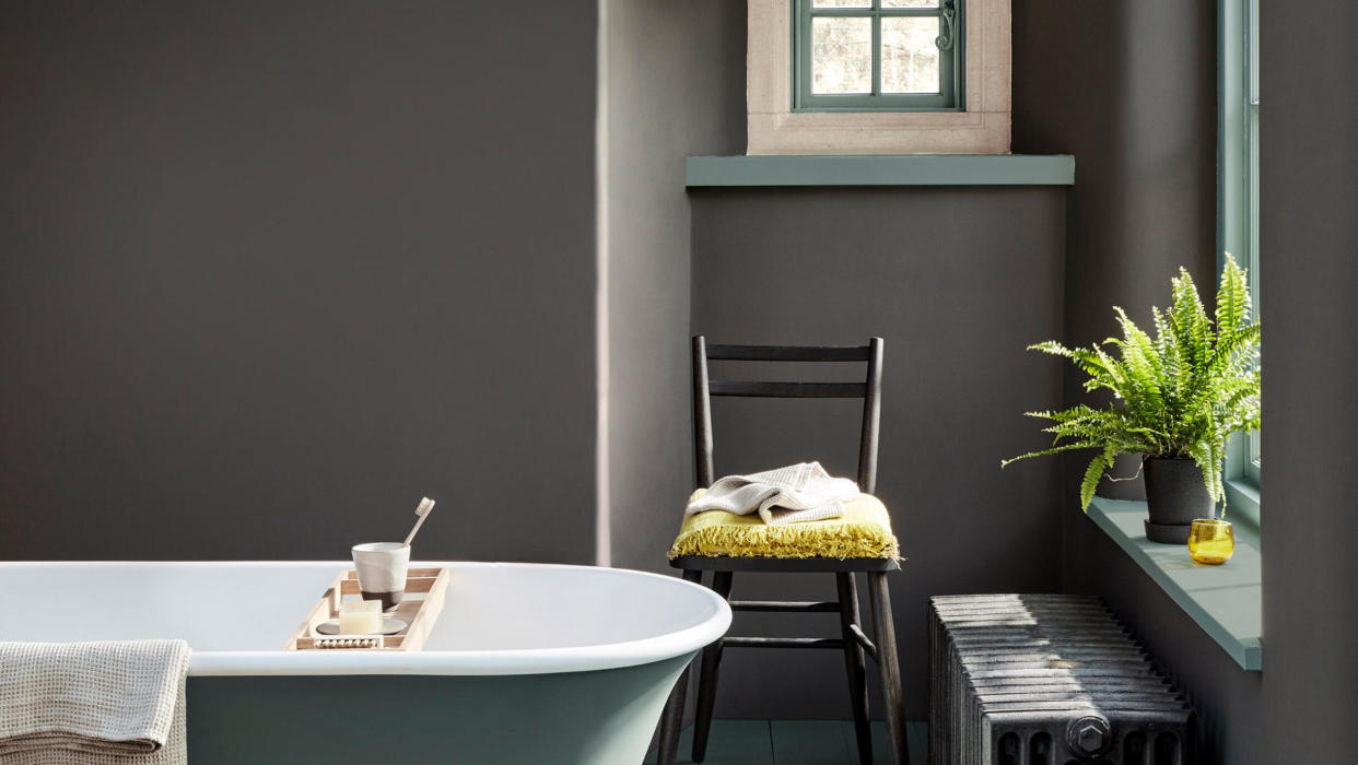
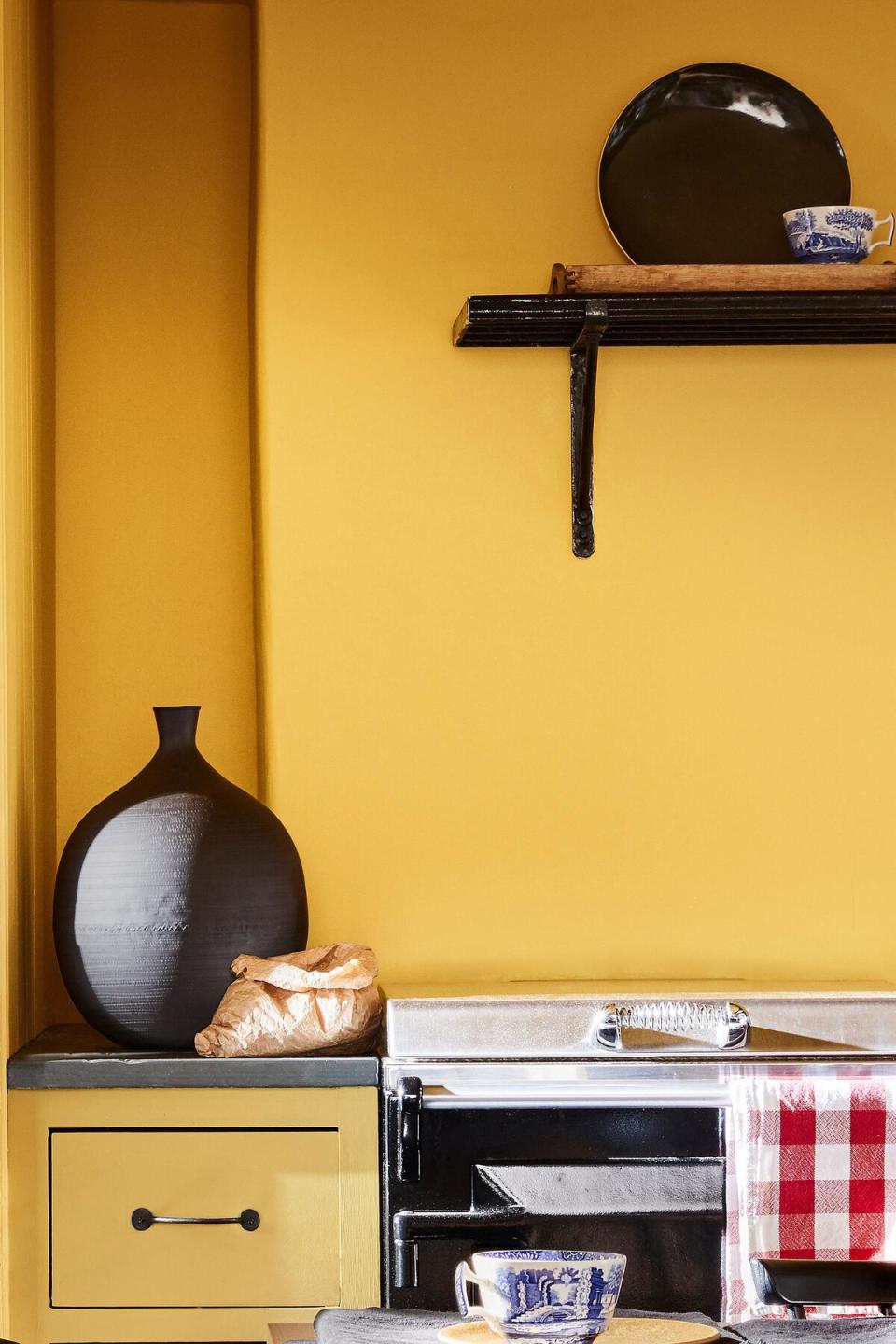
Little Greene paints are distinguished by what Mottershead calls the “raw materials” of its trademark “robust” formula, as well as its low-waste manufacturing process. While other brands may substitute lesser components that result in inconsistent application, insufficient coverage or prolonged drying time, Little Greene prioritizes quality that lasts. Made from six different bases ranging from “high white” to “extra deep” that the company produces at its own facilities and available in nine finishes, Little Greene’s low-VOC paints span the spectrum. “Whether it’s the resins or the titanium dioxide for whiteness, it’s the mixture of all the different ingredients that ensures our colors stay vibrant for a long time,” says Mottershead, “because we believe that if you are paying a high price for a product, the quality has to be perfect.”
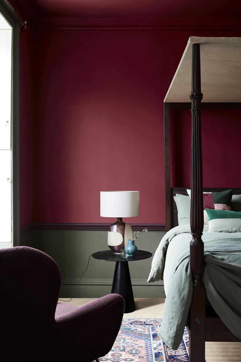
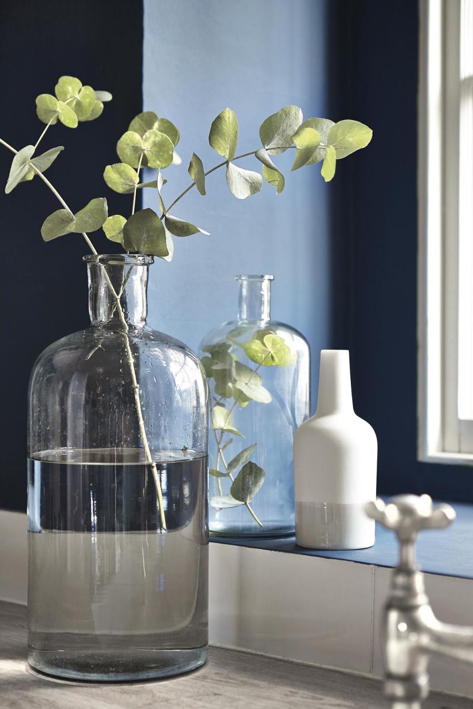
Then there’s that varied and intense pigmentation. “On a typical tinting machine, you might get, say, four pigments that make up all the different colors. On our tinting machines, you get 15 or 16,” she says. “There are three different types of red alone.” This array results in inimitably nuanced colors like pink with hints of orange or sapphire underscored by black.
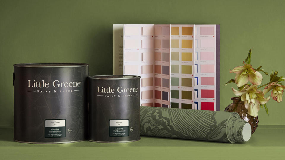
For its American debut, Little Greene is offering a limited palette of 211 colors, tinted to order on-site at the Stamford warehouse. On first impression, that conservative number might seem to contradict the many options its multi-pigment machinery can create, but there’s a method to the edit. In a market sector where designers can find themselves confronted by an incomprehensible quantity of whites, Little Greene’s discerning selection makes the choice of not only single shades but complementary combinations so much easier.
“We’ve been very careful in our selection of grays, stones and whites in our Colour Scales assortment of neutrals, making sure we have a range of pastels and off-blacks as well,” says Mottershead. The company’s color cards group hues according to degree of saturation. “China Clay, China Clay Mid, China Clay Deep and China Clay Dark are all made using the same pigment but at different strengths. You could use one on your ceiling, one on your molding and one on your walls, and they’d all work perfectly together.”
Of particular delight to Anglophiles is the special designation many of the colors get—indicated on Little Greene literature by a small red dot featuring a “V” for Victorian, an “R” for Regency, and so on. Drawing from the company’s partnership with the U.K.’s National Trust, which allows it access to 500 historic properties, these shades re-create iconic colors from the past for contemporary homes. “Invisible Green is marked with a ‘G’ for Georgian because it’s inspired by a color used by the great landscape architect Humphry Repton to camouflage the railings among the foliage in London’s Regent’s Park,” says Mottershead. “Hicks’ Blue, tagged with a ‘60’ for the decade, references the color that famed interior designer David Hicks used to paint the city’s British Telecom Tower.” Engaging factoids like these can be found on the back of Little Greene’s color cards and on its website.
The history and sophistication of the British Empire may inform Little Greene’s American palette, but fear not a stiff upper lip: There’s plenty of Cool Britannia to be found in its colors too. From Atomic Red to Hidey Hole (a hue once favored by George Bernard Shaw) to Trumpet, even the names are playful. “We’re quite fun, and quite friendly, and quite fresh in our approach,” says Mottershead. “Too posh is not our vibe at all.” So, classic with a twist, then? Sounds ab fab for Connecticut.
This story is a paid promotion and was created in partnership with Little Greene.
Want to stay informed? Sign up for our newsletter, which recaps the week’s stories, and get in-depth industry news and analysis each quarter by subscribing to our print magazine. Join BOH Insider for discounts, workshops and access to special events such as the Future of Home conference.

