This Is the Cool Paint Technique You've Been Seeing All Over Instagram

After years of interior design trends leaning toward the super-sleek—by way of glass, chrome, polished wood, or brass; and midcentury-modern furniture against stark-white walls—the moment has turned to one that feels decidedly softer and more naturalistic. Rattan, cane chairs, ceramics, linen, shearling, and primitive wood pieces are slowly taking over as we spend long stretches at home in our best cashmere and sweatpants. The backdrop for all these layered neutrals is more often than not an ancient paint technique called limewash. And like those pre-Colombian amphoras taking over your Instagram feed, it's hardly new.
"I have always been so inspired by Axel Vervoordt before plaster was a trend," interior designer and founder of The Expert Jake Arnold tells BAZAAR.com. "His use of warm, rich, textured walls were really interesting to me as people typically were doing flat paint or wallcovering. This type of raw material felt organic but rich. I really use plaster walls in most of my projects, as they create the perfect backdrop. I have used both darker colors and warmer tones depending on the space."
For Oliver Gustav—a designer who counts a warm gray-and-beige palette as one of his signatures—his entryway into limewash seems almost fated. "Thirteen years ago, I moved from an old, small-town house with a horse stable in central Copenhagen, and into the bel étage in a beautiful mansion from 1780 located at the prominent square in Copenhagen called Kongens Nytorv," the Danish designer tells us. "This was a listed property with a very high level of restrictions. The Cultural Heritage Agency of Denmark made a color study to determine the original colors of the rooms in the mansion. As it turned out that the rooms were originally meant to be bright blue, red, and yellow, I decided to make a pitch for a color scheme that would be more suitable for my work."
He continued, "I made the pitch based on the colors seen in the paintings by the Danish artist Vilhelm Hammershøi, with gray pigments in limestone paint. Luckily, I was granted permission to redo the rooms based on this color scheme and finish. Ever since, I have been fascinated by this type of paint and wall finish, which have become a huge part of my aesthetic universe at Studio Oliver Gustav."
The paint technique actually dates back to the Roman empire and is traditionally created from limestone that's been crushed, burned, and mixed with water to make a lime putty, which is then colored with natural pigments. Jamie Davis cofounded Portola Paints & Glazes with his brother, Casey Davis, in 1998 based on an appreciation for the natural beauty of limestone and Roman Clay after they saw a completed project their contractor father imported to use in a Los Angeles home. "Limewash paints have been around for thousands of years. They are nontoxic, eco-friendly, and have the added bonus of looking really beautiful too," Jamie explains. "Originally, limewash paints were used to act as a breathable antifungal finish for everything from plaster or brick exteriors to the trunks of trees in tropical climates."
While a movement toward using clean, nontoxic products in everything from skincare to cleaning goods is consistently gaining momentum (limewash paints can actually provide better indoor air quality), the unique look of the paint technique is what initially drew the Davis brothers, and many other devotees, in. "I think there is a wonderful trend happening in design right now that is very tastefully blending old and new. Ten to fifteen years ago, Venetian plaster and faux finishes were super in, but today's design is definitely elevated," Jamie explains. "Textured walls are a wonderful way to add an element of design to your space without having to go super bold with color."
Often used interchangeably, Portola's Lime Wash and Roman Clay do have differences. "From a distance both finishes have a lot of similarities. Both have a soft mottled appearance that shows a natural variation in color. The main difference between the two is the application," Jamie says. "Roman Clay is applied with a putty knife or trowel and will typically be super smooth and soft to the touch. Lime Wash is applied by brush and will have a more suede-like texture."
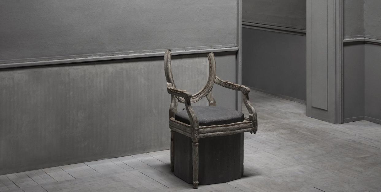
Both processes achieve those textural cool grays, warm tans and browns, and rich whites and ivories that have a distinct layered quality. In other words, they photograph beautifully—which makes them ideal in today's image-driven world. The secret to the look is in the lime itself. "The lime in the paint is white, so the variation in color that shows up has to do with the contrast between the pigment and the white lime. Light shades will be soft and understated, while mid-tone to deeper colors will show more texture and variation," explains Jamie. "Some of my favorites are Piano Room and Presidente," Arnold says," both by Portola.
Traditionally, you would have to be blessed with 100-year-old plaster walls or something similar to achieve these affects, but modern iterations, like those by Portola Paints, have leveraged reformulated primers so anyone with a YouTube login and a slight artistic streak can have their walls looking emperor, or interior design influencer (as the case may be), worthy.
You Might Also Like

