The complete MGM logo history
The MGM logo is one we’ve all seen on screen – but do you know the history of the MGM logo? That familiar lion has made MGM one of the most recognised film studios but the design has evolved many times over the years to stay current, while retaining its brand legacy.
Before Metro-Goldwyn-Mayer (MGM’s original brand name) was established, the lion associated with it was dreamt up way back in 1916 for the Goldwyn Pictures Corporation. There’s a debate as to who had the idea first – publicist Howard Dietz or Paramount art director Lionel S. Reiss – but either way, it was a bold choice, and Dietz had the idea of placing a live lion inside the logo to bring it to life on film. He claimed the lion was a reference to his time at Columbia University, where the athletics and football teams are known as The Lions. You may have heard the urban myth that the trainer and assistant were killed whilst filming the first lion clip, but this has been proven false.
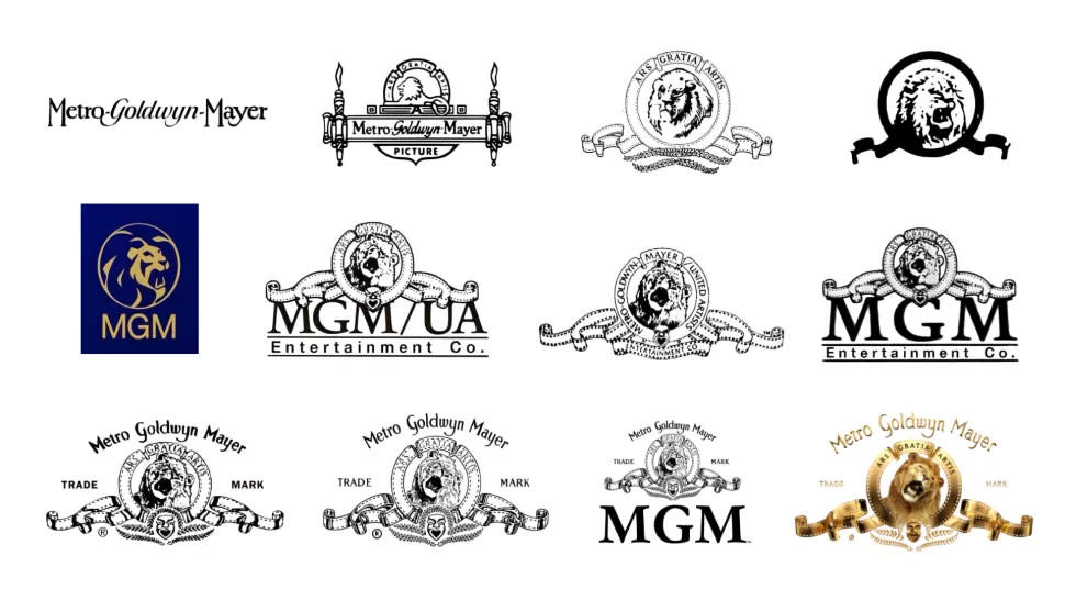
Here’s how the MGM logo (a contender for the best logos of all time) has changed since the company was launched. There are some branding inconsistencies where new logos were introduced for one part of the company only, giving primary and secondary logos, plus each film had a special opening or end credits logo with that live footage incorporated, so bear with us on this rollercoaster ride of a timeline.
01. The first MGM logos: 1924-1939
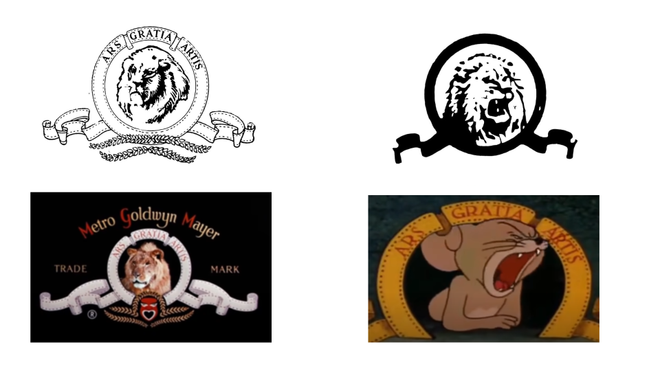
The first parodies of the MGM logo began to appear, promoting a Marx Brothers film, A Night at the Opera (1935), by swapping a roaring Leo for various roaring Marx brothers and changing the motto to incorporate their name, as ‘Marx gratia Marxes’.
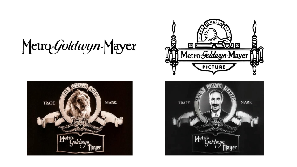
When the studios of Louis B. Mayer, Metro Pictures and the Goldwyn Pictures Corporation merged to create MGM in 1924, their starter logo as a company featured a live Leo the Lion turning his head, inside a circle flanked by a ribbon-like reel of film, with the motto ‘Ars gratia artis’ (art for art’s sake, in Latin). Strips of laurel leaves, a theatrical mask, and the marquee of Metro-Goldwyn-Mayer sat beneath it.
There was also a typography-only logo for business documents, in a narrow serif font for ‘Metro’ and ‘Mayer’ that harked back to Art Deco, and a cursive font for ‘Goldwyn’. This was redesigned in 1924 to frame the wordmark with a scrolling banner flanked by torches. A lion sat on top, facing left, with an arc above him holding that same motto, ‘Ars gratia artis’.
Lions are hugely symbolic; they can represent strength, dominance (the lion is, after all, the king of the jungle), and animal instinct. They also appear in many heraldic crests and flags. There were actually seven lions that played Leo over the years; the most prolific, Jackie, appeared in over 100 films. By 1928, film industry technology meant that Leo the Lion could finally roar on screen – albeit thanks to a gramophone recording played during a film premiere.
02. The MGM motto and the film reel: 1939-1966
For its main static logo, MGM’s motto was added to the upper half of the circle in 1939. It would later be parodied in the cartoon Tom and Jerry (1961), and in the film National Lampoon’s Animal House (1978), where it was the motto of the fraternity house. By 1952, red was added to parts of the opening credits logo: capital letters MGM, the motto, and the theatrical mask. The other letters in the brand name became gold. However, with many films only seen in black and white at this time, not all viewers would have appreciated the colour choices.
MGM’s best-known film during this period was Ben Hur (1959), a remake of an earlier 1925 silent film. Director William Wyler got permission to change the logo for the opening credits, as he worried a roaring lion would take away from the emotional first scenes. A silent Leo was used instead.
Arguably the least imaginative logo lasted from 1964-1966: the reel of film was replaced by a very thickly-weighted ring and ribbon, and a more simplistic lion side-profile. Much of the definition and intricacy was lost. A new element from the moving logo also appeared: those two strips of laurel leaves.
03. A stylised, flat lion: 1966-1982
In 1965, Leo became even more stylised and minimalist, after branding agency Lippincott & Margulies was recruited to update the logo. This was a bold choice, which yet again didn’t feature the slogan or the film reel elements. The typography chosen for MGM underneath the lion was Helvetica, a real classic for sans-serif type fans.
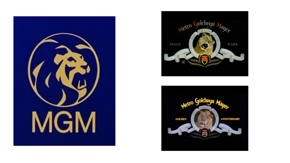
This new logo made the headlines, with newspaper The Bridgeport Post reporting that ‘The original MGM lion, one of the most famous trademarks in the world, will continue to roar, however, on all of the company’s motion pictures and television programs.’ That meant the stylised lion appeared on printed posters, MGM Records studio adverts, and at the end credits of a film. It went on to be adopted by MGM Casinos and then tweaked slightly for MGM Resorts International.
04. Rapid changes to the MGM logo: 1982-1986
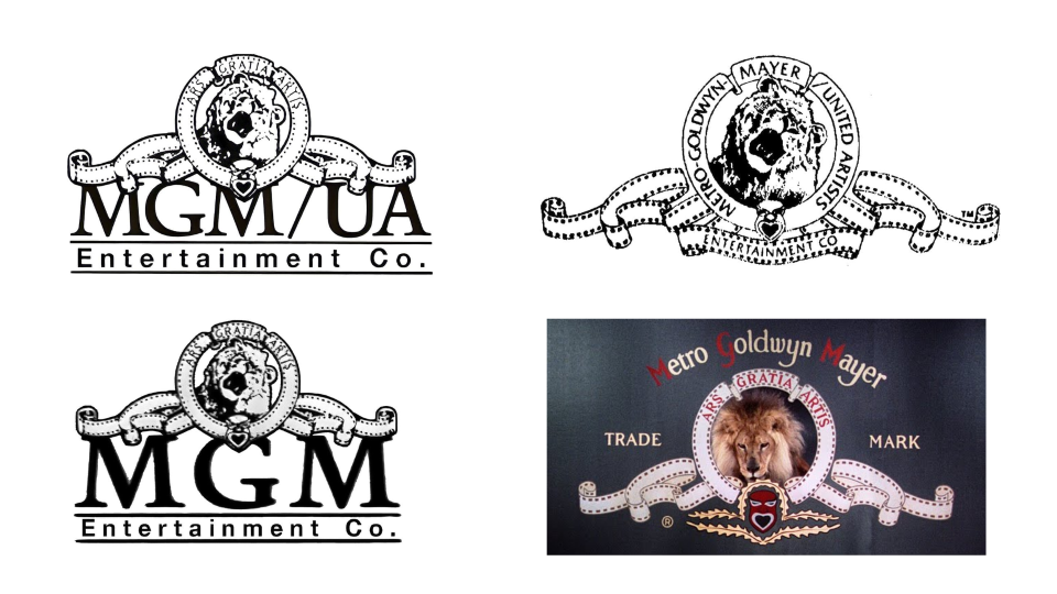
By 1982, it was time to bring back the slogan, the film reel, and a more realistic lion. Out went the Helvetica typeface, too – a traditional serif font was chosen to spell out ‘MGM/UA’ (United Artists), almost compressed by the film reel above, followed by a sans-serif font for the words ‘Entertainment Co.’ underneath. The logo feels crowded, and the double font choice makes it seem less unified. Another new element was a tiny mask with a heart-like mouth, which appeared like a crest at the bottom of the circle.
A quick change for 1984 saw the slogan replaced by ‘Metro-Goldwyn-Mayer/United Artists’ around the circle, which had its film reel qualities removed, and ‘Entertainment Co’ moved to a lower section of the film reel. This only lasted the year, so it obviously wasn’t the right direction. 1984 was MGM’s Diamond Jubilee, so its opening credits logo began to use gold, but this wouldn’t be introduced to the print logo for several decades.
In 1986, out went the United Artists branding, and in came the slogan again, taking its place in the upper circle, which resembled a film reel once more. The laurel leaves of 1939 also returned.
05. Trademarks and reviving typography: 1986-2021
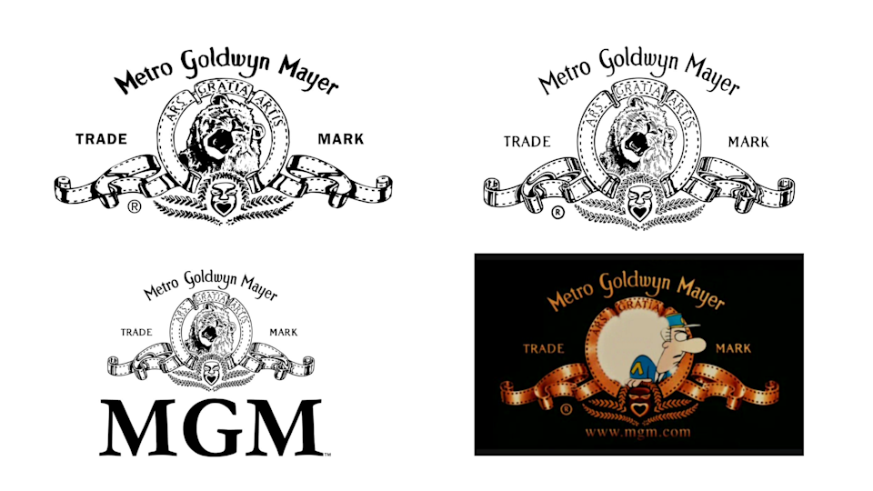
A second change to the static logo in 1986 (yes, it’s hard to keep up!) saw the words ‘Trade mark’ surrounding the familiar film reel and lion, transposed from the moving logos seen on screen. There was also a revival of old typography, with ‘Metro Goldwyn Meyer’ spelt out yet again in the Art Deco-style typeface, this time removing the dashes in between words.
Small changes occurred from here – mainly the thickness of all lines was reduced, creating more space and finesse, and extra contours were added to the film reel. Meanwhile, the MGM lettering was reintroduced in 2011, in a simple serif font with less weight than before.
By the mid-noughties, the opening credits logo now incorporated an MGM website address. In 2014, to celebrate MGM’s 90th birthday, Leo the Lion had his pawprints added to the Hollywood Walk of Fame.
06. A CGI lion: 2021 – present
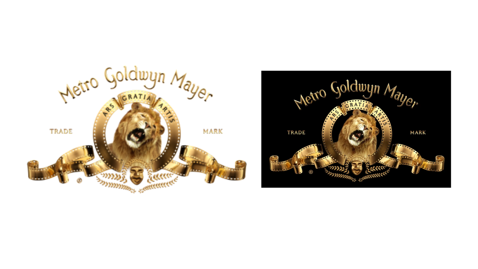
The current version of the MGM logo gives the lion more realism, but uses CGI to do it – a perfect example of innovation in the film industry, that also won the studio an award from animal charity PETA. However, we found that not everyone was a fan of the new MGM logo.
In a radical change that harked back to the glory days of Art Deco, the entire static logo turned gold, with a range of tones and gradients giving the impression of mirror-like shine.
MGM will undoubtedly continue to revamp its logo, reflecting current graphic trends, and we can’t wait to see what the studio chooses next.
Want more fascinating logo histories? See our posts on the Apple logo history, and the Nike logo history.

