What color is replacing pink? Designers are turning to these three shades to capture a new decorating mood
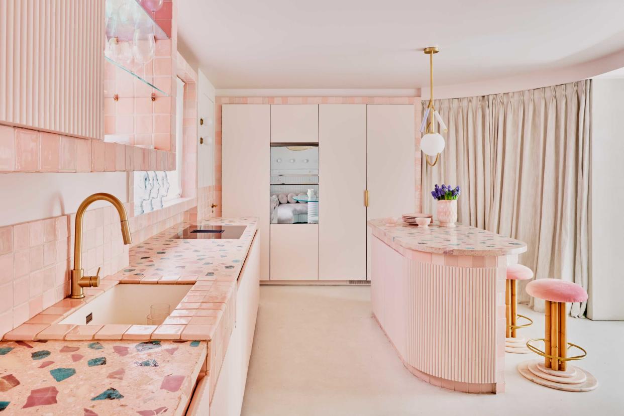
Isn't it funny how a single color can come to represent a period in time? The most memorable of which in recent years has to be the "millennial pink" trend - a color that became the muse for everything from interiors and fashion to branding a few years' back.
Millennial pink became the gender-neutral, "Instagrammable" hue in the mid 2010s. Rose Quartz was a soft pink Color of the Year for Pantone in 2016, but a true millennial pink is a little softer, with more beige undertones. But how do we collectively decide on what colors represents the mood in interior design trends at any one time?
'Colors can evoke emotions and feelings in people, which can be influenced by cultural, societal, and historical factors,' interior designers and color consultants Sabrina Panizza and Aude Lerin, co-founders of PL Studio, tell us. 'Therefore, certain colors may capture the mood of a period of time because they become associated with the events, fashion, and aesthetics of that era.'
'In addition to that, certain colors gain popularity at a certain moment in time as people are physically drawn to those, as somehow, they provide people with a feeling of emotional safety,' Sabrina and Aude add. 'A clear example is the rise in popularity of the color green following the pandemic; during times of stress and uncertainty, people often seek comfort in nature and the outdoors, and the color green is strongly associated with nature, growth, and renewal.'
Millennial pink might not be so commonly referred to as such, but this shade is still around, even if it's not quite as ubiquitous as it once was. So, what has replaced millennial pink as the defining color mood of the next generation? And what does that say about where interior design sits right now?
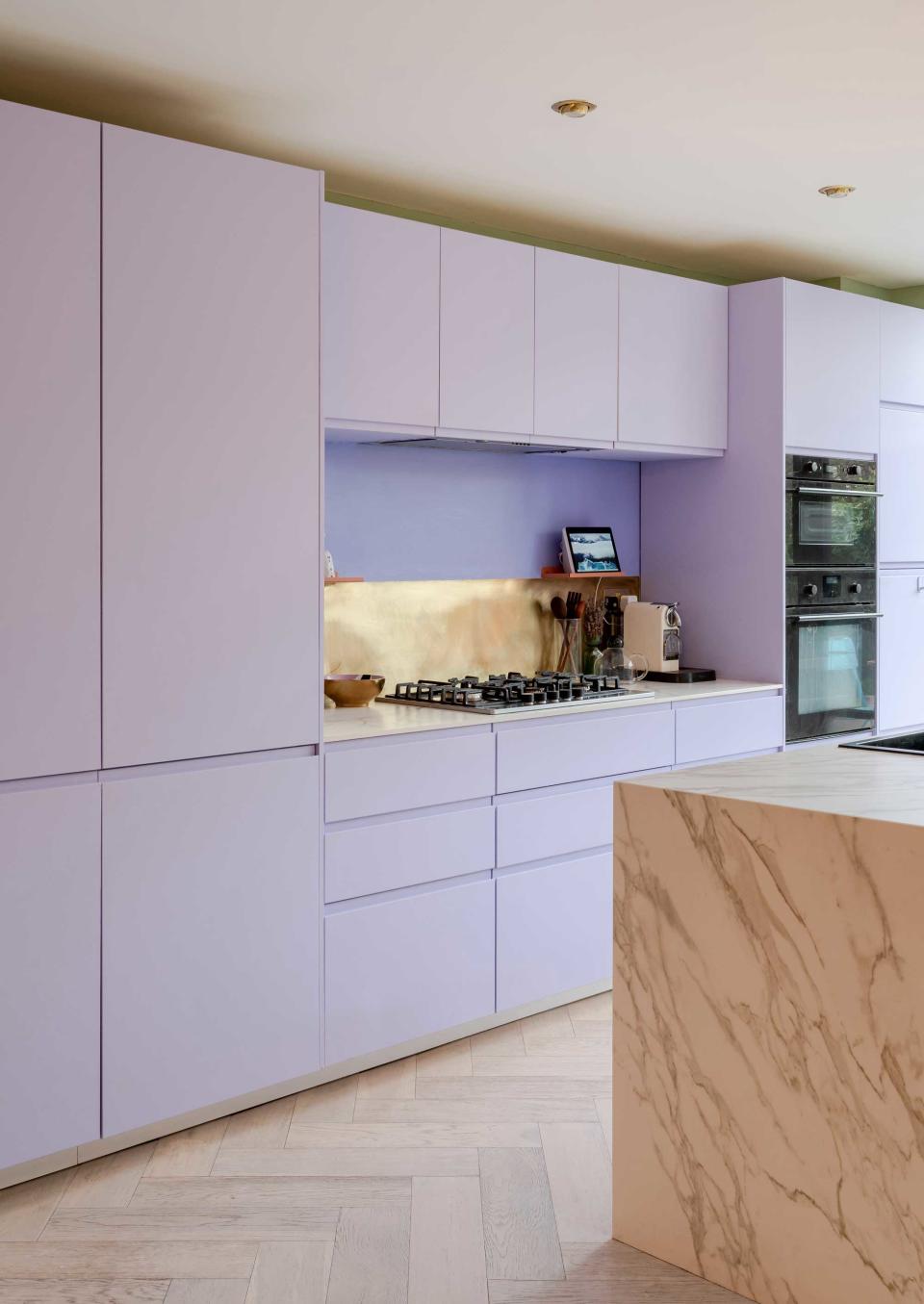
1. Lavender
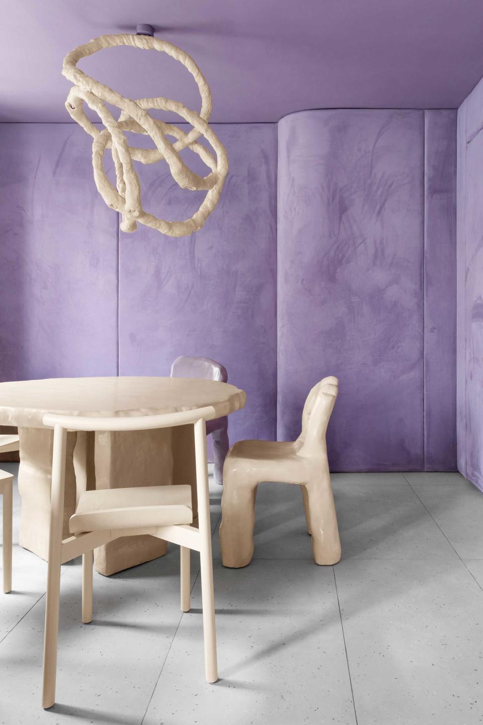
If pink is the color of the millennials, it follows that its successor is a defining color for Gen Z. A cursory Google shows that "Gen Z yellow" has "officially" been awarded that status, but we're not so sure this declaration wasn't a little premature. In fact, it feels like the Gen Z aesthetic has been defined by softer, creative pastels rather than this striking yellow shade. And leading the charge for this color trend is a revival in lavender.
'Pastels are like the zen masters of colors,' interior designer and color consultant Emma Merry of Home Milk tells us. 'In these crazy times, we all crave a little peace and tranquility, and pastels deliver with their calming vibes.'
'Lilacs and lavender are optimistic and playful and remind us to take life a little less seriously,' Emma adds. It's a color that had perhaps fallen out of favor in recent times, but that plays a role in its return to grace. 'Nostalgic colors have a profound impact on our emotions and often serve as a source of comfort during times of need,' Emma says. 'As we navigate through uncertain times, we naturally gravitate towards colours that remind us of happier moments and simpler days.'
'However, lilac also has an adventurous spirit, and is associated creativity,' says Sabrina and Aude, 'as it is a color that can inspire imagination. Lilac is an uplifting shade that brings optimism into an interior space.'
So, how do you decorate with this trending color? Lavender hasn't disappeared as an accent color in more traditional, rustic schemes, but for 2023's take on the trend, it's about committing to the color. Think color blocks, and large swathes a la the color drenching trend.
Some of the magic of lavender also comes in what you pair it with. There are plenty of colors that go with lavender, and each will change the atmosphere that it creates. 'For a bit of 'year round summer' pair with other pastels, think soft pinks, yellows and minty greens,' says color consultant Emma Merry, 'but if you want a bit of a modern edge then go for a striking combo like lilac with a deep sage green with a warm neutral plaster tone.'
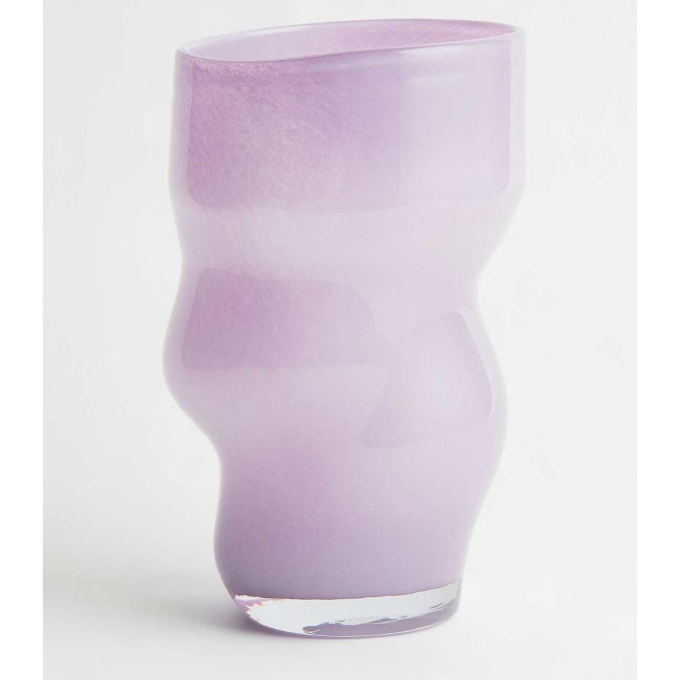
Lilac glass vase
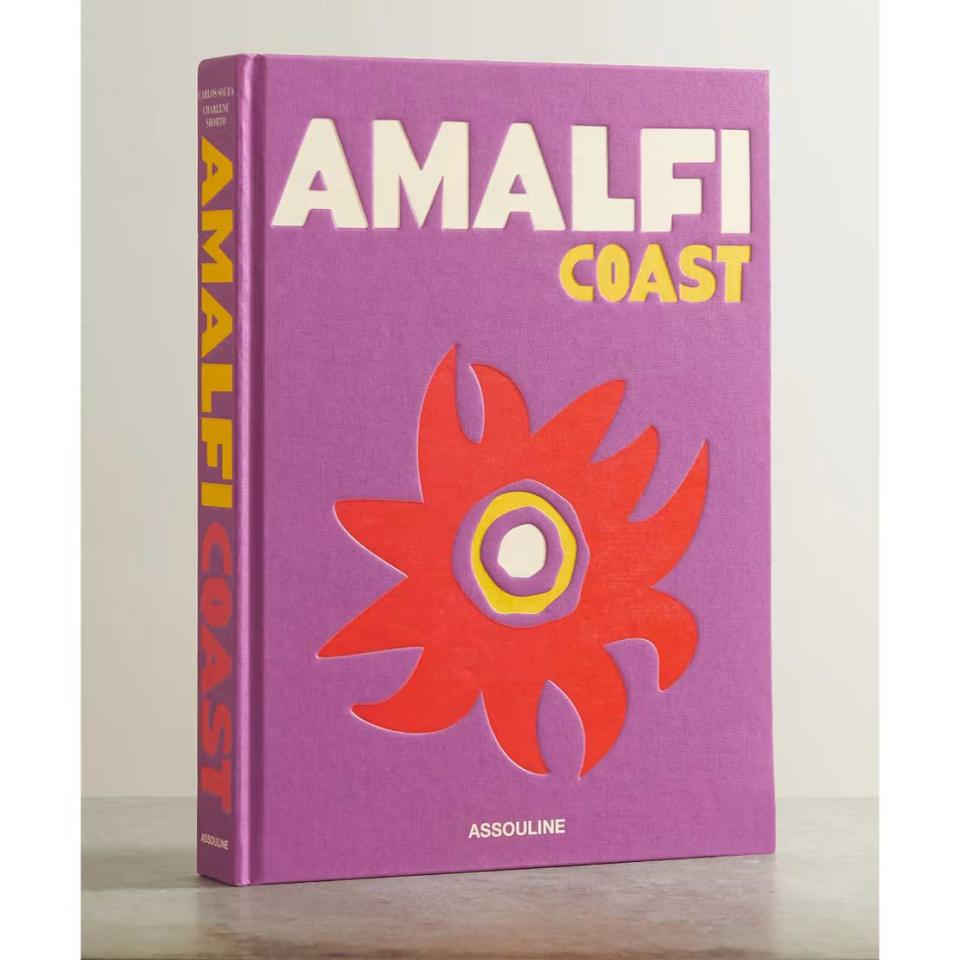
Assouline Amalfi Coast book
Gin Blossoms matt emulsion
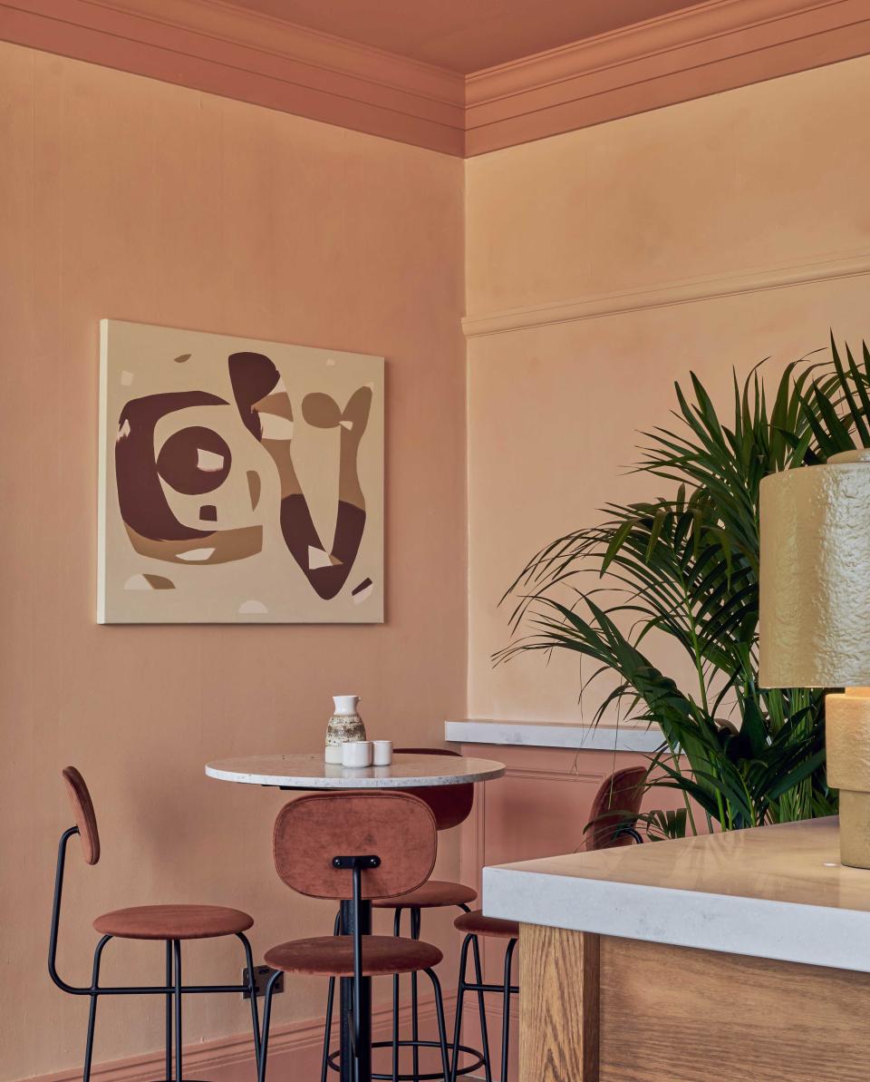
2. Peach
Another way of decorating with pastels has emerged alongside lavender - a sugary peach shade. 'The color peach is a soft, warm, and inviting color that is often associated with sweetness, and youthfulness,' PL Studio's co-founder Aude Lerin tells us. 'It is a color that can evoke feelings of warmth and approachability, which therefore creates a positive and calming atmosphere in an interior space, and a feeling of comfort and protection.'
'In my opinion the use of peach aligns perfectly with the slow living movement, which embraces a slower pace of life and it’s the antithesis of the bustle of city life; the slow interiors trend is all about creating a peaceful environment, a calming escape from today’s fast-paced world, that brings harmony and happiness,' Sabrina Panizza suggests.
'It's very interesting to look at peach and lilac together, as they both are pastel colors, soft shades that instil harmony and balance in an interior space, which show how much people are in need of a tranquil and soothing environment,' adds Sabrina. 'Nevertheless, both hues seem to be associated with something livelier and more energetic – peach is associated with joy and happiness, and lilac with creativity and quirkiness.'
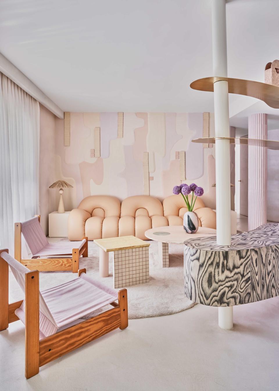
Like lavender, the colors that you complement peach with change its outlook. While it goes with many of the same colors that go with orange, its companions will change the look. For example, in the living room above by interior designer Patricia Bustos, this all pastel scheme feels modern, yet whimsical - a softer version of maximalism.
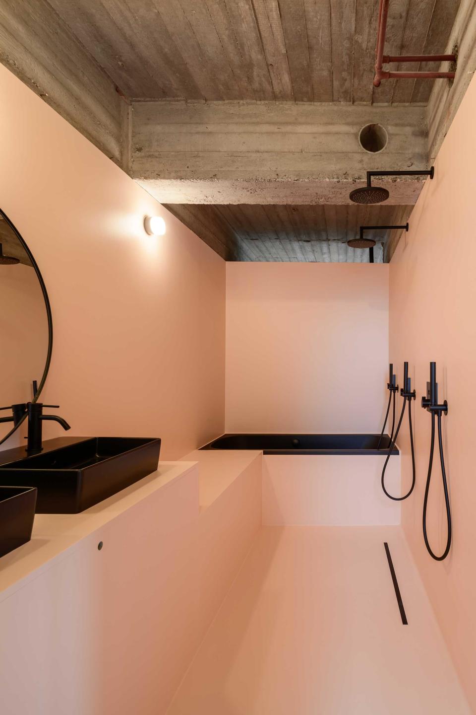
In the small bathroom above, however, peach takes on a more minimalist, architectural form, contrasting against the modern black brassware and industrial concrete ceilings.
'For the brave minds, lilac and yellow is a great color combination to create a high-spirited and joyful interior space that will certainly get your creative juices flowing,' Sabrina and Aude suggest. 'If you are looking for a softer alternative, lilac works well if paired with a warm off-white and a touch of brass - a delicate look for a principal bedroom or guest room. Lastly, another combination we like is lilac and red, perfect to achieve an uplifting yet regal interior space. It is an interesting pairing that feels very ‘arty’ and can be adapted to different areas of the house.'

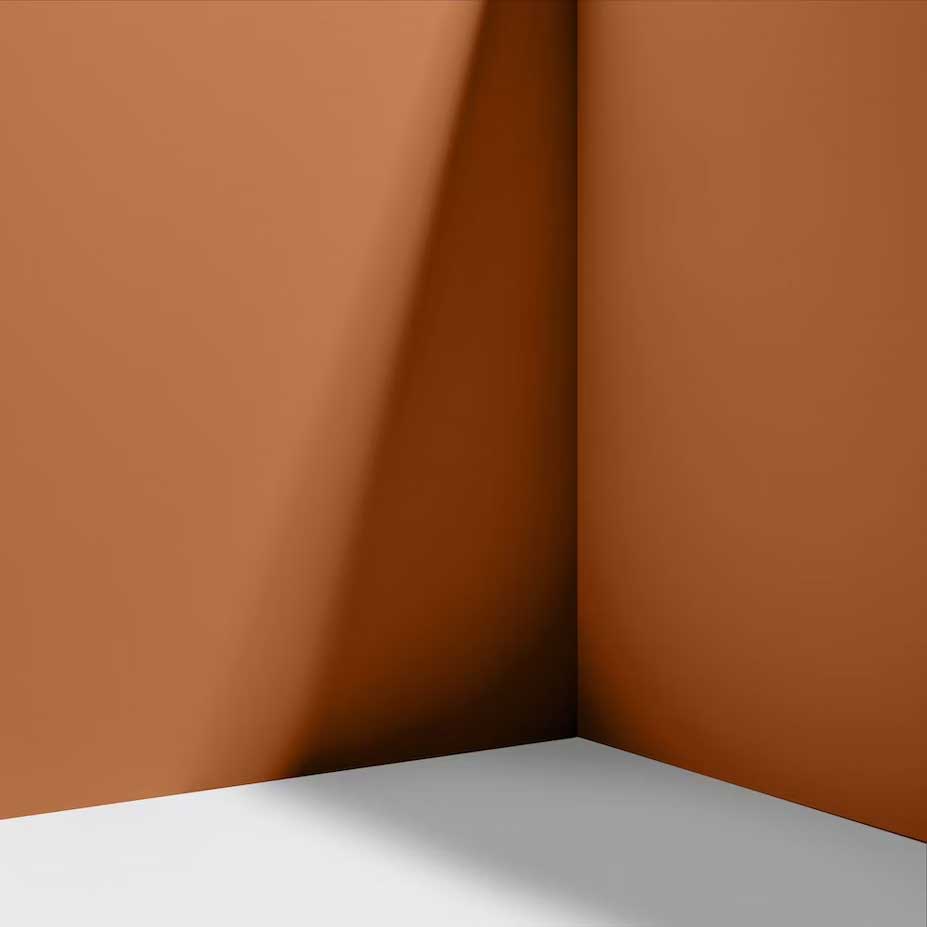
Faded Terracotta paint color
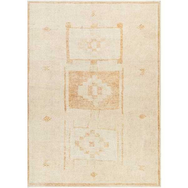
Becki Owens x Surya Solana Moroccan indoor rug
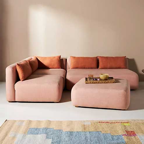
Kori modular sofa
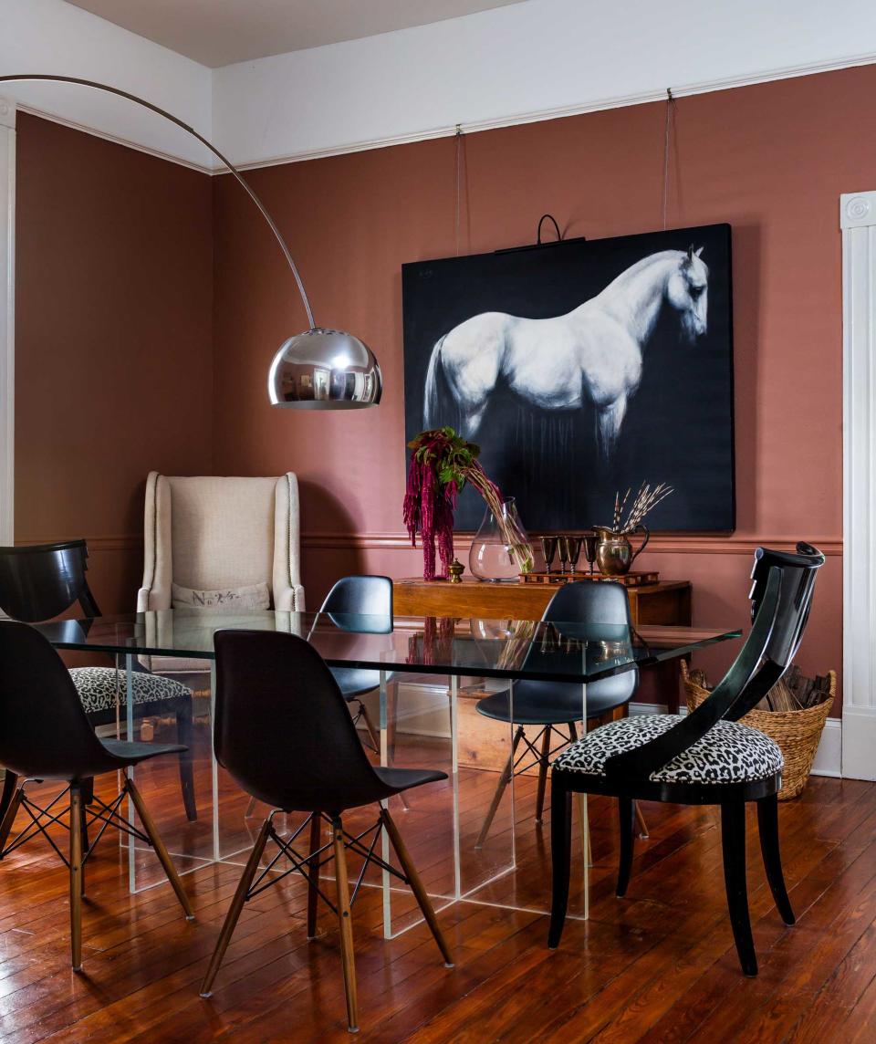
3. Terracotta
Pastels aside, there's another orange tone that's coming through alongside peach and lavender. Darker terracotta shades, a tonal variation of peach, are becoming a go-to color for saturated, design-forward schemes.
'I love the warmth that this tone brings to a room,' says interior designer Laura W. Jenkins. 'It can also be a perfect neutral, allowing you to mix in other colors rather than the overall room color dictating what happens within it.'
'The warmth that a terracotta color brings to a room ends up feeling like a hug and creating an environment that is not only soothing but also one where you want to curl up and read a book,' Laura adds. 'There is also a softness to the colors which again is soothing rather than energizing.'
Both peachier and darker terracotta colors are coming through as an alternative to the once-pervasive millennial pink, and can even be used in combination. But what other colors complement terracotta?
'I love the pairing of the black and terracotta in this dining room,' Laura says, 'but you could take this same base color and mix in green colors and plants to create a room that feels more earthy.'
'Terracotta also pairs great with blues,' Laura adds. 'Blue is basically a complementary color to the undertones of the terracotta - it brings a fresh, modern take to color pairings.'
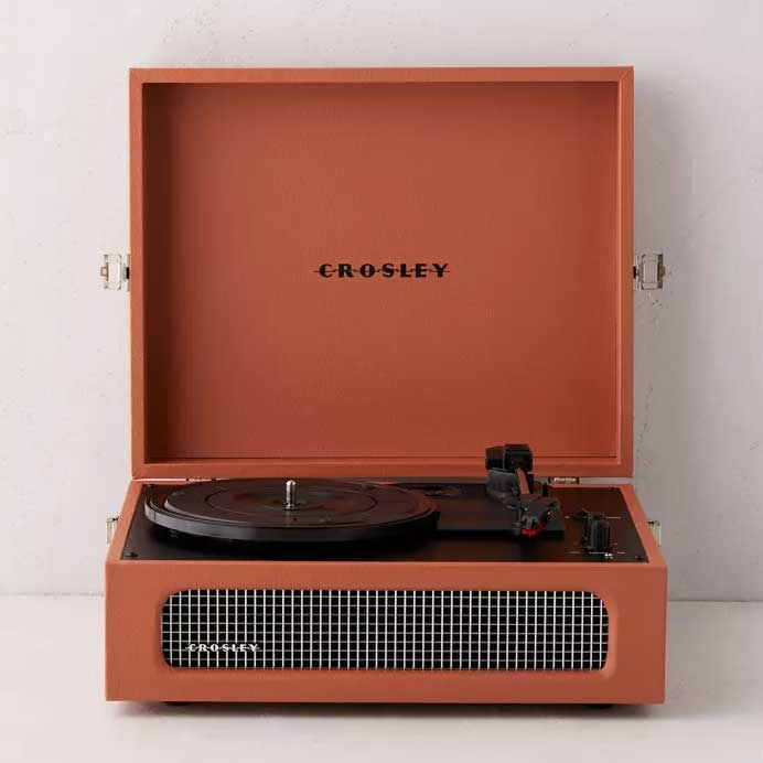
Crosley terracotta Voyager
Ghost Ranch paint color
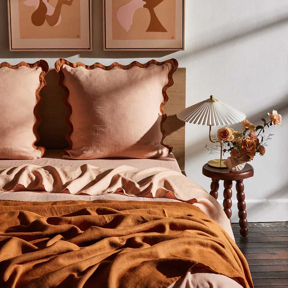
Terracotta and Rust bedding bundle

