What color is replacing Gen Z yellow? Trend forecasters make their predictions
The Snapchat logo, Instagram-fad skincare packaging, sherbet-colored hues at Ganni, or Beyonce’s lemon Roberto Cavalli dress worn for her best-selling album Lemonade. These are just some of the hallmarks of what was once tipped as the next millennial pink: ‘Gen Z Yellow’.
Dawn for all things Gen Z yellow first came around as early as 2015 when the Oxford English Dictionary announced the word of the year was not, in fact, a word, but an emoji: the ‘tears of joy’ one. It is distinctly digital, pixel-happy coloring (bold, sickly, zingy, acidic) gave the hue this viral quality that could quickly cut through the noise on the internet – helping products like Korean beauty brand Dr. Jart+, and Starface acne pimple patches reach youthful faces of this chronically online cohort.
Decorating with yellow has one foot in the digital world and the other in the 1980s euphoric Brit youth dance scene it references, where this acidic yellow (seen with the childlike smiley faces of the time) became synonymous with a subversive rave scene; you only have to think of Nirvana's smiley logo to get the idea.
This youthful zingy yellow continued to hit the cultural touchstones of the mid to late 2010s: think of Zadie Smith’s Swing Time cover (2016), Ottolenghi’s Simple cookbook, available at Amazon, and a whole suite of Spring/Summer 2017 runways (Dries Van Noten, Jason Wu, Emilio Pucci). It was then coined ‘Gen Z Yellow’ by Haley Nahman in 2017 in the now defunct Man Repeller online magazine.
So it makes sense it was the sartorial choice of Harry Styles’ bright yellow suit for the 2020 Brit Awards, because then quickly after it became solidified into the zeitgeist as a Pantone Color of the Year in 2021 titled ‘illuminating’, heralded as an optimistic, sunny, expressive color – a ray of hope during the worldwide pandemic.
But much like the tears of joy emoji (sorry if you haven’t already heard: it’s now apparently deemed deeply millennial, ‘replaced’ by the skull emoji) – the question lies: does this also spell doom for Gen Z yellow?
What is the new Gen Z yellow in interior design?
When it comes to replacing Gen Z yellow, the answer lies within your kitchen. Yes, designers are looking to nature and everyday food and beverage items for their color trend inspiration in 2024.
Here are the two colors that trend forecasters predict will replace Gen Z yellow in 2024:
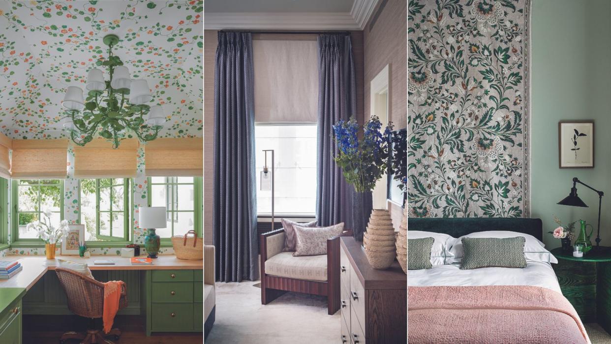
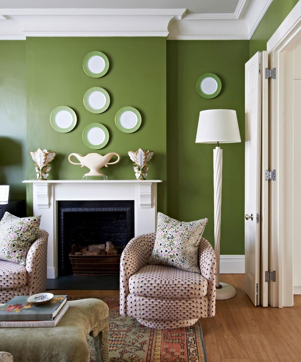
Decorate with a matcha green
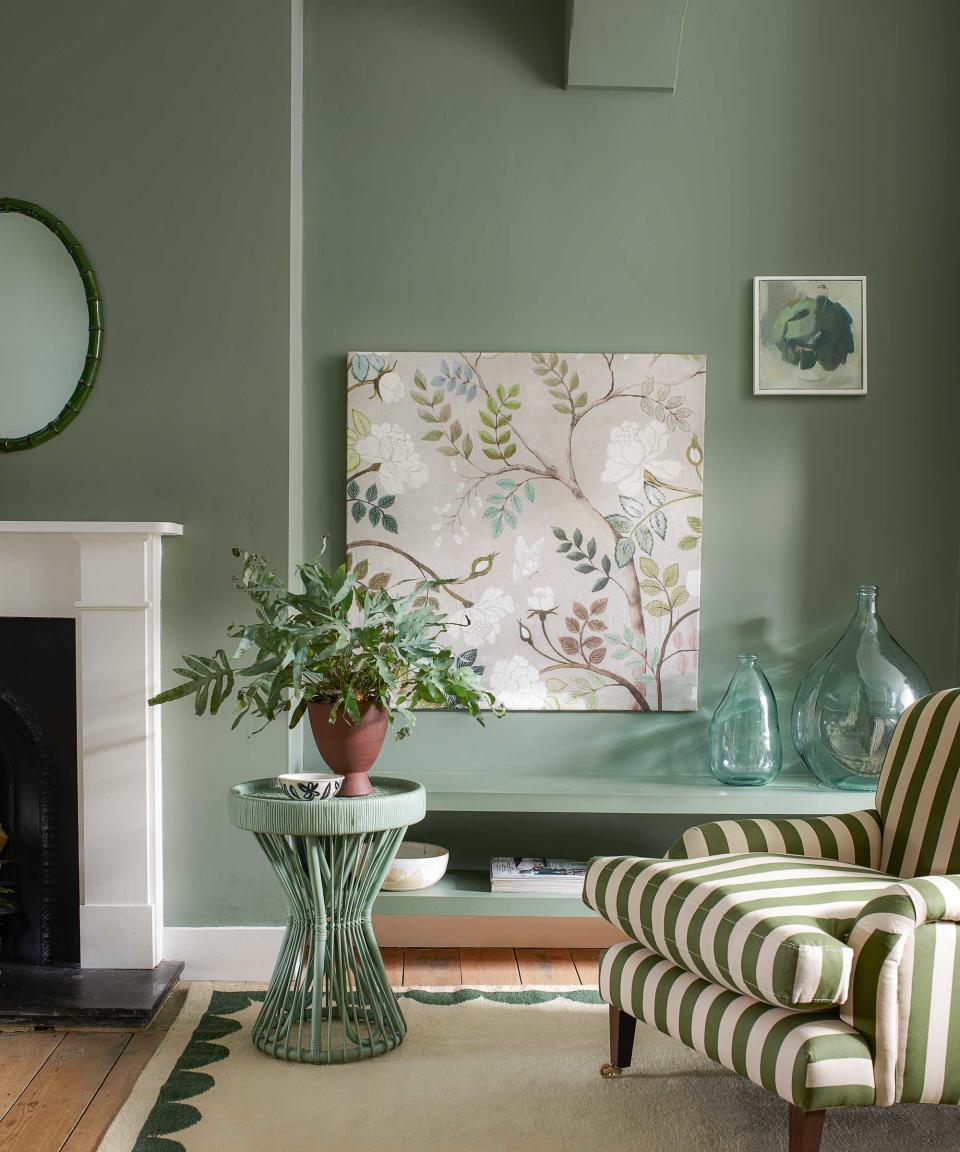
Gemma Riberti, head of interiors at WGSN, has tipped a cool matcha green as one of the key color trends for interiors for A/W 24/25.
Cool matcha, a light pastel type of green, she says, is ‘a calming, soothing pale with a therapeutic quality, the perfect combination of a vegetal green and a mindful pastel. Greens are a highly restorative color family thanks to their immediate connection to the natural world and we are starting to see them being treated as a natural neutral.’
‘Cool matcha connects to both nature and technology, highlighting the importance of developments in nature-powered bio and plant-based materials, dyes, and pigments. There is at the same time also a more ethereal, almost surreal side to this color which makes it interesting for Metaverse-inspired narratives, where it can be used to create a soft yet eerie aesthetic – think coatings and pigments for playdough-like clay, matte velvet, ceramic glazes, foam-like plushness, and lightweight sheers. The glowing quality of decorating with green also leads the way to narratives around bioluminescence, glow-in-the-dark effects, and more.
This pastel room color has a similar digital literacy as Gen Z yellow; it’s a color that comes under what you might call ‘digitized brights’ – the type of colors that are deeply informed by AI platforms (Midjourney, DALLE) and animation, that give this deeply electric, saturated, vibrant palette. We’re perhaps beginning to see some early adopters. In design, there’s architect and researcher Adrian Chan’s recent design project, and Studio Wok’s latest design, Pan. And in art, there’s this sense of minty matcha freshness flecked on the canvas, and barnacled on the sculpture pieces by artists like Hannah Lim, Joanna Vasconcelos, Colleen Barry, and Flora Yukhnovich; think also of the ultra-popular Scandi interior furnishings by Gustaf Westman and Hay.
In technology too, there are rumors swirling that the next iPhone15 is tipped to be mint green too in the coming months. So when thinking about how this reverberates into the home: consider paint colors like Little Greene’s Wormwood, or Whirlybird by Farrow & Ball, or for more intense iterations it’s Arsenic or House of Hackney’s Anise. And for complementary colors, Studio Wok for their Pan project, says this color works well when it’s ‘contrasted with the warm and natural shades of the palette’ that includes cool whites, woods, and starling blacks. Gemma Riberti, says this cool matcha green works ‘especially when paired with midnight plum tinted darks which really set it off.’
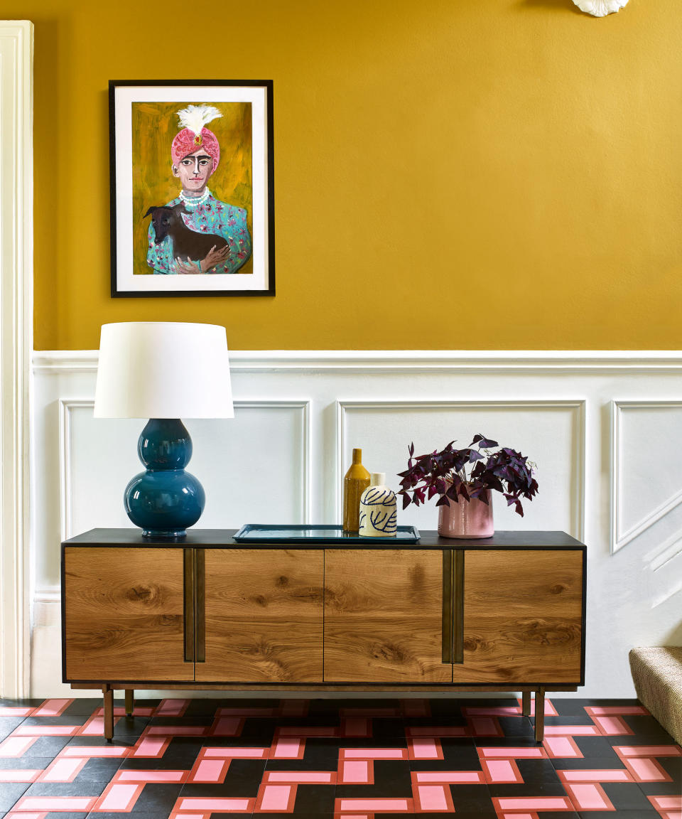
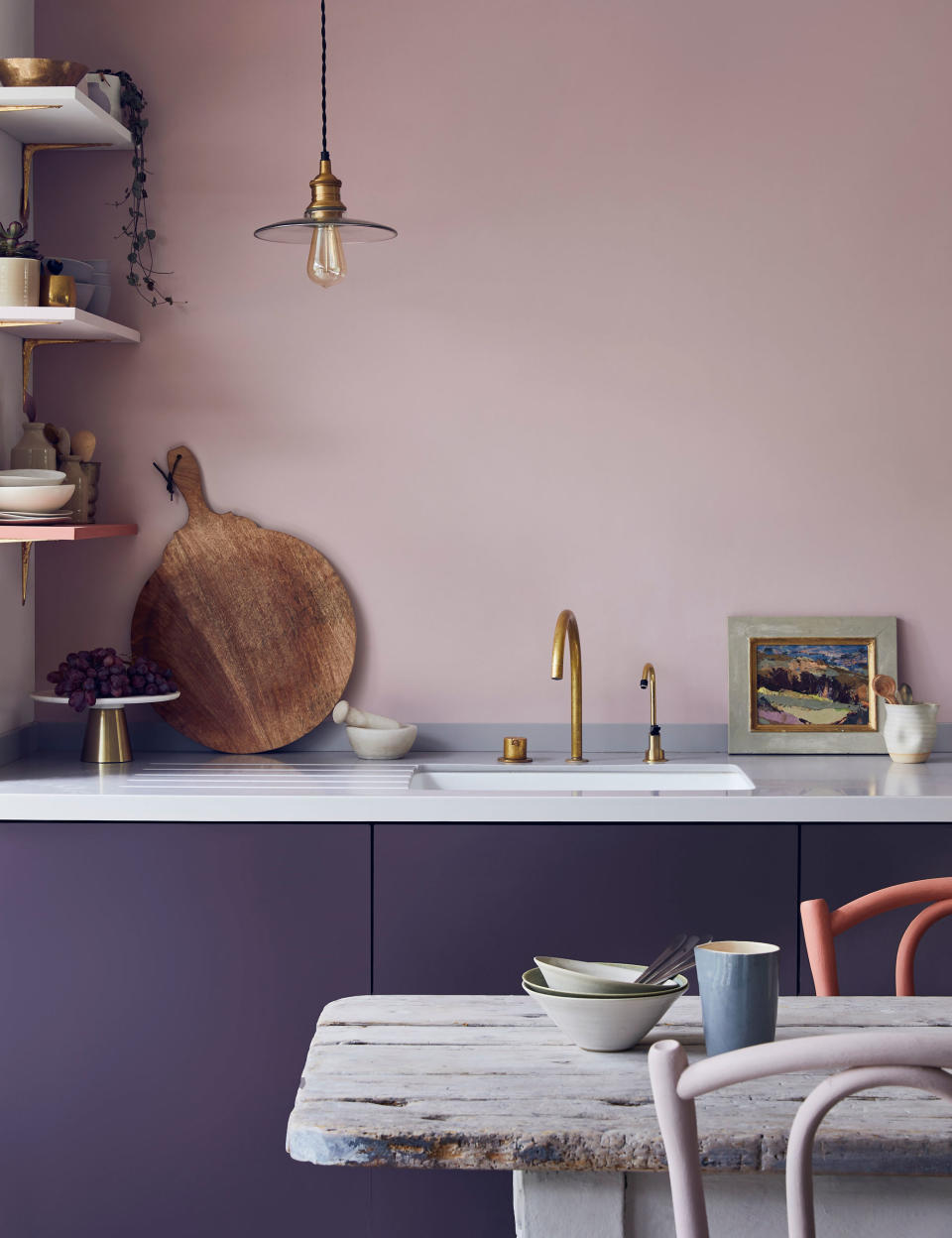
Accent your home with midnight plum tones

Gen Z's sunny yellow may also be retreating into the night with its darker, intriguing, and complementary counterpart: midnight plum. What’s often assumed is that along with colors like Millennial pink, and Gen Z yellow, is that younger generations are only drawn to the lighter pastels of life. Not so, says Riberti, suggesting its darkness offers a calming mood for the home: ‘Dark tints that address the focus on rest and wellbeing that are front of mind for consumers. This purple room color has many facets according to whom it is working with: treat it as a jewel tone that conveys a premium look and feel alongside gleaming warm metals, especially in plush materials, glossy glazes, and silky sheen.’
This premium association stems from deep purple’s ancestry. In the West, it was used to symbolize regality, same in ancient Japan where a deep purple Murasaki was once kinjiki (a forbidden color) to anyone outside of the higher social strata of society. There’s also a strong sense of mysticism and creativity associated (think Tarot readings, esotericism, where purple is connected to higher realms of consciousness).
Midnight plum is a color that’s both steeped in the past but also one that’s deeply forward-looking. Think of the virtual worlds, and Web3 and you’ll probably of purple; ‘this purple also connects to themes of space exploration and the fascination for the emergence of the Metaverse,’ says Riberti.
‘It can take on an otherworldly quality thanks to transformative finishes such as anodized, metalized, iridescent treatments, so it’s ideal for directional products with a futuristic aesthetic.’ You might take Audrey Large’s Low Table Cosmic strings as your cue for design inspiration here.
Futuristic, but equally calming, Dominic Myland, CEO at Mylands also sees the darker shades of plum as a soothing balm against the everyday stresses of life: Deep and rich shades of plum feel warm, intimate, opulent, and romantic, like Mylands’ Plum Tree that’s an earthy and natural hue, reminiscent of fresh plums and its familiarity can feel comforting and reassuring.’
Which rooms work best for this paint? Myland suggests it’s best ‘to use for spaces that you want to feel comforting and welcoming like the bedroom, TV snug, living room, or dining room. They can be used as wall paint to create an enveloping space, or as an accent color.’

