The Clippers Got It Right

Photo courtesy of Los Angeles Clippers/NBA; Collage: Gabe Conte
It’s been a rejuvenating season for the Los Angeles Clippers: the team quickly claimed one of the top spots in the Western Conference and hasn’t let go—firmly establishing themselves (for now) as the best team in Los Angeles along the way. The long-thwarted Clippers kept the good times rolling on Monday by releasing their new logo, court, and uniforms for next season—a to-the-studs redesign fit to send them into a bold new era.
The rebrand will usher the team into its new home at the Intuit Dome, the new $2 billion arena in Inglewood that owner Steve Ballmer has referred to as a “basketball palazzo.” While construction on that not-so-humble abode isn’t complete yet, we can now assure that the Clippers will look great while playing there.
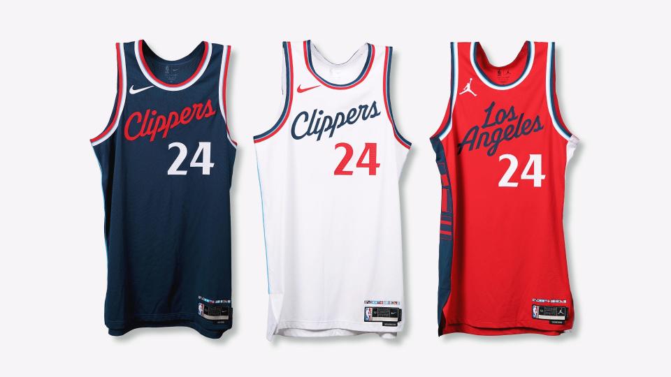
After cycling through several slightly different variations of their red, white, and blue color scheme (and briefly experimenting with black), the franchise has landed on the right look for 2025 and beyond. Going back to script lettering across the front rather than the block letters they’ve used in recent years both evokes the glory days of Lob City and gives the jerseys an air of class. The Clippers acknowledged that a no-frills, old-school look can be just as effective as something hyper-modern, and the results should leave Angelenos happy.
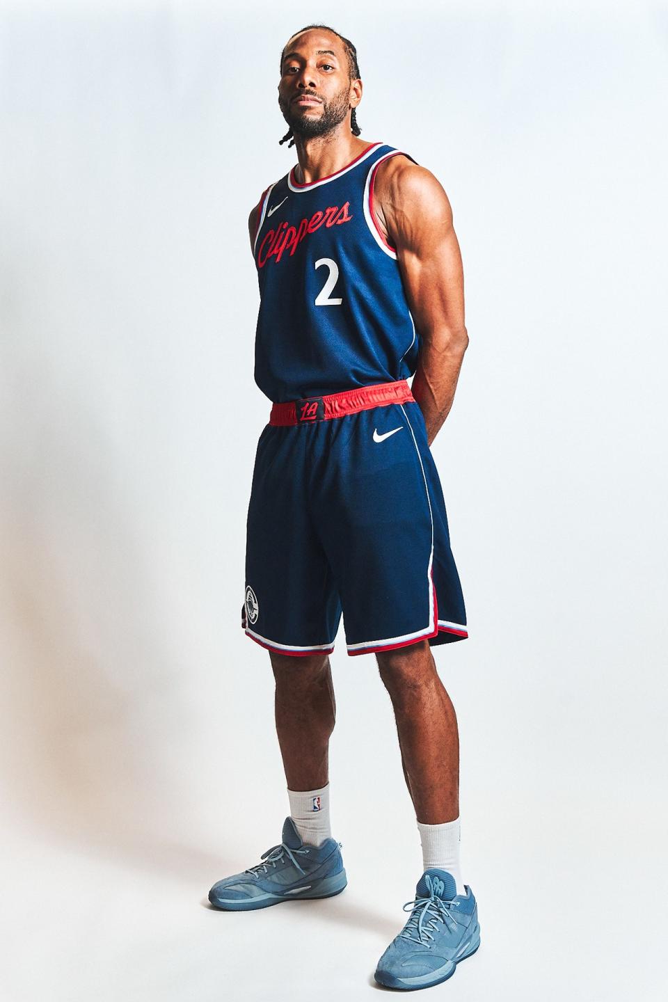
The black appears to be gone for good, and there’s a really sharp red Statement Edition uniform in its place, marking the first time the Clips have had a red top in the rotation since the 2016-17 season. The new blue jersey is also a slight departure from their typical royal blue, sliding a few shades down the navy spectrum. There’s a faint, lighter blue, too (dubbed Pacific Blue) around the trim that’s done really nicely as well. While it’s nothing over the top, going with blue text and red numbers on the white jerseys (perhaps grabbing inspiration from their neighbors at Dodger Stadium) makes that look really pop, too. Simple, yet pleasing. Take notes, other teams!
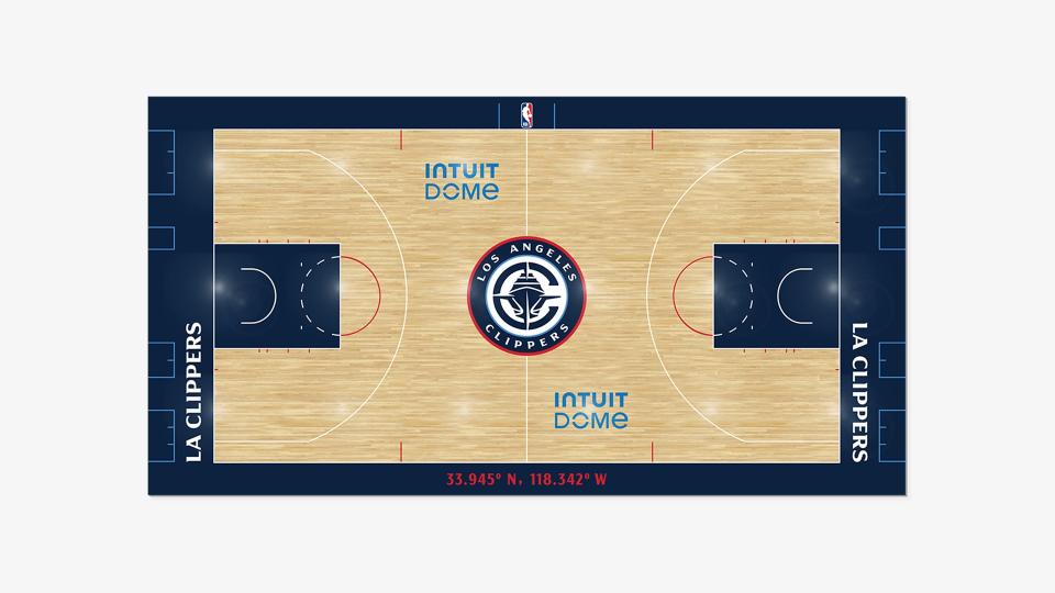
Intuit Dome will be swaddled in that navy blue color when the Clippers take the court there. Their new hardwood heavily utilizes the color on the baselines, sidelines, and painted area around the hoops. It’s not a flashy court at all, but that seems to be the point, and subtlety goes a long way in an NBA landscape where many teams have jumped the shark with their art design.
ProLine Basketball Court Mockup Template - Two Views
While the jerseys are serving a sort of new-age retro look, the revamped logo leans even harder into nostalgia, while also reminding the world that a clipper is a type of boat. They’ve got a nice nautical motif going! The hull of the ship being integrated into the seams of a basketball is really next-level stuff, and the logo pays tribute to the team’s origins in San Diego while also providing a reminder that the team is not named after barber shop equipment. And they won’t rely on an LAC wordmark anymore: the boat illustration is surrounded by a new Clipper “C” that will work perfectly on a dad hat or a bumper sticker.
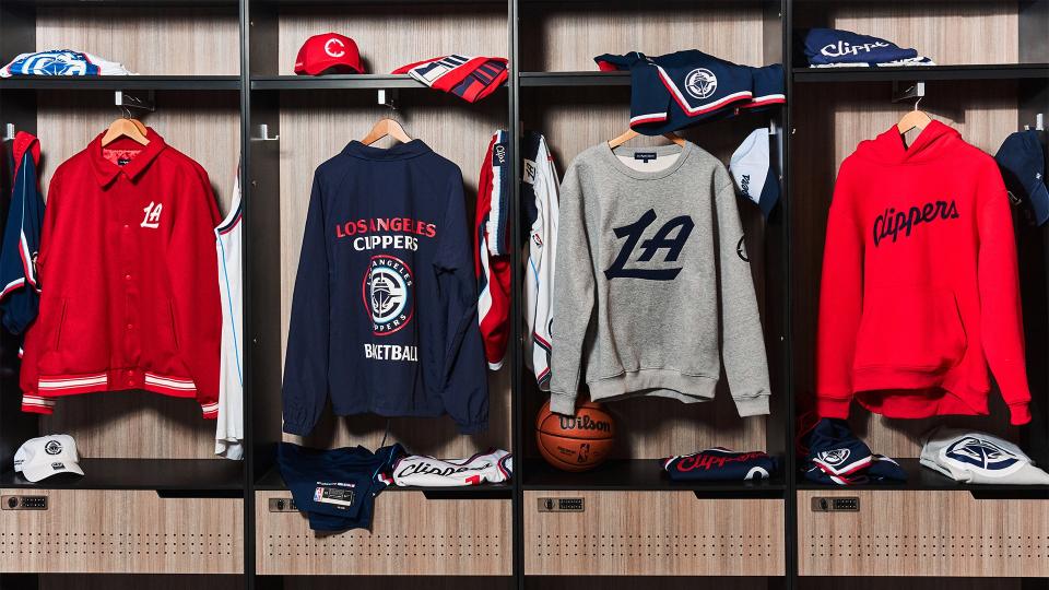
Along with some really snappy merch and an understated secondary “LA” logo, the Clippers get an A+ from us on this entire endeavor. With several of their NBA counterparts also in desperate need of a rebrand, let’s hope they liberally borrow some ideas from the Clips, who proved that you don’t need to do anything crazy to create a jersey that fans, players, and anyone with good taste will rave about. The only thing left to do is win.
Originally Appeared on GQ

