The new Cleveland Browns logo has a ridiculous number of hidden meanings

A good logo design for a sports team needs to accomplish a lot. It has to be simple enough to work across an array of merchandise, it needs to convey a team's history and, ideally it should please fans. Somehow the new Cleveland Browns logo has achieved that while packing in a whole kennel full of hidden references.
Keeping fans happy is often the most difficult thing to achieve with sports team logos, as we've seen in numerous controversies in recent years. The NFL's Cleveland Browns aimed to overcome that by letting fans choose their new canine logo. The fans in the Dawg Pound have spoken, and they've opted for a design with close to a dozen hidden references that might go unnoticed among those not familiar with the American football team. Can you spot them all? (Also see our piece on the best sports logos for more inspiration).
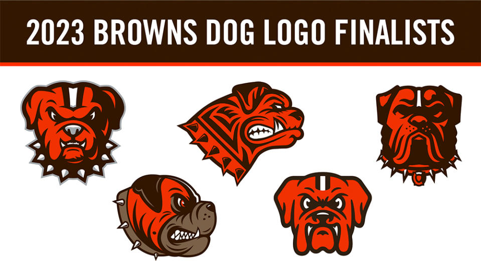
The Cleveland Browns held a contest in the offseason inviting fans to choose a new dog logo for the team (it had to be a dog in reference to the 'Dawg Pound' bleachers section at the team's First Energy Stadium). After a knockout-style contest that lasted a couple of months, the winner emerged as a bullmastiff created by graphic designer Houston Mark.
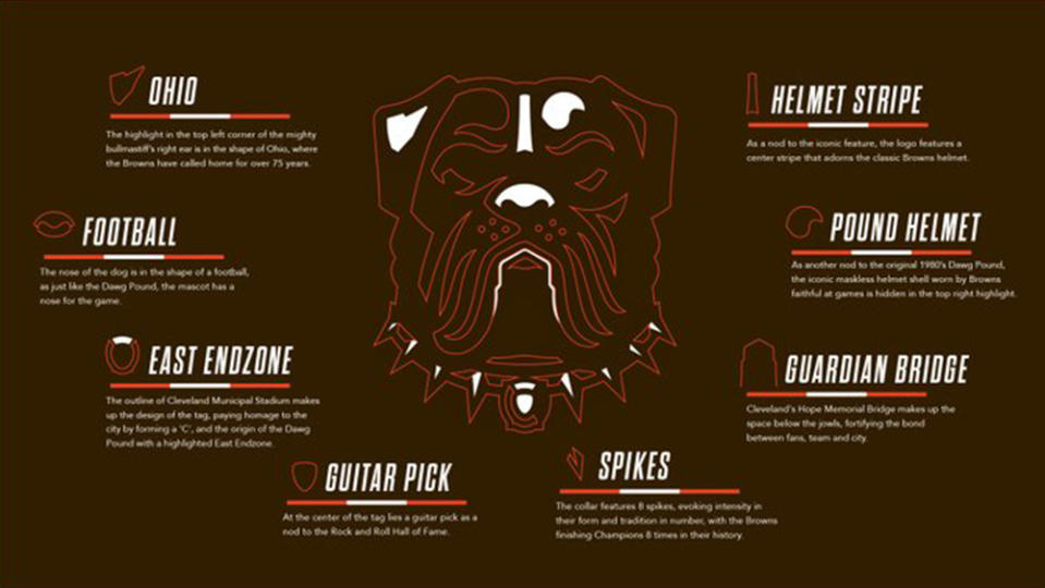
Mark delivered on the brief with his tough-looking dog (sorry, dawg) in the team colours, but he also packed in a whole host of hidden Easter eggs that fans might not even have noticed when they were voting for the design. The details reference things as diverse as the Browns' home state of Ohio, the team's stadium, the sport of American football itself and even rock n' roll. Yep, it's one deep dawg! Can you spot all eight (or ten) hidden references below?
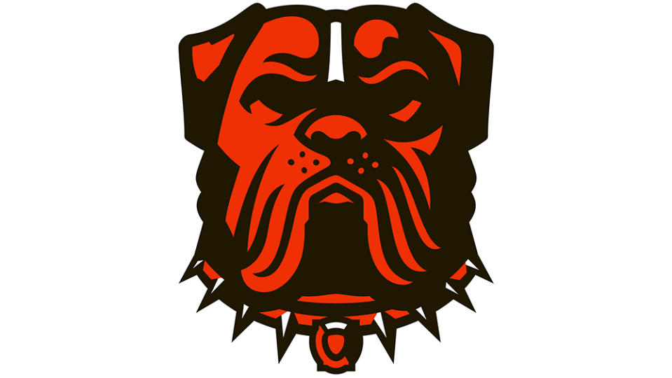
Here's the list of the eight abstract symbols hidden in the design:
1) The state of Ohio the shape of the orange part of the dog's right ear (on the left as we see it).
2) An American football: the shape of the dog's nose.
3) East End Zone: the collar tag features a stadium outline that also features a 'C' for Cleveland, and a white area that symbolises the East End Zone at the Browns' stadium, where the Dawg Pound originated.... hold on, that's references in one.
6) Guitar Pick: Also in the dog's collar, this was included in reference to Cleveland's Rock & Roll Hall of Fame.
7) Spikes: The spikes on the collar aren't just spikes. There are eight of them to represent the number of championships the Cleveland Browns have won.
8) Guardian Bridge: The space below the dog's jowls forms an outline of Cleveland's Hope Memorial Bridge.
9) Helmet stripe. The white centre stripe is a reference to the Brown's helmets.
10) Pound helmet. The shape to the right of that is apparently a reference to the maskless helmet shell that Browns fans are known for wearing in the Dawg Pound.
Struggling to see all the references? On Twitter, The Browns provided a handy visual guide that gives a tour of the design.
The Cleveland Browns dog logo will function as a secondary design to support their main logo, which is an orange football helmet, completing an identity that's also seen the return of Brownie The Elf as the NFL team's midfield logo.
Browns executive vice president JW Johnson said in a statement: "We are so excited to unveil a new dawg logo that perfectly encapsulates who we are as a franchise and as a city. Our fans have been asking us for a new dawg logo for quite some time, so it made perfect sense for them to select the logo themselves and decide how they want our team to be represented – and they made a great choice."
For more sporting logo action, see our sports logo battles: Denver Nuggets vs Miami Heat and Golden Knights vs Panthers. And make sure you've not missed the Minnesota Wild logo optical illusion from the NHL.

