This Seattle designer breaks down a project that lets the views do the talking
open book | Apr 23, 2024
Brian Paquette explains his approach on a project that called for warm light, smart space planning and restraint.
Though he grew up on the East Coast, it’s Seattle that has indelibly shaped Brian Paquette’s sense of style. Since launching his firm in 2009, the designer has continued to refine an aesthetic that embraces the region’s overcast pallor rather than fighting it, with pared-back rooms that celebrate natural materials, sculptural forms and evocative textures. His newly released second book, Outside In: Interiors Born From Nature, explores how the environment has shaped his oeuvre, with personal landscape photography and essays accompanying the 11 featured homes.
Among the work is a modernist home by the late Seattle architect Ralph Anderson, which was scooped up in 2020 by a couple who had dreamed of owning the house for decades before it became available and who tapped Paquette to add warmth, character and functionality to a complicated floor plan. The designer explains how he approached the space—honoring Anderson’s characteristic simplicity, verticality and expansive windows—and divulges the ingredients for a successful project.
THE BEGINNING
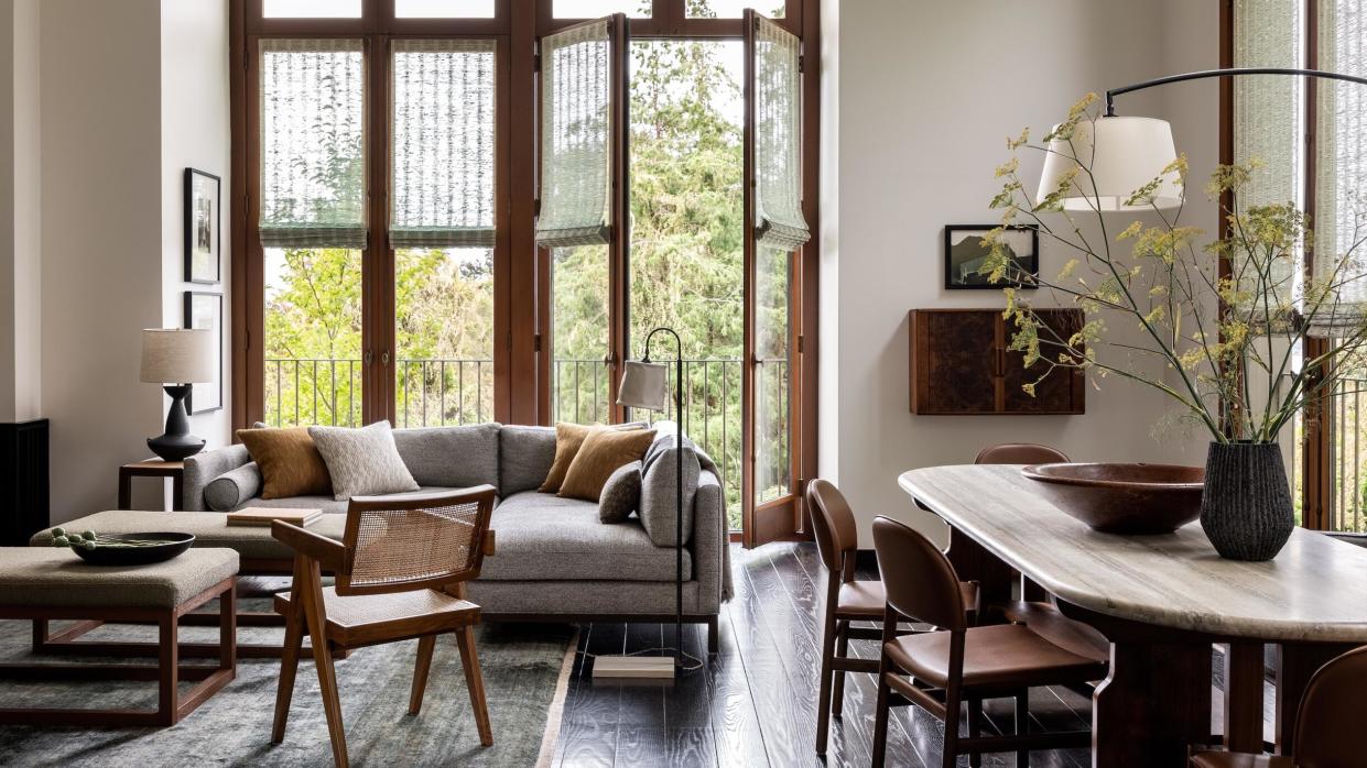
This is a pretty specific house—very tall and upside down, with the garage on the first floor; three bedrooms and two bathrooms on the second floor; and the living room, dining room and kitchen on the third floor. The house is on a dead-end street, right next to a public park that no one goes into, so it’s super quiet. You really feel like you’re in the middle of the woods. Classic architecture in the Pacific Northwest is usually known for two things: paying attention to the outside, which this house very much does; and a minimal palette with minimal materials that are used over and over again. When the clients got this house, there were just white walls, beautiful black floors, and cement and steel—and then all these windows.
THE BRIEF
The client had been following me on social media and knew she wanted to work with me. About half of our projects are like this, where the client says, “I love your work, and I want to see how you would interpret this house.” Aside from telling me that they had wanted this house for a long time, she didn’t really give me any direction. She’s a photographer and a doctor, so I focused on her photography. We have a similar eye—moody and earthy—which informed a palette that is muted and all about texture. I didn’t want to introduce wallcoverings or paint, because I wanted to respect the fact that the minimal palette of the architecture was there intentionally. I wanted to keep it really clean.
THE FLOOR PLAN
Creating a furniture plan for this living and dining space was far from straightforward—it was not some four-square where you’re like, “Oh, this is how this is laid out.” It’s a really tight space, and it took a bunch of iterations. There was another project recently where we had this giant great room—the rug was 20 by 36 feet—and as an exercise for my small team, I was like, “Let’s do 20 different versions of this room, just for fun. We’re not going to bill the client for any of it, but let’s just throw things at this and see what happens.” We ended up showing that client three different versions because I liked all three. But for this client, there was only one option that really worked for how they wanted the space to function.
THE FURNISHINGS
When it comes to furnishings, I keep a really tight tool belt. I want to work with people I love and respect—with people who are in my phone, who I actually talk to—so throughout our projects, you see the same vendors over and over again. This project is no different. It was like, “Here’s this vendor, and this is what they do. What do we want to do with them that’s special?” A woodworker we love here in Seattle worked on the dining table; he also made a floating bar in the dining room. [Los Angeles–based design brand] Lawson-Fenning is in the space too. I made a sectional with them by taking three of their sofa designs and melding them into one custom piece. We worked with our friends at Armadillo for the rugs, because they have the perfect colors for this project. And then it’s a big textile mix. I don’t really like prints—I want things that age well over time, so I prefer a lot of texture. There’s a lot of texture-on-texture layering that you’re really only going to pick up on when you’re sitting on the sofa and you’re next to it, seeing the interplay of the sofa and the rug and the pillows and the chair. It’s all very subtle.
SOULFUL DINING
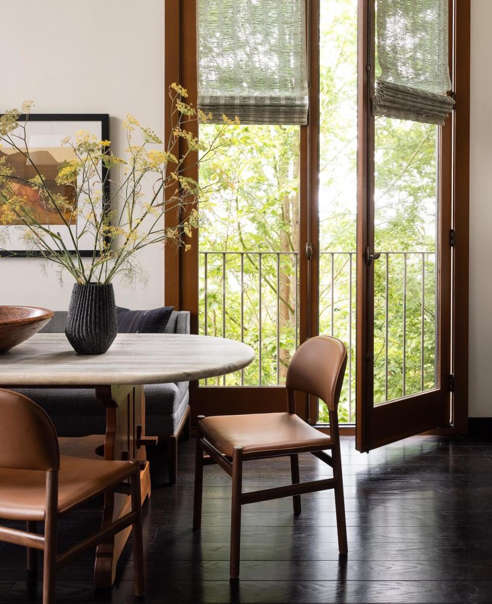
The client had this 48-by-48-inch dining table that her late father had made all out of wood. I don’t even know what style you would call it—maybe arts and crafts. But a dining table that size made no sense in that room, so I was like, “Hey, can I dismantle this and use every bit of it that I possibly can to build you a new table that honors your father’s work but works for the space?” She thought that was so poetic, so that’s what we did: I worked with our local woodworker to create a base out of all of the materials from the table and then had a travertine top made for it. I wanted the juxtaposition of materials to be visible, and for it to be very clear that the base was a hand-made thing. Getting that tabletop up all of those stairs, though, was a different story. That was harrowing.
TONAL BALANCE
Seattle has a real lack of warmth, and you have to lean into it, so the base of the palette is all those cool and natural tones that you see all the time, whether it’s the sky or the trees. But the palette can’t be just that. I use a lot of walnut and brown leathers to warm up a space. And then, whatever tones people would immediately think of, I desaturate them a little bit. If it’s yellow, I use ocher or goldenrod; if it’s red, I use burgundy. It’s a delicate dance. And honestly, especially with this house, that’s the last ingredient. I picked all my base fabrics first. Then, as the pieces are getting finished, I’m thinking, “I have a cool sofa, so its base is going to be warm. And I’ve got a warm upholstered chair, so its legs could be cool—or they could be warm again to reinforce that warmness.” It’s very specific to where you are.
LAYERED LIGHT
Sense of place has a big impact on how we approach lighting too. We have some really short days here, where it might only be light from 11 a.m. to 3 p.m., so I’m thinking about creating a triangle or square of lighting in every room. I don’t want you to have to use cans, period—and if you do, they’re always on a dimmer, and I only want them at 10 to 20 percent. I use lamps to create a bunch of different variations of light for that room.
You see a lot of shaded lights here—maybe there’s some directional light, but even the floor lamp next to the sofa has a leather shade, so it glows differently than a linen lampshade. I love beautiful lamps, and this project has all of my favorite lamp makers, from Danny Kaplan Studio and Dumais Made to Adam Otlewski and Pletz.
SHADES OF GREEN
There are zero privacy issues in this house, so we were looking for window treatments that added a little bit of texture to the height of the ceiling, but also were something they could close when they’re away. My first thought was to do raffia shades in the same finish as the wood trim of the windows so they truly disappear. Then I saw this greenish tone in the Hartmann&Forbes showroom. When I put the sample with everything else, I realized we needed that green to bring in the green from outside.
CURATED ART
This project was really just a furnishing job, plus going through the client’s massive art collection. Most of it was stuff they had picked up from charity auctions over the course of 25 years; I went through at least 150 pieces to find the right ones for this space, asking questions like, “When did you get this? Why did you get this?” They had a lot of great stuff, and we reframed it and made it new. Their previous house was a super-old Craftsman that was all woodwork, so they couldn’t hang a ton of art. Now they could finally display it.
SECRET TO SUCCESS
Sometimes clients buy a house for the neighborhood or the school district, or for one aspect of the house. They might buy something contemporary, but then want it in a style or vernacular that doesn’t make sense for the architecture. What made this process so successful is that these clients just wanted to honor the house—they leaned into what the house was and where it was, and let it happen. Now, that’s not always the best recipe, and the best client is not always someone who just says, “Do whatever you want.” When people are like, “I only want clients who let me do what I want,” I always find that really ridiculous—there has to be some push and pull so that you’re not creating the same thing over and over again like a machine. I can’t remember exactly which project came after this one, but maybe it was a client who wanted to be more collaborative with the process but also trusted me. That’s still the same level of success; it’s just different. There are plenty of ways to be a good client, as long as you are honest about where you live, hire a designer you trust, and want to be a steward to the house. And all of those things happened here.
This article originally appeared in Spring 2024 issue of Business of Home. Subscribe or become a BOH Insider for more.

