Brand Impact Awards 2023: Client of the Decade
The Brand Impact Awards is in its 10th consecutive year in 2023, so to celebrate, we've launched some very special Decade Awards. Client of the Decade recognises the brands and client-side teams that have performed consistently well at the awards over the years.
It was a no-brainer for our panel: one client stood head and shoulders above the others, with its partner agencies picking up eight trophies in total – including five Golds – for a range of different brand projects since 2015.
So congratulations to the BBC: our Client of the Decade, adding yet another trophy to the haul in 2023 with weareseventeen's Silver-winning rebrand of BBC Nordic.
Here's a reminder of the BBC's Gold-winning projects over the years, plus two clients who made the shortlist.
For more on the BIAs, see the full list of Brand Impact Awards 2023 winners or download the winners showcase. You may also like to read about our other special award, Small Studio of the Decade, or discover the top-performing 12 agencies over the last 10 years.
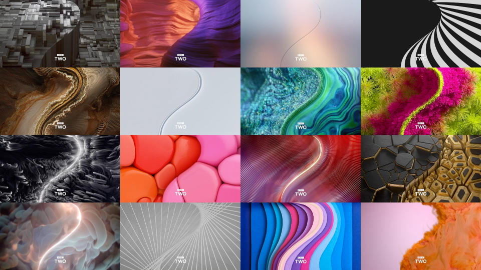
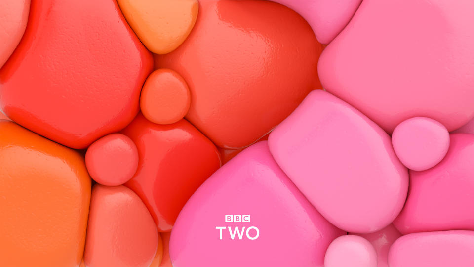
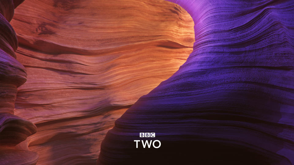
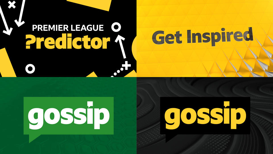
The BBC
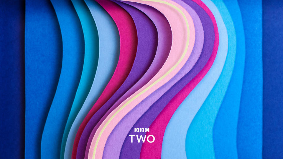
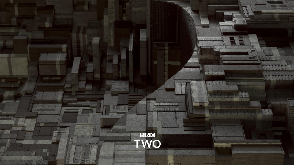
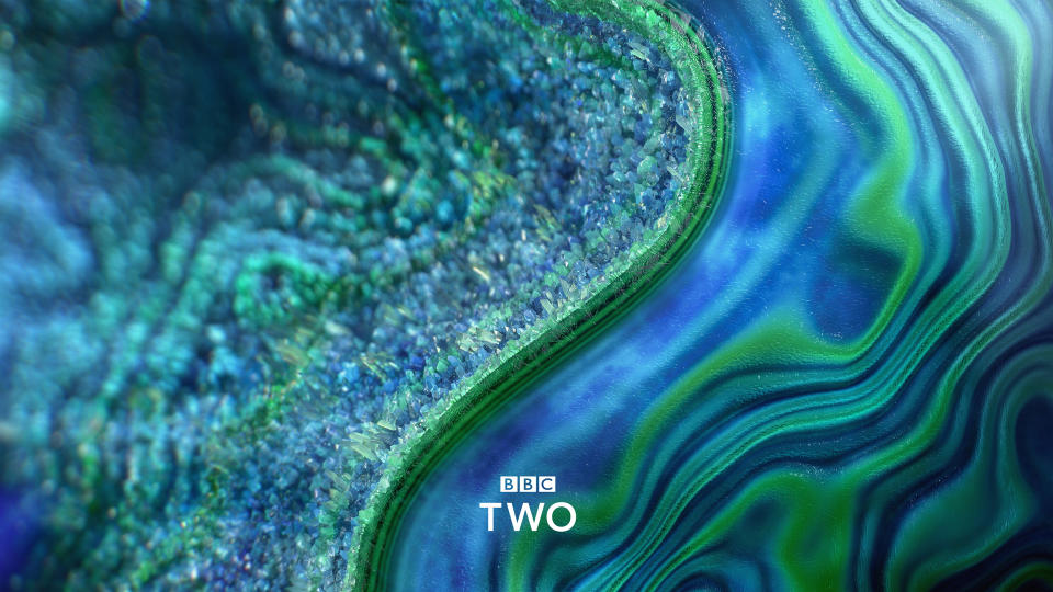
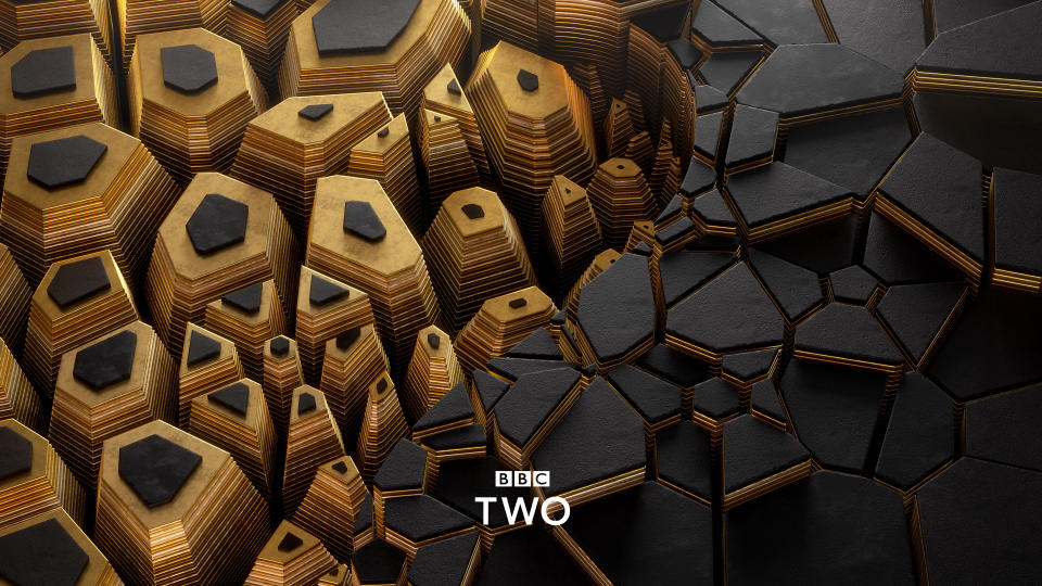
BBC Two
Client of the Decade: Winner
1 x Best of Show (2019)
5x Gold, 1x Silver, 1x Bronze (2015-2023)
This triple Gold-winner picked up trophies in the Culture and Entertainment categories, plus the Collaboration Award. It went on to win Best of Show 2019 by unanimous vote.
Superunion's (now Design Bridge and Partners) innovative branding system curates the experience between programmes, effectively turning the whole junction into an extended ident. Each trailer is assigned one of 25 'moods' – such as 'escapist', 'intense', 'revelatory', 'visceral' or 'anarchic'. These weave together into a seamless narrative, leading viewers on a journey of discovery.
The agency collaborated closely with a hand-picked selection of top animators – including FutureDeluxe, Aardman, The Mill and Mainframe – to develop 25 mood-based animations. While they vary hugely in style and tone, all of these animations feature the exact same curve motif at different points – which subtly hints at the outline of a '2'.
BBC Sport
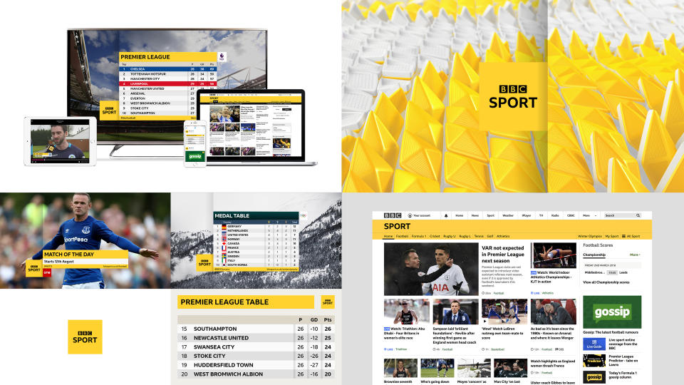
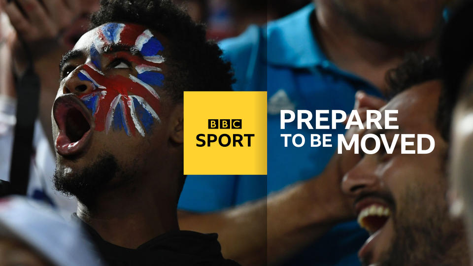
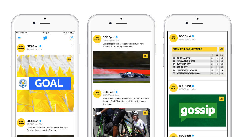
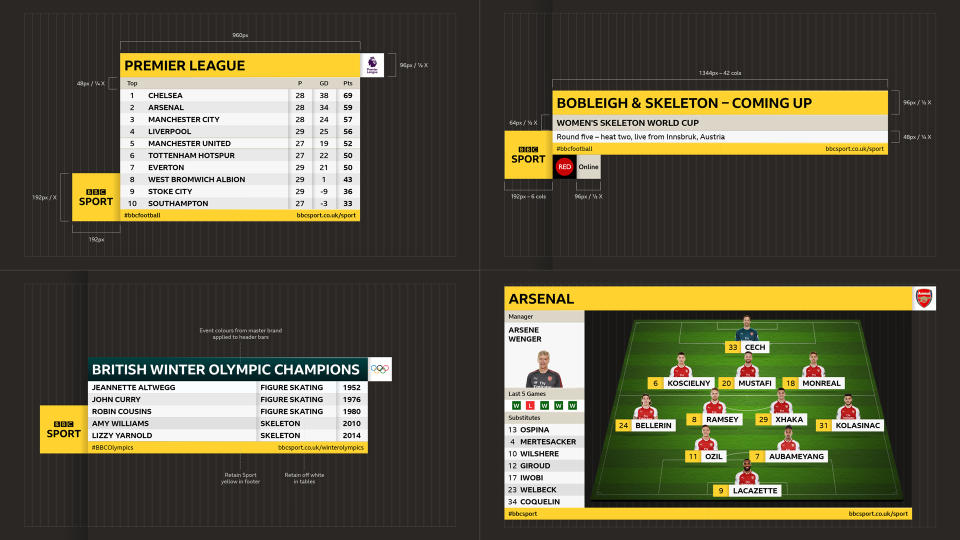
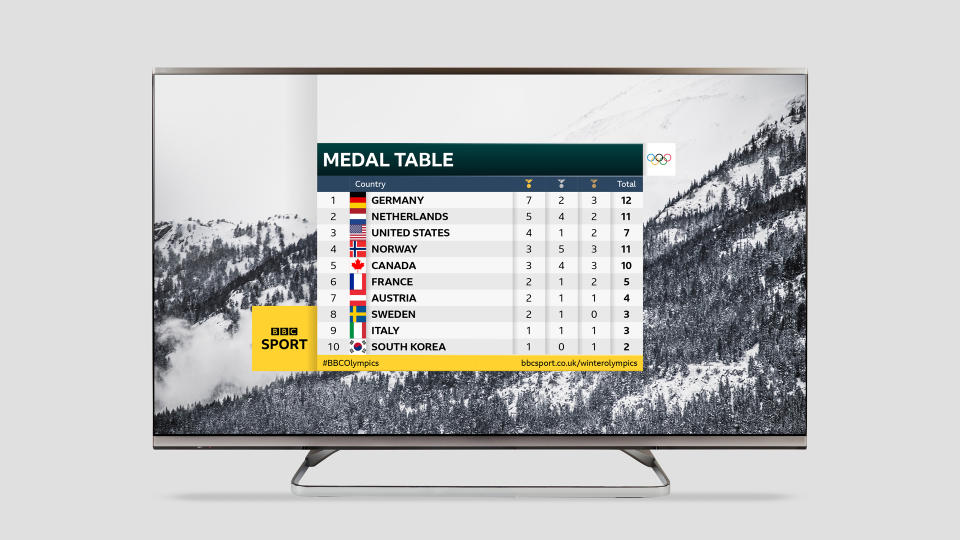
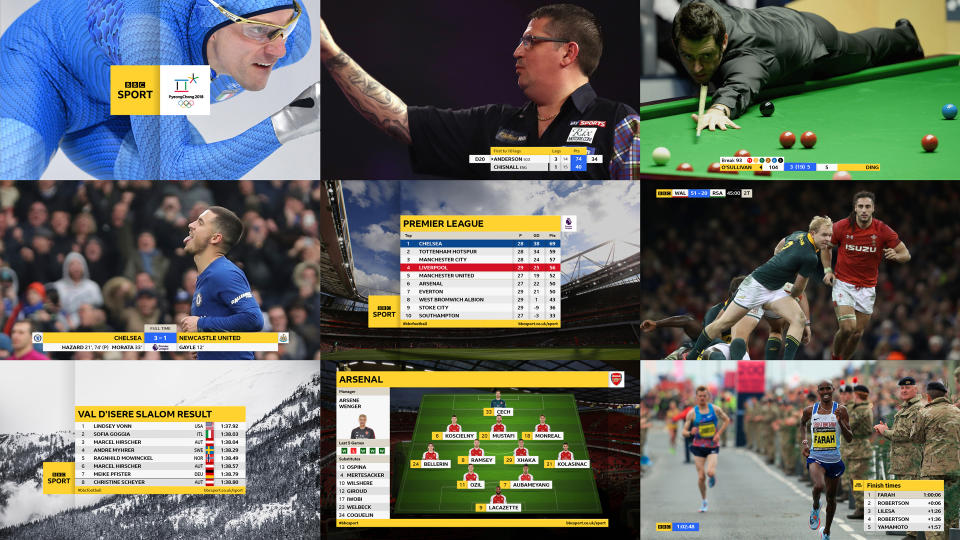
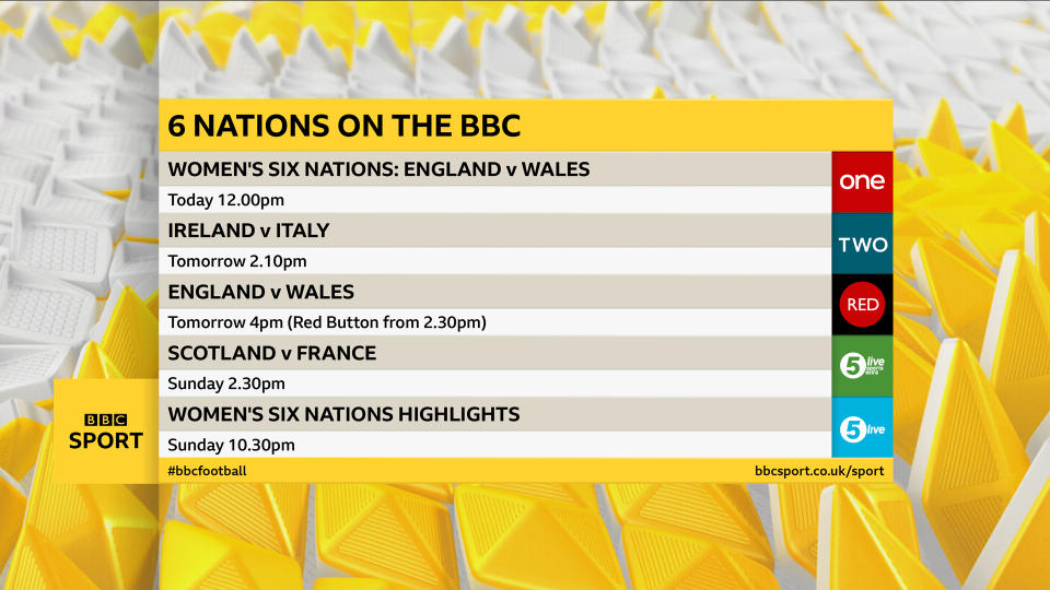
Picking up a Gold Award in the Sports category in 2018, this BBC Sport rebrand was the first major use of the organisation's new bespoke typeface, BBC Reith.
Studio Output worked closely with the BBC's internal teams to reinvent BBC Sport's outdated, broadcast-focused graphics as a clear, legible, unified system.
Balancing flat 'interactive' products with a richer 'sit-back' TV approach, the new scheme improves legibility by adding subtle depth and physicality, introduces new highlight colours to clarify information, and improves coherence and cut-through across every platform it touches.
BBC Newsbeat
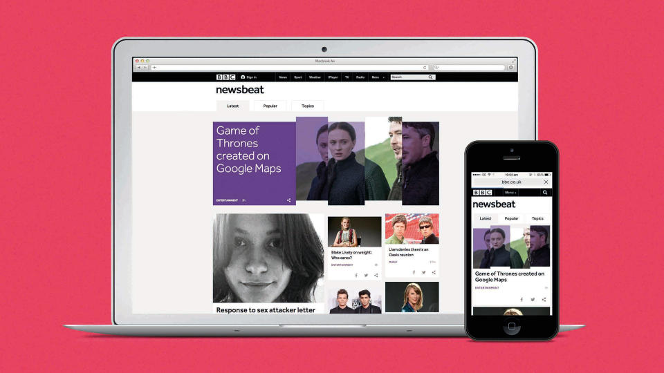
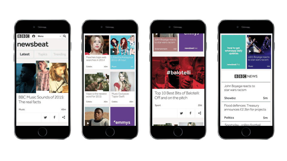
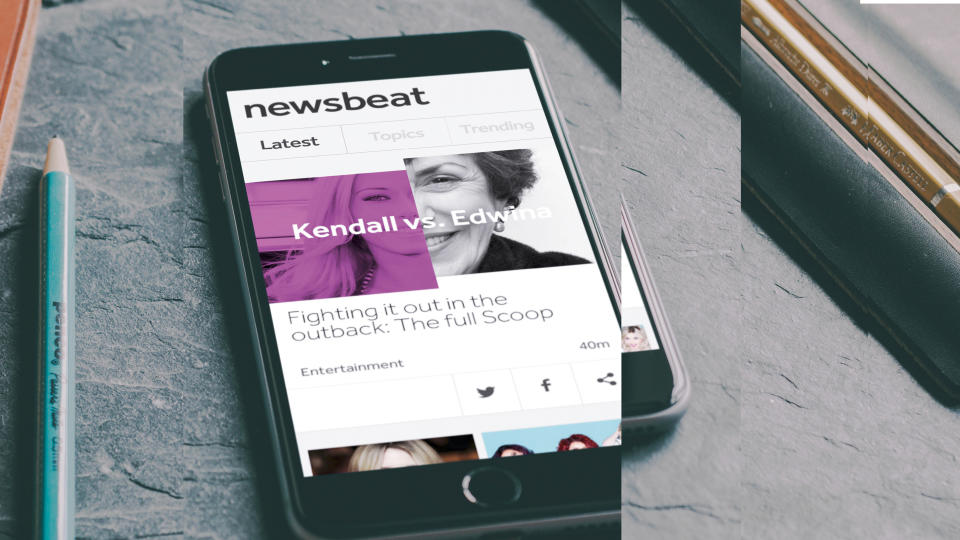
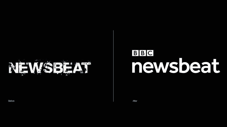
Winning Gold in the Entertainment category back in 2015, Moving Brands' reinvention of BBC Newsbeat – the news service for 16 to 24-year-olds – is bold, unmistakable, always on and always moving on.
In a dynamic twist, the 'beat' part of the logo acts independently from 'news': when users hit pre-programmed points within the Newsbeat site, it triggers an animation within the wordmark itself.
To continue the music theme, the grid system replicates a simple time signature. All are divisible by four, and content can land either on or off the beat.
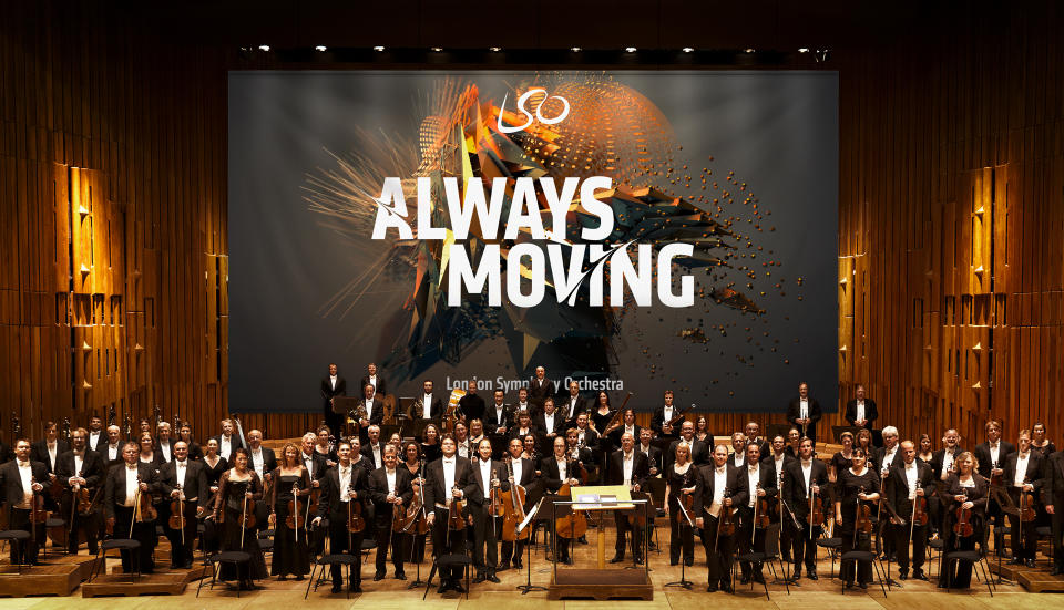
London Symphony Orchestra
Client of the Decade: Shortlisted
1x Best of Show (2017)
1x Gold, 3x Silver, 2x Bronze (2017-2022)
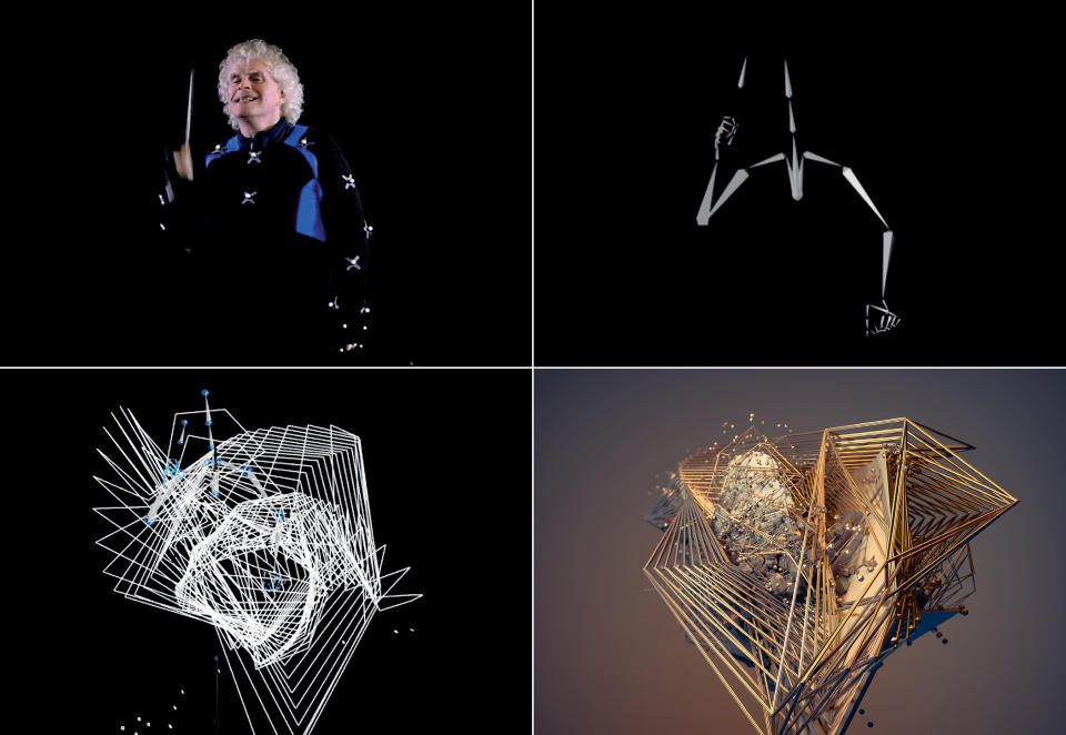
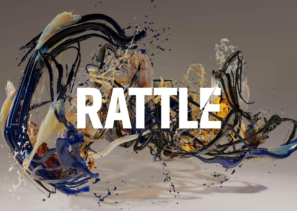
The Partners cleaned up at the Brand Impact Awards 2017 with a Gold in Culture, a Collaboration Award, and another unanimous Best of Show vote for its groundbreaking motion-capture-driven rebrand of London Symphony Orchestra.
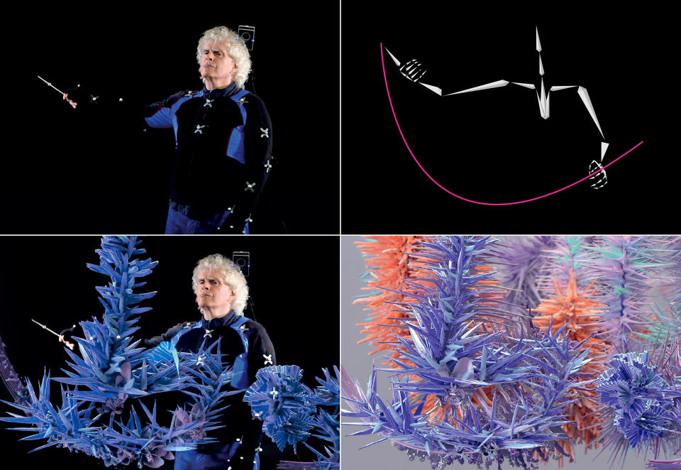
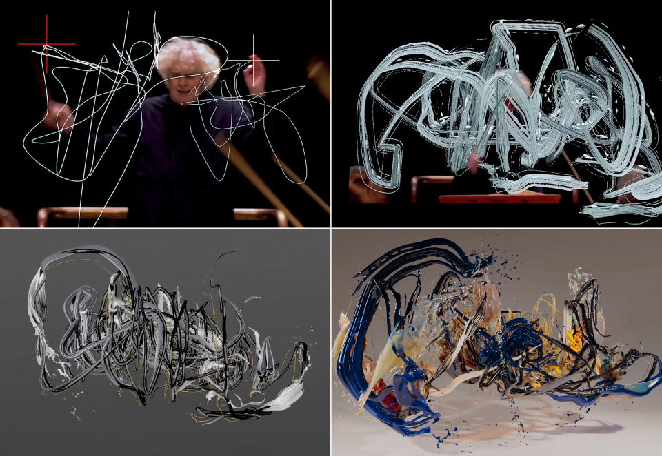
To celebrate world-renowned conductor Sir Simon Rattle joining LSO, The Partners captured the conductor's movements via motion data technology. Digital artist Tobias Gremmler then transformed them into a series of powerful animations that put Sir Simon firmly at the heart of the brand.
LSO has been a regular fixture at the BIAs since then, with subsequent seasonal campaigns adding several more trophies to the haul through Superunion, following The Partners' merger with several other WPP agencies. These include:
Roots and Origins
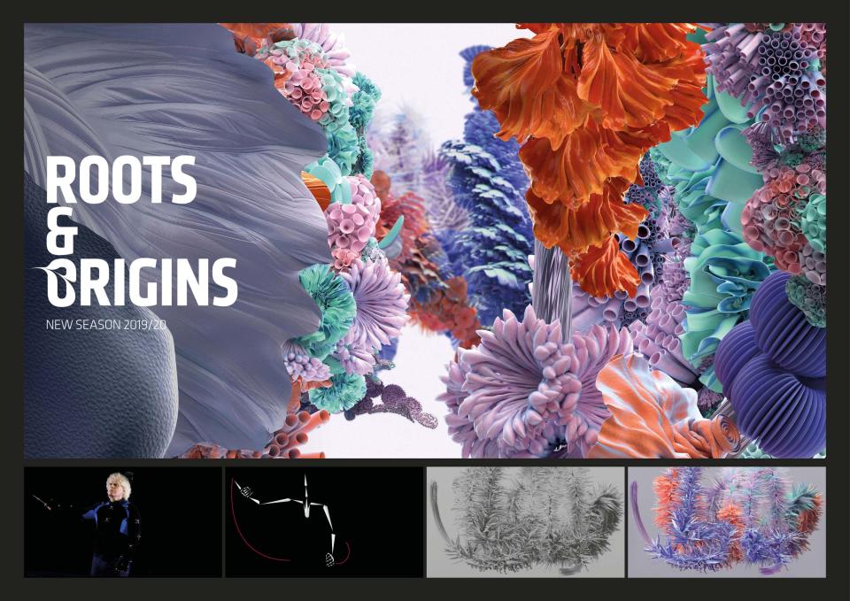
Two years after its Best of Show win, LSO picked up another Silver Award in Culture. Its theme for the 2019/20 season was Roots & Origins – an exploration of the birth of classical music. Inspired by nature bursting into bloom, Superunion depicted it in reverse – from flower to seed.
Dancing on the Edge of a Volcano
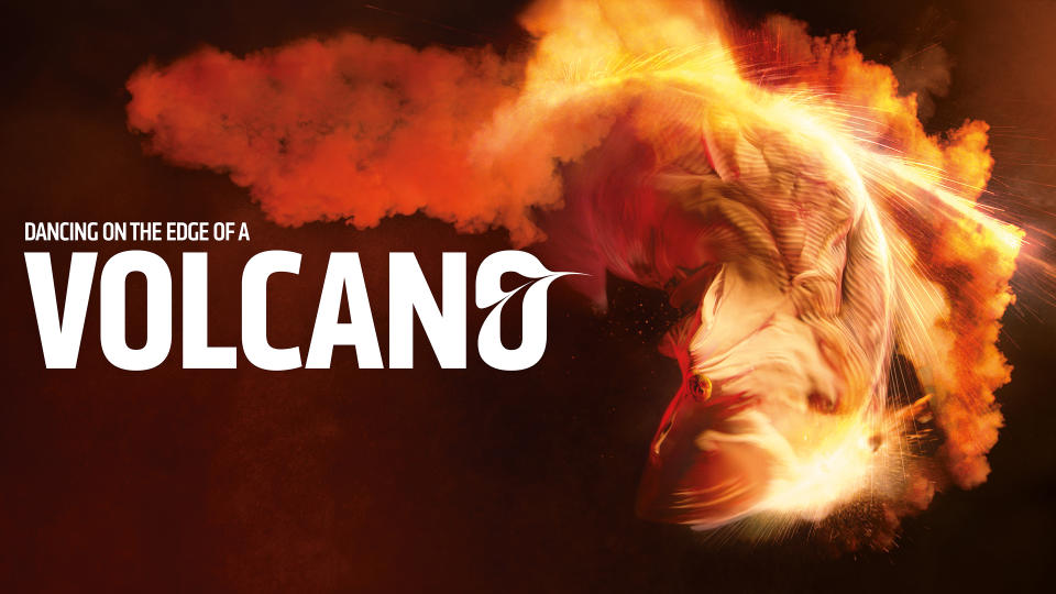
Winning Bronze in Culture for Found Studio and Superunion in 2020, this explosive, tension-fuelled film expresses the season's volcanic theme through pyrotechnics.
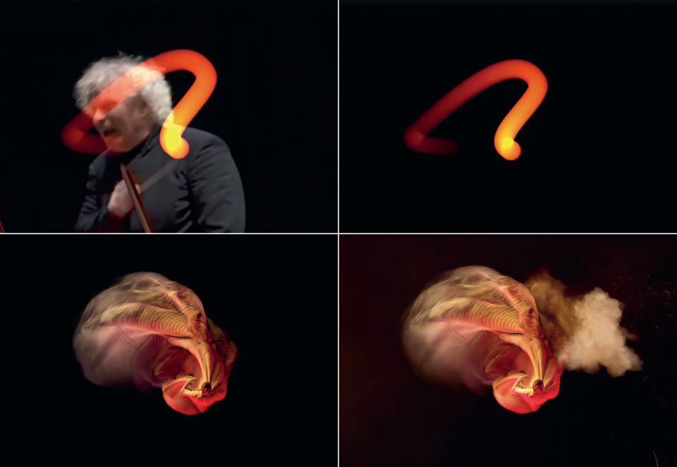
The Master Conductor
A double-winner with a Silver in Culture and a Bronze in Motion in 2022, Superunion's Master Conductor campaign is the swansong for Sir Simon Rattle at LSO. Here, his gestures become an expressive art-piece that builds intensity until it dramatically liquifies and collapses: the end of an era.
Mr Lyan
Client of the Decade: Shortlisted
1x Best of Show (2022), 1x Gold, 1x Silver, 1x Bronze (2019-2022)
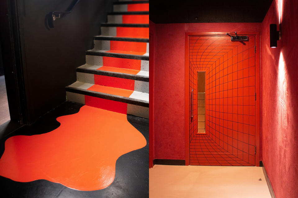
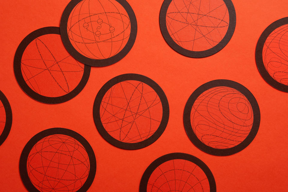
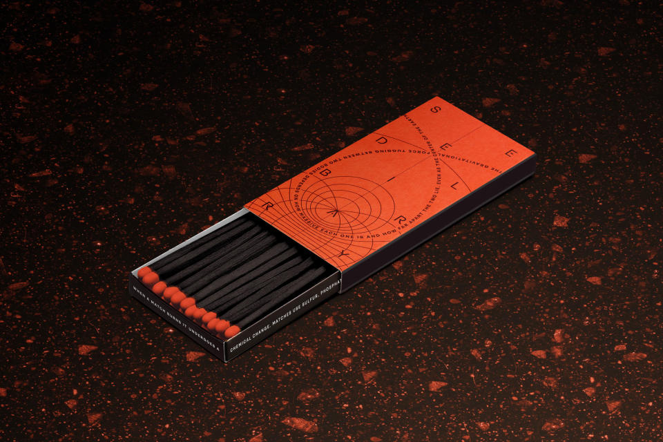
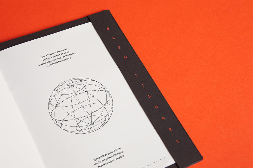
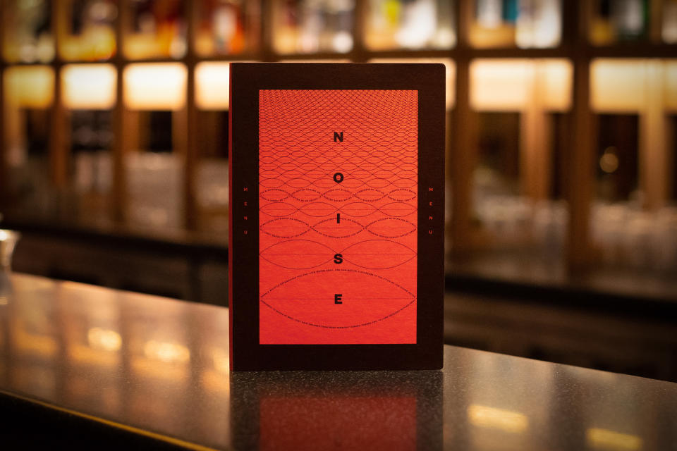
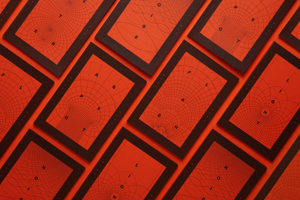
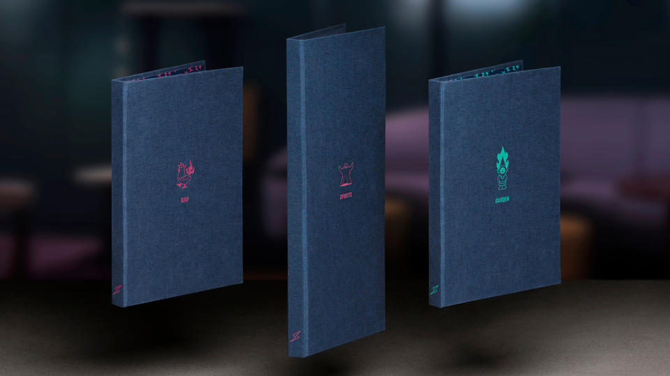
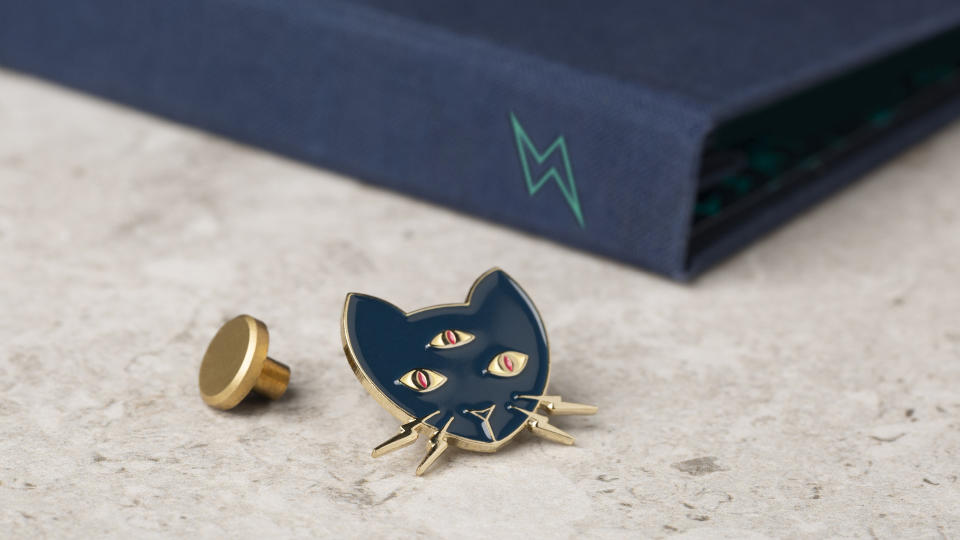
Our third shortlisted client is Mr Lyan, last year's Best of Show with Magpie Studio's striking brand identity for Seed Library – which also won a Gold Award in Bars & Restaurants.
Seed Library marked the latest in a series of award-winning collaborations between Magpie and renowned mixologist Ryan Chetiyawardana (aka Mr Lyan).
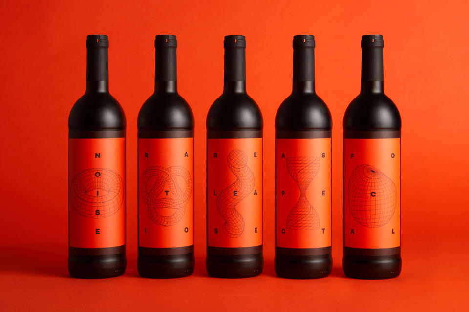
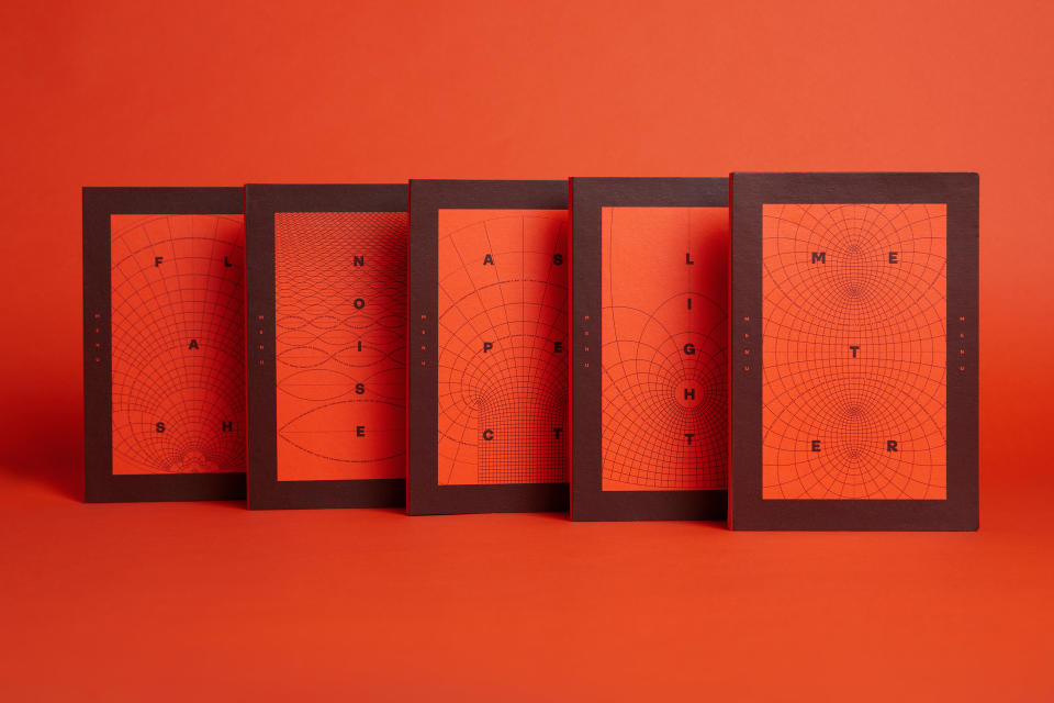
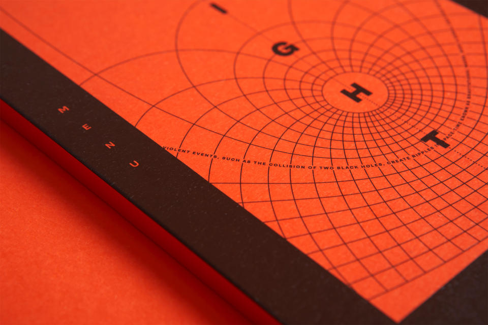
Inspired by vintage scientific and mathematical diagrams, Seed Library's identity features a strikingly fresh palette of black and bright orange. Excerpts from Einstein's writings on black holes adorn the interior – a nod both to Chetiyawardana's scientific background, and his team's weird and wonderful methods to discover alternative flavour sources.
Silver Lyan
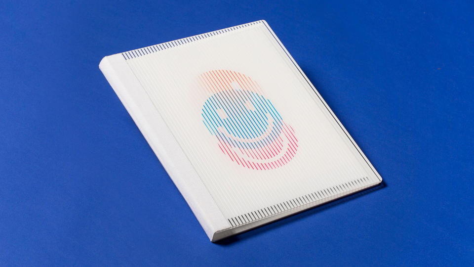
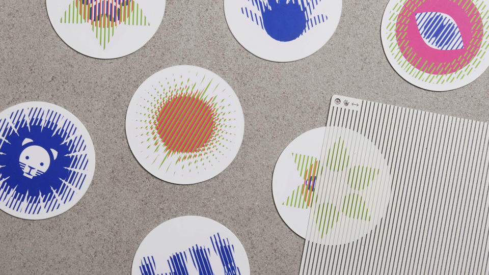
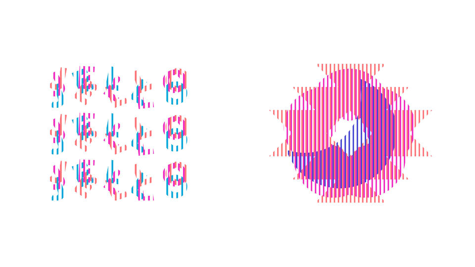
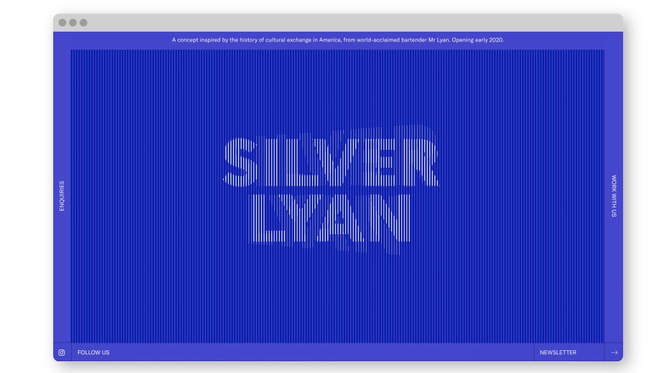
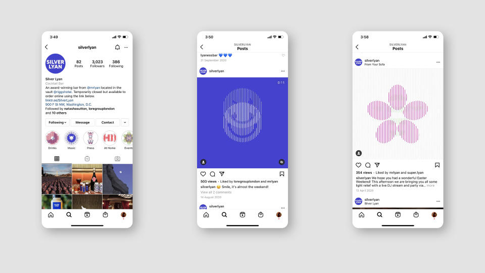
Magpie also picked up a Silver Award in 2021 for Silver Lyan, Mr Lyan's first Stateside bar. This beautifully crafted, playful identity expresses the ever-shifting culture and history of the US capital. Bold, graphic illustrations come to life through a classic 'scanimation' technique that helps tells the story of each drink.
Super Lyan
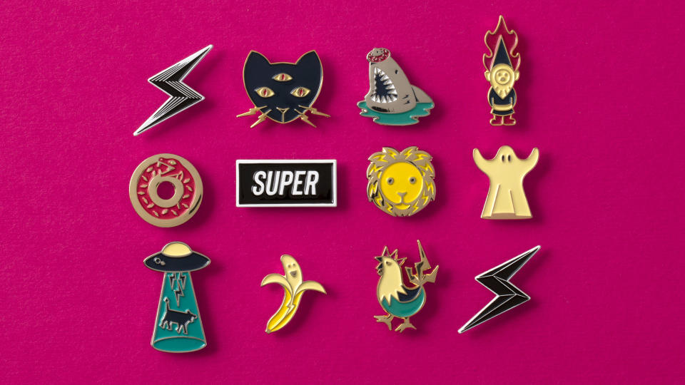
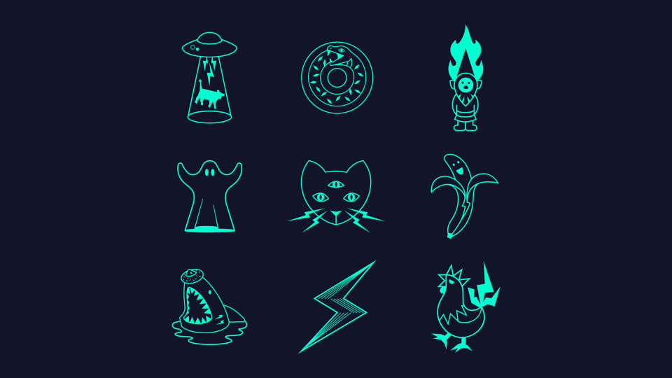
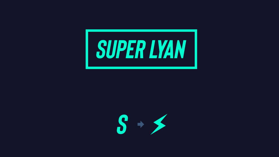
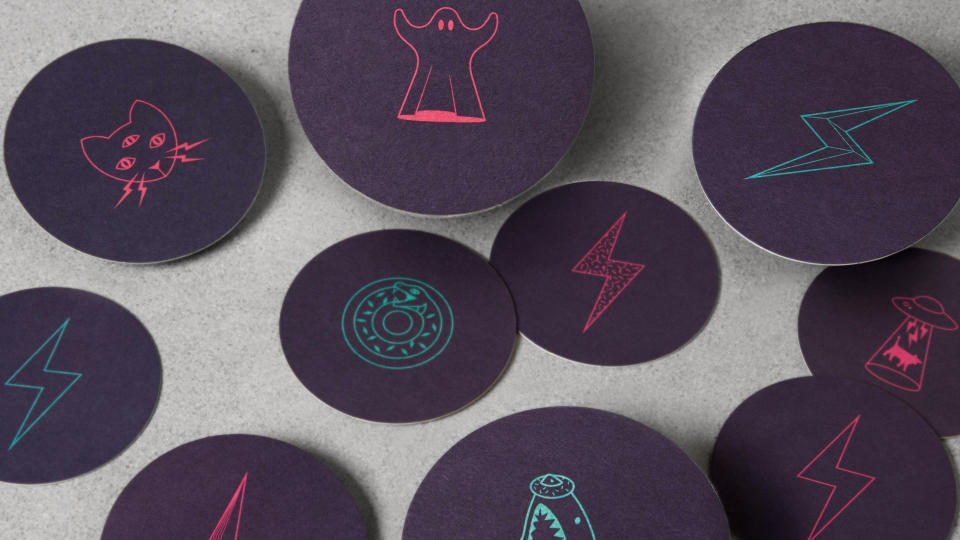
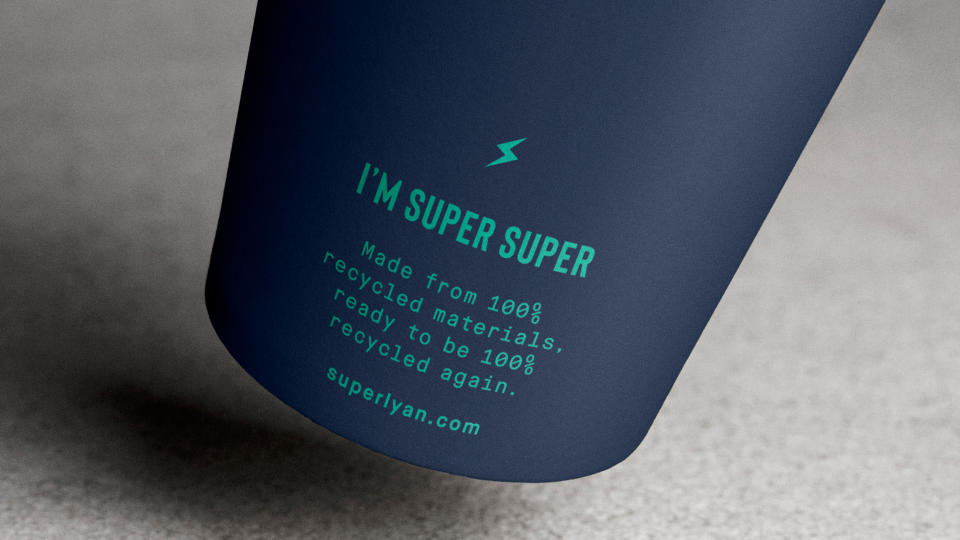
Another Mr Lyan venture, Super Lyan, was shortlisted in 2019. An accolade in itself given the BIAs' notoriously rigorous judging process, 'Shortlisted' would later evolve into our new 'Bronze Award' tier the following year – so we have counted it in Mr Lyan's overall tally as such.
For more about the BIAs, see this year's full Brand Impact Awards winners list or download the winners showcase. You may also like to read about our other special award, Small Studio of the Decade, or discover the top-performing 12 agencies over the last 10 years.

