How to Make Bold Paint Colors Work in Your Home
The 2023 Real Simple Home designers are throwing out neutrals and doing it oh so well.
CHRISTOPHER TESTANI
A lot of us have commitment issues when it comes to using color in our homes. The issue isn't so much about not liking color as it is about being unsure how to incorporate it or worrying about not liking it in the future. In fact, designer Megan Hopp, one of the designers for our 2023 Real Simple Home, says that she often has clients who say they really want to use color but are afraid, so they think starting with a neutral backdrop and incorporating smaller scale accent colors is the safer choice. But Hopp offers a different framework for thinking about this.
"Let's talk about whether or not you actually like the color white more than you like the color green," she says, as an example. "If white is your preference in color, OK, then that's valid. But if you love green, why do you think that having a green room is gonna be more upsetting or get boring?"
Hopp also notes that while starting with a neutral backdrop may seem like the safe choice, it can actually make it trickier to design the rest of your space. "I actually find it easier to start with a really dynamic color or pattern as kind of the core of the design or your inspiration," she says. "For me, when you're starting with a neutral, it's kind of like your first step is hardly a step at all. You know, you're not really making any sort of decision, and therefore, there's nothing to really build on."
As evidenced in our 2023 Real Simple Home, our designers weren't afraid to go bold with color, and they've successfully made the case for using vibrant paint colors throughout your home. So, we asked them for advice on choosing a bold color palette.
Tour the Real Simple Home Here
Reframe How You Think About Color
To get more comfortable using color in your home, you have to start by unlearning some of the misconceptions surrounding color. The main idea you should throw out is the line of thinking that says neutrals are more sophisticated than bold colors. "You can still create elevated spaces while using bold color," designer David Quarles IV says. "We are colorful human beings that experience a wide range of hues of emotion. With that, limiting our homes—unless it is indeed our style to keep our homes neutral—to a neutral color palette because others consider it chic is no way to live. Through intention, design, and beautiful application you can have the most colorful of spaces also feel like the most luxurious oasis."
Start With an Emotion
Quarles IV doesn't believe in starting with a neutral when designing your home. "Neutrals? I don’t know her," he says. Instead, the designer, whose design signature is a disco ball, likes to "create from a place of happiness," which, for him, almost always equates to color. "So, rather than start with a backdrop, I start with the emotion a person wants to feel in the space we’re creating," he says. "I draw that out by a series of questions, one main question being for them to share a song or create a playlist describing the feel of the room. Once that is done, I allow my experience with chromesthesia to do its thing. From the sound of music, I’m able to pull out colors, textures, and patterns, even, that embody the emotion(s) they want to experience in the space."
But you don't need to have these heightened senses to pick out colors for your home. Just think about how you want to feel in a space and what colors evoke that feeling for you.
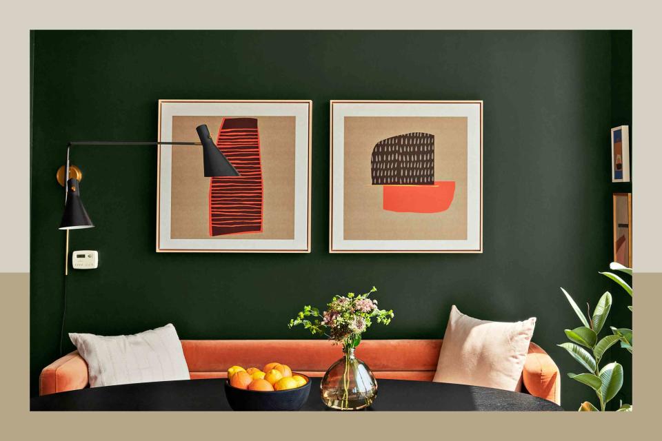
Build Around a Standout Piece
CHRISTOPHER TESTANI
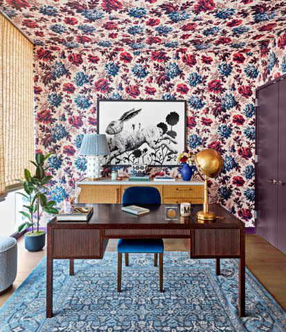
Designer Michelle Gage has her own alternative to starting with a neutral backdrop. "I like to start with the star and build the cast around that," she says. That guiding "star" could be a patterned wallpaper (like House of Hackney's Opia Magna shown above), a statement couch, or another item that can help determine the mood and the color scheme of the whole room. "If [the star] is incredibly bold, I’d balance it out with a more palatable table and perhaps pop color velvet chairs," she says. "Start with the most important and loud feature and strike a good balance by bringing it out in elements around it to keep it from looking like a circus."
Go for a Monochromatic Color Scheme
If you've been trepidatious about color in your home, you may not be ready to make the big jump into having several different colors in your space—and that's okay. Hopp says going for a monochromatic theme can be just as effective. "I am a huge, huge fan of monochromatic spaces where you kind of have flexibility to throw a bunch of different shades together that you know just all fall under the umbrella of, say, blue," Hopp says. "There's nothing more sort of chic to me than a cornflower blue wall with a navy trim." With a monochromatic color scheme, you can still play around with contrast between light and dark shades and make a big impact on your space—without having to worry about choosing other colors to go with it.
Related: 'Power Clashing' Is the Art of Successful Pattern Mixing—Here's How to Do It Right
Refer to the Color Wheel
You don't have to reinvent the (color) wheel when trying to pick out colors that will go together in your home, you can just refer to the primary, tertiary, and secondary colors that are already laid out for us. Quarles IV says he does this in his own work when choosing additional colors for a client project. "If we’re in need of any secondary colors, I’ll replay the [inspiration] song or playlist with the color wheel in hand to see to which colors I’m guided to while keeping in mind the overall goal of how the space should feel," he says.
Pick Your Two Mains
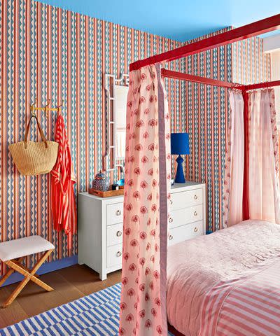
CHRISTOPHER TESTANI
Another option for decorating with bold colors is to pick not one but two main colors as your "lead characters," Hopp suggests. In her bedroom design in the Real Simple Home, she chose pink and blue as her leads, which is reflected in the trimwork and wall coverings. On top of that, she decorated with a bunch of other shades that are both in those color worlds, including a fire engine red on the bed frame, dusty rose pink on the bedding, and a cobalt blue lamp on the dresser.
"So that's the other tried-and-true strategy for people who maybe don't feel so confident [choosing colors]," she says. "Pick two that you really like together and then add in secondary shades within those two worlds."
Related: 9 Design Trends We’re Loving From the 2023 Real Simple Home
Go Bold in Small Spaces
One design misconception, Gage says, is the idea that you can't use bold paint colors or patterns in small spaces. "Small spaces are the perfect places to get bold and step outside of your comfort zone to create an impactful design," she says. "We love wrapping a powder room, or in this case, a home office, in a bold wallpaper pattern."
So, if you're thinking about going bigger and bolder with color in your home, let the above tips guide you—and know that you have the resounding approval of our Real Simple Home designers.
For more Real Simple news, make sure to sign up for our newsletter!
Read the original article on Real Simple.

