From bold to beautiful to bloody, here's what I think of current period product branding

Back in 2017, I wrote a piece about the problem with period product branding. At the time, there were quite a lot of problems to write about. Period products mostly didn't actually show any blood, or anything that looked like blood, and instead used blue liquid to show how absorbent they were.
A woman putting a sanitary towel into her pants had only just been broadcast in an ad for the first time, and familiar tropes about wearing white trousers, rollerskating and feeling ashamed of your period abounded.
But there were a few hopeful steps towards decent branding in this sphere. The likes of Thinx, LOLA and Fémme were changing things up with identities that were daring (Thinx), subtly tasteful (LOLA) and delicate (Fémme).
Since 2017, there's arguably been a revolution in period products overall. There has been a shift away from single use products, with more businesses than before touting period pants, reusable pads and menstrual cups. The conversation around periods is also now more open, aided in part by hashtags such as #periodtok as well as a younger generation who aren't scared to talk about their periods.
So, what does period product branding look like in 2024? Here's my analysis...
Always
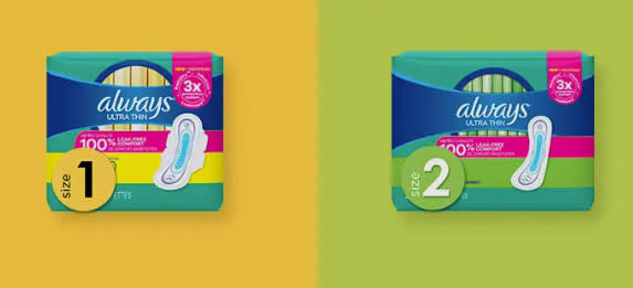
In 2019, Always removed the Venus symbol from its packaging, in an attempt to be more inclusive. The current Always packaging has a floral motif and comes in a range of colours. From a branding perspective, it's distinctly underwhelming.
In terms of adverts, Always has been focusing on its Discreet range of late (ie. products to capture urine not blood). The most notable period product ad from Always in recent years is about an ice skater. The premise being that she doesn't care that she's on her period, she can still wear tight leggings and spin around on the ice.
This is a small step up from past tropes of rollerskating in white trousers, but it still feeds into the idea that period product adverts have to involve women jumping around. What's wrong with a more realistic depiction of a menstruator lying on the sofa eating chocolate? These people need period products too.
Bodyform
Bodyform has been leading the way towards normalising periods, with several campaigns, including the current #bloodnormal campaign. Its website says: "Periods are a natural part of life, so why are they rarely given any screen time? Surely hiding something so normal only adds to the shame and embarrassment many women feel when it comes to their periods. Let’s be open about it."
The company has released a number of groundbreaking new ads over the past seven years, including the much-talked about campaign Viva la Vulva (above) and Womb Stories (above), which includes depictions of several stages of womanhood, from birth to miscarriage to menopause. The latter got a special mention in our Advert of the Decade award in 2022.
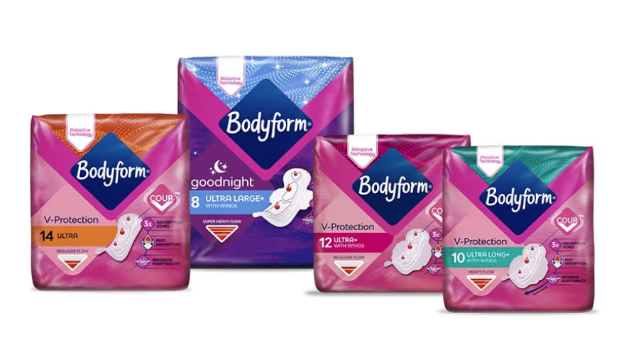
Bodyform is certainly doing a good job of branding itself through its campaigns, though its packaging isn't much to write home about.
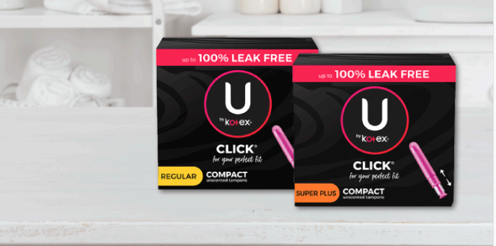
Kotex
Kotex's website leads with a banner that says 'Let's normalize periods together', which feels like a good start. The branding of its pads and tampons is quite sleek – with some black versions that I particularly like.
It has an advert that pokes fun at the different fragrances of period products, and encourages women to "smell like you", which sounds like a good thing to me as encouraging women to mask the smell of their period doesn't help towards normalising it.
&Sisters by Mooncup
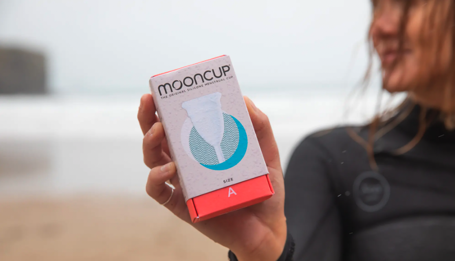
Mooncup has recently been bought out by &Sisters, creating &Sisters by Mooncup. Mooncup rebranded its menstrual cups a few years ago, leaning on a more neutral palette. Mooncup had previously channelled a slightly more 'hippy' vibe, and its current look is much more modern. It's unclear whether the merger with &Sisters will lead to future branding updates.
Grace & Green
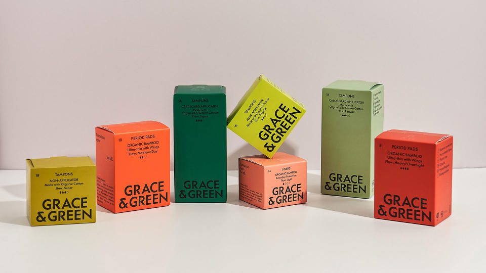
One way challenger brands are showing they are different to the more mainstream options is with beautiful, well-designed packaging. Grace & Green is one of many companies that focus on eco-friendly and ethical period care. The muted tones of its previous branding are typical for the sector but it is just about to launch new branding (sneak preview above), which has more vibrant shades of green and red. Its messaging focuses on period products for all, taking the focus away from overly feminine branding of the likes of Always, and also acknowledging that people of a range of ages and gender identities have periods.
I feel like Grace & Green's new look is at the forefront of the sector and can't wait to see more of it as it is rolled out more widely from April.
Other honourable mentions
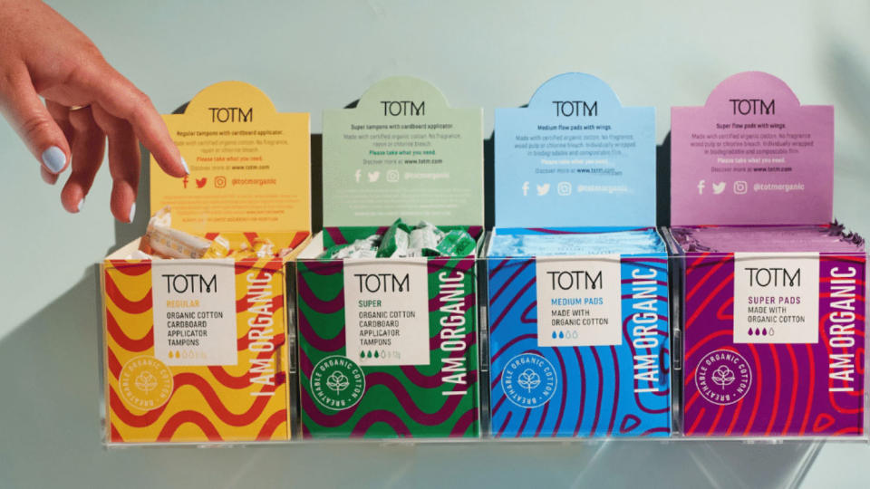
There are plenty of other challenger brands in this now almost oversaturated space. The likes of DAME have focused on organic, natural colours, while Yoni and TOTM have gone for a brighter look. Here We Flo has opted for a more 'fun' aesthetic.
What unites these brands is they are offering extras rather than just tampons, cups, pads or period pants. There are storage bags, boxes, room misters (yes, room misters), sweatshirts and more on offer. Their branding is key to their whole messaging and they are also leading the way in terms of openness and sharing beliefs that women can expect more from their period. In short, they're giving the more mainstream brands a run for their money.
Where are we in terms of period products in 2024?
Overall it feels like things have moved on since 2017. Red instead of blue liquid is being used in adverts and there are plenty of challenger brands disrupting the space. However, the big players such as Always are still relying on old tropes to create their adverts, although they seem to have finally moved on from white trousers and blue liquid. With so many smaller, eco-friendly brands now active in this space, it'll be interesting to see where the branding goes in the next five years.

