I had no idea Nintendo had so many logos
Nintendo might feel like a retro gaming brand, but you probably don't realise just how retro. While, it's always innovated and pushed new formats, from the Wii to... er... the Virtual Boy, Nintendo is most loved for the familiarity of characters like Mario and Zelda, who have been with us for decades.
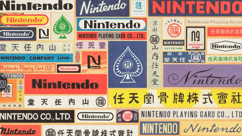
But the company goes back way further than Mario and even Donkey Kong, and its beginnings were far less technology-oriented. Nintendo began life making playing cards in the 1800s. And, as one aficionado has pointed out on Twitter, it's been through a huge number of logo designs during its journey (see our roundup of the best Nintendo Switch deals if you're after one of its latest consoles). See the incredible timeline created by Captain Hanafuda below.
We've written before on Creative Bloq about the original Nintendo logo, suggesting that the first design to use the Roman alphabet was on packs of playing cards made in the 1950s. But it turns out that there were even earlier designs, as Nintendo history buff Yamafuda notes in the Twitter post above.
The very first Nintendo logos from the 1800s used three Japanese kanji characters. Initially, Nintendo produced hanafuda cards, which replaced European cards when Japan banned foreign influences in the 17th century. But as early as 1902, it added European-style cards to its product line, with the company name written in the Roman alphabet.
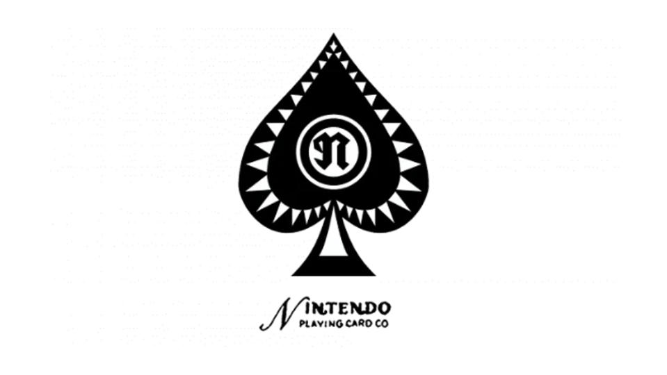
This first appearance of the word 'Nintendo' could hardly be described as a logo, and in subsequent years the company adopted western names, like Napoleon, for its European-style cards. But by the mid-1930s, we can see something that could be considered a real Nintendo logo – a gothic 'n' in the centre of the ace of spades.
It wasn't long before Nintendo began to display the desire to innovate that we know from the company today, and it began to develop its own card games. In the two decades that followed, it appears that dozens of Nintendo logos were used – Yamafuda notes that these are only a selection and that there were many more.
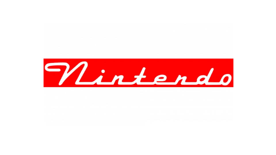
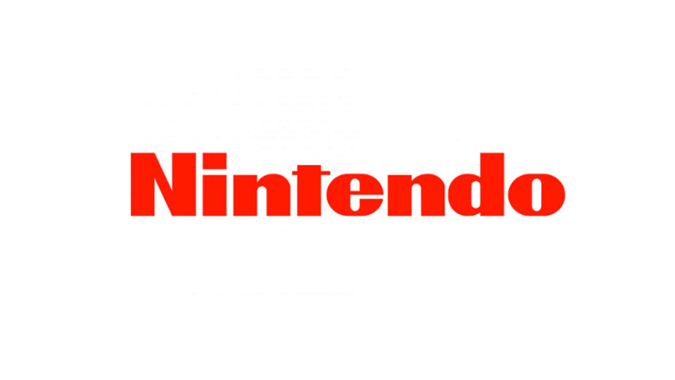
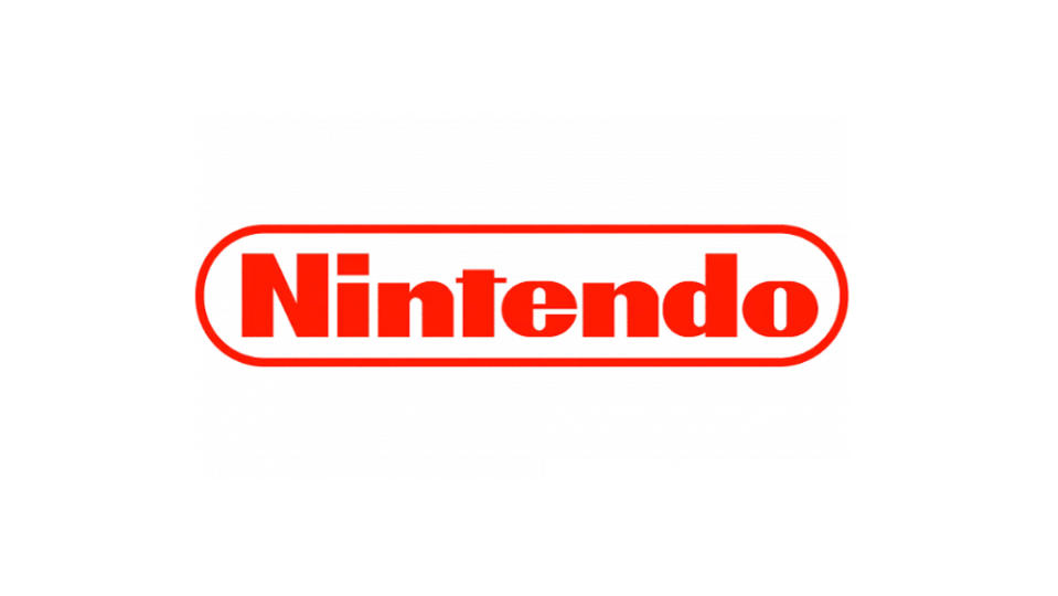
As early as 1968, we can start to see a resemblance to the Nintendo logo that we know, with the introduction of the red colour and Helvetica Black-like typography with the signature cropped 't'. But this was far from a final decision.
There was still a lot of experimentation with different designs and colours to come through the 1970s, a period that saw the company develop toys like the ball-firing Ultra Machine. The pill-shaped, or racetrack-shaped border that we see in the Nintendo logo today makes an appearance in 1972, and this would be the design the company settled on for the release of the Nintendo Entertainment System in 1983.
Nintendo continues to innovate – just recently we heard rumours that work is afoot on a Nintendo VR headset and we've been comparing the rumours around PS5 Pro vs Nintendo Switch 2. But the company has sensibly settled on a clear brand identity these days (bar that period in which it dropped the red for a more mature grey look for the Wii, but we'll forgive them for that).
The Nintendo wordmark is one of those logos that shouldn't work but does. It feels retro and cartoonish; not what you would associate with a tech brand. But this the brand behind Mario and games for all. It's about timeless family fun and the nostalgia is part of that.

