These are the best simple logos, as picked by the pros
With a few well-chosen lines, a talented designer can create an icon that lasts for decades, one that forms a powerful association in the mind of every person who sees it. An effective simple logo can make the viewer laugh with a visual pun, or communicate a powerful concept. Simple logo design is a brilliant example of something that looks easy to do, but isn’t.
Picking out the best, most effective simple logos is a daunting, some would say impossible task. So we did what any sensible publication would do – we delegated. We interviewed a cross section of designers, illustrators and creatives from around the world and across the industry, asking them to nominate what are, for their money, the most effective simple logos ever designed. We received a fascinating range of responses, with designers picking everything from small local restaurants to some of the biggest companies on the planet.
If this gets you inspired to do some logo design of your own, our guide to the best free logo maker is an excellent way to get started without spending a penny. And don’t forget to check out our list of the best logos for more iconic designs. But for now, read on to see the best simple logos…
01. Nintendo Gamecube

"My go-to design when asked for my favourite logo is Nintendo's Gamecube logo," says Chris Spooner, designer and founder of Spoon Graphics, a huge repository of design tutorials and resources.
"It's such a clever design that disguises the letters 'G' and 'C' into the negative space, while also depicting a 'cube'. It's all combined into a simple graphic that works in a flat, single colour, but really comes to life in full colour where the gradients generate a three-dimensional appearance, furthering the “cube” aspect of the brand name."
Indeed, we couldn’t agree more on this pick, having penned our own love letter to the GameCube logo back in 2020. It seems Nintendo’s knack for well-judged simplicity isn’t just confined to its consoles.
02. The Extinction Symbol (Extinction Rebellion)
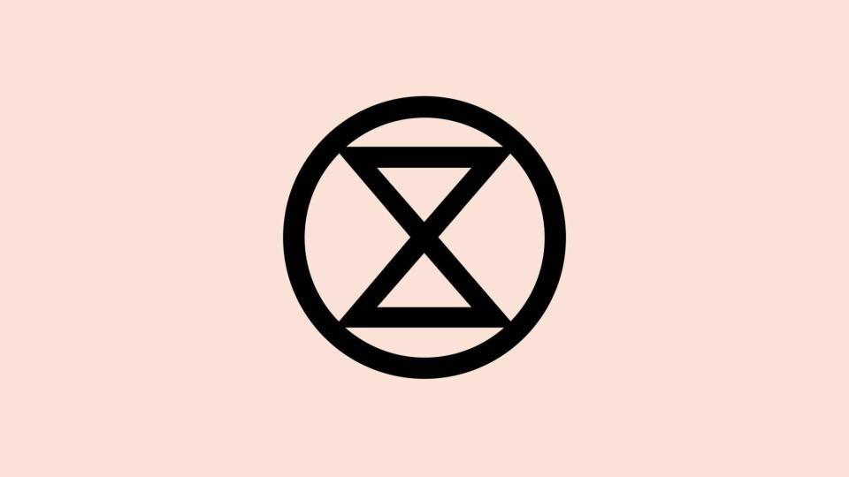
If a logo can make its point with an elegantly chosen image, it doesn’t need a single word. Two triangles placed point-to-point and encased in a circle – that's all that was needed to create the iconic hourglass of the Extinction Symbol, an anonymous piece of design that these days is perhaps most prominently associated with the campaign group Extinction Rebellion. For James Kirkup, founder of design company An Open Understanding, it was the perfect choice.
‘"We’re running out of time. Subconsciously, we all know it’s true. Extinction Rebellion’s mark achieves all the points designers look to achieve when creating a brand mark, but rarely can," Kirkup says.
"Clear in message. Memorable in form. Distinctly own-able. Readable by any. Without winning design accolades, the most important piece of graphic design in the past decade is hiding in plain sight, as much as the health of our planet."
03. Teenage Engineering
Teenage Engineering, a Swedish company, specialises in wireless audio and synthesisers. Perhaps its most famous product is the OP-1, a portable synthesiser, sampler and sequencer used by a multitude of artists, including Swedish House Mafia, Radiohead’s Thom Yorke, Deadmau5, Tame Impala and loads more.
Stefan Dziallas of iconwerk is an icon designer who has worked with some of the world’s biggest brands across multiple industries. He describes the Teenage Dream Logo as: "Playful, friendly, innovative."
"This is one of my favourite logos because it has the spirit of the '60s German design pioneers and it also resembles the simplicity of their industrial design."
04. Oculus VR
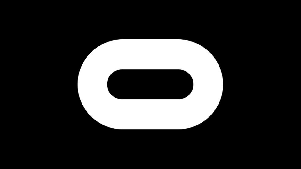
|The Oculus logo was a collaboration between Cory Schmitz, Mackey Saturday, Nicolaus Taylor, and Jon Malkemus," explains logo designer and author David Airey whose book Logo Design Love’ is a highly regarded guide to creating memorable brand identities.
Like a lot of good logos, this design for Oculus VR (who these days go by ‘Reality Labs’ following an acquisition by Meta) represents a marriage between lettering and product. "The wide 'o' works wonderfully as a stylised VR headset," says Airey.
05. Amazon
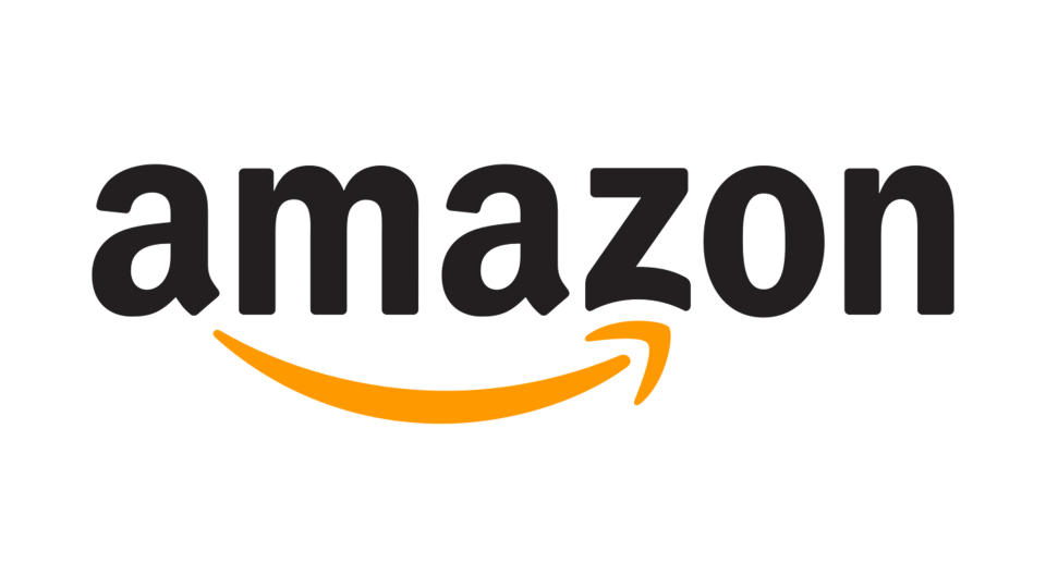
When we see something frequently, we tend to stop really looking at it. You’ve no doubt seen the Amazon logo many times, probably quite recently, but when was the last time you really paid close attention to it? For Jacob Cass, a brand consultant at Just Creative, Amazon’s logo is a classic example of brilliant design hiding in plain sight.
"The Amazon logo, designed by the agency Turner Duckworth, is a prime example of effective logo design because of its clever simplicity," Cass explains. "The logo features a meaningful symbol – a connecting arrow between the letters 'A' and 'Z', which serves as a visual representation of Amazon's mission to be the ultimate destination for everything from 'A' to 'Z', reflecting the vast range of products they offer."
"The bold, sans-serif font, Officina Sans Bold, enhances its modern and clean aesthetic and aligns with the brand's forward-thinking approach," says Cass.
And, as Cass points out, the arrow also forms a smile.
06. British Ceramics Biennial

The British Ceramics Biennial is a festival and year-long programme intended to celebrate all things about ceramics and their related artistic practices. The clever simplicity of its twisty-turny design left an impression on graphic designer and illustrator Alexandra Francis, whose previous client list includes Disney Pixar, Sony Playstation, BBC Sport and many other familiar names.
"The logo for the British Ceramics Biennial is lovely in its simplicity," says Francis. "The way the form replicates the movement, the sculptural nature of clay, and the letter ‘B’ is super effective."
07. New Bedford Whaling Museum
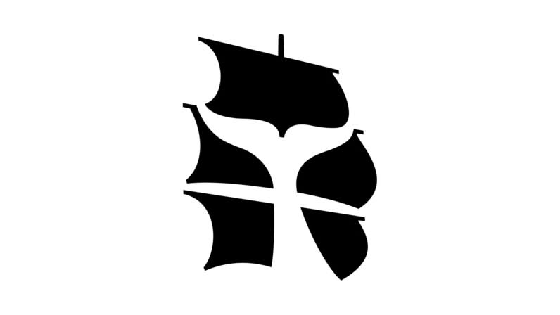
Located in New Bedford, Massachusetts, the New Bedford Whaling Museum was founded in 1903. Throughout the subsequent decades it would go on to amass one of the world’s most extensive and authoritative collections on all things to do with whaling, the industry that once powered much of the globe’s economy. However, it would take almost a century for this clever logo to see the light of day.
"In 2005 Malcolm Grear Designers came up with this intelligent use of negative space for the New Bedford Whaling Museum," says David Airey. "The logo reflects the idea of 'whaling in the age of sail'."
08. Bench
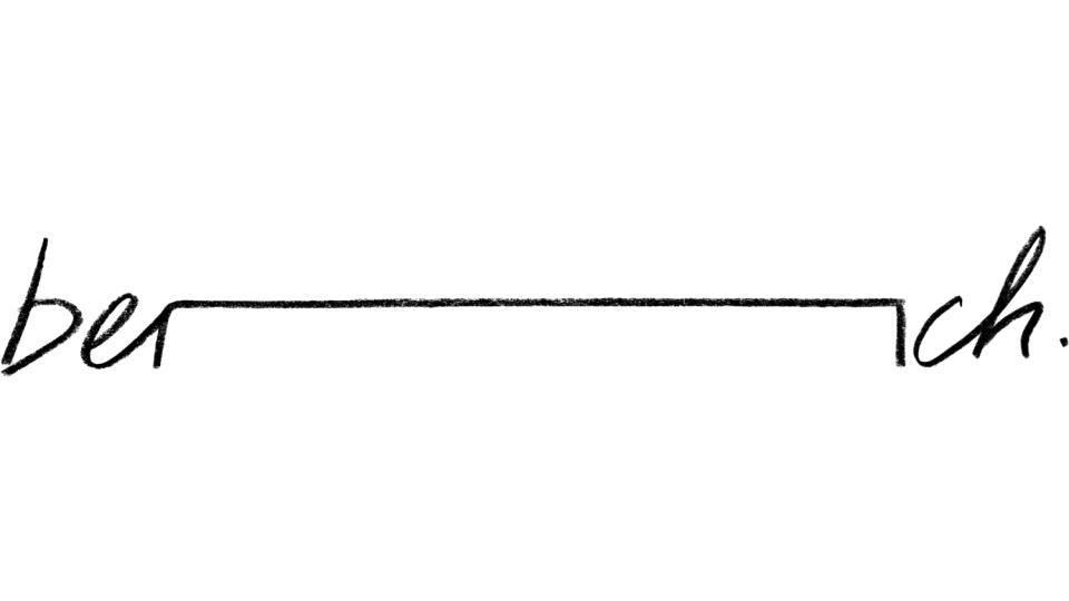
You’ve likely not come across this one before. "This is incredibly local to me," admits Kevin Kennedy Ryan, a British-American creative who designs for progressive organisations, trade unions and the food/beverage industry.
He has nominated the logo for Bench, a bistro-style eatery in his home town of Sheffield – but you don’t need to be a Sheffield native to appreciate the intelligence of this design. "The simplicity of the clever visual pun is so incredibly endearing – stylish, graceful and works delightfully well as a device deployed through menus and other collateral," Ryan says.
09. FedEx

Finally, we’re ending on a classic of simple logo design – and sometimes things become classic for a reason. "The FedEx logo, designed by Lindon Leader, is widely acclaimed as one of the most successful and iconic logos in the realm of branding, and it's also one of my personal favourites," says Jacob Cass.
"This logo incorporates a distinct combination of purple and orange colours, with the name typeset in (mostly) Futura Pro Bold. But what sets the FedEx logo apart is its ingenious use of negative space, which forms an arrow between the uppercase “E” and the lowercase 'x'. Once you see it, you'll never unsee it."
"This hidden arrow serves as a powerful symbol, representing speed, precision, and forward movement – qualities that resonate perfectly with FedEx's core values as a global logistics company."
See these other top examples of negative space, and if you want more logos, head to our pick of the best 1990s logos.

