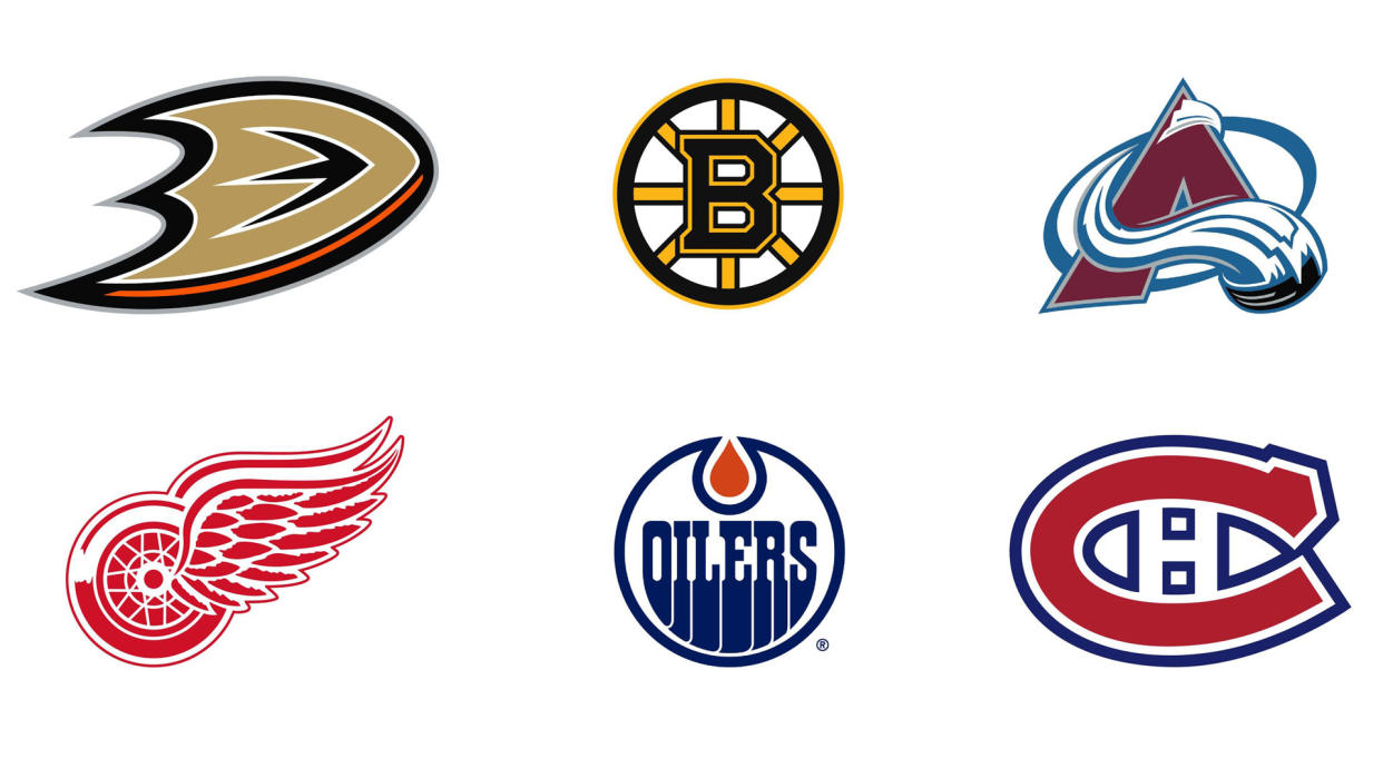
The best NHL logos
The best NHL logos can teach you a lot about design in general. In an era where everything seems to get redesigned every five minutes, these enduring emblems can teach us a lot about how to create designs that last a lifetime, and become dear to the hearts of countless fans.
The National Hockey League (NHL) is the world's premier professional ice hockey league. Founded in 1917, it currently boasts 32 teams from across the US and Canada, and some of the best sports logos around. More than just images, they are the visual embodiment of a team's history, culture and fanbase.
In this article, we'll explore some of the best NHL logos that grace the league today. If they inspire you to create your own designs, check out our roundup of the best logo designers.
One last thing: please note our list is in alphabetical order, and our selection is based purely on design merit, not on the significance or importance of the team. So don't come at us, hockey fans!
01. Anaheim Ducks
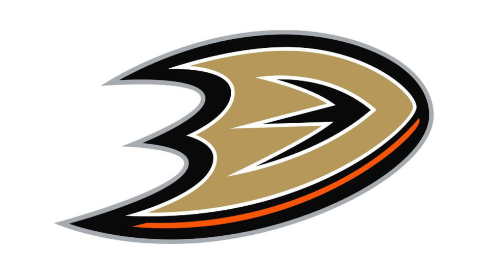
If you know nothing of hockey, your one point of reference may well be the Mighty Ducks children's movies of the 1990s and their various spin-offs. And so you may assume that the Anaheim Ducks, which are based in Anaheim, California, were the original inspiration for the name.
Actually, it's the other way round. The team was founded in 1993 by the Walt Disney Company as the Mighty Ducks of Anaheim, following the success of the first Mighty Ducks film in 1992. And their original logo was straight out of a Disney movie: a cartoon combo showing a duck-shaped hockey mask astride two cross hockey sticks.
The name was changed to Anaheim Ducks after Disney sold it to Broadcom Corporation co-founder Henry Samueli in 2005. And the previous logo changed to the current design, which is based around a stylised duck's foot within a swishy 'D'.
Fans have long been divided over this 2005 logo, with one Twitter poll rating it the worst in the league. So why have we included it here? Essentially because we think this logo has had a raw deal. It's actually a very smart design that evokes a real sense of dynamism and fast-moving action. It's just a shame that it comes in the wake of a logo that fans had become so loyal to.
As 'thehackshow612' puts it on Reddit: "It's not that I hate [the current logo], I just think that there was nothing wrong with the old one. I totally respect and understand why the Samuelis wanted to distance themselves, and this team from anything Disney. I like our current colour scheme, and that it pays tribute to the community and Orange County, rather than a movie."
02. Boston Bruins

The Boston Bruins have been around since 1924, making them the third-oldest active team in the NHL, and the oldest in the United States. The team's name was chosen by its founder Charles Adams, who wanted to identify his franchise with an untamed animal displaying speed, agility and cunning. So he opted for the old English term for brown bear, bruin.
Since 1948, the Bruins' logo has been an eight-spoked, black and gold wheel with the letter 'B' in the centre. Black and gold have been the team's colours since the 1935-6 season, and the spoked design is a nod to Boston's nickname of The Hub. (In 1858 author Oliver Wendell Holmes referred to the State House in Boston ironically as "the hub of the solar system." It was supposed to be a slight but it caught on, and eventually became a term of civic pride.)
The logo has been tweaked numerous times over the course of its history, reaching its current form in 2007. Black borders and a gold outer circle were added in 1995 and serifs on the 'B' were added in the most recent version. The team also have an alternate logo featuring a walking bear surrounded by the full team name.
03. Colorado Avalanche

Colorado Avalanche, aka the Avs, were originally founded in 1972 as the Quebec Nordiques. The franchise joined the NHL in 1979 as a result of the NHL–WHA merger, and following the 1994–95 season, they were sold to the COMSAT Entertainment Group and relocated to Denver.
The team have had the same primary logo during their entire existence in Denver, and it works brilliantly, wrapping a burgundy letter A with a stream of snow suggesting a stylised avalanche. In the background, a steel blue oval pulls everything together, and if you look closely, you'll see a hockey puck in the lower–right end of the snow. Continuing the mountain theme, the Avs also use an alternate logo based on the foot of a Yeti.
04. Detroit Red Wings
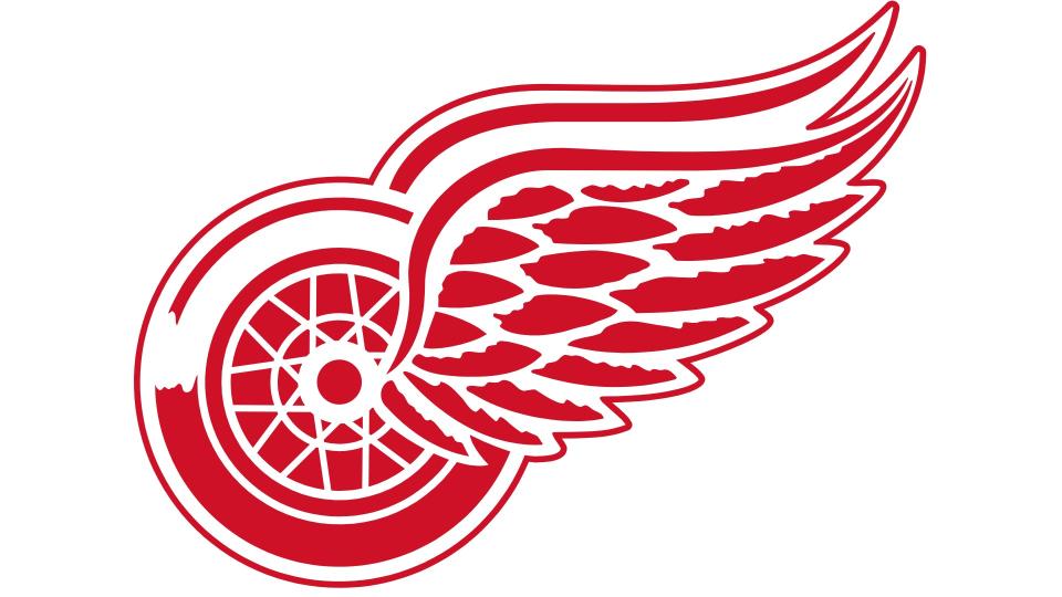
Thanks largely to Motown, people across the world know Detroit as 'Motor City', and so it's apt that the logo for the Detroit Red Wings reflects this.
The team was founded in 1926, and were actually known as the Detroit Cougars until 1930. For the next two seasons, the team was named the Detroit Falcons, before changing their name to the Red Wings in 1932. That was the year they sold to millionaire James Norris, who had played hockey for the Winged Wheelers, part of the Montreal Amateur Athletic Association.
It may be coincidence, but the new name and logo marked a turnaround in the team's fortunes, and it's only been slightly tweaked since, with the last big update applied in the 1948-9 season. Simple and effective, it not only pays homage to the Motor City's automotive legacy but it's a symbol of constant motion, speed and precision… qualities that any successful hockey team prizes.
05. Edmonton Oilers
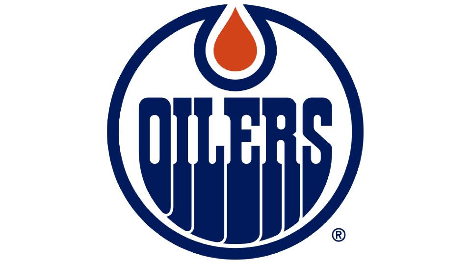
Based in Alberta, Canada, the Edmonton Oilers were founded in 1971, renamed Alberta Oilers in 1972-3, then reverted back to the following year. Luckily, the original logo just says 'Oilers' so with only minor tweaks, it's survived intact to this day.
This much-beloved design evokes the city's industrial history simply and beautifully with a drop of oil glistening at the centre. The oleaginous way the bottom of the letters seem to ooze to the bottom adds to the theme. And the stylised Seventies lettering, far from appearing dated, meshes well with recent retro typography trends, making it all strangely contemporary.
In short, this is one of a select few timeless logos we never want to see change, even if Canada's oil industry does eventually get replaced by more sustainable energy sources.
06. Montreal Canadiens
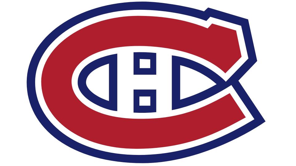
The Montreal Canadiens, officially 'Le Club de Hockey Canadien', are the longest continuously operating professional ice hockey team worldwide, and the only existing NHL club to predate the founding of the NHL. Founded in 1909, they also boast one of sport's oldest and most recognisable logos.
The classic 'C' and 'H' combo was first used in the 1917–18 season, before evolving to its current form in 1933; it's since had small tweaks in 1948, 1957 and 2000. The team is known colloquially as 'the habs' (short for 'habitants'), so many believe that's what the 'H' signifies, but in truth it simply stands for hockey.
Today, the logo is one of the most recognisable in North American sport, with a bold and eye-catching design and striking colour scheme. The latter is based on the team's three official colours, and they are all reflected in the logo: dark red in the 'C', blue for the contour lines and white in the negative space.
07. New York Rangers
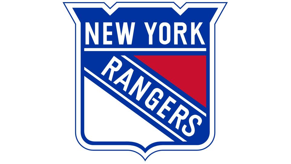
Founded in 1926, the New York Rangers were the first NHL franchise in the United States to win the trophy, and are still the fastest true expansion team in NHL history to do so. Their original owner was Tex Rickard in 1926, and the team was given its name by the New York press, which nicknamed it 'Tex's Rangers'. This was a play on the phrase of 'Texas Rangers'; a paramilitary force founded in the Lone Star State during the 1830s.
The team's shield anthem is iconic and while it's been updated a few times over the last 97 years, it's pretty much the same logo. The main tweaks have been a switch from a dark navy to today's lighter blue in 1999. Overall, the design is solid, enduring and brimming with confidence.
08. Pittsburgh Penguins
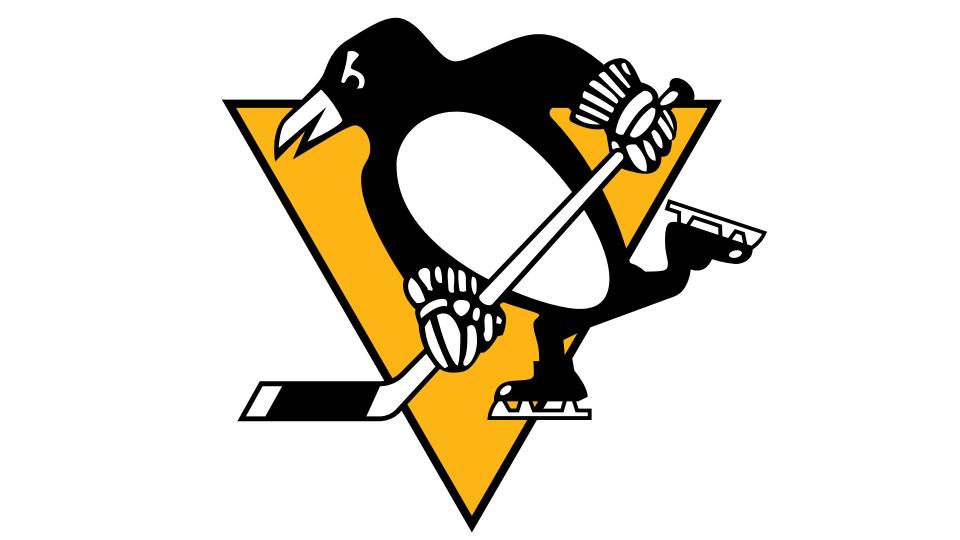
The Pittsburgh Penguins, known as the Pens, was established in 1967 and became one of the most titled teams in the NHL. From the start, their approach to branding has been an example of the K.I.S.S principle (keep it simple, stupid). And so rather than naming their team for a fearsome or intimidating animal, they went for one that actually does slide around on the ice. Added inspiration for the Penguins name also came from the way fans called the team's rink 'the igloo', due to its spherical top and white colour.
From the start the logo, too, has been literal: a fun design featuring a hockey stick-wielding penguin wearing gloves and skates, set against a yellow triangle. It's been updated a few times since, most recently in 2017. But the essential elements have remained throughout: namely a bright and energetic colour scheme, a sense of cartoonish whimsy, and a silhouette that's instantly recognisable, even at a distance.
For more on logos, see our logo history post, the NBA logo history and the Golden Knights vs the Panthers, clash of the logos.

