The best NCAAF logos: college football designs to get your blood pumping
In the dynamic world and ever-changing world of college football, team logos are more than just symbols. They are iconic representations of tradition, history, and the indomitable spirit that fuels the game.
As the battlegrounds echo with the cheers of fans and the clash of helmets, the visual identity of each team stands as a testament to its unique journey. Just like the best NBA logos and the best NHL logos, they get the crowd's blood pumping and help to provide a sense of team loyalty and collegiate togetherness.
In the article below, we've pulled together the best NCAAF logos from the modern era, and give some background and context to why they work so well. Note, though, that we're a design site, so our selection is purely based on how much we like the designs, and is nothing to do with the actual team's performance! For more graphic inspiration, also check out our guide to the best sports logos of all time.
01. Kansas Jayhawks
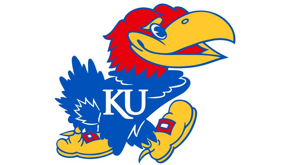
The Kansas Jayhawks represent the University of Kansas in Lawrence, Kansas. Founded in 1890, they play at David Booth Kansas Memorial Stadium, which opened in 1921 and is one of the oldest college football stadiums in the nation.
The name has a fascinating history. There isn't actually an animal called the Jayhawk: it's an imaginary bird believed to combine two actual species: the blue jay, known to rob other birds' nests, and the sparrow hawk, a stealthy hunter.
Accounts of its use date back to around 1848, when a party of pioneers known as the Jayhawkers of ’49 crossed into what is now Nebraska. The term later came to be associated with the abolitionists who settled Kansas. During the Civil War it became a term for guerrilla fighters, and eventually applied generally to residents of Kansas.
Its historical associations, however, have made it controversial. In 2011, the city of Osceola, Missouri produced a declaration condemning what the connection between the Jayhawk mascot and the historical Jayhawkers who burned the town in 1861.
The first Jayhawks logo was drawn in 1912 by Henry Malloy, a cartoonist for the University Daily Kansan. This early design featured some of the characteristics that are still in the present-day logo, including the blue body, grinning beak and big shoes for kicking opponents.
Several variations appeared over the ensuing years, all of which were quite aggressive looking. Following the Second War, however, the university decided to go for a more relaxed and happy emblem to suit the spirit of peacetime optimism. Designed by class-of-1947 student Hal Sandy, the new bird was far more fun and kindly-looking. It's been in place ever since then, with only a mild typeface change from sans-serif to serif in 2006.
02. USC Trojans
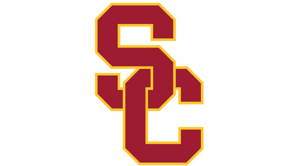
The USC Trojans represent University of Southern California. Founded in 1888, they're based at Los Angeles Memorial Coliseum, in the Exposition Park area of the city.
It's widely known that it was LA Times sports editor Owen Bird who chose the 'Trojans' nickname in 1912. What many people, miss, though, is that USC students didn't actually have a football team at the time! The name was originally picked for the rugby team, and it was only in the mid-1910s that football came back to the university.
SInce the late 1920s, the team's logo has been designed around an interlocking 'S' and 'C'. While the 1983 logo was similar to that of the Olympic rings, the 1993 logo (which has remained relatively unchanged since) depicts them bonded like links in a chain. It's a solid, confident and authoritative logo design that effortlessly conveys the team's values of perseverance, steadfastness and resilience.
03. Missouri Tigers
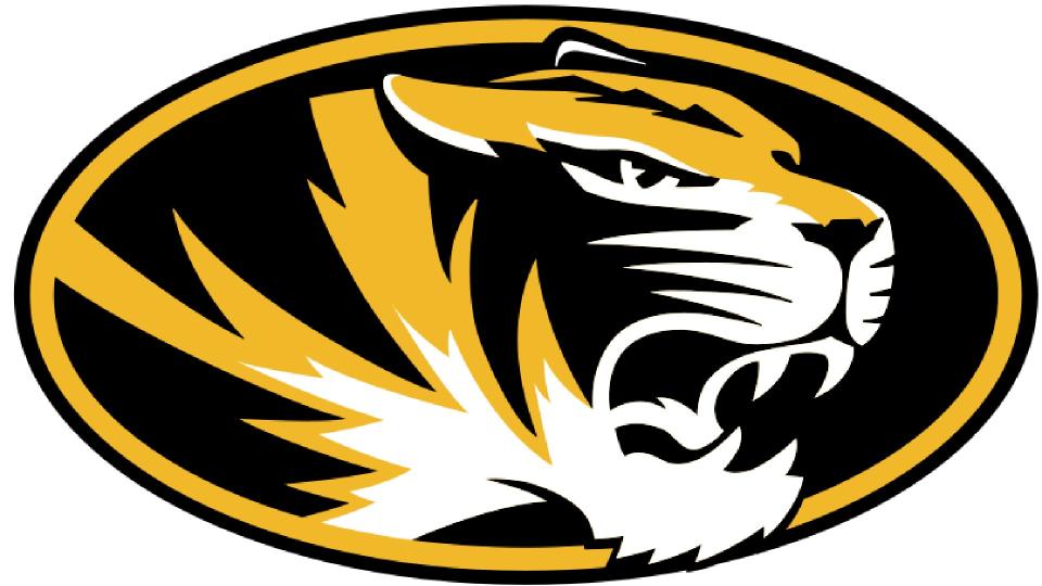
The Missouri Tigers represents the University of Missouri. The team was founded in 1890 and is based at Faurot Field ("The Zou") in Columbia, Missouri. Their name comes from a band of armed Union Home Guards called the Fighting Tigers of Columbia who, in 1864, protected Columbia from Confederate guerrillas during the American Civil War.
There's been a tiger in the team's logo since the beginning, although from 1995-99 it was just represented by a paw. The current logo was created in 2014, and had two quite minor updates in 2016 and 2018. It features no text, but that's not really a problem. Because the stylised yet majestic tiger image, along with the bold, black and gold colour scheme, conveys the identity of the team instantly and effectively.
04. Notre Dame Fighting Irish
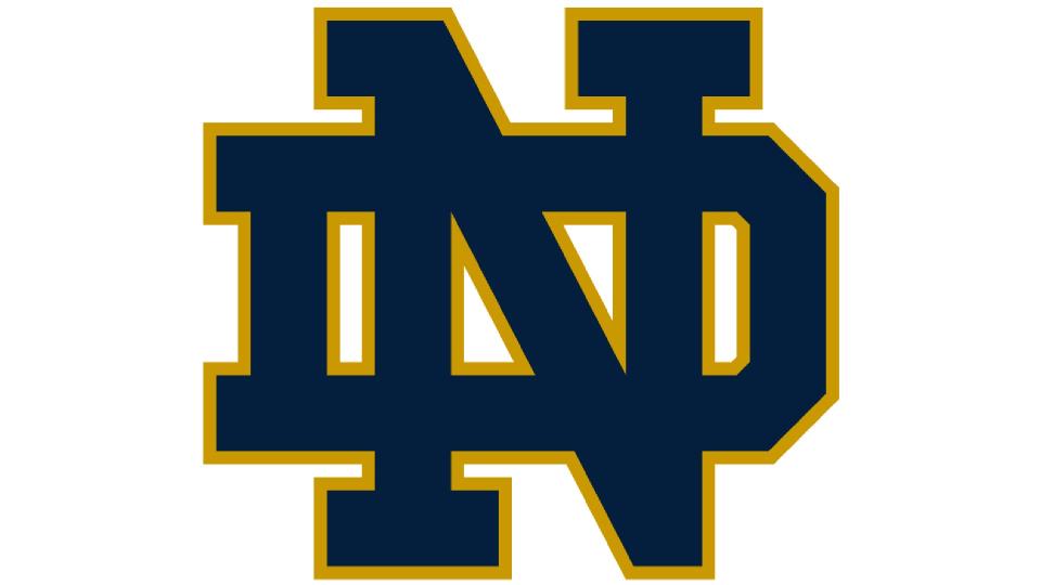
Notre Dame Fighting Irish represents the University of Notre Dame in Indiana, north of the city of South Bend, and are based at Notre Dame Stadium. The team was founded in 1887, and the institution was founded by Catholics, so its Irish associations are clear. However, the origins of its 'Fighting' nickname are more muddied, with several competing stories claiming to explain them.
In one version, the name arose in 1890 during a game against Northwestern, whose fans started chanting 'Kill the fighting Irish! Kill the fighting Irish!'. Another tale comes from a game in 1909 in one Notre Dame player yelled to his flagging teammates: “What’s the matter with you guys? You’re all Irish and you’re not fighting worth a lick.”
The university's own website, meanwhile, suggests that it originated following a visit from Éamon de Valera, an Irish republican who had participated in the 1916 Easter Rising and later became the country's president.
Either way, the logo conveys their fighting spirit effortlessly. The original version was crafted by Theodore Wojcik, who's also known for creating General Motors' Pontiac GTO logo, in 1964. Bringing together the N and D of Notre Dame in an unusual way, the design was based on the concept of a medieval coat of arms, and it instantly conveys a sense of militaristic might. Wojcik's design has had a couple of colour changes over the years, as well as being streamlined for digital use, but remains essentially unchanged beyond these minor tweaks.
05. Ohio State Buckeyes football
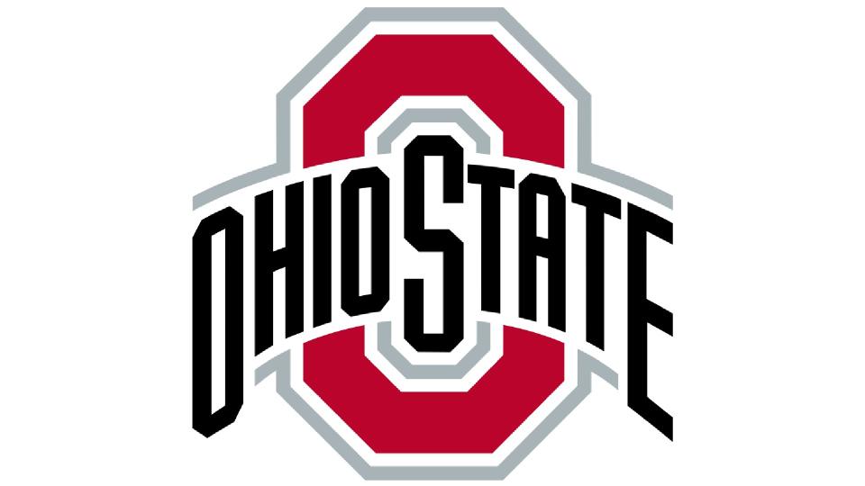
The Ohio State Buckeyes represent Ohio State University. Founded in 1890, they've played their home games at Ohio Stadium in Columbus, Ohio since 1922.
They've had the official nickname of Buckeyes since 1950, and the reason is pretty straightforward: Ohio is known as the Buckeye state. In fact, people living there were being referred to as Buckeyes as far back as 1788, 15 years before the state was even founded.
So what actually is a Buckeye? It's a small, shiny, dark brown nut with a light tan patch that comes from the Buckeye tree, which is not unexpectedly the official state tree of Ohio. According to local folklore it resembles the eye of a deer and carrying one give you good luck.
Ohio State's original logo (1965-1970) featured an image of a buckeye tree with OSU written across it. This was then replaced by two intertwined 'O's forming an oval shape surrounding 'The' above 'Ohio State'. Then in 1995 it changed again to feature a single O surrounded by stars and stripes, commemorating OSU's 150th anniversary.
The current logo was created in 2013. Cast in the university's scarlet and gray colors, it's based around what's known as 'the Block O': a capital 'O' with diamond-cut corners. This central emblem bissected with the name 'Ohio State' in black lettering reminsent of an old English font style. Overall, the design benefits from its uniqueness, sense of forward motion and dynamism, along with readability and a timeless, classic look.
06. Army Black Knights

The Army Black Knights football team represents the United States Military Academy in New York, aka West Point, in college football. Founded in 1890, the team play their home games in Michie Stadium with a capacity of 38,000.
For many years, the team was known as the Cadets. In the 1940s, several papers dubbed it 'the Black Knights of the Hudson', due to the colour of their uniforms. From then on, 'Cadets' and 'Black Knights' were used interchangeably until 1999, when the team was officially nicknamed the Black Knights.
If you weren't aware of the team's military connections, the logo makes it instantly clear. It pays homage to the Academy by combining a beige ancient Greek helmet, sword and star, on top of a black shield. The design as a whole is clean, confident, balanced and authoritative. The team's fifth logo since 1946, it was created in 2015 and was much more minimalistic than its predecessors, making it work better at small sizes and on digital devices.
07. Clemson Tigers
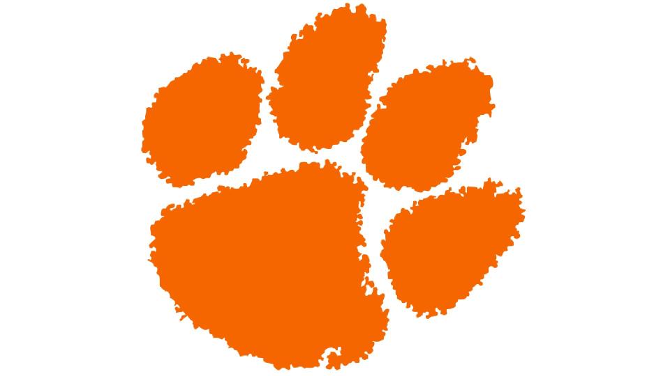
The Clemson Tigers represent Clemson University in South Carolina. Formed in 1896, the team play their home games in Memorial Stadium on the university's campus, which is one of the largest stadiums in college football.
Clemson's athletic teams have been nicknamed the Tigers since 1896, when coach (and later university president) Walter Merritt Riggs brought the name from his alma mater, Auburn University. They didn't get a tiger mascot, however, until 1954. Before that, their mascot was a Southern Gentleman; a student dressed in a formal suit with top hat and cane.
Early logos for the team, from 1926 onwards, all depicted full tigers. The switch to a tiger's paw came about in 1970, when Clemson President Robert C. Edwards hired Henderson Advertising Company of Greenville, S.C. to upgrade the image of the university. Its design was based on a plaster of paris cast of a real tiger’s pawprint, supplied by The Museum of Natural History in Chicago. The imprint was converted to a print, and tilted about ten degrees to the right, in a custom brand colour called Crimson Orange (#F56600).
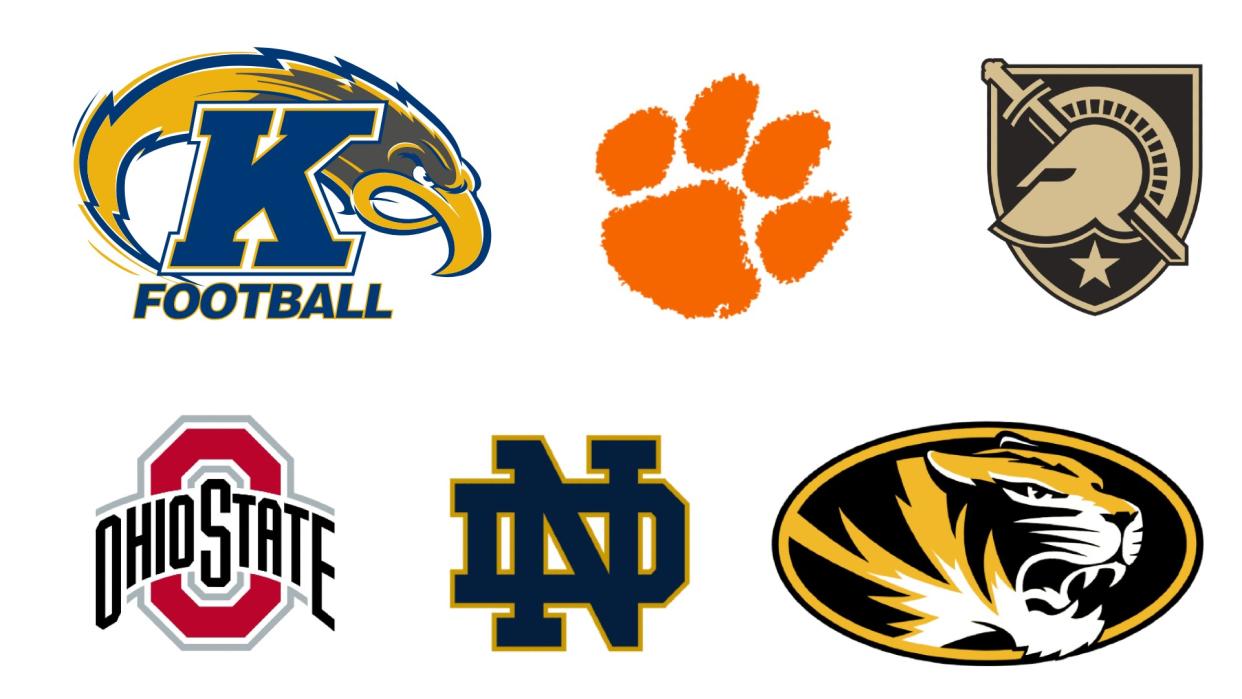
08. Kent State Golden Flashes
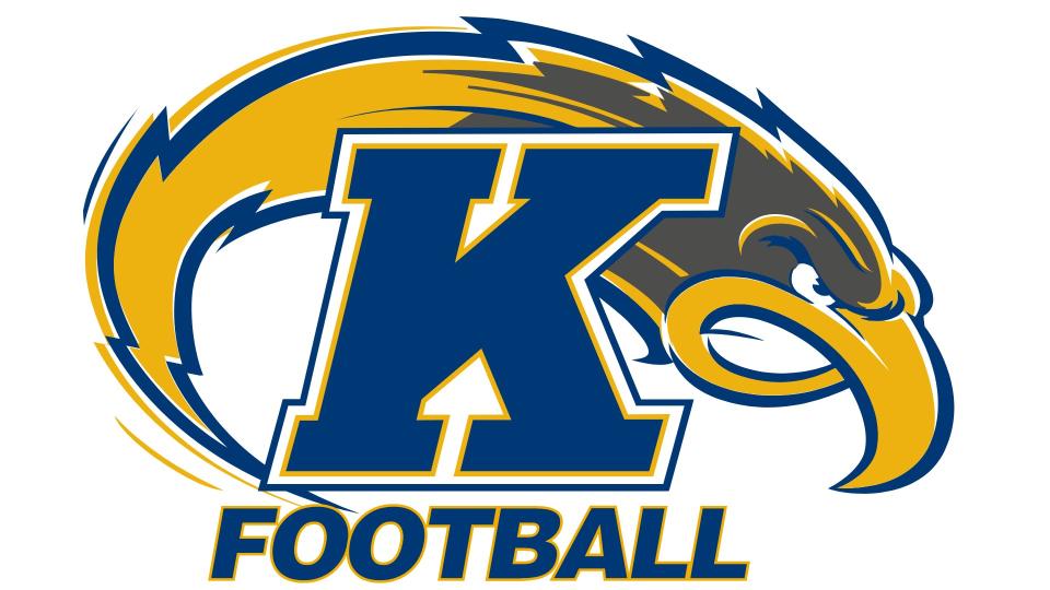
The Kent State Golden Flashes represent Kent State University in Kent, Ohio. Founded in 1920, they're based at Dix Stadium in the far eastern end of the KSU campus along Summit Street.
The program been referred to as the Golden Flashes since the late 1920s – with Flash the Golden Eagle as Kent State’s mascot since 1985. They were originally known as the Kent State Silver Foxes from 1923 to 1926, a name came from the silver fox ranch co-owned by the university's president. Once he departed, the new president held a competition to find a new nickname for the program where Golden Flashes won out.
The logo is one of the most dynamic and fearsome looking in college football today. Designed in 2001 and slightly updated in 2017, it masterfully combines a stylised depiction of the team mascot with a lightning bolt graphic. Overall, this dynamic design delivers maximum punch and impact, helping supporters work themselves up to fever pitch on game day.
For more on logos, see our logo histories posts.

