The best movie logos
- Oops!Something went wrong.Please try again later.
Hollywood is all about mythmaking, and that makes the designed matter that accompanies a movie as important as the trailer, the buzz and the post-weekend chatter about box office.
We're not necessarily looking at the best logos to do with cinema in this story – with decades of iconic names in poster, logo and title treatment design that'd be too long a list. Instead, the best movie logos are the ones that capture and convey something about the movie, something that tells its own story elegantly and quickly, although they may not be up there with the best logos of all time.
To find the best ones we went to designers – some of whom have worked in movie logos themselves – and asked which ones they like and why they work. Below are their picks, in no particular order. If you're into movie-making and want to have a go at creating your own, see our how to design a logo post.
01. Star Wars
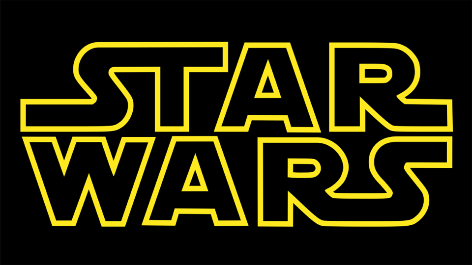
As Mark Braddock, co-founder and creative director of Australia's Block Branding says, a logo associated with a film is a modern concept from the age of movie merchandising.
"Star Wars sparked the notion of films morphing into brands, their titles evolving into bona fide logos," he says. "The studios grasped the potential of crafting brands that peddled more than just tickets."
Designed by fine artist Suzy Rice based on previous work by famed Star Wars concept designer Ralph McQuarrie and typographer Dan Perri, the classic Star Wars logo we know homaged 1930 German fascist propaganda (as George Lucas told Rice he wanted).
As you'd expect, it's so famous by now both the credit and its influences have become a bone of contention among rabid fans, some of whom harassed Rice about it so much she posted on her blog in 2011 that she wouldn't be addressing it any more.
02. Ghostbusters
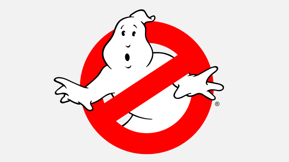
Braddock calls the Ghostbusters logo a classic example, pulling double duty for the in-movie business and fusing seamlessly with merch. "It was a masterclass in purposeful cohesion. It wasn't just about worshipping movie characters, you aspired to be a Ghostbuster rather than just a distant admirer," he says.
03. Alien
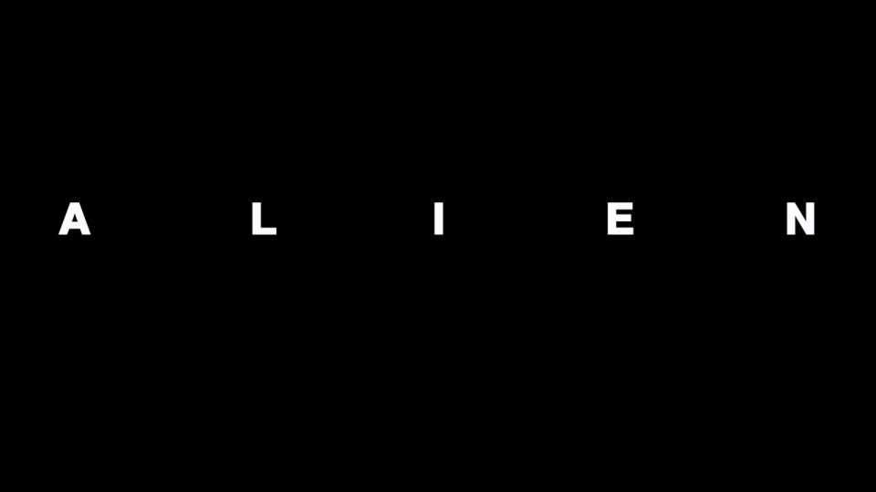
All that said, Braddock's favourite movie logo might not even be a logo as such, but he explains. "The title/poster for Ridley Scott's Alien is sheer brilliance. Scott came from commercials, maybe that's why the marketing felt more like a brand unveiling than a movie launch.
"The typography was understated with its chilly spacing and accentuated isolation. The title sequence of fractured letterforms methodically forming against the cosmic expanse is a metaphor for the film's themes."
04. Vamp
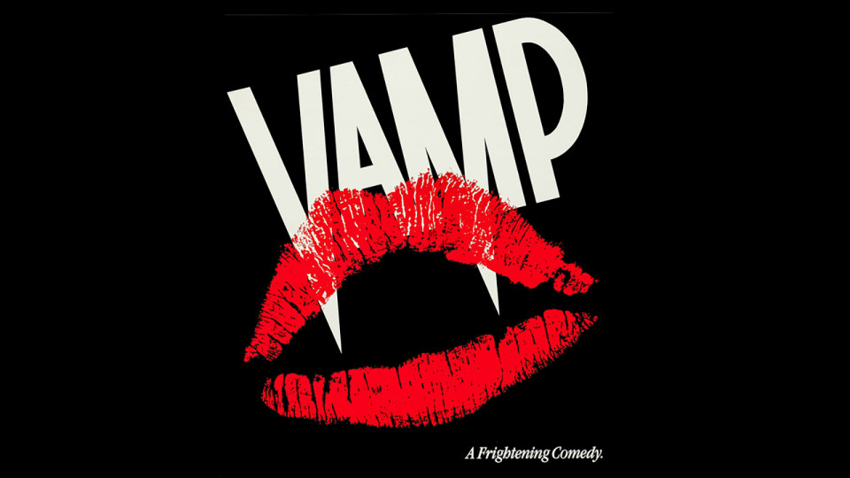
Andrew Bannister is a UK designer and illustrator who's worked across entertainment design fields, and his first pick is 1986 Grace Jones vampire vehicle, Vamp (designer unknown).
"The type is crafted so well," Bannister says, "emphasising the points in the letters so they form the vampire fangs. Then the strong red lipstick mark works like a stamp over the top. It immediately communicates what you're getting – a fun, trashy horror comedy film."
05. Bridge on the River Kwai
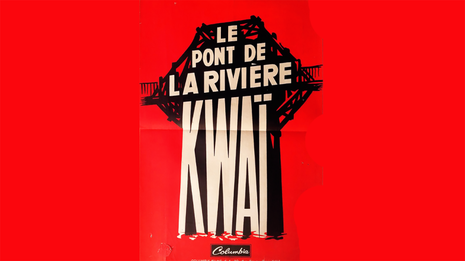
Bannister's next choice is region specific. While most design materials for David Lean's Bridge on the River Kwai (1957) followed the organic, rough hewn, almost comic book aesthetic trends of the day, Bannister thinks designer George Kerfyser's French version, which makes a logo out of the title, plays effectively with a sense of scale.
"The word 'Kwai' feels like a strong, robust structure. The image communicates a sense of foreboding about the huge task ahead building and trying to destroy the bridge.
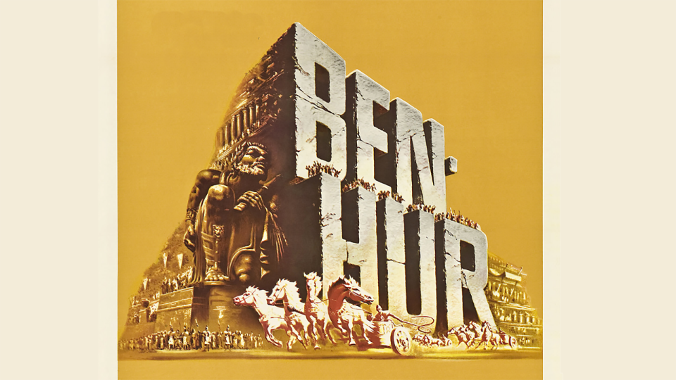
"I love the way 'Kwai' is immersed in the water and the simplicity of colours. Simple paint strokes and bold typography expresses a narrative without the need for any images from the film. Two years later the Ben Hur poster did the same thing by turning the title into a stone architectural feature from the Circus Maximus."
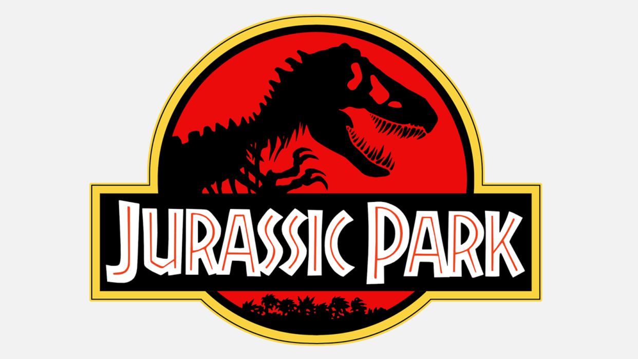
06. Westworld
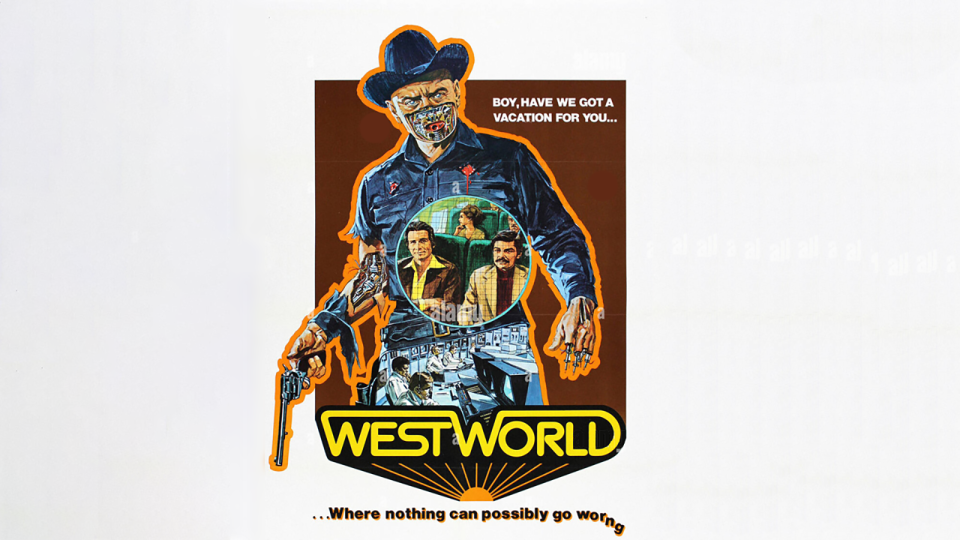
Somewhat predicting the double duty aesthetic of Ghostbusters and Jurassic Park, Bannister also likes Neal Adams' poster for Westworld (1973).
"Westworld has its own vivid key art but the title is treated like it was the identity for the theme park entrance itself – used again in Jurassic Park, which was also written by Michael Crichton.
"It give us the sense we're about to experience a new kind of utopian vision that's almost too perfect, then the tagline below tells us it's not quite what it seems on the surface."
07. Naked Lunch
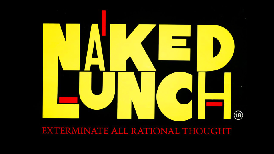
Bannister is also taken by the title treatment for the UK release of William S Burroughs adaptation Naked Lunch, which used designer Randall Balsmeyer's title design.
"It feels like the world of animation experiments by filmmakers like Norman McLaren in the 40s or 50s," Bannister says. "It reflects the subject matter well – a modern interpretation of a classic novel – and contains visual cues hinting at drug use, hallucinatory states and the original non-linear structure of the novel."
08. Blockers
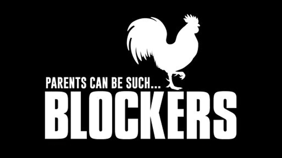
Tomasz Opasinksi, a Polish multi-hyphenate artist who's worked on plenty of entertainment art, likes the title treatment for raunchy 2018 comedy Blockers.
"[It's] a masterful blend of simplicity and boldness," Opasinski says. "It instantly resonates with the target audience while maintaining an air of intrigue for those who might not initially be drawn to it. Straightforward typography and clever iconography creates a visually striking, enigmatic experience. It works on multiple levels, making it a memorable and effective representation of the movie."
09. Grand Piano
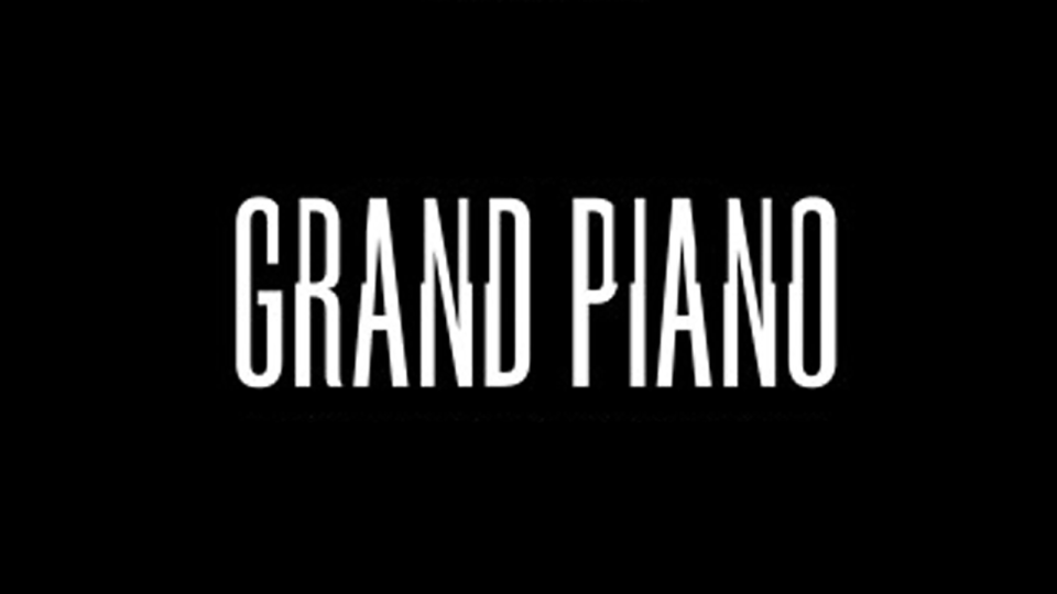
Opasinski also calls Spanish language title treatment of 2013 thriller Grand Piano a stroke of genius.
"The integration of piano keys in the typography goes beyond mere aesthetics," he says. "It becomes a 'second read' that enriches the design. Whether in isolation or in the poster it's a strong, independent visual element that captures the essence of the film and enhances your understanding of the story, complementing and elevating the movie's identity."
10. The Rum Diary
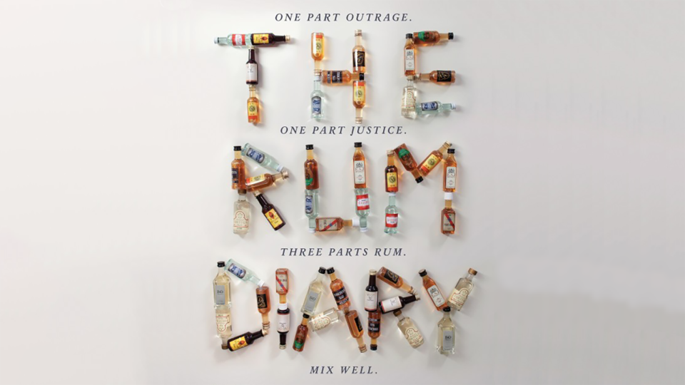
The Johnny Depp-starring adaptation of Hunter S Thompson's semi-autobiographical novel The Rum Diary (2011) didn't really work as a movie, but that didn't stop the title treatment on the first poster release becoming something Opasinski thinks transcends being a mere title.
"It's designed for grand-scale viewing, commanding the entire canvas with its presence and delivering the essence of the story to the audience with incredible impact," he says. "The artful blend of typography becomes a work of art that draws viewers into the narrative."
For more on logos, see our best logos of the 60s, 70s, 80s and 90s posts, as well as our piece on the history of logos.

