The best MLB logos – 8 iconic designs from the world of professional baseball

The best MLB logos hold a special place in the hearts of baseball fans, and for good reason. These logos are not just marketing assets; they are visual representations of tradition, history and the spirit of the game. As such, they have the power to instantly evoke a sense of nostalgia, passion and pride.
This article delves into the world of MLB logos, exploring the best and most iconic designs from some of the league's most storied franchises. From the historic and timeless Red Sox logo to the sleek and minimal Blue Jays emblem, these are some of the best sports logos of all time, encapsulating the essence of each team, their cities and their rich baseball traditions. (Note that good design does not always correlate with baseball success, as this year's World Series champions – the Rangers – haven't made the cut.)
So join us on a visual journey through the world of Major League Baseball's most cherished symbols, in alphabetical order. And if they inspire you to craft your own logos, don't miss our guide to the best logo designer software too.
01. Boston Red Sox
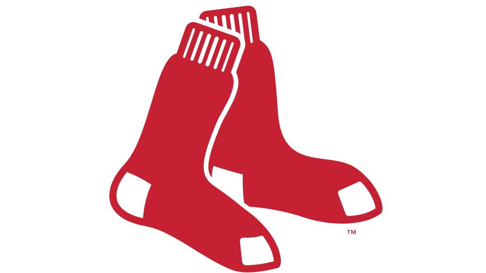
Founded in 1901 as one of the American League's eight charter franchises, Boston's finest have been based at Fenway Park since 1912. They were intially a dominant team, winning five championships by 1918. But after selling star player Babe Ruth to their rival New York Yankees, they went into one of the biggest championship droughts in sports history, dubbed the 'Curse of the Bambino', an era which only ended in 2004.
For their first seven years of existence, they were known as the Boston Americans. The Red Sox name was chosen by the team owner, John I. Taylor, after choosing a white uniform with bright red stockings for home games. He also designed the original logo, featuring a single red sock with a white trim.
The design moved to a pair of socks from 1924-1960, and various other elements were added over the years. But in 2009, the team essentially switched back to the 1924 logo, with a few modernising tweaks; a design which remains in place to this day.
And for good reason. This logo is one of the most iconic and classic in all of sports; simple yet effective, and perfectly representing the Red Sox's rich history and tradition.
02. Chicago Cubs
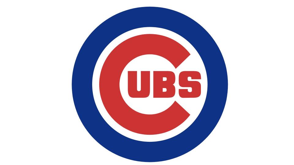
A founding member of the NL in 1876, the Cubs were originally named the White Stockings. The franchise was nicknamed the Cubs by the Chicago Daily News in 1902. It officially took the name five years later, and left their old title to be appropriated by their rivals, who became the Chicago White Sox. The Cubs became colloquially known as 'the North Siders' in reference to their Wrigley Field home ground on the north side of town, and in contrast to the White Sox on the South Side.
There have been many versions of the Chicago Cubs logo across the centuries, almost all of which have been variations on a stylised 'C', often with a bear inside it. Since 1946, though, this menacing animal has been replaced by a more friendly UBS (nothing to do with the Swiss bank, but simply the other three letters in 'Cubs'). This design, which is also notable for its patriotic colour scheme was formalised in 1979 and has been in place ever since. It's simple, balanced, confident and classic.
03. Detroit Tigers
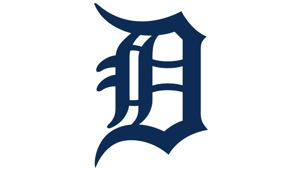
Founded in 1894, the Detroit Tigers are the only Western League team still in their original city. They're also the oldest continuous one-name, one-city franchise in the American League. According to Richard Bak's book 'A Place for Summer: A Narrative History of Tiger Stadium', they were named in tribute to the Detroit Light Guard, a military unit that earned its own Tigers nickname during the Civil War.
American sports teams are known for going literal with their branding, and so it was with the Tigers, whose first logo was a red silhouette of a tiger. Since 1903 however, they've largely used a variation on a standardised 'D'.
The current design, based on the Old English Latin alphabet, has been in place since 2016. Along with conveying a sense of history and grandeur, the arcuate segments of the letters nicely parallel the fangs of a tiger. (Yes, it's subtle, but that doesn't mean it's not effective.)
04. Kansas City Royals
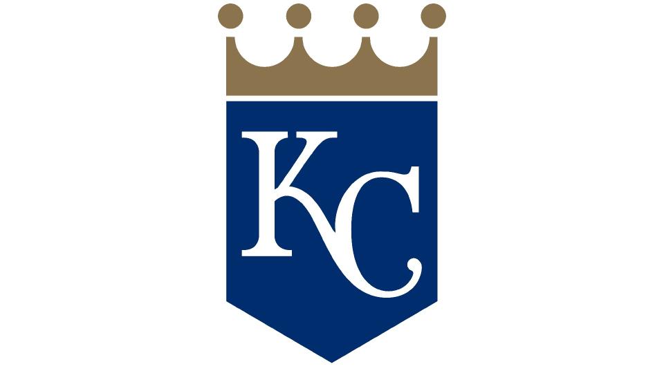
Kansas City Royals are based in Kansas City, Missouri (as distinct from the other Kansas City, in Kansas). The team was founded as an expansion franchise in 1969, and their name pays homage to the American Royal, a livestock show, horse show, rodeo, and championship barbecue competition held annually in the area since 1899. That's according to Sanford Porte, a local bridge engineer who won a competition in 1968 to name the team.
The team's logo, a crown atop a shield containing the letters 'KC', was created by Shannon Manning, a local artist at Hallmark Cards. It's been tweaked a few times since, with the latest 2019 redesign tidying things up and making the design a little more minimal. But it still retains the formal essence and grandeur that the fans adore.
05. Los Angeles Dodgers
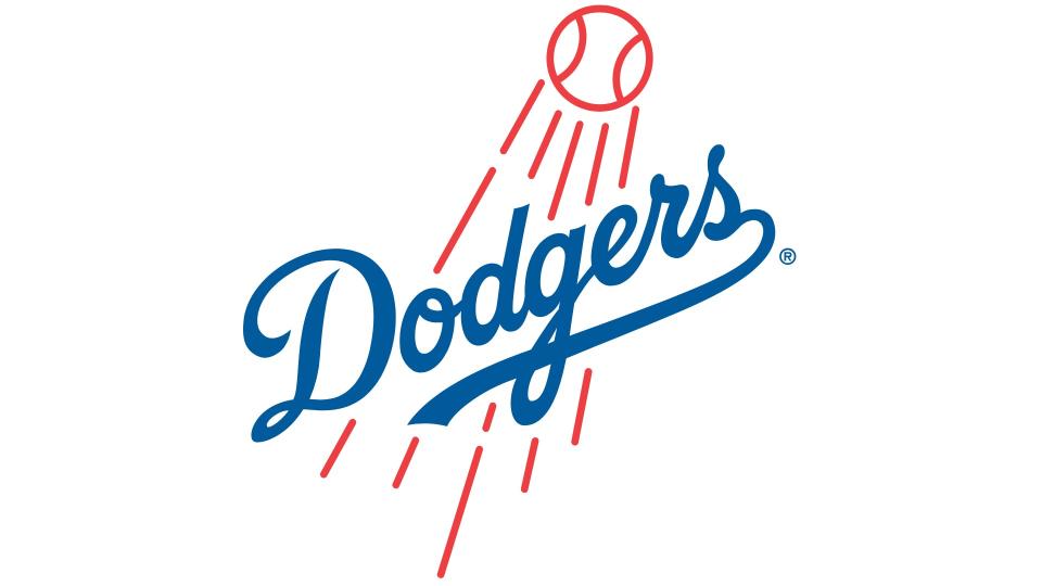
The Los Angeles Dodgers started life in 1883 in Brooklyn. The team joined the National League in 1890 as the Brooklyn Bridegrooms and assumed several other monikers before finally settling on the name Dodgers in 1932. The inspiration came from sportswriter Charles Dryden, nicknaming the team the Trolley Dodgers, after the Brooklyn pedestrians who dodged streetcars in the city. The team made history by breaking the baseball colour line in 1947, with the debut of African-American player Jackie Robinson.
After 68 seasons in Brooklyn, they relocated to Los Angeles before the 1958 season. The team played their first four seasons at the Los Angeles Memorial Coliseum before moving to their current home of Dodger Stadium in 1962.
Their iconic logo has an illustrious history dated back to their East Coast origins. The scripted Dodgers wordmark first appeared by itself in the 1939 logo for the Brooklyn Dodgers, with the baseball and the red streaks being added in 1945. It's been small tweaks all the way since, with the last big update being made in 2012. One of many MLB logos with a patriotic colour scheme, it perfectly represents the Dodgers' cool and laid-back Californian vibe.
06. New York Yankees
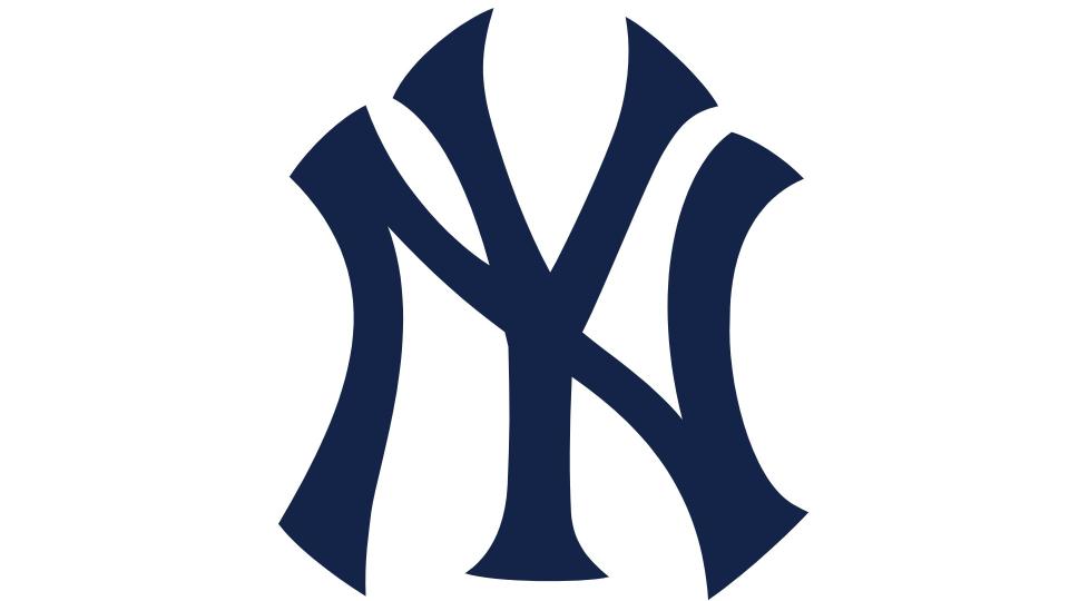
Based in the Bronx, across the Harlem River from Manhatten, The New York Yankees are one of two major league clubs based in New York City alongside the National League (NL)'s New York Mets. Arguably the most successful professional sports franchise in the United States, they've won 20 American League East Division titles, 40 American League pennants, and 27 World Series championships, all of which are MLB records.
The team was founded in 1903 when Frank Farrell and Bill Devery purchased the franchise rights to the defunct Baltimore Orioles (no relation to their current namesake) after it ceased operations, and used them to establish the New York Highlanders.
Fans believed the name was chosen either because of the team's elevated location in Upper Manhattan, or as a nod to team president Joseph Gordon's Scottish-Irish heritage. Either way, it wasn't popular with the press, because it was difficult to fit into headlines. For this reason, New York Press sports editor Jim Price coined the unofficial nickname Yankees (or 'Yanks') for the club as early as 1904, and the team officially renamed themselves as such in 1913.
The New York Yankees logo is today one of the world's most famous sports logos. Its origins lie in an interlocking NY design originally crafted by Louis Tiffany, and struck on a medal of valor presented in 1877 to John McDowell, a New York City police officer shot in the line of duty. Today, it's now recognisable worldwide, even by those who have never watched a single game of baseball, thanks to its use on clothes ranging from Gucci jackets to fashion caps and popularised by countless celebrities.
07. St. Louis Cardinals
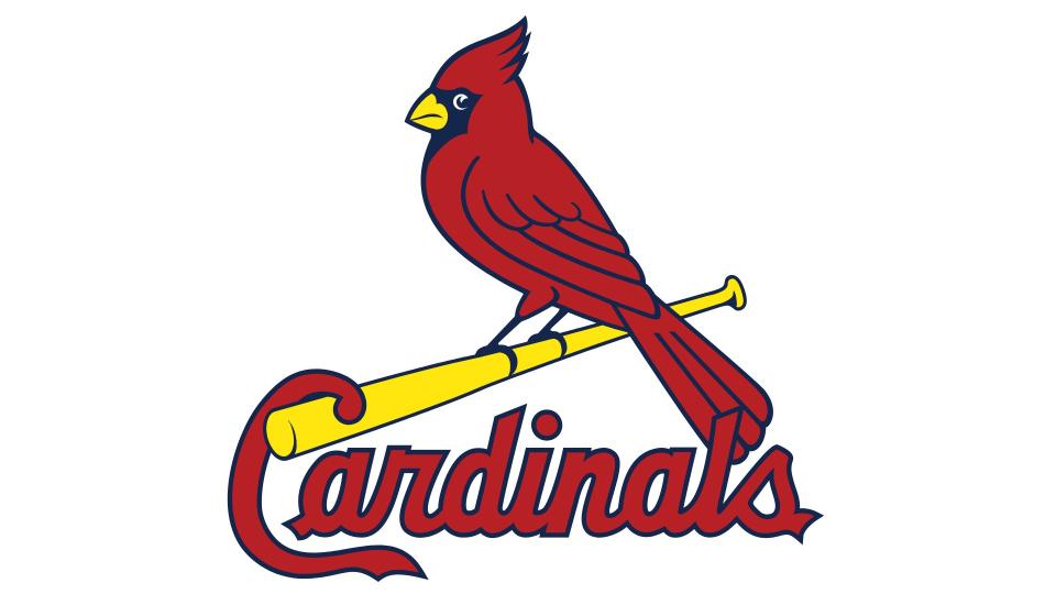
Based at Busch Stadium in St. Louis, Missouri, the Cardinals are one of the nation's oldest and most successful professional baseball clubs. They first came to life in 1881, when entrepreneur Chris von der Ahe purchased the Brown Stockings Barnstorming Club and renamed it the St. Louis Browns, who were nicknamed the Perfectos.
The team wore a uniform with a cardinal red trim and sock striping, and in 1899 a local newspaper included an account of a female fan remarking: "What a lovely shade of cardinal." Fans liked the story, and the following year, the team officially changed its name to Cardinals.
Their first logo was based on interlocking letters. Then in 1922 the team debuted a design based on a red cardinal bird perched on a baseball bat. This has been redrawn a number of times, but the basic theme continues to be adhered to, and the current logo created 1998-9 has remained in place ever since. And why not? It does everything a sporting logo should, being fun, instantly recognisable, totally unique, easily legible and highly scalable.
08. Toronto Blue Jays
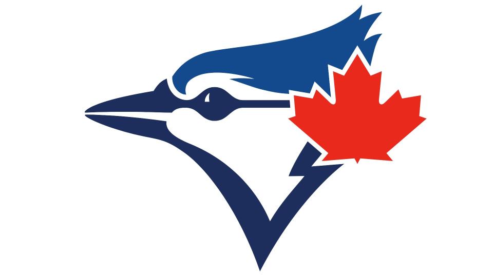
Based in Canada's most populous city, the Blue Jays compete in Major League Baseball as a member club of the American League (AL) East division. Founded in Toronto in 1977, they play their home games primarily at Rogers Centre in downtown Toronto. They are the second MLB franchise to be based outside the US, and the only one in current existence, after the Montreal Expos became the Washington Nationals in 2005.
Their name was chosen from more than 4,000 suggestions in 1976, and suggested by Dr. William Mills, a periodontist from Etobicoke. The Blue Jay isn't actually the national bird of Canada (that's the grey jay), but it's one that's still well loved across the nation.
More pertinently, there was a connection with team owner Labatt's Breweries and their Labatt's Blue beer. Blue is also the traditional colour of Toronto's collegiate and professional sports teams, including ice hockey team the Maple Leafs and football team the Argonauts.
The original logo was designed by Toronto graphic design company Savage Sloan, Ltd in 1976. It featured a stylised bird, maple leaf, baseball and the team name, and lasted unchanged until 1996. After eight years of fan campaigns, the team brought back a modernised version for the 2012 season.
Then in 2020, the logo was simplified further, dropping the baseball and words, and creating the elegant emblem in force today. We love the way it feels both cutting-edge (in its sleek minimalism) and nostalgic (in its colour scheme and traditional elements).
For more American sports logos, see our pieces on the best NFL logos and the best NBA logos.

