The best logos of the 2010s
The best logos of the 2010s emerged amid a time of division, disruption and a perpetual connection to a tsunami of information. Amid Brexit, a tale of two very different American presidents and the looming global climate crisis, the online world at our fingertips offered escape. Smartphones proliferated, apps abounded, VR and AR became more accessible, and our experience of viewing and interacting with the world shifted as Instagram culture took hold.
Brands were transforming how they communicated and engaged with consumers, focusing on clarity and speed. Simplification, legibility, minimalism and flat design styles grew in popularity, with subtler typography, solid graphics and fewer but bolder colours. Here, in no particular order, designers and industry experts pick some of their favourite logos of the decade. Make sure you explore all our posts on the best logos by decade.
01. Airbnb
“What started as an alternative to booking hotel rooms, quickly revolutionised how we think about and organise accommodation when travelling,” says Connor Edwards, senior designer at Jack Renwick Studio. “Design Studio efficiently communicated the difference between staying in a hotel and staying in an Airbnb – warmth, personality and the chance to see a place from a local’s perspective. The symbol transcends language and culture, making it identifiable around the world, perfect for a brand that wants to create in you a sense of belonging wherever you go.”
Kristine Lium, head of creative concept and comms agency studio Pimm, agrees that it's a stand out logo of the decade: “The combination of values, service and vision all combined into one logo,” she says. “The logo in itself has a strong voice and yet a lasting expression being able to stay clear of trend-sensitive aspects.”
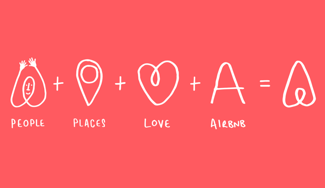
Founded in 2008, travel accommodation company Airbnb went through several different logos, with the 2014 redesign being the most significant. This logo, the same as we know it today, was a move away from the bright blue and pink comic sans-esque and bubble fonts used for its original full name, Airbed & Breakfast. The mark itself, attached to the new name in 2014 – in salmon-orange, known as “rausch” at Airbnb – is meant to look like a rounded letter A as well as acting as a symbol of “belonging” according to Aibnb’s co-founders. It represents a head and arms for people, a location pin symbol for place and an upside-down heart for love, made clear by the brand and designers when unveiled.
“I always look at this as a great logo design lesson – make sure you have a clear rationale you can leverage at launch,” Edwards adds. “The new logo, wider brand narrative and identity marked a sea change for Airbnb. It helped legitimise what, at the time, was a crazy idea. It turned something that felt cheap into something cool. And helped prepare Airbnb for the exponential growth that is still continuing nearly ten years later.”
02. Starbucks
“Very few companies have both the success and cultural significance to be able to remove their name from the logo,” says Ian Paget, graphic designer and founder of design firm and blog Logo Geek. “In 2011, Starbucks stripped away the wordmark, stars and outer ring from their logo, focusing entirely on the siren. This iconic figure also underwent a facelift with the eyes, nose, and hair redesigned to be more symmetrical (except for this one flaw, that's hidden in plain sight). Starbucks explained that this approach allowed the logo to appeal and connect with audiences worldwide.”
Inspired by the original Starbuck’s waterside location and the coffee industry’s seafaring roots, the siren has been part of the logo in various iterations since 1971. As the original designer, Terry Heckler put it, it's the “perfect metaphor for the siren song of coffee”. The 2008 version, designed in-house in collaboration with Lippincott, sans name, not only affirms the universal familiarity of the brand, but also opens the company up to different market opportunities. At the time, then-CEO Howard Schultz, said: “It gives us the freedom and flexibility to think beyond coffee.”
“At this point the era of ultra clean ‘less words – more brand’ is beginning, a few brands went in on this trend at a similar time like McDonalds, stripping everything away but the golden arches a few years prior and Twitter dropping the word-mark and sharpening their bird in 2012,” says Rebecca Harrison, creative director at illustration and animation agency Loveblood Creative. “It was a counter move following a decade where digital tools allowed designers to pucker, warp, gradient fill and explode anything and everything — leading to logos morphing into complex beasts that would age badly. Brand visibility and reach was growing with the rise of the smartphone and the internet, markets were beginning to saturate, and it Stabucks as time for existing, old guard brands to adapt in order to solidify their position.”
03. Instagram
When the Instagram logo changed from the old-timey camera icon to a neon sunset gradient camera symbol, the internet freaked out, with wildly varying opinions from tech experts and fans alike. Aiming to reflect the platform's changing offering, which had developed from an instant photo sharing app with several filters, to a more diverse storytelling platform.
Dyneisha Gross, graphic designer for Ogilvy, remembers the social platform’s logo changing in 2016 when she was a design student. “Instagram, for me, was brown and tan with a huge blue border and then all of a sudden here came gradient. As if photo filters weren’t enough. People across the US tore Ian Spalter apart for the new design of the Instagram app icon and I didn't understand why. I kind of loved it,” she says. “He understood branding and the evolution of logos as patterns and changes over time.
“The reason I love this change is because Spalter considered everything from the product that consumers use to an evergreen library of additional expansion apps. All while focusing on how the mark sets itself apart from its competitors,” Gross continues. “While the owner of the app is controversial, we can’t take away from the process of making something, exposing it to the world, and waiting for their response. Especially when the platform you are making the mark for is used for public opinion. Similar to the new I Love NY branding, Spalter faced the same backlash and almost 10 years later, the mark remains.”
Read all about the Instagram logo history here.
04. Stedelijk Museum
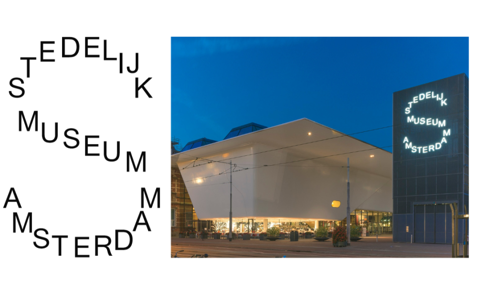
“A favourite of mine from the 2010s is the new logo for Stedelijk Museum created by Amsterdam-based studio Mevis & Van Deursen in 2012. It was such a simple, yet genius modernist idea to create the letter S from the fully written name of the museum,” says Jens Müller, graphic designer and author of Logo Beginnings, Logo Modernism and The History of Graphic Design. “At the same time, a corresponding corporate design was introduced with the logo, continuing the long design tradition of the iconic Dutch museum.”
The 2012 typographic hallmark incorporates the institution’s full name in a distinct S-shaped sign, designed to work both on in a large format the side of a building, as well as on posters and online. It was timed to coincide with the museum’s reopening after extensive nine-year redevelopment, opening up its hugely important collection of contemporary art, including Picasso and Matisse, to the public once more.
05. City of Melbourne
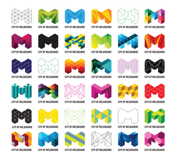
“One of my favourite logo designs of all time is the City of Melbourne identity by design agency Landor and Fitch, which feels as fresh today as it did when conceived in the 2010s,” says Leigh Chandler, creative director of creative agency Sister Mary. “They had a tricky brief – to consolidate several entities under one mark, appeal to a wide range of audiences, and be able to adapt for different usages.”
A super-flexible logo, with a multitude of variations, the aim was to reflect the multi-faceted nature of the city itself. Although the brand guidelines include certain rules, the mark is still open to seemingly numerous creative executions.
“Melbourne is a fun, vibrant and diverse city – all aspects are captured brilliantly in the logo through its use of geometry and a vibrant colour palette,” Chandler adds. “It was one of the first, and arguably the most successful, of a trend of flexible identities that dominated this era. They broke the longstanding rule that a logo has to be rigid and consistent. Instead, this dynamic design is capable of constant reinvention and recreation – all while remaining true to the original framework of the design. A real triumph!”
06. Nottingham Jazz
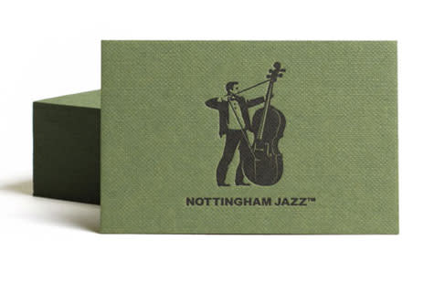
“This logo stands out with its intricate craftsmanship, cutting through the simplicity of the geometric logo marks prevalent in that era. Yet, the true charm of this logo lies in its witty execution,” John Randall, senior graphic designer for Magpie. “It artfully portrays a bass player poised as an archer, deftly pulling back on a string. This subtle nod to the band’s geographical roots, in the legendary home of Robin Hood and his merry band, adds a delightful layer of thematic depth that perfectly complements the band’s profession and provenance.”
The clever icon, designed for a band to hire called Nottingham Jazz, was designed by Dave Burden of Glad Creative in 2011. The creative process involved Burden himself posing as an archer which was then incorporated into an image with a double bass.
“The charm of this logo extends beyond its conceptual brilliance,” Randall continues. “In its printed application, the letter-pressed bass player seemingly launches an arrow around the back of a business card, drawing attention to the band member’s name and the endearing title of ‘Band Leader’. This playful touch adds an element of whimsy to the logo’s refined aesthetic, making it memorable and engaging. Further enhancing its appeal is the thoughtful choice of green textured stock, evoking the nostalgia of the legendary green tunic worn by Robin Hood and his band of outlaws. This tailor-made motif for Nottingham’s jazz scene, in my view, truly has the power to bring a smile to the faces of those who encounter it.”
07. Juventus

The hugely successful Juventus football club, based in Turin, Italy, and established in 1897 are also well known as I Bianconeri, the black-and-whites. “Juventus have played in black and white stripes since 1903, when Notts County sent the club a set of their shirts to replace their original jerseys.” says Bill Wallsgrove, brand strategy consultant and creative director of design studio Brandad. “Juventus’ previous logo from 2014 features the silhouette of a charging bull [also seen in its much earlier logos], a symbol of the club’s home city of Turin that also appears on the crest of local rivals Torino.”
“Juventus unveiled a new crest in 2017 – with club president Andrea Agnelli claiming the minimalist design had been one year in the making – a stylised black and white letter J in the shape of a shield, Wallsgrove says.
The new minimal “J” logo was designed by design studio Interbrand, alongside a new crest that was “bold enough to make a statement, but flexible enough to appear alongside a wide range of new experiences – in the stadium and beyond”, according to designers at the time.
"The launch of the new logo was supported by a promotional video with the slogan ‘life is a matter of black and white’. I really like the minimalist simplicity and construct of the concept – a brand for the future. The die-hard fans, as ever, hated their club being thought of as a brand. They didn’t want to lose the old crest.”
08. Bog Eyed Books
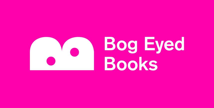
“With a gift of a name, the logo almost designed itself,” says Baxter & Bailey, designers of the playful logo for Bog Eyed Books, a platform for British comics for children. “It has been designed to appeal primarily to the publisher’s key audience: comic-crazy kids.”
Designed in 2017, it's a top choice from the decade for David Airey, logo designer and author of books including Logo Design Love and Identity Designed. “Sometimes, logo ideas are so obvious you think there’s no way a designer would come up with anything else. But from experience it can be all too easy to miss what’s right in front of you,” he says.
Want more logo content? See our guide to the best logos of all time.

