The best logos of the 1990s – as picked by experts
From fashion to music to graphic design, everyone seems to be rediscovering the 1990s right now. But if you weren't around at the time, you may be wondering what it was really like…
Well, the world had 5.2 billion people in 1990, and everyone's experience varied. But in the West it's fair to say there were two major differences between now and then. Firstly, we were living in a pre-internet world. And secondly, the global economy was relatively stable and booming, following the end of the Cold War. Skip to the end for more on the culture at the time.
So what are the best '90s logos? Nostalgia can often be an undue influence, so to give this list a firm foundation, I gathered a panel of experts from leading design agencies, and I've curated their best suggestions in the article below.
Read on, as we look back at some of the most successful and evocative logos of the era, and what we can learn from them today. If you want more nostalgia, see all our posts on the best logos by decade, and if you need help with creating your own logo, check out the best logo design tools.
01. FedEx
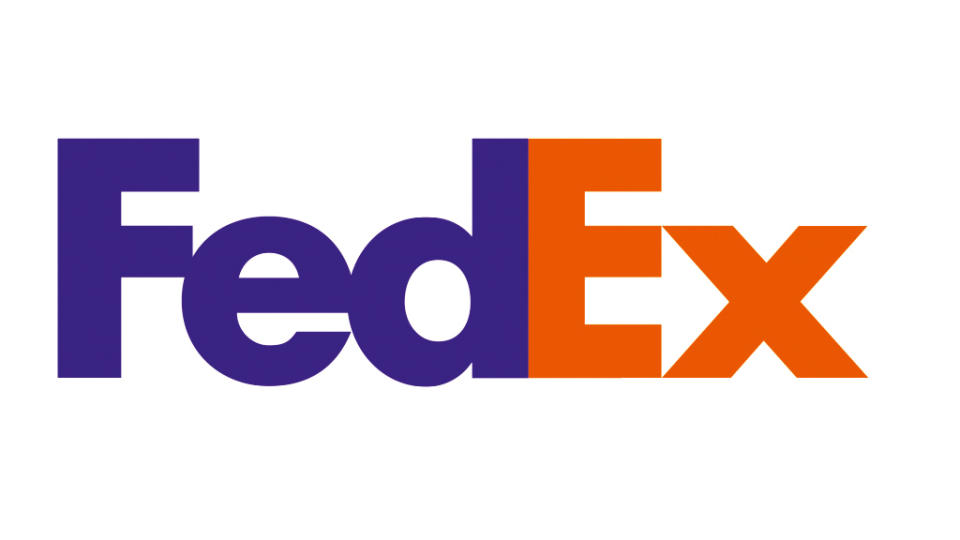
Created by Lindon Leader of Landor Associates in 1994, the FedEx logo is one of the best logos of all time; largely thanks to its clever use of negative space. Not sure what we mean by that? Well, if you look between the 'E' and the 'x' you'll spot a hidden arrow that brilliantly embodies the FedEx ethos of moving stuff around the world.
"Once the hidden arrow is seen, it can never be unseen," says Alan Young, joint CCO at St. Luke's. "But that is not the only brilliant factor in this piece of branding. After all, 'Federal Express' is not exactly a modern sounding name. Founded in 1971, it sounds like it could have been founded in 1871. Deciding to rename as FedEx in 1994, is not just a case of 'shorter better'; this is how their customers already referred to them."
"More than the hidden arrow, what makes the logo so effective is the choice of colours," adds David Nathan Davies, design director at Design by Structure. "A bold combination of purple and orange instantly set FedEx apart from a sea of plain logistics logos."
All this means that, almost 30 years later, the logo remains a timeless classic. "The FedEx logo is an iconic mark that hasn’t changed in its fundamentals since 1994, and is a great example of a ‘smile in the mind’ idea," enthuses Jake Howlett, creative graphic designer from Free The Birds.
"The arrow is a witty nod to the brand’s ideals, and has since become synonymous with its ethos. I love this use of negative space to cut through the visual noise of brand messaging to create something timeless, without contorting the typefaces."
02. Gap

If one retail brand sums up the 90s, it's Gap. The retail chain was originally founded in 1969 as 'The Gap' and targeted a perceived gap in the clothing market between department stores and the catwalk, by selling 'stylish basics'. It took a while, but this eventually proved to be a hit formula that swept across the world in the 1990s.
"Gap was the unofficial uniform of my 90s childhood," recalls Ellen Munro, creative director and partner at BrandOpus. "I was head to toe in Gap from the dungarees to the hoodies."
Smart branding was crucial to Gap's success, and it all cohered around what was a strikingly minimal logo for the time. First released in 1986, what became known as the Blue Box was instantly recognisable on the 90s high streets, and imbued the range with a touch of refinement and class.
As Munro puts it: "A navy blue square with tall, condensed, slab serif lettering gave the brand stature, and exuded a classic, wholesome American confidence for its British consumers." So timeless was this cool and confident logo that when a radical redesign was introduced in 2010, shoppers rebelled and the company had to quickly revert to the Blue Box after only one week.
03. Formula 1
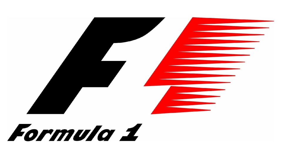
Formula 1, aka F1, is the main international competition for racing cars. It's been running since 1959, but it's generally felt by aficionados that its most iconic logo was that designed by Carter Wong and first used in 1994.
"It's another great example of the use of negative space between graphics," says Howlett. "This logo was used from 1994 up until its redesign in 2018, standing the test of time for nearly 25 years. The use of colour gives it a certain power and the red speed marks are emblematic of the energy and movement of the races."
04. National Lottery
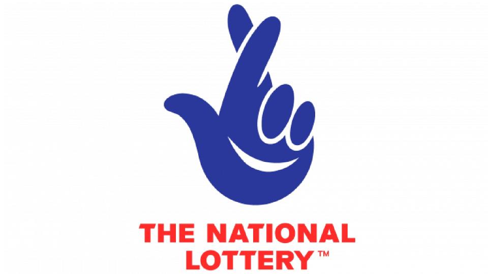
It's become such an established part of British life, along with various spin-offs like the Health Lottery, that's it's weird to think there was ever a time when there was no National Lottery. But as Munro recalls, "When the National Lottery launched in 1994, it was such a big deal it took up a prime-time TV slot for the numbers to be drawn."
Given that the UK wasn't used to forms of betting that didn't involve horses, greyhounds or football results, branding the new competition was a big challenge. So the government didn't take any chances, bringing in Saatch & Saatchi Design as a safe pair of hands. And they didn't disappoint.
"The logo cleverly summed up the optimistic hope of playing," recalls Munro. "A hand with crossed fingers symbolising good luck, but with the folded fingers doubling up as a positive, smiling face. In a time well before emojis, this logo had that similar instant emotive feel and has evolved only slightly since, with a refresh by Wolff Olins in 2015."
We list the smile in the logo as one of the top logo Easter eggs you might have missed.
05. Orange
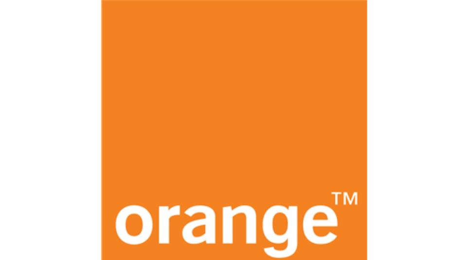
Also launched in 1994 was the phone network Orange. In the tightly contested mobile phone market of the time, it didn't have any particular technical advantages over its rival, so it leant heavily on compelling branding. In a launch led by WCRS (an iconic design agency that disbanded in 2018), they focused on small and medium-sized businesses with the tagline 'The future's bright. the future's Orange'.
The message was a simple one, and so was the logo. "The logo is very minmal, with a clean but approachable tech aesthetic," says Munro. "But what really stood Orange apart was that it was an early example of a brand being more than just its logo. They owned the orange colour, utilising it to bring distinctiveness to all their communications and there was a warmth and playfulness that gave it huge appeal."
06. Walkman

We often associate the Walkman, Sony's portable cassette player, with the late 1970s when it was first introduced. But given that the first iPod wasn't launched until 2001, the device remained central to youth culture throughout the 1980s and 1990s. And while it'll mean little to today's Gen Zers and Gen Alphas, the Walkman logo still burns strong in the hearts of those from this earlier era.
"The Walkman brand and logo has always been absolutely bananas in expression," explains Thomas Wilder, global principal at Wolff Olins. "The original typographic expression in the early 80s was a tubular-like typographic expression built with cartoon legs.
"While the 90s version steered away from the cartoon-like characteristics of the previous iteration, it added a cool, futuristic, sci-fi tonality that felt right at home on a product that was built to embody the future of music products. It perfectly mixed the technology with the more emotive qualities of the brand."
"The Sony Walkman logo is an iconic representation of the groundbreaking portable music player," adds Wybe Magermans, director of growth at WMH&I. "The amorphous 'W' shape embodies the distinct 90s style and conveys a sense of dynamic motion. Notably, the letters in the wordmark are interconnected, with the exception of the letter 'L', symbolising the freedom to enjoy music on the go."
07. PlayStation
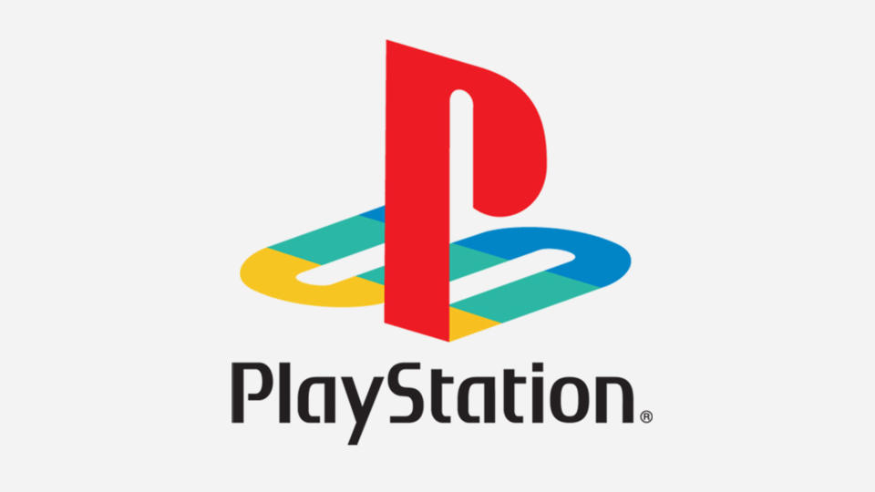
Videogames made a huge leap forward in the 1990s, and in those pre-Xbox days, Playstation was the console of choice for serious gamers. The iconic Playstation emblem was created by Manabu Sakamoto in 1994. It's a clever combination of the letters 'P' and 'S' that purposely conveys a sense of depth, in order to symbolise console's 3D capabilities (up till then, videogames had been mainly 2D). The letters were custom-designed, and green was added to the existing brand colours (red, blue and yellow) to add a sense of vibrancy to the design.
"The PlayStation symbol, broadly unchanged to this day, instantly jumps to mind as one of my favourite early 90s logos," says Davies. "The unusual composition of the letters paired with bright colours and the swelling of the music on the loading screens set the expectations that you were entering another world; creating something truly unique and memorable."
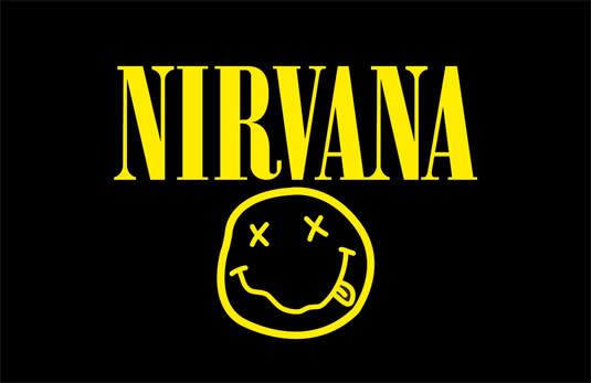
08. Nirvana

The grunge revolution of the 1990s turned the music industry on its head. When Nirvana knocked Michael Jackson off the top of the Billboard Charts with 'Smells Like Teen Spirit', record companies were sent reeling. The kind of noisy rock music they'd previously dismissed as underground and having limited appeal had suddenly become mainstream.
Nirvana didn't just influence the pop chart. More broadly, they were a rallying call for creatives everywhere, helping shake up every element of the cultural sphere. And of course, the Nivarna logo was as discordant as their music. An ironic comment on the manufactured pop they were kicking against, the distorted smiley is believed to have been designed by singer Kurt Cobain himself.
The story goes that Kurt was inspired by a googly-eyed visage on the marquee of a Seattle strip club. Whether or not that's true, the design hit home, and still adorns millions of T-shirts worldwide, often worn by people who've never heard of the actual band (the logo has also got caught up in a copyright battle).
For Oliver Maltby, executive creative director at Interbrand, it was a breath of fresh air. He identifies an 80s trend of "ignoring classical design theory in favour of using new design packages opened by computer technology. The effect was a death of brightly coloured, upbeat vector shapes organised without much consideration or ideas. But that was about to change.
"A counter to the saccharine mainstream came from a band that reflected the idea that 'all was not okay'. Nirvana used their distorted smiley face to reflect the pains of growing up. It’s a beautiful, simple way to connect to the emotion of the music they produced."
09. BBC
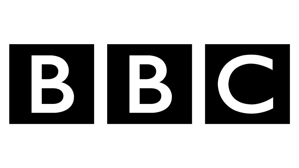
Founded in 1922, the BBC has had many logos over the years. But the minimalist design they settled on back in 1997 remains as modern-looking today as it did at the time: not a bad feat in a fast-moving media landscape.
Ironic, really, considering it came in for a ton of flack at the time. I was working on the Radio Times that year, and remember how the Beeb's in-house magazine, Ariel, was packed with letters from staff complaining about the amount of money that had been spent on what they saw as a "terrible logo".
History, however, now sees things differently, and Davies provides some context. "The logo was re-designed by the [now late] designer Martin Lambie-Nairn to address technical problems with earlier italicised variants caused by the switch to digital broadcasting," he explains. "And it's another standout for me from the 90s. Three simple black boxes contain the iconic initials, set in Gill Sans, instantly creating a feeling of authority. It’s a logo that feels as if it’s always been this way."
10. Windows
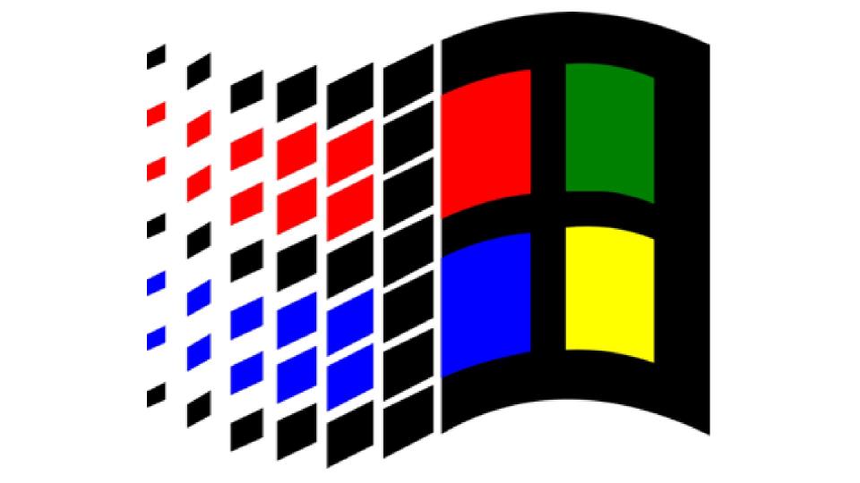
Designers spend a lot of time staring at logos, but in truth, very few normal people ever do. In the 1990s, though, there was one big exception. Millions of us would spend at least a few minutes staring at the Windows logo every morning as we waited for our desktop computers to boot up.
This partly explains why so many people see the 90s Windows logo as iconic today. Only partly, though: it was a pretty great design too.
"The 90s Windows logo brought in a pixel-like stream of boxes in a wave that gave the impression of movement: many windows, many possibilities," explains Munro. "Meanwhile, the four colour squares highlighted that now we had colour operating systems! For me, the logo brings back the magic moment when you won a Microsoft Solitaire game and all the cards bounced down in a similar, stuttering style as this has."
11. Cartoon Network
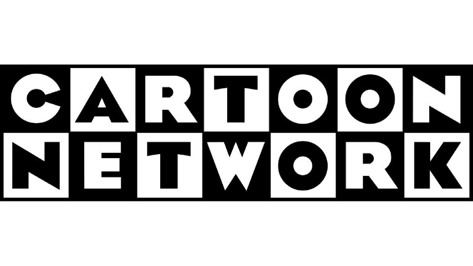
What kid doesn't love cartoons? So it's weird to think that it was only in 1992 that CNN founder Ted Turner launched Cartoon Network and brought all-day animated fun to households around the world.
The new channel's logo featured a black and white 7x2 square grid with each letter set in Eagle Bold. It was a bold and original design that was instantly recognisable and quickly became iconic.
"As a 90s baby myself, it was one of my favourite logos: a huge part of my childhood and something I'd see most days of the week," recalls Howlett. "The black and white checkerboard structure is bold and stands out against the colourful backdrop of its signature animations; making it eye-catching and memorable."
12. Nerf
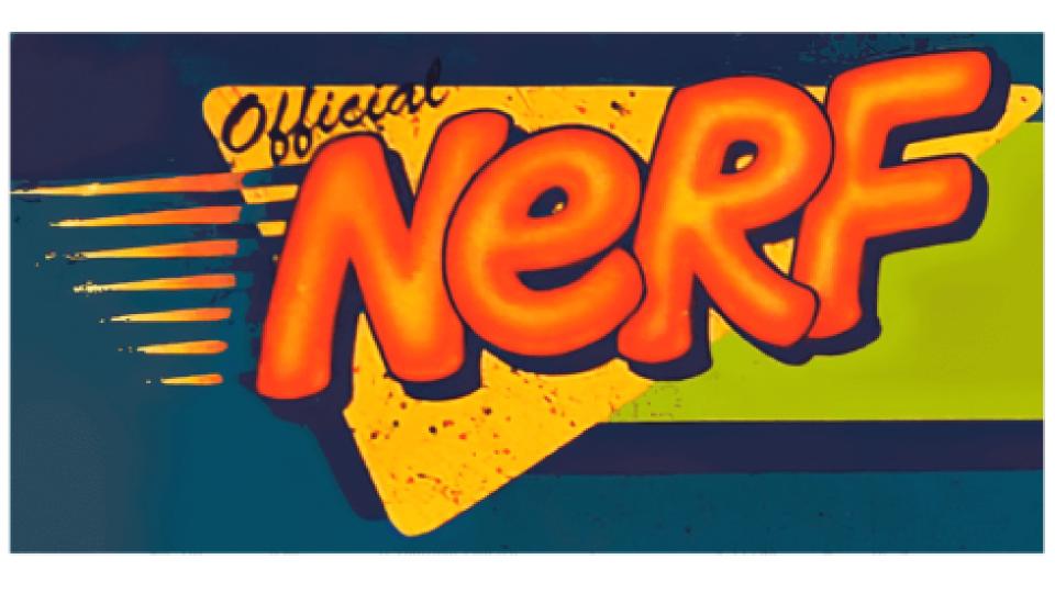
If you've never played with Nerf guns, you haven't lived. These toys, which were created by Parker Brothers and currently owned by Hasbro, allow kids to shoot each other with foam darts that don't cause any harm. Originally founded in 1969, they were the toy du jour for 90s brats, and the brand's logo was bright, loud and garish in a way that sums us most people's memories of the decade.
"Nerf is a brand that started in the 1960s with one of the first indoor balls," recalls Wilder. "However, I remember it from my childhood as the 1990s toy; foam-based weaponry to engage in nerf battle royales with friends."
As for the logo, Wilder describes it as "fun, friendly-feeling, exciting, unapologetic and slightly squishy. The typographic forms have a foam-like expression. And the colour palette is also wildly vibrant and emblematic of the time."
13. Jurassic Park
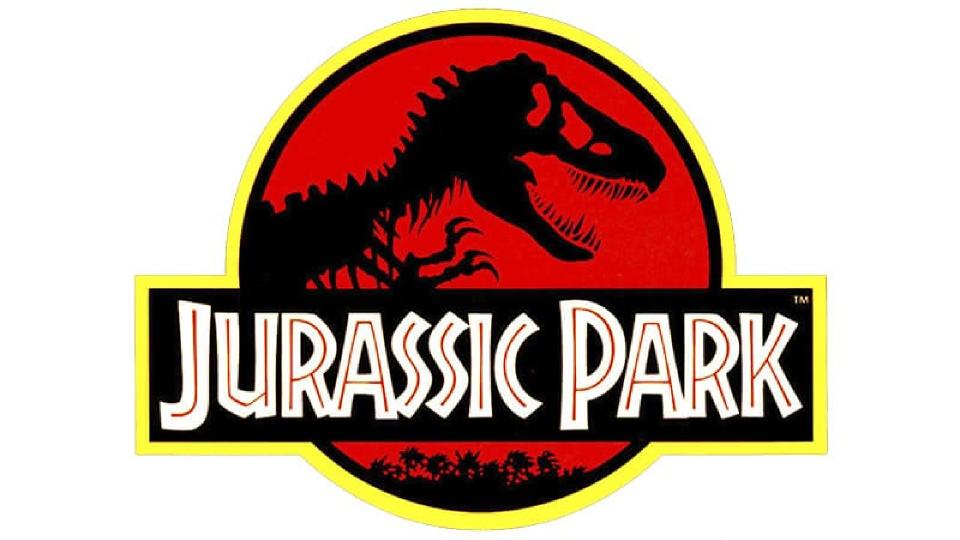
Jurassic Park was one of those landmark films that changed cinema forever. Yes, CGI had been around for a while (the first use was in the opening credits of 1986's Labyrinth). But this was the first time it had been so immersive and all-encompassing, setting the template for pretty much every blockbuster since.
The film's logo works on two levels: both in-film as the branding for the fictional park, and as the branding for the film itself. And there's an extra dimension, too, because the design was based based on the Tyrannosaurus Rex skeleton that was used on the cover of the original book, designed by Chip Kidd.
The genius of this design was that, like all great logos, it strips the idea down to its bare essentials. "The jacket is extraordinary in its simplicity and clarity," says Wilder. "It perfectly illustrates the essence of the story and also immediately stands out online or on shelf. Kudos to Kidd for reducing the design down to only what’s necessary to communicate the largest idea. The silhouette graphic on the jacket, while not a traditional logo, has surely become one of the most recognisable symbols in the past 30 years."
Cultural revolution in the 90s
For me personally, as a twentysomething living in London, thanks a relatively stable global economy and the lack of internet, most of my peers had jobs and easy access to credit. And we were determined to spend it on having fun as much fun as possible...
We weren't the only ones, and that led to a cultural boom, bringing forth new forms of music (from Britpop to drum and bass, grunge to garage), new types of artists (from Tracey Emin to Banksy), new restaurants and culinary fusions led by a wave of celebrity chefs, and even new types of booze (from Hooch to WKD).
Not everyone, of course, was living the high life and wasting their salary on endless nights out. Most people, just as in every other decade, were just getting on with the day-to-day: work, shopping, meeting friends and watching TV.
But under the influence of youth culture-driven capitalism, all these things were changing too. For example, the beginnings of fast fashion made clothes more fun and affordable for ordinary people. An explosion of satellite and cable TV brought Brits the benefits of multichannel TV for the first time. And better computers like the iMac even made office work cooler.
Optimism in design in the 90s
So what did all this mean for logo design? Well, it's difficult to generalise but it's certainly true that many graphic designers took their cue from the general optimism in an increasingly prosperous society.
That was reflected in such elements as bright, neon colours, bold use of typography, the influence of graffiti and handwritten fonts, use of circular and abstract shapes, offset text and just a general visual exuberance and energy, which we've arguably not seen in the same way since.
That said, no one was throwing the baby out with the bathwater. And so the best logos of the period also reflect the enduring and universal qualities of great logo design. And because a lot of them have persisted unchanged to this day, most people probably don't even think of them as 1990s logos.

