The best logos of the 1970s
- Oops!Something went wrong.Please try again later.
From political upheaval and workers’ strikes, to the maturation of commercial colour TV and the rise of disco. From the death of Elvis and the Vietnam War, to Concorde, Bowie, shagpile carpets and platform shoes. Whether remembered for austerity or decadence, the gloom or the boogie, the 1970s was a decade of polarities.
And, equally varied, branding and logos of the era often saw fearless colour palettes, flowing type and vibrant motifs, alongside powerfully stark, minimalist design. Here, designers, authors and industry experts pick some of their favourite logos of the decade, in no particular order.
If you're after more logo content, see our best logos list, as well as the best logos of the 1990s and the best 1980s logos.
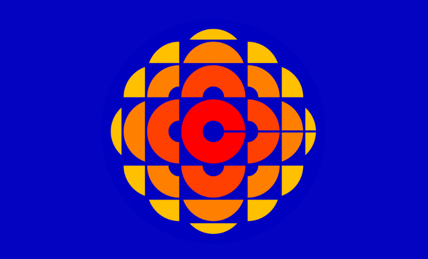
01. Canadian Broadcasting Corporation
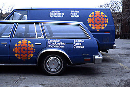
The Canadian Broadcasting Corporation logo was designed by Toronto-based Burton Kramer in 1974. “I see this logo as a literal jewel of 1970s logo design,” says Seymour Auf Der Maur, editor and curator of design archive website Logobook. “It starts simply with the letter ‘C’ at its core, and broadcasts it, through a jewel-like geometric visual echo.”
The kaleidoscopic design was one of CBC’s most memorable and most significant logos, often called “the gem” and the animated version referred to by some as “the exploding pizza”.
“Although it has been evolved over the years to the current design – even if the ‘C’ has gone – the impression remains,” Auf Der Maur says. "This is a timeless design motif that will forever inspire designers to think beyond what’s expected.”
02. Abba

Agnetha, Anni-Frid, Björn and Benny are the four names that inspired this logo for the Swedish pop group Abba, designed by Rune Söderqvist in 1976. “Like all of the best logos, it looks effortless but is deceptively simple,” says Angus Hyland, designer, artist and partner at design firm Pentagram. “As well as being an acronym of the band members, the logo is a palindrome (which means it can be read backwards or forwards), and also a visual palindrome, which means it also looks the same in the mirror.”
First used on the ‘Arrival’ album cover, the logo includes one inverted 'B', so that both 'B's are oriented toward the 'A's, to represent the two couples that made up the band. Söderqvist went on to design every subsequent album sleeve for ABBA, alongside the sets for several of the group’s major world tours.
“Set in News Gothic, it’s modernist, restrained, and, like the music, it has more than stood the test of time,” Hyland adds. “It sums up 1970s modernism and most especially Skandi-modernism before the UK got to love IKEA.”
03. NASA
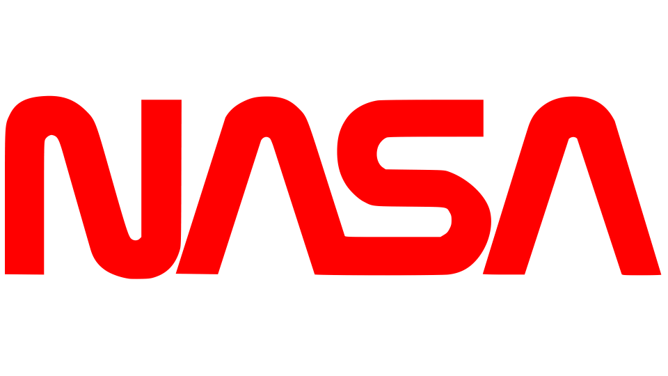
This version of the logo for NASA – the US’s National Aeronautics and Space Administration – replaced the earlier so-called “meatball”, though the organisation now uses both in different circumstances.
“NASA's ‘worm’ logotype was introduced in 1975 – the product of a genius initiative by the US central government called the Federal Design Improvement Program. Created by the firm of Danne & Blackburn, it was big and bold and looked amazing running down the side of rockets,” says Michael Evamy, copywriter for design-led brands and author of several books on design, including Logo and Logotype.
“Composed of letterforms like characters from a future language, it suggested an organisation that was thinking years or decades ahead,” Evamy adds. “Inexplicably, it was withdrawn in 1992, but is now making a comeback at NASA launches.”
04. Nike
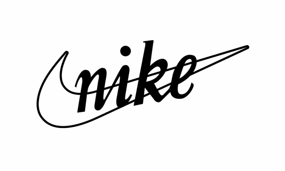
“Very few companies can get away with using only a symbol, however, Nike is one that can,” says Ian Paget, graphic designer and founder of design firm and blog Logo Geek. “The Swoosh, designed by Caroline Davidson back in 1971, when she was a student, is a very simple mark, yet its simplicity enables it to be versatile, working well on the shoes as well as everything else.”
The company’s co-founder Phil Knight, famously said, “I don't love it, but it will grow on me", when first presented with the logo. And, though potentially now one of the most recognisable logos globally, Davidson was paid just $35 at the time (equivalent to around $260 in today’s money). “It's a great lesson that we can design a remarkable solution, yet not always get the appreciation we deserve,” Paget says. “Thankfully the company recognised Caroline’s contribution and greatly rewarded her with shares in the company, now worth millions.”
Also called the “tick”, the logo was created when the company was renamed – from Blue Ribbon Sports to Nike – after the Greek goddess of victory, which inspired the design, said to symbolise her wing. Given that the brand would have been unlikely to have been recognised from the symbol alone when first released, the company name was also written over the top in lower-case script.
05. I Heart NY
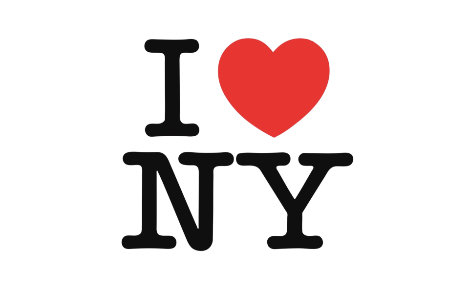
Milton Glaser’s “I Heart NY logo” was designed for the New York State Department of Commerce in 1977, and is still hugely popular today, emblazoned on T-shirts, mugs and other souvenirs from the city.
“Hastily conceived in the back of a taxi, Glaser had no idea just how successful and iconic his doodle would become,” says Libby Sellers, design writer, consultant and former curator of London’s Design Museum. “In an era of cultural and societal change, Glaser’s pop-style design captured both the era’s relaxing of typographic rules and the desire for peace and love. That it spawned a slew of international imitators, and anticipated the world of emoji’s, highlights its consistent relevancy.”
Glaser’s original drawing – sketched with a crayon on a scrap paper envelope – is held in the Museum of Modern Art in Manhattan. After the terrorist attacks on 11 September 2001, he created a customised version which read “I Heart NY More Than Ever”.
06. Deutsche Bank
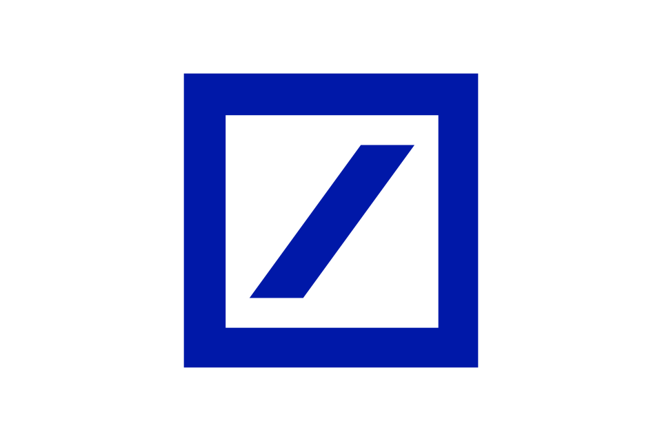
The Deutsche Bank logo is a favourite of Marina Willer, graphic designer, filmmaker and Pentagram partner – “for its extreme simplicity, and how it expresses the concept of growth in the most direct way," she says. "It’s one of those which anyone can draw on a napkin.”
The simple blue square with an oblique line, designed in 1974, was chosen as the winner of a design competition that saw eight designers from small studios submit concepts for a new corporate identity for the bank, now one of the world’s largest financial services providers.
“[It] stands with the British Rail symbol as a model of simplicity, clarity and distinction,” Evamy says. “[The designer] Anton Stankowski brought ideas from constructivist art into professional design, and his ‘slash in a square’, standing for consistent growth in a secure environment, positioned the bank ahead of the game in an old-fashioned industry. Fifty years old in 2024, the mark continues to influence designers.”
07. Centre Pompidou

The logo for Parisian Centre Pompidou was designed in 1974 by Jean Widmer. It took shape on an embossed tablecloth while Widmer was sitting on the terrace of a bistro facing the museum. ”[It’s] an idea that captures the defining feature of the building — the escalator in the glass tube that’s visible from the outside,” says David Airey, logo designer and author of books including Logo Design Love and Identity Designed.
Now in his 90s, speaking to the museum, Widmer recalls: “It's the fastest logo I designed in my whole career, I already had it in mind … I presented the two logos at the same time, the one with five stripes and the one with six. They wanted me to draw a black frame around it but at that point I said, ‘it's out of the question!’ I finally gave in on the six stripes, although I found it less forceful.”
08. American Revolution Bicentennial
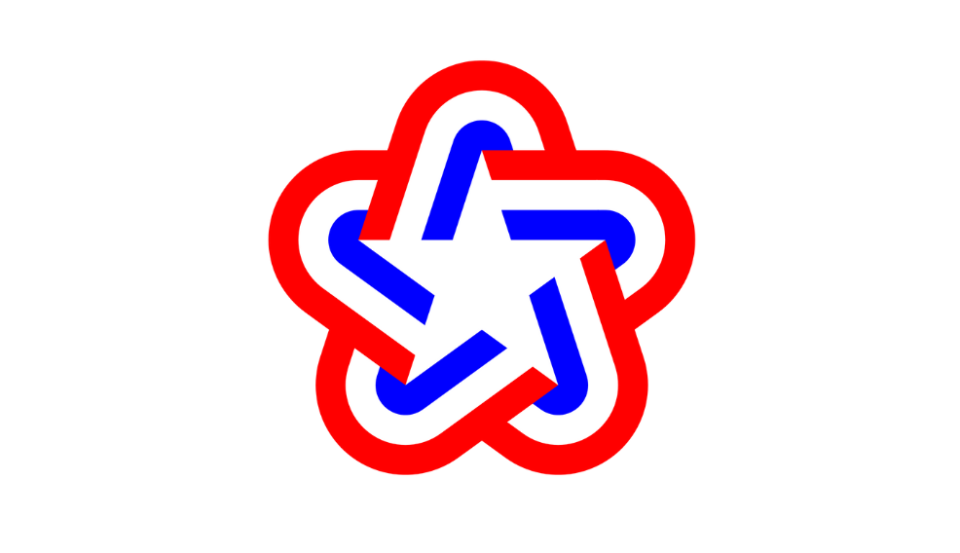
“Ivan Chermayeff and Tom Geismar were some of the most prolific and highly regarded logo designers of the 70s, and were invited to design the logo for the American Revolution Bicentennial in 1976,” Auf Der Maur says.
Formed of red, white, and blue ribbon to create a soft five-pointed star, it was designed to mark the national celebration of the US’s 200th birthday, it was used across events, parades, souvenirs and even the Viking Mars lander — the first spacecraft to successfully land on Mars.
“They successfully created a powerful symbol to celebrate 200 years of a proud nation that was the envy of the world,” Auf Der Maur adds. “The star gives us hope ... the stripes lead us into an infinitely progressive future, coming together to make an iconic shorthand of the US flag itself. Simple, beautifully executed and so intuitive to use.”
For more on logos, see our best logos of the 20th century piece, or discover the history of logos.

