The best logos of the 1960s
- Oops!Something went wrong.Please try again later.
From mini skirts to mods and rockers, civil rights to women’s lib, the 1960s was a time of social change, hedonism and counter-cultural movements, where vision, creativity and innovation spread from placards and protest to fashion and music – and even corporate identities.
Experimental design took hold against a backdrop of pop art, op art, minimalism and conceptual art. And the logos of the 1960s embraced abstract techniques, psychedelic tendencies, emotion and humour.
Here, in no particular order, designers, authors and industry experts pick some of their favourite logos of the decade. For more great logos, see our best logos of the 1970s, favourite 1980s logos and the best logos of the 1990s.
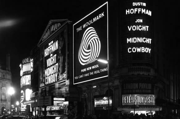
01. Woolmark
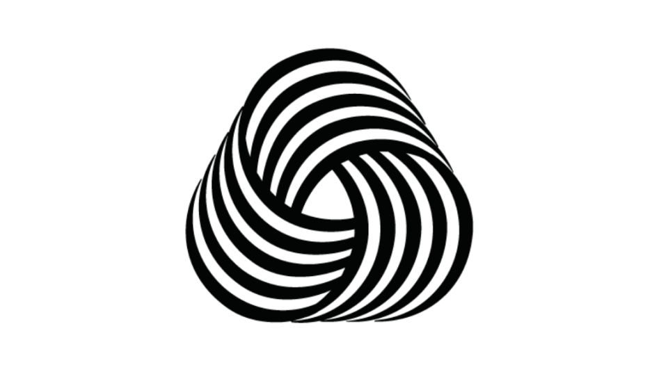
Chosen as the winner of a 1964 competition, the Woolmark logo was not originally credited to its true designer. The entries to create the mark, for the International Wool Secretariat, were assessed by an international design jury, which included Italian designer Franco Grignani, who, upon seeing the designs, was somewhat disappointed by the quality. Grignani was then persuaded by the IWS to submit his own designs, but did so under the name of another IWS employee, Francesco Saroglia – and it was not until the 1980s that Grignani was officially declared the designer.
The swirling optical art style logo is used to certify that products are pure wool and meet global quality standards of the Woolmark Company (formally the IWS), and is now applied to an estimated five billion products around the world.
"The wool logo is one of my favourites," says Marina Willer, graphic designer, filmmaker and Pentagram partner. "I love how it draws you into it, it’s mesmerising and it doesn't need any colour."
Seymour Auf Der Maur, editor and curator of design archive website Logobook says he always feels inspired when he sees this logo in the world. “It proves that branding doesn’t need to be an aggressive attention-grabbing exercise, this breathtakingly elegant design became the ultimate symbol of a product that has made human life a little bit more comfortable and sustainable," he says "[It] captures so much of the aesthetic ambition of logo designers of the 1960s."
Angus Hyland, designer, artist and partner at design firm Pentagram, agrees. "A fluffy ball of wool given the Bridget Riley/MC Escher treatment, its groovy but elegant Austin Powers-esque op-art curves perfectly channel the psychedelic 1960s."
02. British Rail
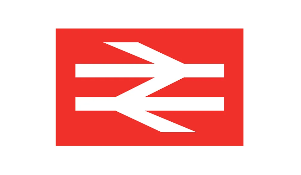
“During the early 1960s, British Rail was going through a significant period of modernisation and streamlining, and needed an equally bold and progressive design to inspire the next generation of passengers,” says Auf Der Maur. “A powerfully simple single line weight arrow design, representing the constant and reliable movement (in both directions) along the railways. The arrows correctly point in the direction of the railway itself (train travel, across the world, generally moves on the left hand side due to the modern railway being invented in Britain)."
The 'double arrow' British Rail was designed by Gerry Barney in 1964, a lettering artist at Design Research Unit (DRU), with two-way traffic arrows on parallel lines representing the tracks – and a precursor to other recognisable transport pictograms such as the Swiss Railway logo. Universal in scope, it’s a resilient logo, having survived through British Rail’s privatisation in the 1990s, and the effective re-nationalisation of the railway infrastructure in 2002, and is still found across tickets, stations, street signs and trains.
“The logo became the perfect compliment to the iconic London Underground logo, while also looking uncannily like the British flag itself – very clever,” Auf Der Maur says.
03. WWF
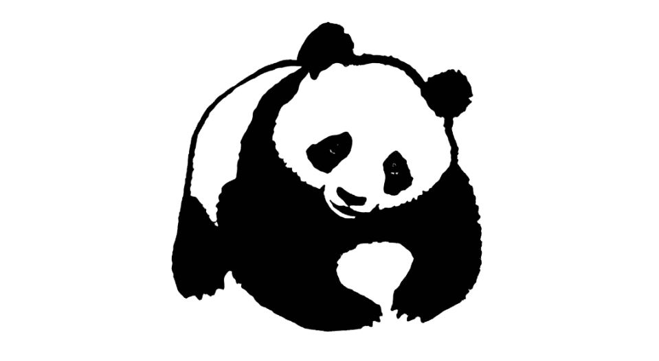
Several years before the World Wide Fund for Nature was founded in 1961, Chi-Chi, a giant panda, arrived at London Zoo. Becoming one of the zoo's best-loved animals, she was the inspiration behind this friendly yet poignant character used for the WWF’s logo. It’s a powerful symbol of the work of the WWF: the conservation and restoration of wildlife around the world and their natural environments.
“This was designed in 1961, not by a London design studio or smart Manhattan agency, but by Sir Peter Scott, a pioneering conservationist and co-founder of the World Wide Fund for Nature, which was set up to save endangered species,” says Michael Evamy, copywriter for design-led brands and author of several books on design, including Logo and Logotype. “The symbol transcended language barriers and was easy to print on low-budget campaign material. More importantly, with one or two tweaks, it’s still winning hearts and minds over 60 years later.”
At the time of its creation, Sir Peter Scott commented: “We wanted an animal that is beautiful, is endangered, and one loved by many people in the world for its appealing qualities. We also wanted an animal that had an impact in black and white to save money on printing costs.”
04. Mexico 1968
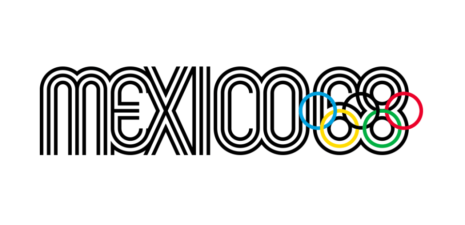
The logo for the 1968 Olympic Games – Mexico 1968 – was designed by Lance Wyman. The logo and related designs incorporate optical art, geometry and a tri-linear typeface, drawing inspiration from Mexican heritage and culture, through colour and pattern. Wyman worked alongside Pedro Ramírez Vázquez, head of the Mexico City Organising Committee for the Olympic Games, a respected architect and visionary, and the duo also collaborated on a new pictogram system for each sporting event.
The psychedelic patterns and hypnotic graphics of the visual identity permeated the entire city, found on everything from hats and dresses to stamps and balloons, from small memorabilia to pavements and plazas.
“[It] has a similar energy [to the Woolmark logo] with the stripes emanating from the words and drawing you into it,” says Willer. “It reflects an era of optimism, a modernist utopian belief that sports could bring nations together.”
05. MIT Press

This celebrated modernist colophon for MIT Press, created by Muriel Cooper, was allegedly offered to her mentor – and design legend – Paul Rand, who turned it down and requested that the project be given to Cooper. She had several stints at the publishers, as a designer in the 1950s and then as its first female design director in 1967, although worked at her own independent graphic studio when she created the logo.
“Throughout all her work Muriel Cooper sought to rationalise formats and bring a consistent design aesthetic to everything she oversaw. This extreme attention to detail even extended to the colophon, or logo, she created for MIT Press in 1965,” says Libby Sellers, design writer, consultant and former curator of London’s Design Museum. “Her ingenious design of a seven-bar logo – an abstract play on the vertical strokes of MITP’s letters – not only invoked the image of a row of books, but also now sits on the bookshelves of nearly every architecture and art enthusiast the world over.”
“Though Cooper’s design, with its prescient nod to a (still to be invented) bar code, heralded the dawning of the digital era, which she also helped shape though her work at the MIT Media Lab,” Sellers adds.
06. TDK
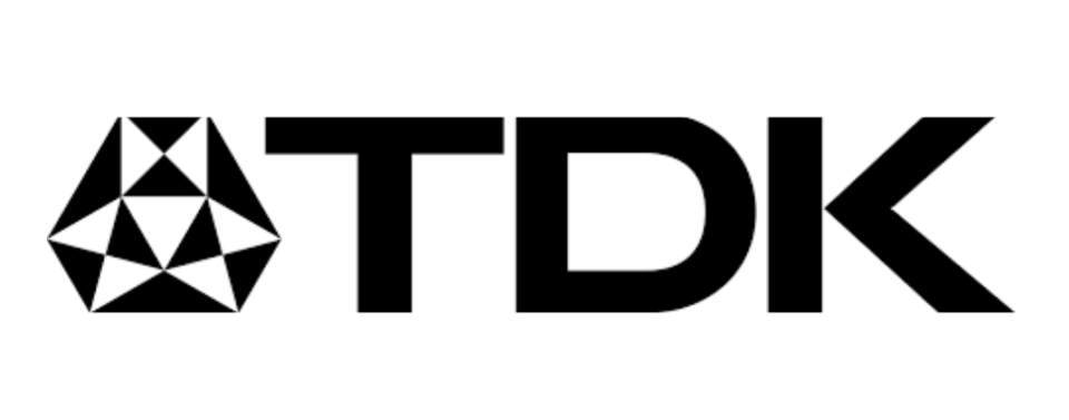
The 1960s saw the introduction of audio cassette tapes on a commercial scale, meaning music was suddenly much more portable. The format peaked in the 1980s and saw a decline when CDs took hold through the 1990s. However, the ease of making a mixtape at home, and the DIY, low-cost, retro novelty of cassettes has meant some instances of resurgence and residual popularity, particularly in underground music scenes.
Along with the power of simplicity – as found in the balanced lettering and a geometrical emblem made of “triangles and squares to represent electronic computers and magnetic materials”, as TDK states – the nostalgia-inducing appeal of logo like TDK's plays a huge role in its longevity, as Evamy attests: “I was a big home-taper in the 1980s, and I bought TDK blank tapes for no other reason than the logo, which suggested to this teenager an exotic Japanese techno-superiority and sophistication, as well as crystalline audio clarity. Much later I discovered it was designed by a giant of Japanese design, Yusaku Kamekura, in 1967.”
07. Chase Bank
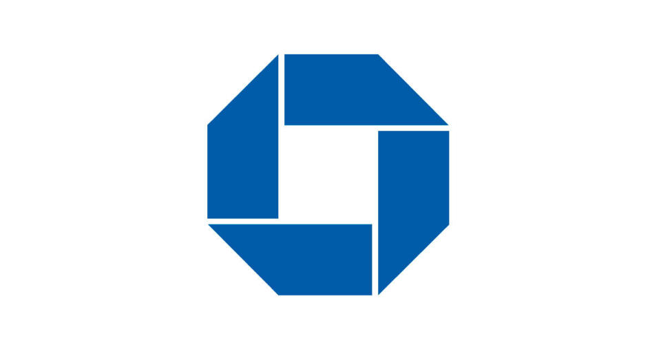
“The Chase Bank octagon logo is one of [Chermayeff & Geismar’s] early designs, and for the time the raw simplicity was something rarely seen, so a dramatic change,” says Ian Paget, graphic designer and founder of design firm and blog Logo Geek. “Two of the three top executives even resisted the idea of an abstract logo.”
Despite there being few US corporations using an abstract symbol to identify themselves at the time, the minimalist blue octagonal mark, created in 1961, became widely recognisable – and even the execs who had previously opposed the mark came to wear it proudly on tie pins and cufflinks.
Chermayeff & Geismar describe the mark as “abstract but not without meaning” and “inspired by a traditional Chinese coin, and, with the square enclosed in an octagon, it suggests a bank vault – and by extension the notion of security and trust.”
08. UPS
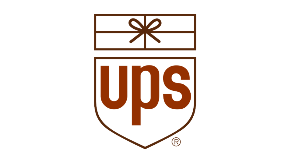
Paul Rand’s logo for UPS is testament to the tool of humour in graphic design. In Rand’s own words, from his 1985 book, A Designer’s Art: “The visual message which professes to be profound or elegant often boomerangs as mere pretension,” he wrote, “and the frame of mind that looks at humour as trivial and flighty mistakes the shadow for the substance. In short, the notion that the humorous approach to visual communication is undignified or belittling is sheer nonsense.”
The logo was a top choice of the decade for David Airey, logo designer and author of books including Logo Design Love and Identity Designed. Airey quotes Rand to annotate his decision: “I do not use humour consciously, I just go that way naturally. A well known example is my identity for United Parcels Service: to take an escutcheon – a mediaeval symbol which inevitably seems pompous today – and then stick a package on top of it, that is funny.”

