The best logos of the 1940s

The 1940s were arguably the most tumultuous period in modern history. At the outset, humankind stood at a crossroads between barbarity and progress as the most destructive of all wars was fully unleashed, and culminated in the launch of weapon that could potentially wipe out all life on Earth. Then came the complexities of a post-war realignment; a power struggle whose reverberations are still being felt today, most recently in Russia's invasion of Ukraine.
And yet for most people life went on, as a unique tapestry of culture, design, and innovation was being woven around them. It was a time when many found solace in the allure of cinema, the rhythm of jazz, and the timeless charm of classic cars. Amidst these transformative years, the '40s also ushered in a renaissance of branding and visual identity, giving birth to some of the most iconic logos in history.
The best logos of the '40s encapsulated the spirit of the era, reflecting both the hardships of war and the optimism of a better future. In this article, we look back at our favourites, with input and analysis from logo experts across the design industry today. Meanwhile, if these logos inspire you to create fresh designs of your own, check our selection of logo design tools.
01. Coca-Cola
One of the logos we never want to see changed, Coca-Cola's scriptive wordmark is recognisable across cultures and countries the world over. And while its origins lie in 1887, it was the 1940s that saw it took its modern shape. Matt Burns, executive creative director at beverage branding agency Thirst, doesn't think that's a coincidence.
"The 1940s was an era of graphic design royalty, where legends like Paul Rand and Saul Bass graced us with logos that still hold their character to this day," he points out. "The 1941 iteration of Coca-Cola’s logo is one of my favourites because of this exact reason. Sure, it’s been tweaked over the years, but its essence has stood strong throughout time with a consistent use of its now-iconic Spencerian script and bold red, which Pantone aptly named after the drink.
"It’s a brand that clearly knows who it is," he adds, "and is confident enough to own that, with a logo so intuitive that it's enabled the brand to stretch itself creatively for over 135 years." Burns offers the example of Move, Coca-Cola's collaboration with Rosalía, which introduced a sketched take on the typeface, as well as the introduction of Diet Coke in 1982 – "a modern twist that built seamlessly on the traditional assets". And he argues there's a broader lesson here for brands to learn.
"Understand who you are; what you stand for. Have complete clarity on your brand’s DNA, and believe in that DNA. Most importantly, listen to the heart – both your own, and the heart of the brand.
"If brands constantly change and revolutionise to chase the current trend, it’s likely they’ll suffer when looking to build equity and meaning into their assets in the way Coca-Cola has done – even back in 1941."
02. M&Ms
M&M's have been popular sweets for generations of kids, but their first market was actually US soldiers. Shortly after the chocolate treats first went on sale in 1941, America entered the Second World War, and GIs in the Pacific loved them because they don't melt in the heat. For this reason, the company switched to exclusively producing them for the military; the kids would have to wait.
The candy-coated chocolate concept wasn't at all original, though. Founder Forrest Mars Sr. (son of the Mars Company founder, Frank C. Mars) basically copied it from the UK-made Smarties, which he'd seen Brits eating during the Spanish Civil War.
M&M's branding, at least, helped them stand out. The two Ms represented the 'M' in Mars' name, and that of Bruce Murrie, son of Hershey Chocolate's president William F. R. Murrie, who had a 20 per cent share in the firm. The brand's original logo was a simple monochrome wordmark, but while it's evolved over the years in terms of colour and typography, it hasn't really changed all that much (apart from briefly switching to Ma&Ya's in early 2023).
"The M&M's logo is a classic example of simple yet lasting design," says Petra Seiler Albrektson, executive creative director at B-Reel. "At a time when things were basic, the logo's characters brought a fun touch. Like the candies themselves, it added a pop of fun to the plain backdrop of that era, making it just as enjoyable as the treats it represents."
03. Volkswagen
Founded in 1937, Volkswagen's origins aren't something the company like to talk about too much. That's because the idea came directly from Adolf Hitler. The fascist leader had a vision of a car that the average person could afford, which neatly dovetailed with his plans for a superhighway, the Autobahn. The company's original logo even incorporated the Nazi flag.
Hitler didn't survive the Second World War, but the company did. Richard Williams, co-founder at WMH&I, takes up the story.
"At the end of the war, the ruined Volkswagen factory was rebuilt under British supervision, and mass production began in 1946," he explains. "Control of the company was transferred to the West German government and the state of Lower Saxony. With it came the evolution of one of the world's most recognisable logos, which never looked more perfect than on a split screen Type 2 Kombi, Bus" – which most of us know as the VW Van.
Given the firm's origins, it stands testimony to the VW logo that it went on to inspire people in a more positive way, becoming symbolic of the hippy/peace movement and playing a pivotal role in early 80s hip-hop culture. And today it continues to have a cultural impact far beyond just promoting a particular car company.
"The Volkswagen logo speaks volumes in a time of shifting tensions and divides," says Wayne Deakin, global principal at Wolff Olins. "A super minimalist 'V' over a 'W' enclosed in a circle, it's a paragon of simplicity. Crafted during the tumultuous 1940s, it has since become an enduring symbol of German engineering.
"In today's industry, where minimalism reigns supreme, the VW logo teaches us that less is often more and how a design can convey strength and reliability through its simplicity, making it instantly recognisable and unforgettable."
04. Shell

Since first appearing in 1901, the Shell logo has moved from a realistic rendering of a scallop shell to a more simplified shape. Yellow and red have been a fairly consistent element, although no one is quite sure why.
These colours may come from the company’s origins in exports, as both yellow and red are used in maritime signalling. Others have pointed to the logo's early introduction at Californian service stations, and the fact that red and yellow are the colours of Spain, where many early Californian settlers were born.
Either way, the Shell logo remains an icon of branding history. "Despite people’s strong emotions on the subject, when you look at logos of these eras you can’t leave Shell out," says Deakin. "This design classic first took form in the 1900s, but the future design elements solidified in the 1940s with the Shell word and colours becoming centre stage.
"With its distinctive yellow and red scallop, this iconic emblem has evolved subtly but has always retained its core elements to date. It illustrates the power of consistency over time. The Shell logo teaches designers that even minor tweaks can help a logo stay fresh while preserving brand recognition."
05. Adidas
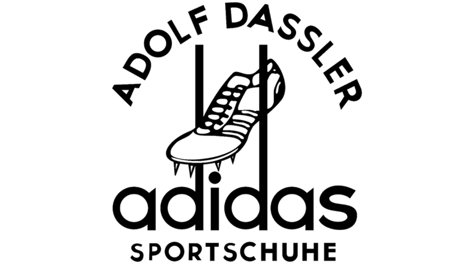
Today, Adidas is the largest sportswear manufacturer in Europe, and the second largest in the world, after Nike. Its founder Adolf 'Adi' Dassler first began making shoes in 1924 but it wasn't until 1949 that he registered the name of his company and created a logo to represent it.
"This design isn’t quite as refined and simplistic as the version we know and love today, but you can definitely see how it inspired future interpretations of the logo," points out Jake Howlett, creative graphic designer at design agency Free The Birds. "The lowercase typeface is something that has continued through all generations of the iconic mark.
"A particularly interesting feature on the 1949 logo is the extension of the 'd's, which was used to cleverly house an illustration of a shoe," he adds. "Perhaps this could’ve been the inspiration for the introduction of the quintessential stripes, that we began to see in the 1971 adidas logo.
The 1949 version of the logo was actually only used up until 1950, where it was refined and brought closer to how we know it now. "However, it was undoubtedly a huge influence in the brand's aesthetic and heritage, and something that should be remembered."
06. Boeing
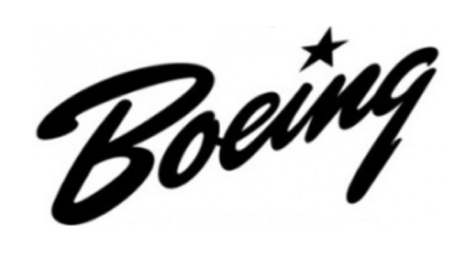
Fun fact: aerospace company Boeing is the largest exporter in the United States by dollar value. Founded in 2016, it's had five main logos over the years, which are all quite different on the surface. But what they share is an overwhelming sense of movement, dynamism and positivity. And that even applies to the simplest of these: the handwritten wordmark which debuted in 1940, and stayed in place for a full two decades.
"The Boeing logo from the 1940s has a very different feel to what you’d expect given the circumstances," says David Nathan Davies, design director at Design by Structure. "Set in a script typeface on an upwards diagonal slant, the logo has a great sense of movement and a more positive and uplifting tone. This is further reinforced by the title being replaced by a star; no doubt a reference to the Stars and Stripes."
07. Manchester United
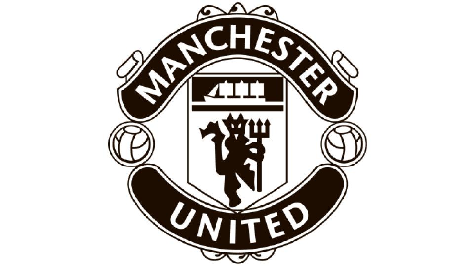
Founded in 1878 as Newton Heath LYR Football Club, Manchester United has grown to become one of the largest football clubs in the world and was valued last year at $6bn (£4.8bn) by Forbes. From selling shirts to landing lucrative TV rights, branding is an essential part of the club's operations. And the club first got two of its iconic logo elements in the 40s, explains Oliver Maltby, executive creative director at Interbrand.
"The first came when Manchester United added the clipper from Manchester’s coat of arms, granted in 1942," he explains. "This was included to represent free trade and enterprise – and possibly to annoy their coastal Liverpudlian neighbours who the city had circumvented with their canal.
"The second was the addition of the ‘red devil’ which has now become synonymous with the club and their playing style. The nickname the ‘Red Devils’ caught on after the Munich air disaster when Sir Matt Busby managed them, but the original logo was created back in the 40s."
08-09. Lambretta and Vespa
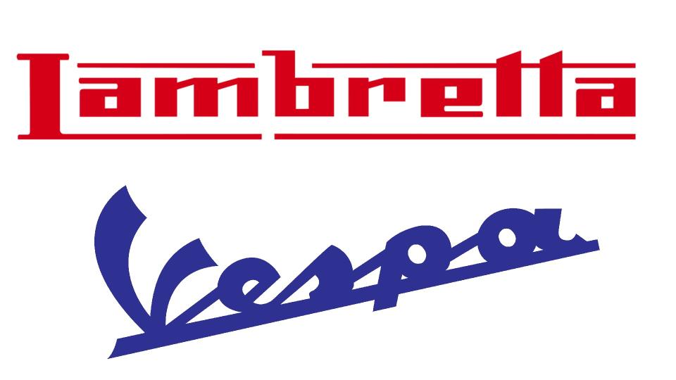
We had to include both Vespa and Lambretta on our list, but it's easier to deal with them together rather than separately. As Andy Breese, head of design at Collective Studios, puts it: "Conceived just months apart, two Italian scooter brands typify the optimism of the post-war years; a time in which young people yearned for a cheap form of mobility to facilitate their new-found freedom."
To the layperson, the scooters may have looked similar, but each had their own distinctive brand mark that set them firmly apart. "Lambretta, like many famous Italian brands – Ferrari, Ducati et al – is associated with red," notes Breese. "In contrast, Vespa couldn’t be more opposite with its penchant for blue."
There is at least one similarity that runs through both logos, though: they use horizontal bars to link letters together. "Whilst it can be argued that this adds authority to the overall look, this was more likely to have been a practical decision," believes Breese. "Linking the letters allows for greater efficiency on the assembly line. The production worker could apply the logo in one, rather than adding individual letters by hand."
And then there's the letterforms themselves. "The initial cap of each brand is highly idiosyncratic," says Breese. "In the case of Vespa – Italian for ‘Wasp’ – the ‘V’ is intended to represent antennae, and the diagonal orientation evokes the body to give an overall sense of movement and buzzy aggression. In stark contrast is the ‘L’ for Lambretta, which can easily be mistaken for a capital ‘I’. Unlike the italicised Vespa lettering, this lettering lacks flair. It is straight and resolutely still."
In other words, it's no coincidence this logo was made in the 1940s: it's very much a product of its time. As Preese puts it: "Rather than being ruminated over in a design studio, the Lambretta logo feels like it was devised out on the factory floor with the tools and technology of the day. And that makes its brutally honest rendering arguably more compelling than its superior, stylish rival."
For more logos throughout the decades, see our pieces on the best logos of the 1950s, '60s logos, '70s logos and logos from the 1980s and 1990s.

