The best logos of the 1930s
- Oops!Something went wrong.Please try again later.
- Oops!Something went wrong.Please try again later.
The 1930s was a dark era for humanity, a decade in the shadow of World War II and The Great Depression, of global economic, social, political and technological upheaval. However, it was also a time of rapid change and innovation. With the addition of sound, cinema-going grew in popularity, as the golden age of radio saw commercial broadcasting become part of daily life.
The decade also saw the advent of household electrical appliances from vacuum cleaners to home telephones; some of the best-loved chocolate products we still know today were launched; and pre-sliced bread, transparent adhesive tape and nylon stockings first made an appearance.
With consumer-friendly products increasingly accessible and heavily marketed, visual communication and consumerism became more tightly connected. Text and wording was an important part of how governments communicated with audiences, too. Both brands and other organisations were recognising the power of logos in this era, many of which were more streamlined, legible, bold and commanding, or appealing in a more playful way.
Here, in no particular order, designers and industry experts pick some of their favourite logos of the decade. For more logo nostalgia, see our best 1940s logos, best '50s logos and best 1960s logos roundups.
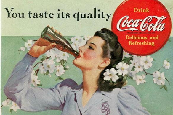
01. Coca Cola
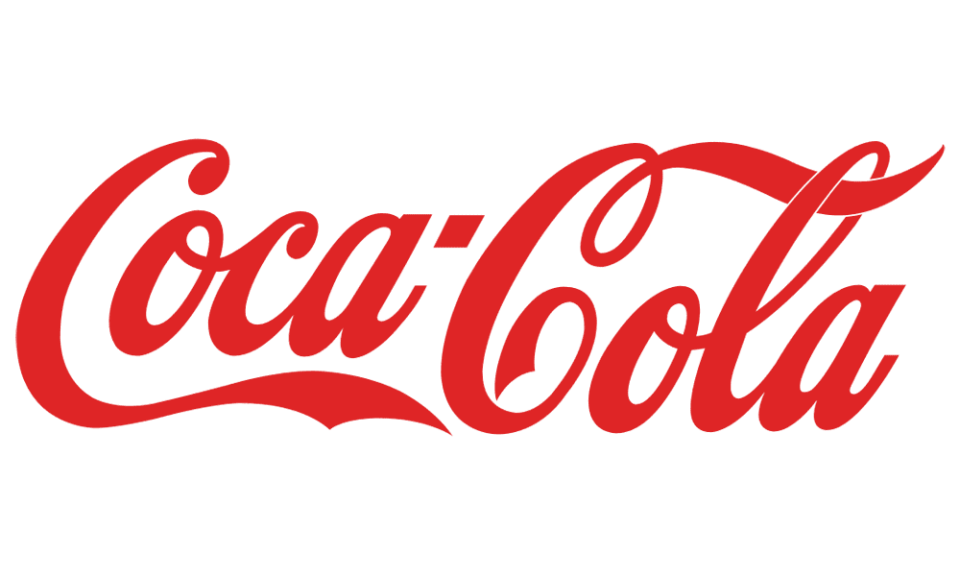
“One of my all-time favourite logos, which has remained unchanged for over a century, is definitely Coca-Cola's,” says Dyneisha Gross, graphic designer for Ogilvy. “Originally designed in the late 1800s, they adopted the same script lettering. With major tweaks and changes based on the times, they finally landed on the mark that has been unchanged.”
Gross believes the power of the Coca Cola logotype lies in its refusal to adapt in response to prevailing trends, or adopt a more contemporary logo style using serif fonts.
'Coca Cola' was the first and only name proposed by bookkeeper Frank Mason Robinson, who worked for the drink’s inventor John Stith Pemberton. Robinson, who stated that “the two C’s would look well in advertising”, was also the one behind the early designs akin to the logo as we know it today.
“Coca-Cola has successfully established a timeless mark loved and recognisable by multiple generations,” Gross says. “I've learned through designing logos in the past that if the logo is great and there's a chance to maintain the familiarity people love, you seize that opportunity.”
02. Audi
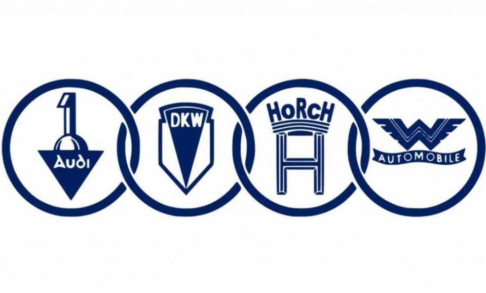
“The four connecting rings of the Audi logo were first introduced in 1932. It symbolises the unity of four car companies: Audi, DKW, Horch, and Wanderer. This collaboration, known at the time as Auto Union AG, came out of necessity during the Great Depression as the firms worked to consolidate resources and reduce expenses,” says Ian Paget, graphic designer and founder of design firm and blog Logo Geek. “The symbol of the four rings, which is still in use today, reflects the strength and unity found in their partnership.”
Occasionally, the rings are still used in combination with the brand name, which came from the surname of the founder, August Horch, which means 'listen' in German, translating to 'Audi' in Latin (Horch had previously had left his original namesake automobile company). Without the brand name however, they are still some of the most famous rings in the world today, bar the Olympic rings, of course.
03. Bovril
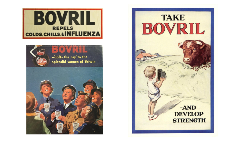
“Bovril was one of the original ‘superfood’ brands,” says Rebecca Harrison, creative director at illustration and animation agency Loveblood Creative. “It was marketed as a super elixir that would make the weak strong, the ill well and the meek powerful.”
The salty meat extract, often mixed with warm water to make a drink or spread on toast, was developed by Scottish butcher John Lawson Johnston in the 1870s as a “war food” to feed the French army. It was initially called Johnston's Fluid Beef – a name unlikely to have stood the test of time, in contrast to the drink, which continued to be advertised as nutritionally rich and strength-giving throughout the two world wars, with some ads even claiming it could cure influenza.
“Often alongside tongue in cheek slogan-based propaganda of the age, the [1930s] logo is strong, bold with minimal fuss,” Harrison says, noting how it stood out against “more intricate, illustrative logos from the likes of 1930’s Pepsi or Caterpillar”.
04. Fiat
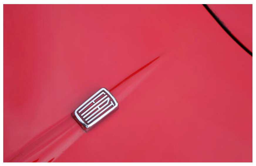
“Fiat’s logo variations in the 1930s (yes, there were five in just one decade) all had one thing in common – the iconic, elongated and condensed Art Deco-inspired letterforms,” says Leigh Chandler, creative director of creative agency Sister Mary.
The ornate circular foliage frame of the previous decade was replaced with a simpler red badge, which came in several different shapes throughout the decade, housing the letters of the company name, Fiat – an abbreviation of Fabbrica Italiana di Automobili Torino.
“It’s not surprising to see that this brand, which has had so many wildly different iterations over its lifetime, has taken inspiration from the 1930’s era logo for today’s iteration,” Chandler adds.
05. Ministry of Supply
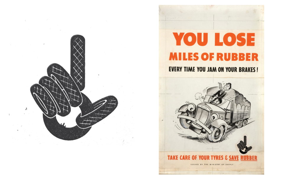
“I’ve always had a deep appreciation for the Ministry Of Supply's ‘Take Care Of Your Tyres & Save Rubber’ campaign logo. In my view, it stands as one of the first conceptual symbols that managed to break through the cacophony of its era,” says John Randall, senior graphic designer for Magpie Studio. “The amalgamation of graphic tires, crafting an attention-grabbing hand to establish a memorable and impactful motif, is nothing short of brilliance.”
The Ministry of Supply (MoS) was a UK government department formed in 1939 to coordinate the supply of equipment to the British armed forces, including explosives, ammunition and guns. The MoS called upon the public not to waste and to hand over any disused rubber in order to help replace supplies that were lost, which they salvaged for war purposes.
“It’s worth noting that in the pre-computer age, graphic design was a profession governed by handwork and traditional tools, skills that have, regrettably, largely faded into obscurity in today's creative landscape,” Randall says. “It was a delightful surprise to stumble upon an original image of the poster layout from this campaign, shedding light on the hand-drawn grids and cut-out graphics that were employed to place and size the elements.”
06. Warner Brothers
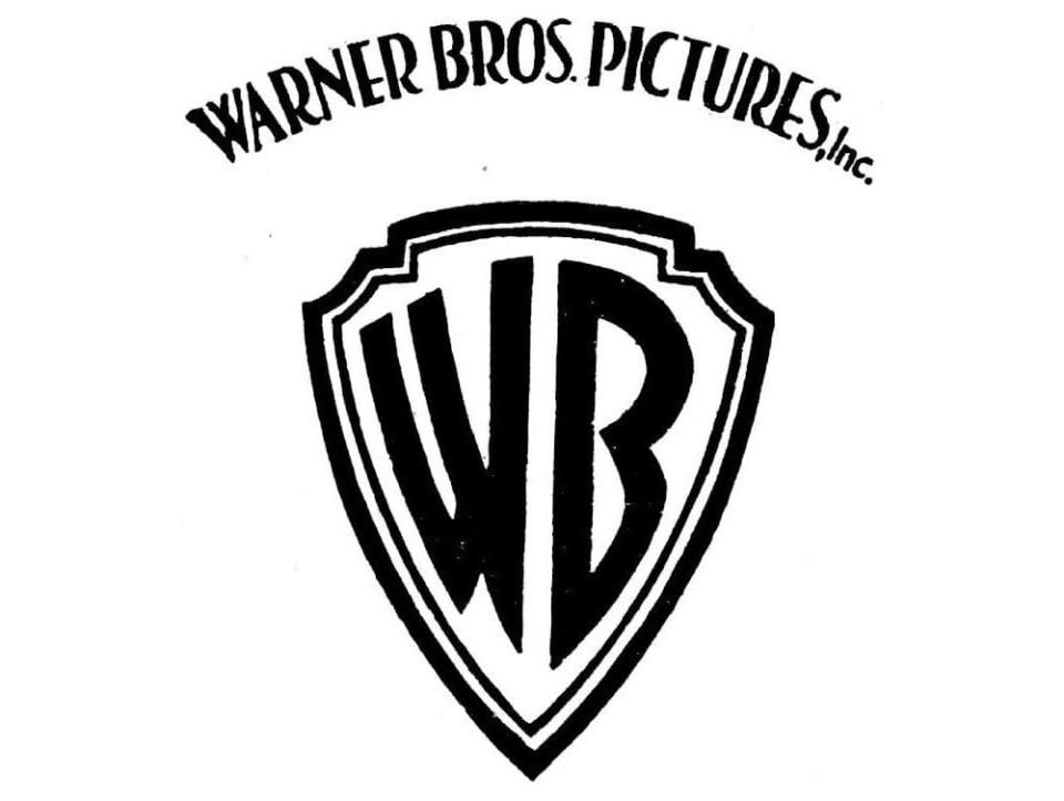
“The beauty of the best logos is in their staying power. Styles may come and go, minor tweaks may be made but if you can create a solid foundation for a logo that stands the test of time that is a great logo design. Warner Brother’s famous shield is a classic example of a logo with the power to last, as it has for almost a century,” says Lisa Franck, strategy director at design and advertising agency Tavern.
“At the time, shields were a popular holding device that many brands eventually moved away from as trends changed,” she adds. “However, the simplicity of the WB initials allowed this particular design to not only survive the trends cycle but to also achieve instant recognition around the world for decades to come.”
Created by graphic design legend Saul Bass, the iconic WB of the film and entertainment company’s name takes centre stage in this bold logo. It was a departure from 1920s iterations that included words and pictorial elements such as the studio building.
The name itself has an interesting story attached: the brothers original surname was Wonskolaser when they emigrated, together with their parents, from Russian-controlled Poland to the US, before their father changed their surname to Warner.
07. Spratt’s
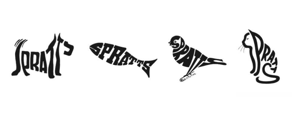
“The playful, fun and flexible use of logos may seem to be a design phenomenon of recent years. However, the logo series developed by Max Field-Bush in 1936 for the British pet food manufacturer Spratt's is an example that some developments can be found in design history long before they became established,” says Jens Müller, graphic designer and author of Logo Beginnings, Logo Modernism and The History of Graphic Design. “Field-Bush created a number of variations, each showing the brand name in the shape of popular pets, which were used side by side in the company's publicity work."
Alongside signage and posters, the calligrams (a visual device where letters create an image related to the meaning of the words) were also seen on promotional enamel badges for Spratt’s. The company name can still be seen on the facades of the former factories, now a live-work space called Spratt's Complex, in Poplar, London.
09. Kodak
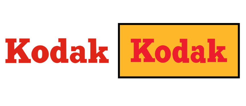
“This 1935 iteration of the Kodak logo is a great example of less is more,” says Derek Koch, senior designer at strategy and design studio Team. “It was remarkably simple for its time (relying only on type and colour) allowing it to become an instantly recognisable symbol for the company without any literal symbols of cameras or photography. The decision to shorten the logo from Eastman Kodak Company (the prior version included a monogram composed of the company’s initials, EKC) to Kodak makes it even better.”
The brand’s colour palette was debuted in 1935 with the name in bright red in a bold slab serif font, and a variation with the name against a cheery yellow background. With a friendly and familiar feel, it was an apt choice for Kodak, which was founded by George Eastman in 1888 with the aim of revolutionising photography by making it accessible to the masses.
10. Caterpillar
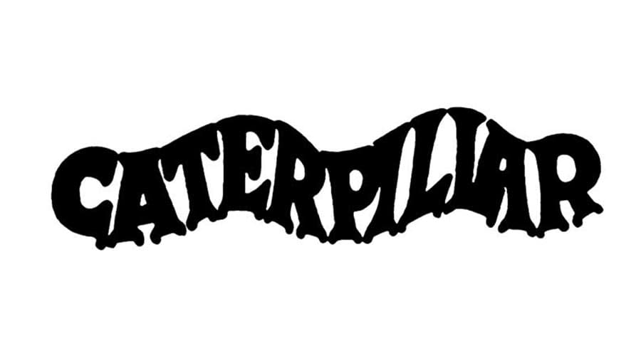
The original, playful logo for Caterpillar, the world's largest manufacturer of construction equipment, was in use from 1925 until 1931, and the first in a very wide variety of logotypes and emblems for the company throughout the years.
“While it went through a transformation in 1931, the logo they sported as the decade turned was, in my view, a stroke of brilliance," says Magpie’s Randall. “The thoughtful design insight that transformed the ‘C' in the logotype into the rounded head of the insect, with the stems of the characters forming delicate feet, is a source of pure delight. The name itself was artfully rendered in a wavy inscription to resemble the silhouette of a caterpillar, perfectly capturing the feel of the continuous-track-system used for the wheels of their vehicles.”
For more on logos, see our history of logos, the best logos and the best entertainment logos roundups.

