The best fashion logos, according to the experts
- Oops!Something went wrong.Please try again later.
Fashion is a huge industry, employing millions of people including print designers, advertising experts and graphic designers. No matter the price point and customer base, some fashion industry logos become household names, while others become cult favourites among insiders, linked to their unusual designs, their adverts or their collaborations.
But what makes a good fashion logo? Harry Hoskyn, creative director at Spring Studios, explains the appeal: “It’s far more than a vector: it's the association that we have with the brand, the power to become part of our everyday visual vocabulary – high or low.”
To pick our favourite fashion logos, we’ve spoken to a range of experts, including those with backgrounds in graphic design, art, law and even sociology. For more on logos, see our best logos of all time post, plus our favourite 1980s and 1990s logos.
01. Chanel – 1925 to present
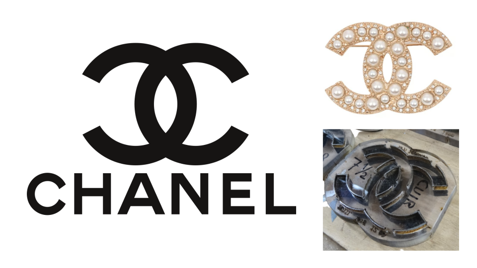
The interlocked ‘C’ initials, as designed by Coco Chanel herself, speak for themselves. The symmetry is easy on the eye, and it’s clean and easy to identify at any size or scale, which perhaps explains why the Chanel logo has stayed the same since 1925.
Marco Molteni, creative director of Jekyll & Hyde, says, "The Chanel logo has all the characteristics a logo should have: meaning, clearness and strength. It’s the logo that every designer would have loved to design."
There’s an urban myth that the Chanel logo features on lampposts in Mayfair – sadly it’s just part of a creatively presented logo for Westminster City Council. You’re much more likely to find the double 'C's covering denim, emblazoned on handbags, topping a lipstick cap, or spelled out in pearls on a brooch. Other comparable logos that play with interlinked lettering include Gucci and Fendi, both of which also have a rich heritage.
So, is some of our affection tied up with the company’s historic roots? David Airey, brand identity designer and the author of Logo Design Love and Identity Designed, explains: "The Chanel design we’re familiar with could be something entirely different, yet still feel as iconic, because it’s attached to a brand that is more than 100 years old."
02. Versace – 1993 to present

The Versace logo is one of the most, shall we say, distinctive fashion logos. However, it had a deep resonance to designer Gianni Versace, who based it on a mosaic spotted in his hometown of Reggio de Calabria when he was a child. It’s unusually complex, but unforgettable, and it’s been in place since 1993.
Myths and legends have always been an attractive subject for logos, from heraldic badges and crests in the Middle Ages to metaphysical designs for wellness brands.
“The use of Medusa harkens back to the early days of commercial symbolism, when mythological figures were popular subjects in trademark design,” says James I. Bowie, founder of Emblemetric and Professor of Sociology at Northern Arizona University, specialising in research on logo design. “It’s also an abrupt shift from the previous Versace logos, which were modern-looking wordmarks. This image suggests a deep-rooted history and classic visual appeal.”
The Medusa image is framed by a Greek key-style pattern, which also features as trims on some Versace clothing. The most exciting use of the logo is perhaps its bold remix for 2021, when the Amplified Medusa pattern was developed featuring brightly-coloured prints of the Medusa head we’ve come to know and love, on jackets, shirts, plates, and even a £235 puzzle. This was a really exciting way to connect the logo to younger consumers.
03. Loewe – 2014 to present
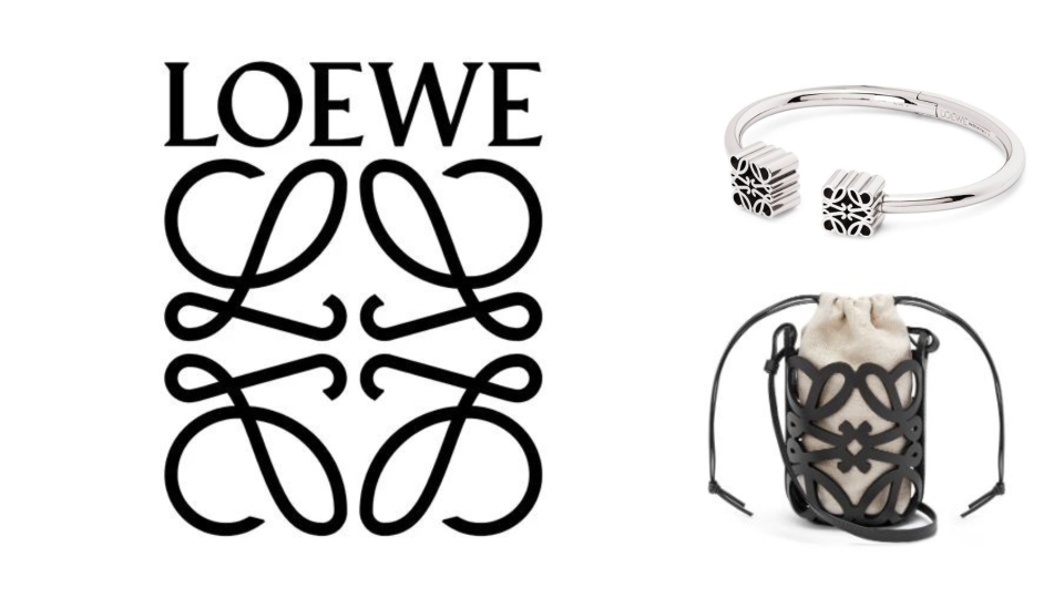
Loewe is a very European brand: it was founded by a German, Enrique Loewe Roessberg, from a group of leather craftsmen working in Spain. It’s best known for its leather bags (though more recently we were blown away by its pixelated clothing). The current logomark blends the brand name with a reworking of the stylised motif known as the Anagram.
“We’ve always been amateurs and collectors of Berthold Wolpe typography, and own a very rare specimen publication of his Pegasus typeface, lesser known then than his Albertus,” say Mathias Augustyniak and Michael Amzalag of M/M Studio, which redesigned the logo and often collaborates with Loewe. “We felt it was the perfect starting point for us to create a custom word mark, echoing Enrique Loewe’s German roots.”
The Anagram, created by Vincente Vela in the 1970s, is actually based on branding irons to make a pattern based on ‘L’ letters. This sparked more research for M/M Studio:
“We researched branding irons from around the world to understand the process of bending and shaping the metal to make very simple symbols, and applied it to the four letters: it’s a drier expression, moving away from the painterly feel and bringing them into the world of signs.”
For more insight into heritage-driven brands, see our overview of the new Burberry logo.
04. Louis Vuitton – 1854 to present
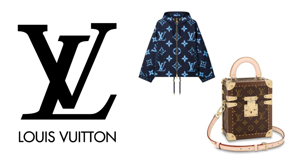
Monogram logos continue to be all the rage, and Louis Vuitton isn’t afraid to play around, taking centre stage at the height of the logomania trend in the mid-00s, where having an unashamedly branded designer item was the height of cool. However, its signature monogram canvas pattern was first added to goods by founder Louis Vuitton’s son Georges, back in 1896, when the company sold luggage and boxes. The canvas combines the 'LV' lettering with a series of simple motifs: a flower, a star, and another star inside a diamond.
“The interlocking 'LV' with the flower pattern is a trademark in itself,” explains Julie Zerbo, a lawyer and journalist who is editor-in-chief at The Fashion Law. “It’s very powerful and pretty robust; you see bags covered in logos.”
Perhaps the most interesting corruption of the LV logo came from Marc Jacobs’ reign as creative director; he invited artist Stephen Sprouse to spray-paint a graffiti design over a monogrammed bag, known as the Graffiti Speedy.
As we come to the end of the ‘quiet luxury’ trend for disguising brand names, we’re seeing a revival of prominent monograms like 'LV'. However, you might not realise the chequered Damier pattern (in brown and beige squares) that often accompanies the LV logo is trademarked as well – Zerbo notes that “it’s good branding practice to have an arsenal of multiple different trademarks.”
05. Supreme – 1994 to present
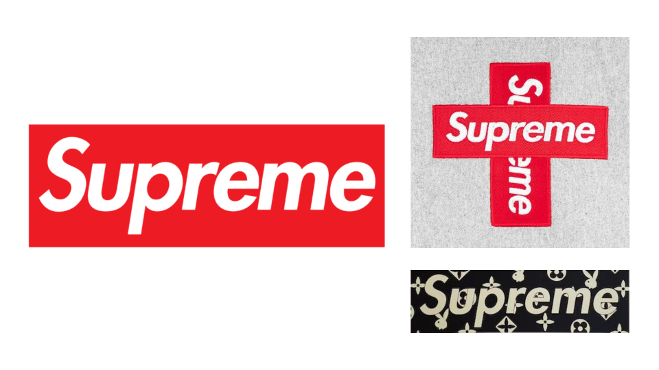
This is another logo you’ll recognise, even if you’ve never bought a single product from Supreme, a brand beloved by both skaters and fashionistas. It started out in Manhattan in 1994 and, rather than a rapid expansion, carefully focused on limited-edition products and very few stores.
The logo, known as the Supreme Box, is clearly inspired by artist Barbara Kruger, active since the 1970s, whose most famous artworks contain italic Future Bold or Helvetica Ultra Condensed text in a red box. Yet Supreme tried to sue another company in 2013 for copying the lettering, Kruger finally spoke out, calling the skater brand “a ridiculous clusterf**k of uncool jokers”. She got her own back in 2017’s Art Biennial in New York, where she exhibited distinctly Supreme-inspired goods, like skateboards saying ‘Don’t be a jerk’.
“Supreme is readily identifiable; when you see white block lettering against a red background, you know where it comes from, and consumers can identify it,” says Zerbo. “They know their customers and there’s a lot of demand. They use a ‘drop model’, which notoriously makes it difficult to order large quantities.”
Supreme remixes its logo for store openings, tongue-in-cheek imitations of other brands, and art tributes. Collaborations are Supreme’s bread and butter, with A Bathing Ape, Louis Vuitton, Playboy and even Oreos getting involved – some savvy shoppers listed the Oreos on resale sites for $500. We'd suggest the designers behind the criticised McDonald's x Palace collaboration look this way for advice.
06. COS – 2007-2021
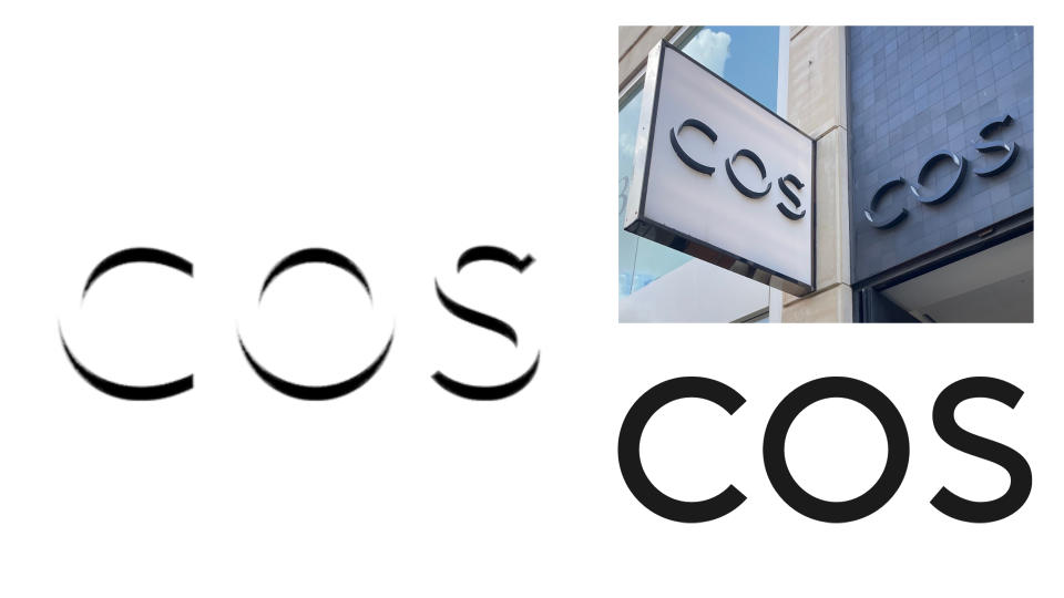
Unlike its fast fashion sister brand H&M, COS (which stands for Collection of Style) is all about fashion built to last, often inspired by art or architecture; its first fashion show was held at London’s National Gallery.
‘Everything in our collection is crafted with longevity in mind’, says the brand’s guide to product care. This feels true of the original logo, which lasted from the brand launch in 2007 until 2021: a quietly stark wordmark, with the text extruded so parts of each letter are completely erased, letting the existing marks become a shadow. Suddenly the lettering pops, and it appears to be 3D.
"The original COS logo was a perfect reflection of the brand’s minimalist style – the letterforms were not even visible; rather, only their edges or shadows served as indications of their existence,” says Bowie. The newer logo loses all the sculptural and special charm of the original: this is a severe case of ‘blanding’, a bit like replacing a fountain pen with a chunky felt tip.
Both the H&M Group and the UK PR company representing COS declined to comment on the redesign, but Bowie and Airey wonder if the heavy reliance on negative space may have made it difficult to replicate for different products and purposes – “at small sizes, on embroidery, for instance,” suggests Airey. Having spotted the old logo outside my local COS store in Bristol, I’d be happy if they didn’t get round to erasing all traces of it. Long live the sculptural COS wordmark.
07. Comme des Garçons PLAY – 2002 to present
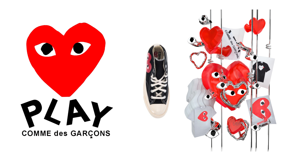
The diffusion line from achingly cool brand Comme des Garçons (CdG) is just as playful as the name suggests. Take a crudely-drawn heart symbol and make it whimsical and childlike with cartoon eyes. It might not be to everyone’s taste, but Polish artist Filip Pagowski has created an instantly recognisable logo to elevate the range of classic basics.
The main CdG line is arty and sculptural, whereas this is like a fun little sister, and it’s all highly collectible thanks to CdG founder Rei Kawakubo’s god-like status in the fashion world. For Bowie, the timing of CdG Play, launched in 2002, is key:
“The use of hearts in logos in the United States spiked after 2001, in what I suspect was a reaction to the September 11 attacks. The PLAY logo was perfectly positioned to appeal to our desire for love in an increasingly turbulent world.”
“In relation to others in the fashion industry, this really stands out, looking more like a painting than a luxury lifestyle logo,” says artist and graphic designer Rachel Kate Noble, who was commissioned by Sevenstore to create artwork that paid tribute to Pagowski’s logo. “It emphasises the more radical, artistic thinking and positioning of the brand.”
Noble’s artwork allows the familiar design to be even more playful: “Using the strong graphic of the CDG PLAY heart-shaped logo in a 3D world was really satisfying.”
08. A Bathing Ape – 1993 to present
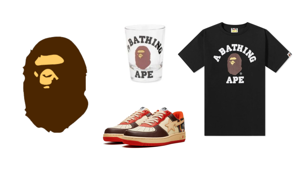
This Japanese streetwear brand gets a nod for its unpretentious approach to logo adaptations. The visuals, created in 1993 by founder Nigo, are pretty simple: a 2D stencil-like rendering of an ape, with just two colours: a stone colour for the facial features, and mid-brown for the surrounding fur.
The name comes from The Planet of the Apes film, combined with the Japanese custom of rich young men taking baths, hence the saying ‘A bathing ape in lukewarm water’. Adding the water or the bath would make this logo harder to render at different scales, so instead we just get the head and neck of the animal.
BAPE, as it’s nicknamed, isn’t afraid to play around with logo presentation, colours and surrounding motifs. Even the typeface for the wordmark can change, but the most commonly used is the college font, with chunky slab serifs; there was even a special ‘College Dropout’ trainer issued with Kanye West in 2007, which now has a resale value of up to £10,000. In 2023 alone, BAPE has issued collaborations with ASUS, Adidas, the Gran Turismo film, and football team Inter Miami.
09. Marge Sherwood – 2022 to present
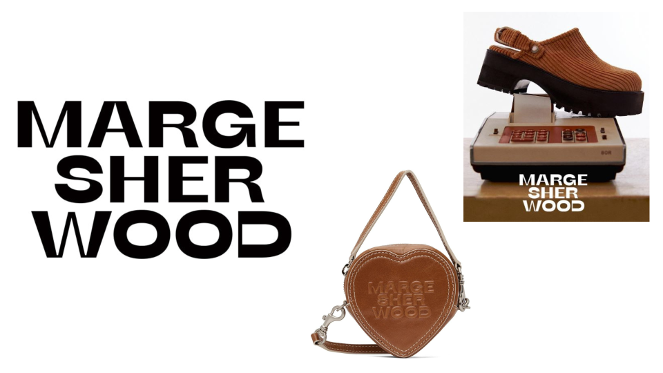
Do you recognise the name? Marge Sherwood was a character in the Patricia Highsmith book, The Talented Mr. Ripley, published in 1955, and the 1999 film adaptation (set in 1959), where she was played by Gwyneth Paltrow. Seoul-based designers Sungeun Um and Soonyoung Kim were inspired by Marge when creating their bag brand in 2016, and have since gone on to add shoes to the range.
Their first wordmark was very standard – think narrow capital letters with wide spacing – but the redesign is far more effective, with retro touches and varying weight on parts of letterforms harking back to that all-important inspiration.
“There can be a pull with nostalgia,” says Airey. “We think back to our fondest memories and want to be back there. People in branding know this, and try to capture attention through designs that suggest certain time-periods.”
Taking a tip from Louis Vuitton, they’ve now launched a logo patterned bag with a checkerboard background and ‘MGSW’ inside a heart motif. With all the bags being quite small (a reminder of the early 00s, when you could barely fit a small mobile phone and your keys inside), they definitely fit the category of whimsical rather than super practical, and the wordmark mirrors this.
10. Telfar – 2005 to present
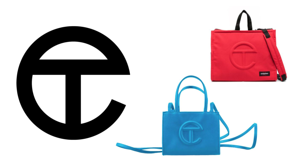
The monogram for Telfar Clemens’s unisex fashion brand dates back to his school days, when a teacher made monograms for each pupil in the class. The ‘T’ sits snugly inside the ‘C’. That logo is now embossed on jeans, but is best known for appearing on his covetable bag range, so popular amongst New York’s fashion set that it’s been nicknamed the ‘Bushwick Birkin’. Telfar has also collaborated with Converse, Melissa and Eastpak.
Sadly, Telfar has faced legal issues relating to its logo, with beauty brand Charlotte Tilbury sharing some common traits in their 'CT' monograms. Tilbury’s has the ‘C’ slightly overlap the ‘T’, hooking it like a link in a chain, but otherwise they’re very alike. Zerbo explains the problem:
“They’re arguably similar logos, but they’ve coexisted in the market as they sell different types of goods: Charlotte Tilbury is skincare. When Telfar filed a trademark application to use their logo on perfumes and cosmetics, Charlotte Tilbury filed an opposition.”
This is a reminder that your logo doesn’t just represent your brand identity – it stands alongside others in the same niche, and if you diversify, you risk overlapping with competitors or confusing your customers.
For more logo content, see our logo history, best simple logos and best entertainment logos pieces.

