The best adverts of the 1940s, as picked by experts
The adverts of the 1940s can be neatly divided into two broad categories. First, as the world was consumed by war, governments harnessed the best advertising talent to boost morale and promote policies on the home front through powerful propaganda. Then came the post-war period, and a series of iconic consumer ads that reflected the upbeat and hopeful spirit of the times.
To bring you some of the best examples of both, we've talked to experts from across today's design and advertising industries. They recall the impact and ingenuity of the best 1940s ads, and explain why, much like the best logos, each design worked so well.
So join us as we revisit some classic designs which continue to captivate generation after generation. For more, see the rest of the best adverts by decade series
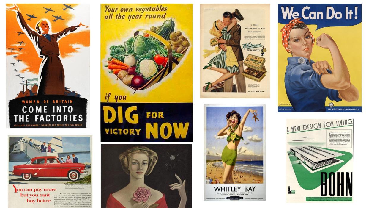
01. Dig for Victory
In the first few years of the 1940s, Britain faced the realistic prospect of mass starvation as ships importing food were targeted by German submarines. In response, the Ministry of Agriculture and Fisheries launched a major educational campaign using leaflets, guides and short films encouraging citizens to grow their own food.
"The Dig for Victory campaign stands as a stirring testament to the power of collective effort and resilience," says Felix Chilvers, creative director at FutureDeluxe. "The campaign's aesthetic mirrors a bountiful basket of vegetables, evoking a sense of wholesome abundance and connection to nature. What a powerful image to present to war-torn, food-deprived Britain."
It wasn't an unqualified success. "Its purpose was to encourage self-sufficiency," Chilvers explains. "However the reality was that, although people started picking up spades and digging up their drives to make way for carrots, these actions were not nearly enough to keep the nation fed. But its main achievement lies in giving back some control and improving the mental health of the nation.”
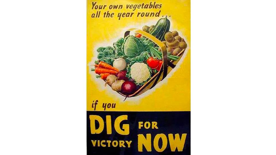
02. We Can Do It!
One of the biggest social changes that came out of the war was mass employment for women, who had traditionally been expected to stay home and work as mothers and housekeepers. This was out of pure necessity, as most men were serving in the military, but once the genie was out of the bottle, it couldn't be put back in. And of all the wartime posters this American one, created by J. Howard Miller in 1943, has become the most symbolic of that generational shift.
It's origins, however, are often misunderstood. "Contrary to a common misconception, the artwork wasn't crafted to motivate women to enter the workforce," explains Richard Fenn, creative director, visual design at House 337. "Rather, many were actively engaged in various factories and shipyards at the time. The image served as an acknowledgement of their efforts and an encouragement to persist in their endeavours."
Matt Hauke, senior designer at Design by Structure, adds that the poster has ultimately made more impact over the decades than it did at the time. "It was actually relatively unknown and only ever on display internally at one company, Westinghouse Electric," he notes. "But its impact on our culture in the decades following has been huge.
"Originally intended to boost morale and quell disruption among female workers, its meaning has now completely U-turned and become the embodiment of female empowerment, yielding endless parodies. While brands such as Aunt Jemima and Uncle Ben's are clambering to undo their dated cultural imagery, it’s refreshing to have an image be reappropriated through sheer cultural will, to have a positive impact on society."
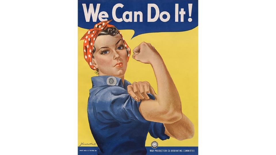
03. Women of Britain: Come Into The Factories
The need for women to work in the factories was as important in Britain as it was in the US, as this inspiring poster demonstrates. It was designed by British illustrator and political cartoonist Phillip Zec, whose career began in advertising.
"I love the heroic stance of the woman in the poster, framed by a flock of war planes overhead," enthuses Tamryn Kerr, co-founder and CCO at Hijinks. "It paints a picture of a time when women literally kept the country running: imagine that!
"It’s also the antithesis of how women were normally depicted in advertising, with a notable and applaudable lack of red lipstick," she points out. "This piece of advertising is now incredibly collectible and goes for as much as £6,000 per poster, which proves the timelessness of the artwork and the need for female empowerment."
04. Whitman's Chocolates
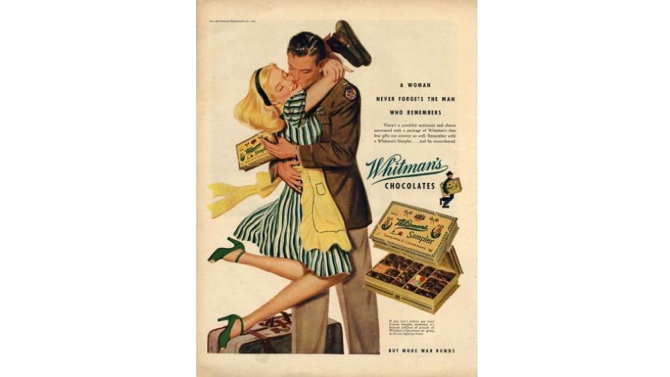
The twin needs of war and the economy meant the 1940s was dominated two quite different types of ads: official and commercial. Although they actually weren't so different...
"In many ways consumer advertising was indistinguishable from the country's propaganda machine, reflecting images of patriotism, of teamwork, of responsibility," says Gregg Lipman, managing partner of CBX. "Early 1940s advertising riffed off the popular images of America at war, including the popular 'pin-up' girls of the time. This example from Whitman's Chocolates shares the posterised, colour saturated style of the pin-up, but more interestingly supports the role that gender played at the time: the brave fighting man supported, maybe idolised even, by the adoring, loyal wife."
Lipman also notes the professionalism of the layout, that ensures the reader knows how to navigate the page. "A core image brings you through the headline, copy block, identity and signs off with the pack," he explains. "And colour is used to support the brand's visual equity, with 'Whitman's green' mimicked in the colours of the woman's outfit."
05. British Railways
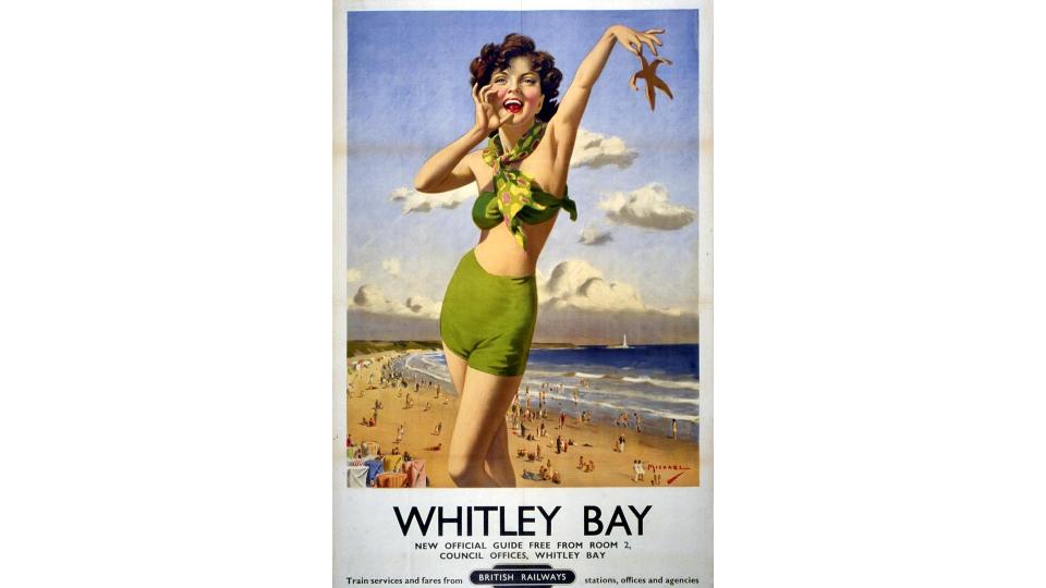
While wartime posters are our most obvious association with the 1940s, the post-war period also threw up an equally enduring trend in the form of the illustrated British Railways poster. John Cherry, executive creative director at Atomic London provides this example for Whitley Bay in Tyne and Wear.
"You’ve probably seen similar posters for regions and towns all over the UK," he says. "They’re proudly sold in market stalls, independent art stores and gift shops of National Trust properties, and end up being hung in the kitchens, bathrooms, and hallways of the discerning middle classes. They’re positive and optimistic, beautifully crafted, visually simple and full of nostalgia; all great reasons why people put them on their walls."
As Cherry explains, the original campaign was designed to get people moving again after the war years, during which British Railways had pointedly asked the public in posters 'Is your journey really necessary?'. "After the war, people had got into the habit of remaining in their local area," he says. "So these posters encouraged people to travel again, to stimulate the traditional holiday and hospitality economies of towns and areas all over the UK."
And if that last bit sounds familiar… well, it is. "Today’s rail companies have the same task, attempting to get us all moving again," Cherry points out. "Only a few years since Covid lockdown, where we were all told to 'stay at home', we’re all travelling less and the hospitality sector has still to recover."
06. Bohn
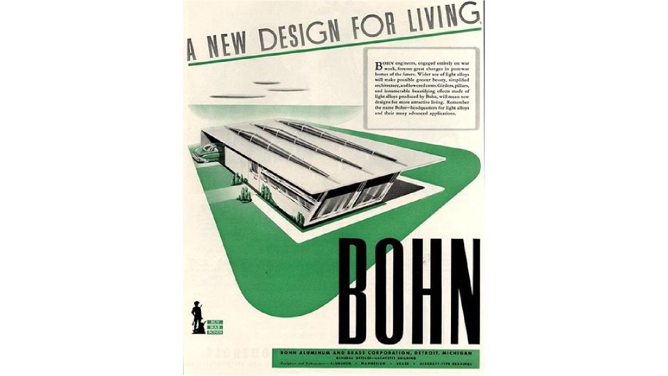
Another big theme in post-war 1940s advertising was looking to the future with optimism, with an emphasis on mass consumption, prosperity and new technologies. And here's a great example, designed by American futurist and illustrator Arthur Radebaugh for Bohn Aluminum and Brass Corporation, a manufacturing company based in Detroit, Michigan.
"This piece from Bohn particularly captivated my graphic design-centric mind," says Fenn. "I mean, just look at it – a delightful embodiment of early Art Deco; its bold, sleek, and streamlined design stands out. It serves as a reflection of the post-war optimism that characterised America during that era."
07. De Beers
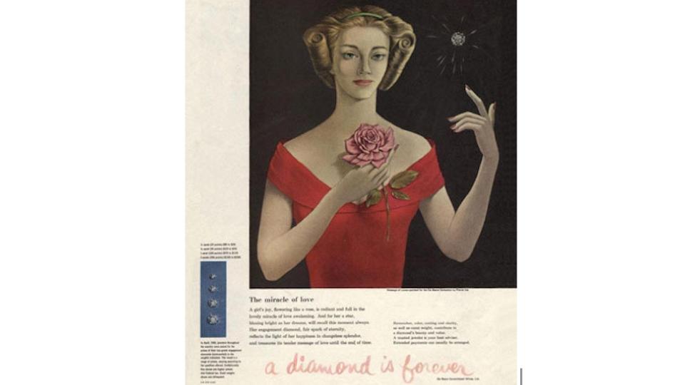
While some ads echo down the ages thanks to their visuals, others are iconic because of their use of copy. As none more so than this 1947 ad for diamond consortium De Beers.
Rob Kavanagh, executive creative director at Oliver UK, sets the scene. “In the 1940s, radio and print reigned supreme," he explains. "And in the battle for brand saliency and a permanent space in someone’s mind, the jingle or slogan was king. Like bygone advertising ghost signs, their power lives on today – especially in popular culture and common parlance. The likes of 'Does what it says on the tin' and 'Because you’re worth it' can trace a direct lineage back to 'Go to work on an egg', 'Put a tiger in your tank', and 'Have a break, have a KitKat'. They’re still Grrreat."
Equally, the importance of De Beers’ slogan 'A Diamond is Forever' cannot be underestimated. "Before they asserted the supremacy of the rock they had a near monopoly on, engagement and wedding rings typically sparkled with almost any other precious stone," Kavanagh explains. "Now that’s an idea for eternity.”
08. Ford
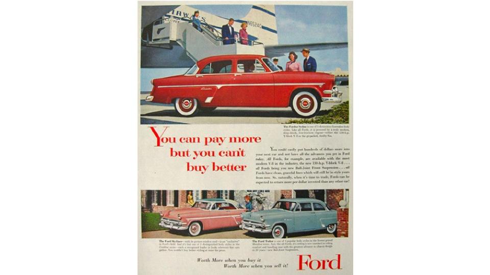
It doesn't matter which 20th century decade you discuss, Ford is a brand you can't ignore. And the 1940s is no exception, says Dipti Bramhandkar, executive strategy director, North America at Iris.
"Post-war consumers sought value, and Ford positioned itself as a brand providing superior cars at reasonable prices," she notes. "This campaign for the 1949 Ford models resonated by offering affordability and quality. The tagline challenged the notion that higher costs equalled better products, fostering confidence in a post-war era of optimism."
And here's why it worked so well. "With modern designs reflecting progress, Ford's message was clear, memorable, and addressed economic concerns. The campaign gave Ford a competitive edge by presenting itself as a smart and discerning choice in a changing landscape, capturing the essence of post-war consumer aspirations."
The brand was also building on a proud wartime record, having switched from making automobiles to producing the airplanes that arguably made the difference between winning and losing the war. And while this was of course done for patriotic reasons, it didn't exactly harm the company from a marketing point of view, says Karim Salama, director at e-innovate.
"Aligning the company’s service with the nation’s goals and virtues is a perfect demonstration of the purpose of a product or service," he explains. "Not to mention, of course, that it is close to heart: Henry Ford’s son was imprisoned and had suffered the consequences of the war first-hand.
"By adopting the zeitgeist of the time into its company’s identity, Henry Ford proved to the world how advertising is more than product placement: it can penetrate into the deepest motivations of national identity."
And for further visual inspiration, check out our guide to logos by decade, which includes the best 1940s logos.

