The best 20th century logos, as picked by the pros
- Oops!Something went wrong.Please try again later.
The 20th Century was an incredibly important time in the history of the logo. While logos and things like them had been used for hundreds (arguably thousands) of years beforehand, and the first official logo had been trademarked in 1876 by the Bass brewery company, it was in the 20th Century that logos really evolved into what we know them as today.
Many of the best logos of all time sprang from the mid 20th Century and the rise of modernism. A logo became something more than an eye-catching picture that could sit next to a well-known name; it became a substitute for the name itself, thanks to forward-thinking designers like Paul Rand, Thomas Geismar and Saul Bass. If you’d told someone in 1900 that one day, a simple design of two yellow arches would be recognised by billions of people as the emblem of a restaurant, they’d have thought you were talking nonsense. But, as we all know, indeed it became so.
Picking the best logos of the 20th Century is therefore a challenging task. As such, we enlisted some help from across the industry, and polled an expert panel of designers, creatives and other experts to help us pick out the logos that best define this iconic period. The results we received were a fascinating mix, from some of the most iconic brands on the planet, to amazing designs we had never seen before.
If this gets you in the creative mood, check out our resource of the best free logo design tools. But now, let's see what the pros picked as the best 20th century logos...
01. Chase Bank, 1961
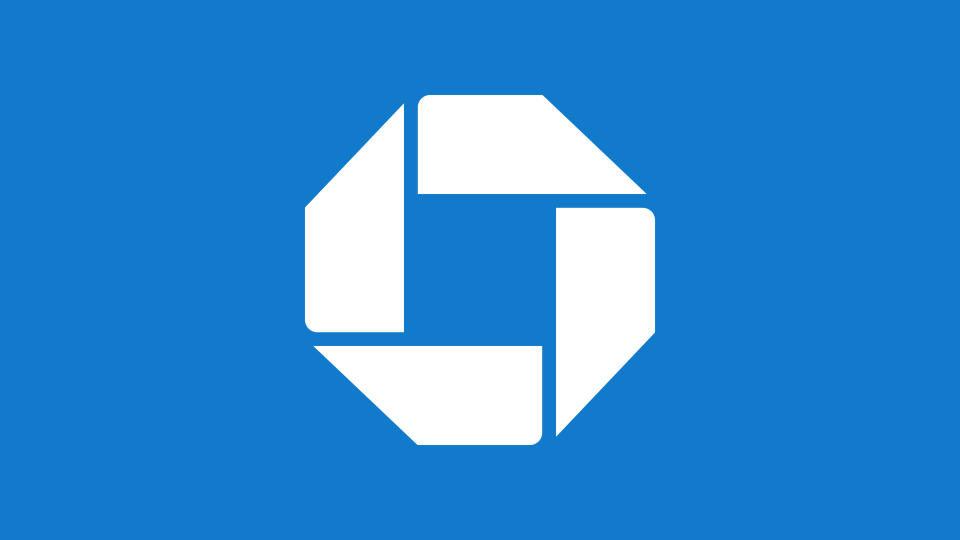
It’s basically impossible to talk about the history of logos without mentioning Chase Bank. This octagonal symbol by design agency Chermayeff & Geismar was one of the first incidences of a huge company trusting that a well-designed abstract symbol could be indelibly associated with it in people’s minds.
Swedish creative director and logo designer Fabian Arbor, describes the Chase logo as: "Simply before its time."
He says, "To do something as bold as representing your whole brand with a simple mark like this was almost unheard of in 1961. Over time, it’s become arguably one of the most recognisable symbols in the world."
02. M.C. Equipment Inc.,1975.

Rich Baird is a veritable font of knowledge when it comes to modernist logos. He runs the comprehensive resources logo-archive.org and brandarchive.xyz, and has digitised and preserved thousands of historic logos.
"The logo that first comes to mind when I’m asked to pick just one example (from the thousands I have digitised on LogoArchive) is Raymond Bellemare’s work for M.C. Equipment Inc. from 1975," he says.
"It’s playful and unexpected amongst the more industrious, often abstract or literal construction logos of the time. Bellemare also leverages familiarity and association; the power and longevity of the elephant."
"This is furthered by execution, which is solid and robust. Its formal geometry makes it easy for sign-makers to scale up, or for it to be applied using any number of techniques, printed, cast or fabricated."
03. Google, 1999
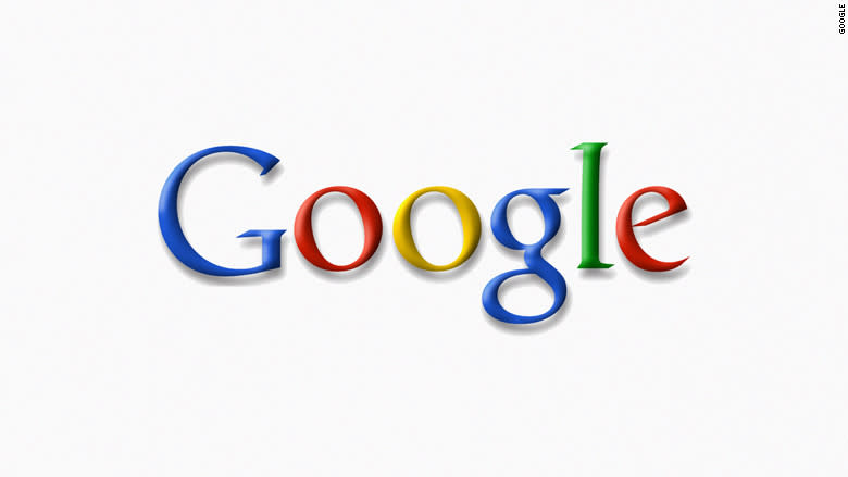
We’ve talked a lot already about the importance of shape and geometry in logo design – but what about colour? For Manchester-based graphic designer and illustrator Jane Bowyer, one of the most iconic logos of the last century came right at its end, and its success was all down to a clever sequencing of colour.
"The Google logo, designed by Ruth Kedar, is undoubtedly one of the most recognisable logos worldwide," Bowyer says. "Its charm comes from its simplicity and playfulness, but its true magic lies in its ability to be recognised even without its name. Just that sequence of colours – blue, red, yellow, blue, green, red – immediately makes you think of Google."
"The daily doodle proves how versatile this logo is, as it has been adapted by countless artists and creatives while still maintaining its distinctive ‘Google’ identity. It's remarkable to think that even after two decades, the Google logo remains loyal to its original layout, the distinctive colours and playfulness that made it iconic from the start."
For more on the Google logo, read our Google logo history.
04. Columbus Indiana Visitors Bureau, 1973

Modernist designer Paul Rand is perhaps best known for his creation of multiple globally recognised logos for computing company IBM. However, illustrator Natalia Maca finds the most inspiration in his work for the Columbus Indiana Visitors Bureau.
"The elegant use of typography by Paul Rand does not cease to amaze me," says Maca, who has illustrated, animated and designed for a number of well-known brands from her home in Regensburg, Bavaria.
"His focus on simplicity and the use of strong shapes from the ITC Avant Garde Bold font make this logo one of my favourites. It's easy to see that the 'c' letter represents Columbus and also serves as a symbol for visitors. I especially appreciate how the logo is used on other design elements, with the 'c' appearing in different colours to represent the diversity of people who visit the Bureau."
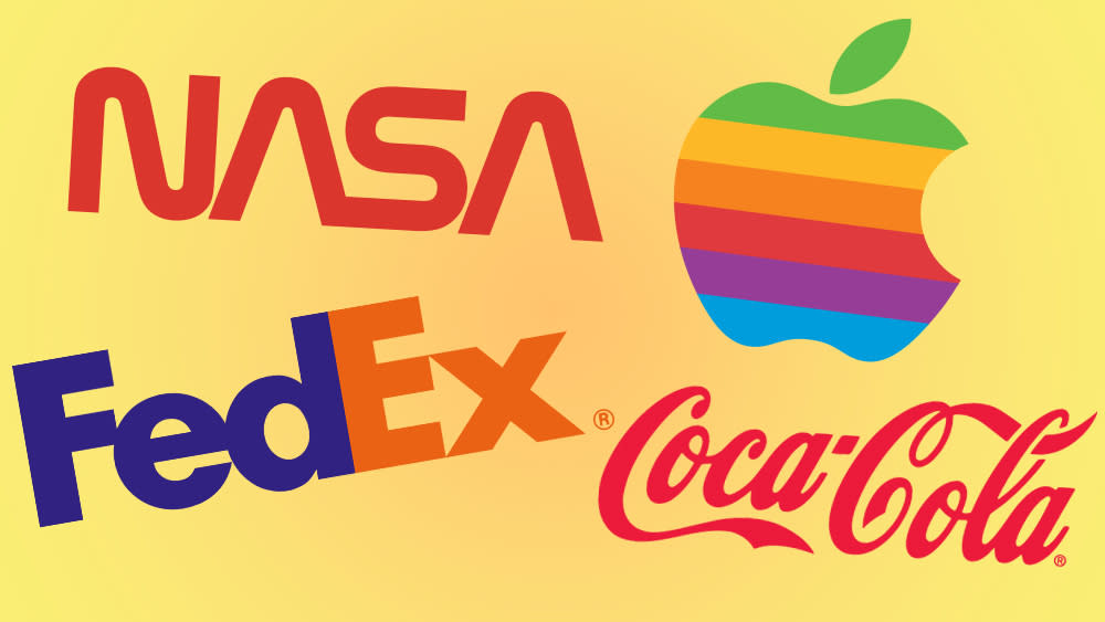
05. Coca-Cola, 1941
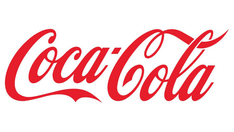
While the roots of Coca-Cola’s truly globally recognisable logo can be found in the 1800s, it wasn’t until 1941 that the definitive form of its Spencerian script was truly nailed down (we did our own little history of the Coca-Cola logo a while back). It’s the standout pick for Tom Ross, CEO and founder at Design Cuts, a community and marketplace serving one million creatives.
"Coca Cola's iconic wordmark logo is recognised all over the world,” says Ross. “What I love about this logo is how enduring it is. In a world of minimal, simplistic, shape-based logos – this elaborate wordmark somehow feels simple and timeless, whilst being incredibly unique."
06. Apple, 1977
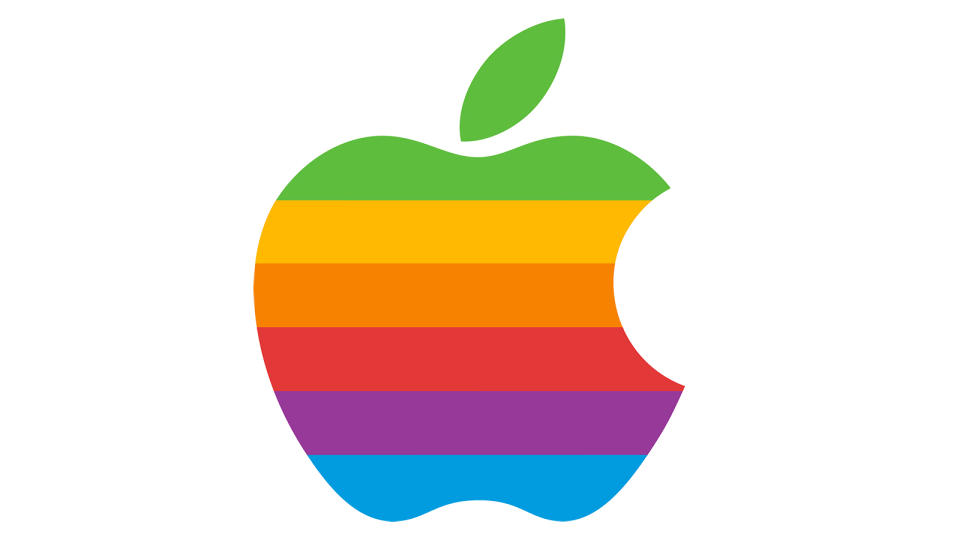
"How could I resist picking the Apple logo as one of the 20th century's juiciest logos?” asks Jacob Cass, logo designer and founder of Just Creative, who is based in Sydney, Australia. "Its simplicity, versatility, and strong brand association make it a truly effective logo. Designed by Rob Janoff in 1977, the minimalist apple with bite taken out of it is instantly recognisable and memorable, even at small sizes and in just one colour."
Cass says, "The logo has come to symbolise simplicity, innovation and creativity which aligns perfectly with Apple's core values, fostering a strong emotional connection with its loyal tribe. It's timeless. And it's recognised all over the world, making it not just an iconic symbol of the 20th century, but the 21st century too. As a professional logo designer myself, I can't help but say the Apple logo was ripe for picking as one of the 20th century's best logos. It was simply the natural choice."
For more on the Apple logo, see our Apple logo history piece.
07. NASA, 1975
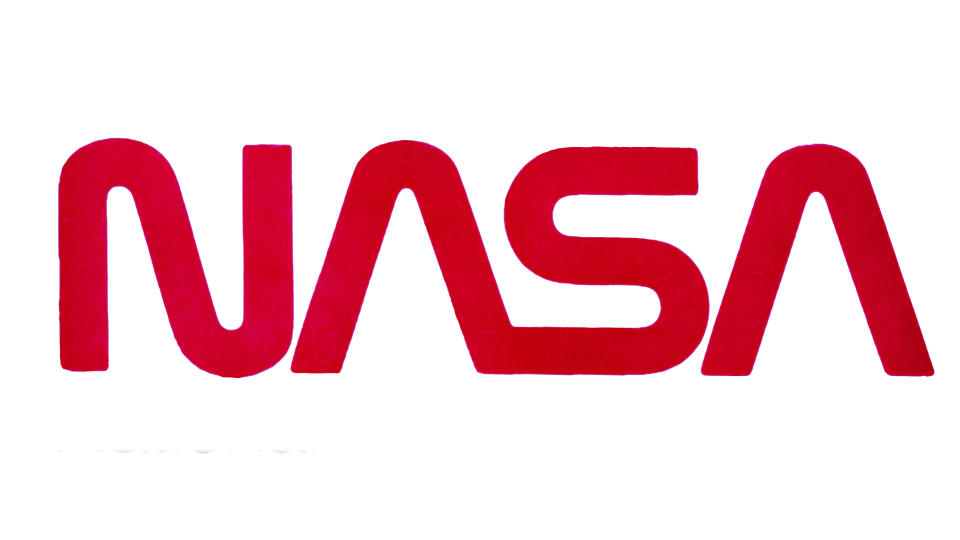
While NASA has been responsible for a few iconic logos in its time, it’s this simple, red-text version that is the most appropriate choice for Arbor.
"It’s the definition of simple but distinguishable," he says. "This kind of red lettering has become synonymous with space exploration and science."
Indeed, the style of lettering has clearly had an influence on multiple science fiction properties in the years following its design. Its echoes can be seen in latter-day Star Trek and the video game franchise Mass Effect.
08. McDonald’s, 1968
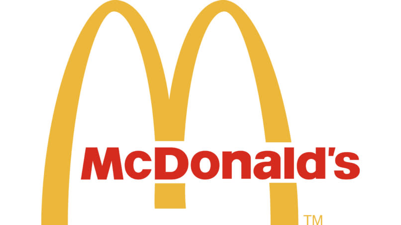
Given that we already coyly referenced the famous 'Golden Arches', it was inevitable they’d end up on this list. A proto-version of the design first appeared in 1961, albeit with a diagonal line running through the arches. It would be seven years later that the logo would reach the form that a huge percentage of the world’s population would instantly recognise.
June Digan, an illustrator and designer based in the Philippines, says, "The McDonald’s logo is the first that comes to mind. Even though it has undergone many adjustments since it launched several years ago, the golden arches remain iconic. It's so flexible and effective. The way they use it in their marketing campaigns is just perfect!"
Ross agrees. "The logo is simple, memorable and scalable," he says. "It's also incredibly versatile. In a recent ad campaign, McDonald's were even able to trigger association with their brand through showing two raised eyebrows!"
09. FedEx, 1994
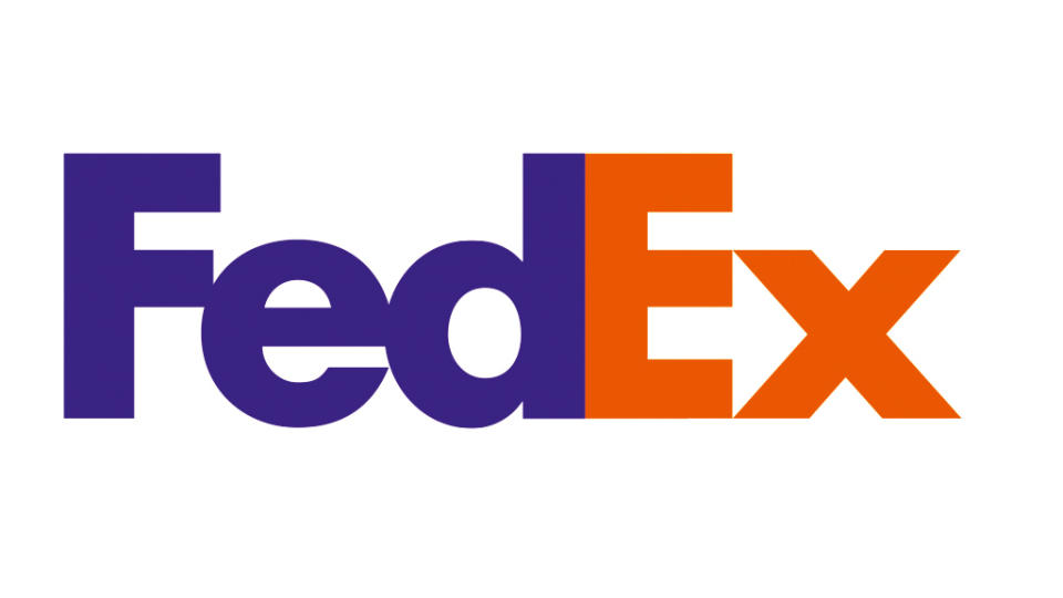
And finally, we’re ending with a logo so iconic that it also made it into our list of the best simple logos – but it really does deserve two spots. Graphic designer and creative director Mark Daniels says, "There's something about a simple yet effective symbol that can instantly convey a company's values and mission. And when it comes to logos, the FedEx logo is up there with the best."
"What makes it so brilliant is its simplicity. Using negative space to create an arrow between the 'E' and the 'X' is clever and effective. And the arrow perfectly represents FedEx's values: speed, precision, and delivery.
"The logo is also incredibly versatile. It works just as well on livery as on a website. And it's been around for decades, but it still looks modern and relevant today. Simple. Effective. Memorable. Versatile. Timeless. In my humble opinion – a true masterpiece in the world of branding."

