The best 1920s logos - 9 iconic designs from the Roaring Twenties
- Oops!Something went wrong.Please try again later.
- Oops!Something went wrong.Please try again later.
While the 1910s were known as the Turbulent Decade, the 1920s were in many ways their mirror image. What was later dubbed the Roaring Twenties, aka the Jazz Age, was a period of unprecedented prosperity and cultural dynamism in the aftermath of the First World War. The rise of consumer culture saw increased access to car, radios, and other conveniences, while lively music and dance trends symbolised a break from conservative social norms.
These trends are all reflected on our selection of the best logos from the period, with designs from the worlds of fashion, entertainment and consumer products; some of which live on, with only minor modifications, today.
We've interviewed a range of experts to curate our list, which adds to our collection of the best logos by decade. Meanwhile, if you're inspired to create your own designs, then also read our guide to the best free logo design tools.
01. Chanel
Chanel is one of the biggest names in fashion today, and has been so for some time. The privately owned, luxury fashion house was founded in 1910 by Gabrielle Chanel, better known as Coco Chanel, in Paris. It's been headquartered in London since 2018, and today generates annual revenues of more than $10 billion. Much of that, we'd argue, has to do with the power of its distinctive branding, centred around a logo designed by the founder herself in 1925.
"The Chanel symbol was designed in 1925 by Coco Chanel by interlocking the two 'C's from her name," says David Nathan Davies, design director at Design by Structure. "The symbol works so well because of its simplicity in both concept and execution, making it very easy for anyone to understand and recognise. At nearly 100 years old, the symbol still feels contemporary against its luxury competitive set."
Yawming Wong, design director at Waste Creative, agrees. "This logo is one of the most iconic and enduring symbols in the world of fashion," he says. "The interlocking double 'C' embodies elegance, style and luxury. The simplicity and symmetry of its design add to its visual allure, making it a memorable and instantly recognisable monogram.
Neil Cooper, head of design at Wolff Olins, adds: "The logo's simplicity and boldness felt distinct from other more intricate and ornamental logos at the time. Now, over a century after its creation, it's transcended fashion, becoming an iconic representation of sophistication. A testament to standing out, rather than following current trends. As Coco once said, 'Fashion changes - style remains.'"
But as Warren Beeby, chief creative officer at Rankin Creative, points out: "It’s been imitated by high-end brands recently without success, because this isn’t only a logo – it’s an emblem of the enduring elegance, modernity and sophistication of the product itself."
02. Warner Bros
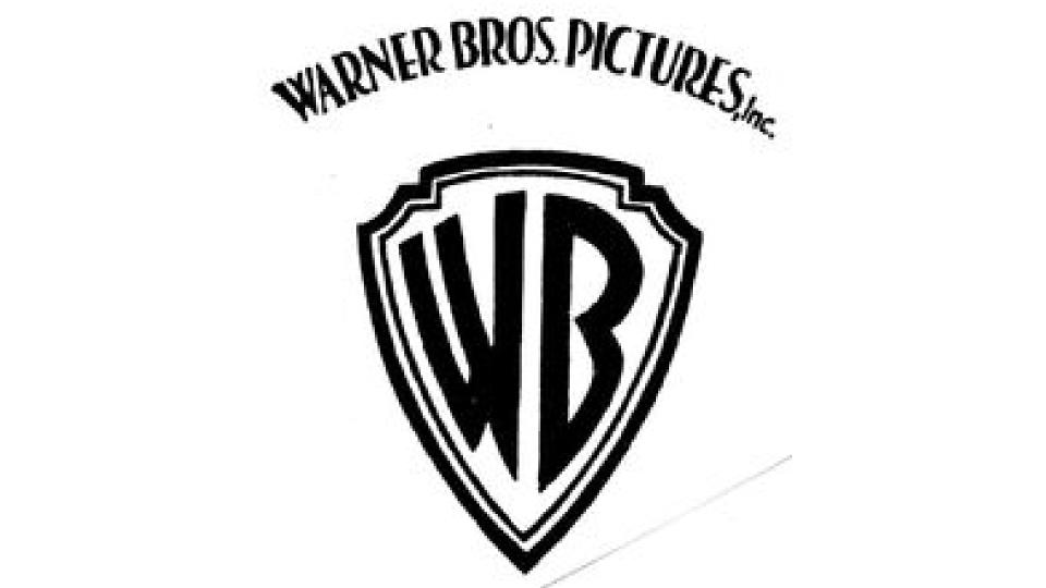
Founded in 1923 by four brothers, Harry, Albert, Sam, and Jack Warner, Warner Bros. established itself as a leader in the American film industry after the success of one of the first sound pictures, the Jazz Singer in 1927. They grew to become a global conglomerate, diversifying into animation, television, and video games, and their current net worth is estimated at $26.19B.
Their original logo was an unremarkable word mark, but this was followed in 1925 by a shield containing a picture of these building. Then, in 1929, came this simplified shield which looks remarkably similar to the present-day logo.
"One of the 'Big Five' Hollywood Studios, Warner Bros’ logo has truly stood the test of time – as long as we ignore the bubble lettered blip of the 1970s," says James Ramsden, executive creative director of Coley Porter Bell. "The shield reflects the golden era of filmmaking that the studio is so associated with, and yet maintains its relevance in the modern age. The design is so malleable, often recoloured or adapted at the beginning of its films, while movie making has changed, this logo has remained constant, setting the tone for the mastery that will follow."
03. Ford
The Ford Motor Company was founded by Henry Ford in 1903, and didn't just revolutionise car making, but mass production itself. Today, it remains the second-largest US-based automaker (behind General Motors) and the sixth largest in the world.
Ford had a number of logo designs, in 1903, 1907, 1909, 1912 and 1917. But then in 1927, the logo underwent a significant change. As Davies explains: "The script logotype was placed in the now synonymous blue and white oval that remains iconic to this day. This logo is highly recognisable because its blue colour is at odds with many car manufacturers who opted for chrome or monochrome coloured logos. The script wordmark also alludes to the history of the company, calling back to its founder whose signature loosely inspired the lettering."
Mark Christou, principal at CBX, is also an admirer. "The 1927 Ford logo, echoing Henry Ford's personal touch, proudly stands as a signed commitment to reliability, quality, and innovation, encapsulated within the iconic 'Ford Oval.' This signature not only signifies progress and forward movement but also serves as a timeless symbol, embodying reliability and efficiency. The celebrated Ford blue, a brushstroke of strength and grace, subtly pays homage to the familiar blue of the American flag, linking the brand to a broader legacy of resilience and distinction."
Ford has recently tweaked its logo, with the most recent version now looking more in line with the 1960s version of the marque.
04. Ferrari racing team
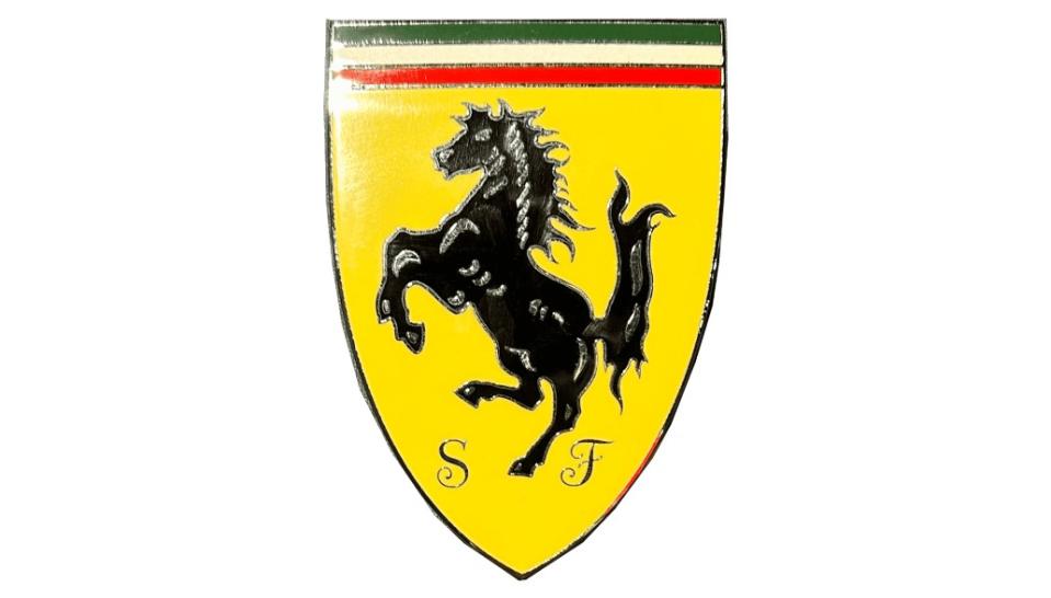
The Scuderia Ferrari racing team was founded in Modena, Italy in 1929. Almost a century on, they are the oldest and most successful racing team in Formula One today. "The prancing stallion is an inherited emblem from a celebrated Italian World War One fighter plane, reflecting the passion, legacy and aspiration of the team," explains Marina Mylonadis, product designer at This Place.
"The prancing horse accurately captures the delicate balance between power and elegance: a reflection of Ferrari's visionary aesthetic and the turning point in automotive design in Europe and the US. The colours of the logo, the Italian flag and canary yellow reinforce Ferrari’s Italian identity, hometown of Modena and National Pride."
05. The New Yorker
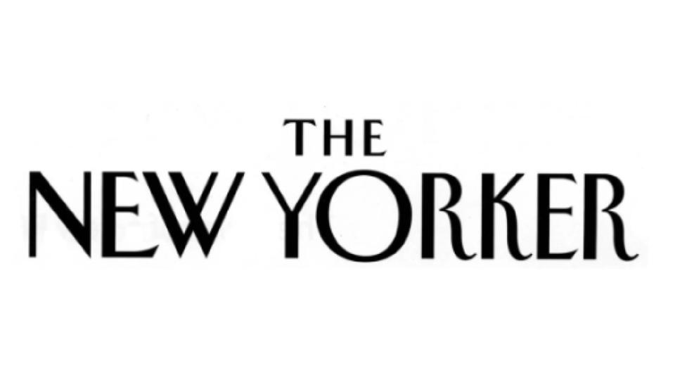
The New Yorker was founded in 1925, by reporter Harold Ross and his wife Jane Grant. While it began as a humour magazine, it soon established itself as a forum for serious fiction, essays and journalism, a mix that it retains to this day.
"Firmly rooted in Art Deco tradition, The New Yorker logotype has become a shining example of design in the 1920s," says Phil Zhang, designer at Hook. "Originally created in 1925 by designer-illustrator Rea Irvin, its tall letterforms and exaggerated x-heights – showcased in such characters like the 'R', 'K' and 'E' – are indicative of this design movement’s typography of the time, and has come to define the look and feel of the publication we know today.
"The brand has become so widely popular that artists around the world have created faux magazines in homage, such as The Tokyoiter, The Parisianer and The Shanghairen," he adds. "Genuinely of its era, yet remaining virtually unchanged after nearly a century, stands as a testament to it being truly timeless."
06. BP
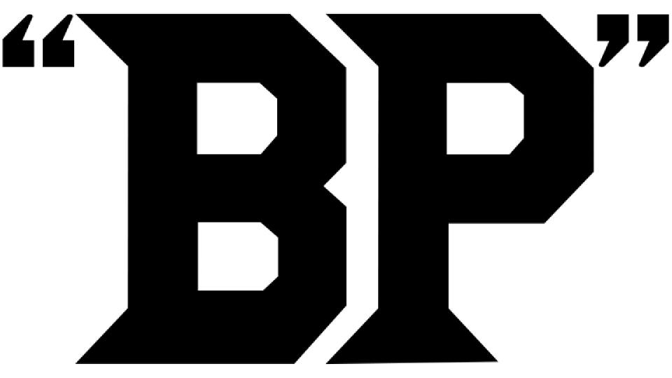
BP, formerly the British Petroleum Company, is a multinational gas and oil company founded in the mid-1950s as a result of a merger between Standard Oil and Anglo-Persian Oil. Its original logo dates back to 1920, when a staff contest to design a trademark was won by A. R. Saunders, who worked in the purchasing department.
This design featured the letters BP inside a pair of quotation marks, which would have been bland and generic were it not for the unusually sharp serifs and diamond-shaped corners of the letters.
In 1930, a new version housed the letters inside a shield; a design that was then updated with different colours in 1947, 1961 and 1989 respectively. The shield emblem was so beloved that the 2000 logo, a completely new design based around a sunflower, remains one of the most hated logos in modern history.
07. MGM
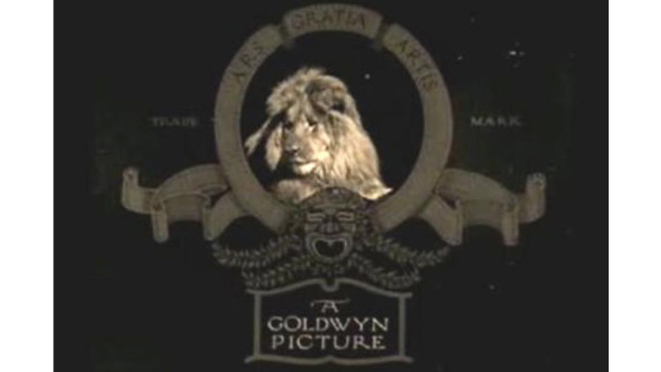
Movie studio MGM, short for Metro-Goldwyn-Mayer Studios, Inc., was founded in Beverly Hills, California in 1924. It was formed by combining Metro Pictures, Goldwyn Pictures and Louis B. Mayer Pictures into one organisation, and soon became Hollywood's most prestigious filmmaking company. And a century on, audiences across the world still associate it with its famous roaring lion logo.
"The MGM logo design has truly stood the test of time and become a true icon in the world of graphic design," says Andy Taylor, chief creative officer at Trouble Maker. "Since 1924, when Metro-Goldwyn-Mayer was founded, the logo and its subsequent sonic mnemonic of the lion’s roar has largely remained unchanged and polished just a smidge over the last century.
"The roaring lion encased in its golden frame and flamboyant ribbons of film roll is more than just a symbol," he continues. "It is a piece of cinematic history capturing all of the glamour and grandiosity of the film industry. Timeless and captivating, it draws you back to the Golden Age of Hollywood and has you sitting on the edge of your cinema seat and your corn popping. From the Wizard of Oz to Singing in the Rain and from Rocky to Silence of the Lambs, you know you are in for an epic visual feast from that very first roar."
08. Esso
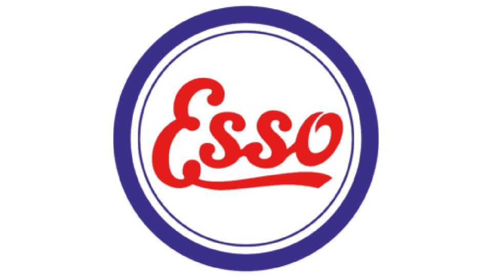
After the breakup of the original Standard Oil company in 1911, the company adopted the name 'Esso'; the phonetic pronunciation of Standard Oil's initials. Today, Esso is a trading name for its direct descendant, the multinational oil and gas corporation ExxonMobil.
The first version of what became the classic Esso logo appeared in 1926. It's a classic example of Art Deco design, with a red, white, and blue colour scheme that instantly evoked a sense of national pride, and a cursive script made distinct by the elongated 'e'. This design was cleaned up and formalised in 1934 and 1965, leading to the classic Esso logo known and loved around the world today.
09. Rolex
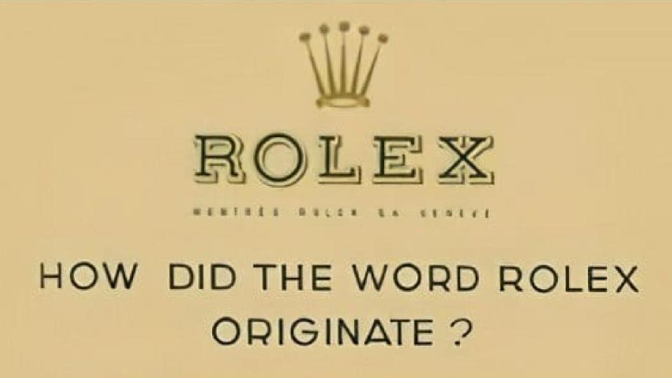
Rolex is a Swiss watch designer and manufacturer originally founded in 1905 as Wilsdorf and Davis. It was renamed Rolex SA in 1920 (the SA is short for Société Anonyme, or limited company). Rolex a word they picked because it was easy to pronounce in multiple languages, and was hard to misspell. Wilsdorf also thought it was onomatopoeic, sounding like a watch being wound.
"Rolex's branding identity has been through three iterations," says Mylonadis. "The original logo’s anatomy was of three parts against a sandy rectangular backdrop: the golden crown, the serif logotype and the phrase, ‘How did the word rolex originate?’.
"Looking at the logotype, the onomatopoeic nature of the word ‘Rolex’ itself – resembling the sound of clockwork – is exaggerated by the garamond serif typeface with 90 and 45 degree angled stems, emulating the inner mechanics of clockwork systems.
"The golden crown elevates the brand to something that is fit for royalty, alongside the gold and deep green colour palette, tantalising consumers with the dream of honour and privilege. The slender design of the crown bears affinity to the fingers of a hand, adding a further layer of depth to the mark."
Want more on logos throughout history? See our logo histories or logos by decade posts.

