The best 1910s logos – 10 brilliant designs from the 'Turbulent Decade'
- Oops!Something went wrong.Please try again later.
The 1910s was known as the 'Turbulent Decade' and for good reason. The world was rocked by a series of cataclysmic events, including the sinking of the Titanic in 1912, the First World War of 1914-1918, the Russian Revolution of 1917 and the Influenza Pandemic of 1918-1919. No wonder, then, there was never any huge nostalgia for this chaotic decade over the decades that followed.
Of course, there were good news stories too. These included the rediscovery of Machu Picchu in 1911, the completion of the Panama Canal in 1914 and Einstein's general theory of relativity in 1916. The art world saw the rise of exciting movements such as Futurism, École de Paris, Surrealism and Abstraction. And commerce and industry continued apace, thanks to inventions such as stainless steel and a mass production boom led by Ford.
In the midst of all this activity, some of the best logos emerged, some of which have been scarcely changed to this day. So continuing our look at the best logos by decade, this article shares the best 1910s logos of all, with expert comment from leading creatives. Should they inspire you to create your own designs, be sure to check our list of the best free logo design tools.
01. BMW
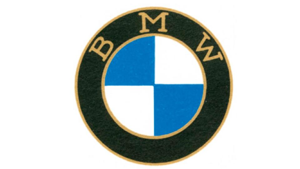
BMW began life as Otto Flugmaschinenfabrik, founded in 1910 by Gustav Otto in Bavaria as a manufacturer of aircraft engines. The firm was reorganised in 1916 into Bayerische Flugzeugwerke AG, then renamed Bayerische Motoren Werke (BMW) in 1922. The company's first logo was created in 1917, and remains a stone-cold design classic to this day.
Sharoze Tallat, head of creative and marketing at Ingenuity, calls it: "A simple and iconic design packed with history and debate. The BMW logo hasn’t fundamentally changed since its inception in 1917, which says a lot about its enduring appeal in a world where brands constantly re-brand to accommodate modern trends."
But despite being so simple, the logo has long caused debate and speculation over what it represents. "A propeller? Not at all," says Tallat. "It was used as one in a 1920s ad, and that imagery just stuck in collective memory. But the truth is a lot simpler. It’s the colours of the Bavarian state flag, but inverted since you couldn’t use state imagery for commercial purposes at the time." For more on this, read our article BMW reveals the truth behind its logo.
02. The Olympic Rings
The first Olympic Games were held in Olympia, Greece from the 8th century BC to the 4th century AD. In 1894, a French aristocrat called Baron Pierre de Coubertin founded the International Olympic Committee (IOC) to revive the event, leading to the first modern Games in Athens in 1896.
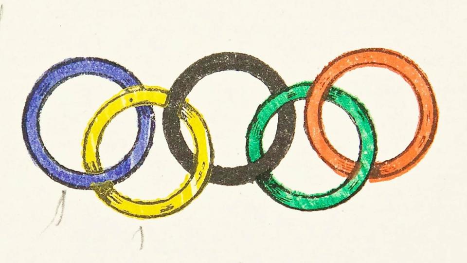
First introduced in 1913, the Olympic Rings logo couldn't be more unique and recognisable. It made its debut at the 1920 Games in Antwerp, Belgium, and remains virtually unchanged today. The design was created by Coubertin himself.
"It's a beautifully simplistic design," says James Ramsden, executive creative director of Coley Porter Bell. "The five interlocking rings in blue, yellow, black, green and red represent the five continents taking part, and every participating nation’s flag. Promoting peace and sportsmanship, the design is perfectly elegant, and endures because of its adaptability for each event."
"It’s hard to believe that such graphic simplicity was adopted before the Modernist aesthetic even became a thing," adds Rachna Dhall-Haasnoot, creative partner at Made in Amsterdam. "Its consistent application over the past 100 years, from something as small as stamp on a certificate to large installations, or even digital media today, speaks to the power of timeless design."
03. Ford
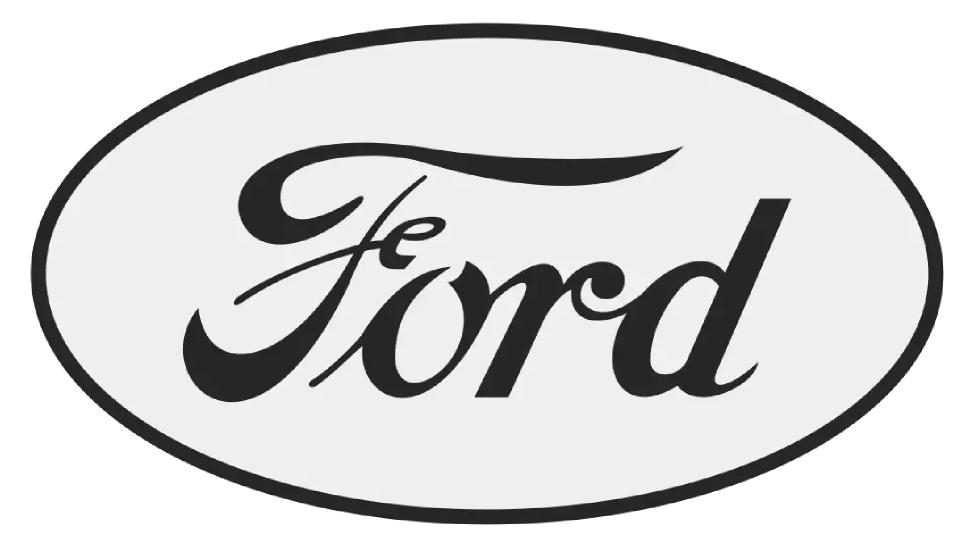
The Ford Motor company was founded in 1903, and revolutionised the automobile industry through the introduction of mass production methods that meant for the first time, cars were affordable for ordinary people. Their first logo was a fussily ornate affair, but a few years later the kernel of what became the classic Ford wordmark appeared.
"In 1912, The Ford Motor Co. abbreviated their name and re-designed their original logo into the scripted type we recognise today," explains Tom Gudgeon, head of design at elvis. "This was to work better as a badge for the front of their vehicles, as well as to closer resemble the founder’s signature, which represented the quality he assured for his reliable production-line cars.
"The soft lines and organic flourishes of the letter forms not only hark back to an era of ingenuity and hand-made beauty, but feel distinctly human," he continues. "The type style remained long after the Nouveau era in which it was designed, and did not change to suit technological innovations over the years. Instead, Ford stood fast; choosing to hone their symbol into the signature of trust and authority we recognise over a century later."
04. FC Barcelona
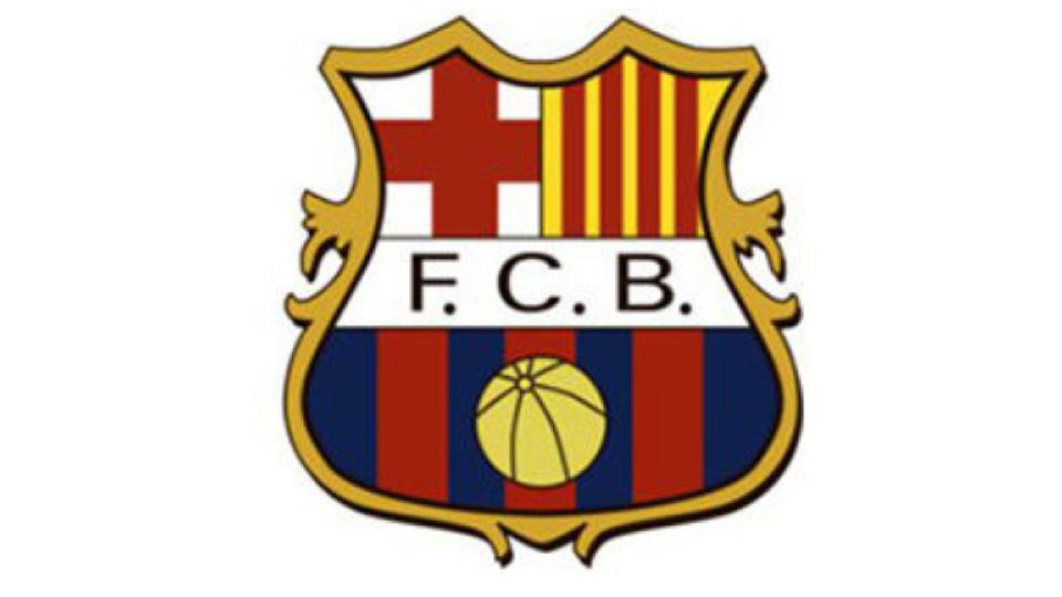
Founded in 1899 by a group of Swiss, Catalan, German, and English footballers led by Joan Gamper, football club FC Barcelona has become a symbol of Catalan culture and Catalanism, hence the motto "Més que un club" ("More than a club"). Unlike many other football clubs, it's owned and operated by its supporters. Which perhaps explains why its current logo is striking similar to this 1910 design.
“FC Barcelona has avoided any temptation to change their logo simply to create noise, controversy and sell more shirts," explains Rob Skelly, associate creative director at Born Ugly. "They have instead respected the craft and history of the 1910 logo, tweaking the aesthetic only in minor ways over the years.
"Barcelona’s logo is arguably not the simplest or most single-minded club logo," he adds. "However it’s one of the most iconic there is, because it’s embedded in time.”
05. Everlast
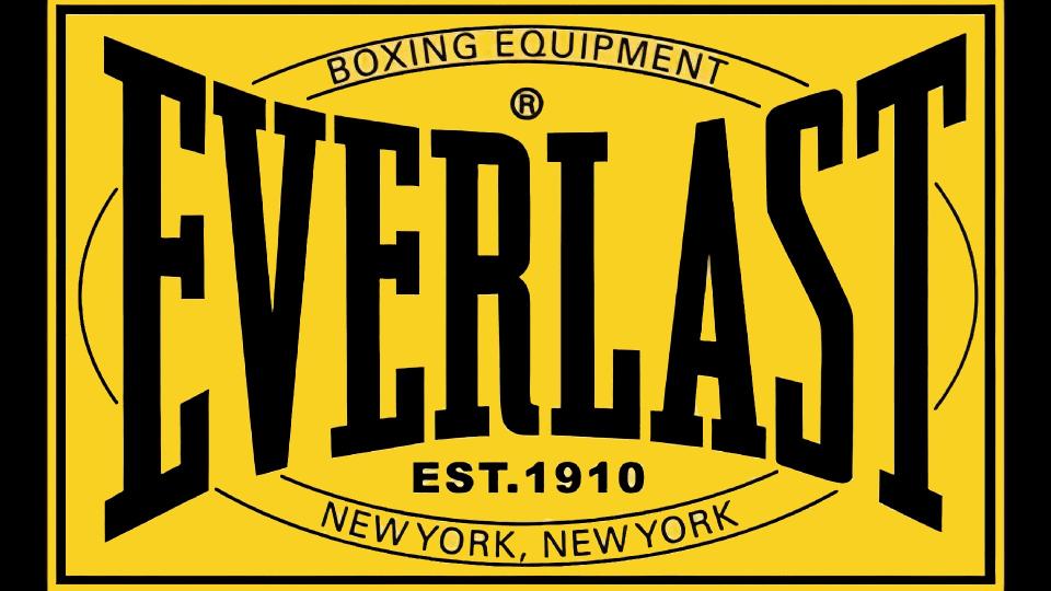
Everlast is an American brand of sports equipment which has become synonymous with boxing. But it actually began life when 17-year-old Jacob Golomb, the son of a tailor and an avid swimmer, designed a type of swimsuit would last longer than one year, hence the name 'Everlast'.
"The original Everlast logo, from 1910, is memorable because of its unusual shape and bold use of yellow," says David Nathan Davies, design director at Design by Structure. "The typography is squeezed, giving the logo a standout silhouette that's unique even to this day. The logo is reminiscent of the buckle around a boxer’s waist, or if it’s warped over the wrist support of a boxing glove, which makes it relevant to its industry, even 113 years later."
06. French's
French's is an American brand of prepared mustard, along with condiments, fried onions, and other food items. It was created by brothers Robert and George French, after they bought a flour mill in 1883 in Fairport, New York. Today, it's the number one mustard brand in the US; according to Statista, 146.94 million Americans used French's in 2020.
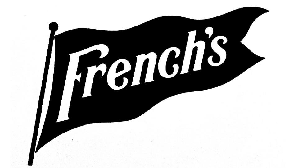
"When talking about great logos of the 1910s you wouldn’t normally turn towards a mustard company," says Phil Zhang, designer at Hook. "But taking a closer look you’ll find a logo directly tied to the pop culture of its time. Originally made for salad dressing, French's mustard quickly became a staple condiment for America’s favourite pastime: baseball. Their association with baseball food – especially hot dogs – was so strong that in 1915 the company adopted a pennant much like the ones seen on stadiums as its official logo.
"What I love about this logo," adds Zhang, "is its simple execution and strong visual tie to a pastime that it’s become inseparable from. The logo has proven to be so iconic that even now the current version has only undergone minor updates from its 1915 counterpart."
07. Prada
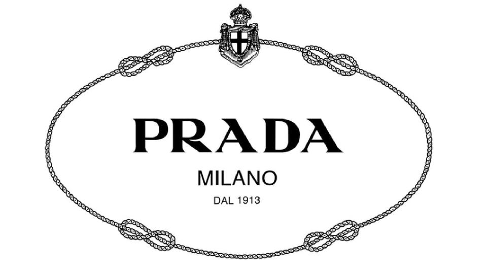
An Italian luxury fashion house founded in 1913 in Milan, Italy, Prada remains synonymous with high-end style and good taste to this day. A company for whom aesthetics is everything needs a strong logo, and that's been the case from the start, explains Amber Magee, associate design director at Hook.
"What’s remarkable to me about the Prada logo is that it’s looked great for over 100 years," she says. "Somehow, it was modern, elegant and emblematic of luxury in 1919 and has upheld those qualities through a century of trends – even surviving the recent shift by many high fashion brands towards sans-serif minimalism."
Magee credits the brand’s longevity to its authenticity, and the way it's stayed true to its Milanese roots. "Ancient and modern Italian history are present in the wordmark and supporting brand elements," she notes. "The Prada letterforms are a variation on Engravers Roman, an all-capital typeface based on Roman Square Capitals. This style of lettering has been used since the first century and can be seen on relics of the Roman Empire, such as the facade of the Parthenon.
"When Mario Prada began making luggage for the Italian royal family in the 20th century, he gained the right to include their heraldry in his branding, a strategic move to differentiate from competitors. This led to two logo variations featuring emblems of The House of Savoy, including a royal crest and a rope motif; both of which are still in use today. Today, the Prada brand remains so synonymous with luxury fashion that it literally represents the concept in contemporary art, entertainment and media. Things of quality have no fear of time."
08. New York Yankees
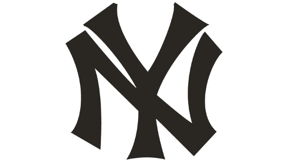
Established in 1903, the New York Yankees are an American professional baseball team whose cultural impact can't be understated. Even non-Americans with no interests in sports will be familiar with the team from countless references in popular culture, from movies and TV shows to music lyrics. Not to mention that their emblem, which first appeared on team members' jerseys in 1913, has become a global fashion staple.
"There is so much that I love about this logo," enthuses Magee. "I love that it’s grown to totally transcend its original meaning. The interlocking N-Y is recognisable far beyond Yankee fandom. It’s become a symbol for New York City itself and is ubiquitous around the world in a way that transcends category and means something different to everyone."
And that's not all. "I love that the form is asymmetrical and imperfect," she continues. "It has a humanity that hasn’t been refined out of it over 100 years. It has a strong physical quality to it too, like someone carved it by hand. Last but least, I love that it is legendarily stolen. Apparently one of the early owners of the baseball club – then called the Highlanders – lifted the symbol from a medal of valour designed in 1877 for the NYPD by Tiffany & Co, translated it to 2D, and put it on his team’s uniforms."
09. Montblanc White Star
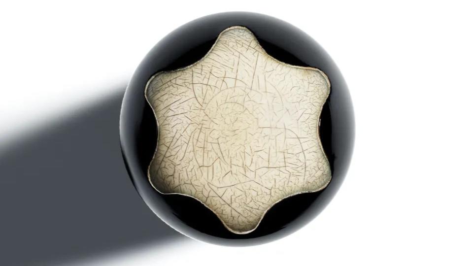
Montblanc is a German manufacturer and distributer of luxury goods, founded in Berlin in 1906, and currently based in Hamburg. It's best known for its luxury pens which are synonymous with its famous white star logo. Tom Munckton, head of design at Fold7, is struck by how ahead-of-its time this 1913 design has proved.
“In an era more defined by the crafted makers-mark rather than the cut-through logo-mark, it’s interesting to find a such a time-hoppingly singular and reductive logo such as the Montblanc’s white star," he says.
"Much as far later logo design would do, the logo responds effectively to the opportunities given by the product itself; a key touchpoint. Sat centrally to the end of the pen lid, it cleverly depicts a white snowy mountain peak, and its minimalism provides immediate brand recall from any owner's top pocket.”
10. London Underground
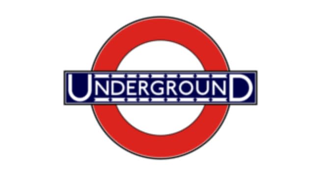
The London Underground (aka the Underground or the Tube) is a subway rail system serving Greater London and some parts of Buckinghamshire, Essex and Hertfordshire. Its origins lie in has its origins in the Metropolitan Railway, which opened in 1863 as the world's first underground passenger railway. It has since expanded to 11 lines with around 250 miles of track.
It's also been the centre of two widely celebrated designs. One was the London Underground map designed by Harry Beck in 1931, which has been a huge influence on transport maps the world over. And the other was the London Underground logo itself, which first started looking like its modern iteration in 1919 (and which made it into our best logos of all time list).
"The London underground logo has become an iconic symbol of London," says Martha Omasoro, designer at Acne. "This pioneering logo was ahead of its time when it comes to accessibility. Its simplicity sees colours reflective of the UK flag, and language stating exactly what it is, making it memorable and recognisable. That's probably why it hasn’t changed much unlike other brands whose logos have been on quite the journey – no pun intended!".
For more on logos, see our logo history or our chat with one of the world's leading designers, Paula Scher, on her logo design process.

