
 Yahoo Autos
 Audi's New Logo Opts for Flatter Rings, Less Chrome
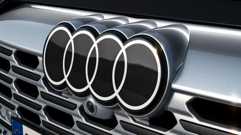
Audi’s logo has gotten a makeover — or at least updated its look. Of course, the four interlocking rings remain, but they are noticeably flatter. The old chrome look has also taken a hike, replaced with white rings on a black background. It’s meant to pop, and Audi says it’s mean to be, “Modern, but not fashionable.”
Audi admits that this logo is in keeping with the current two-dimensional trend that is sweeping the automotive industry. Look to Audi’s sister company, Volkswagen, who got in on the flat-action when it updated its logo.
Read more
“Two-dimensional rings originated at Audi in 2016 as a consequence of digitalization, essentially to depict the rings in a manner that suited the medium,” says Frederik Kalisch, Audi brand strategist. “Three-dimensionality on two-dimensional displays would not have met our technical and aesthetic requirements. So, we opted for a 3D look.”
This latest logo iteration, first introduce on the new Q8 E-Tron, was designed to look the same no matter where you saw it. Audi wants the four rings to look similar whether they are on a car, a virtual cockpit, a smartphone or a billboard.
“The clarity of the new black and white rings makes our corporate identity unmistakable. The thin black border around the rings makes for a consistent, premium-quality appearance, regardless of the car’s paint or radiator grille color. And customers can continue to opt for our new rings in black,” André Georgi, Audi brand designer said. “This variation replaces the white with a dark gray that looks like high-gloss black.
The Audi logo itself is nearly a century old. It dates back to when four German companies: Audi, DKW, Horch and Wanderer all joined up to form Auto Union. About 100 years later the four interlocking rings are still going strong.
More from Jalopnik
Sign up for Jalopnik's Newsletter. For the latest news, Facebook, Twitter and Instagram.
