From The Atlantic to ‘A’: The 162-Year-Old Magazine Gets a New Logo
Click here to read the full article.
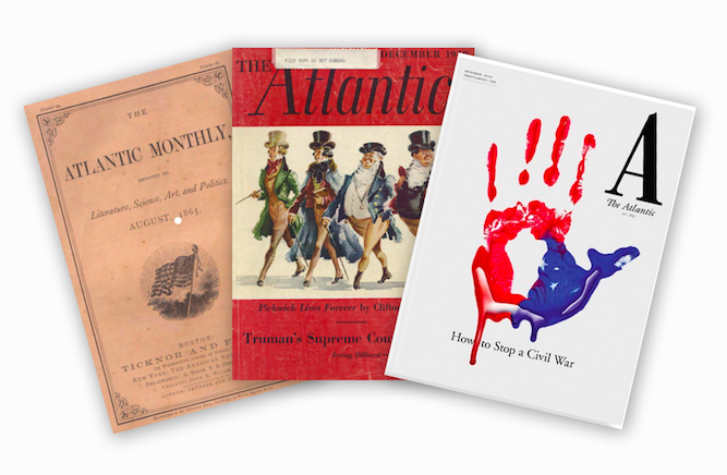
The Atlantic’s longtime cover logo is the latest element to evolve under its new ownership.
After 162 years to the month, the politically focused magazine has whittled away all extraneous design elements and nearly all cover text for its December issue, even mostly replacing The Atlantic title with a large letter “A.”
More from WWD
Ex-BuzzFeed News Reporter Joins The New York Times Styles Section
The 2019 Folio: 100 and Rising Stars Honorees Keep It Short and Sweet
There is still the full name of the magazine on the cover, albeit in a much smaller font and under the new “A,” but the name may drop away altogether at some point in the future, according to creative director Peter Mendelsund. An author and well-known book designer, The Atlantic earlier this year lured Mendelsund away from his job as an art director at Knopf to lead the redesign of the magazine and its digital properties with revived investment from new owner Emerson Collective, the company owned by Laurene Powell Jobs. He brought along with him Oliver Munday to be senior art director as the two have worked together for years and created more than 1,000 book covers.
“We both felt the most radical thing we could do is to steer away from what every magazine was doing, going for the online look,” Mendelsund explained. “Classical, that was the radical thing to do. An anti-Wired look. Wired is sort of emblematic of a magazine looking as digital and maximalist as possible.”
Munday added that, neither having worked in magazines before, they took “a very bookish” approach to the redesign.
“That tends toward a more classical and clear text,” Munday said. “The Atlantic, especially, is about the words, the prose, the argumentation. That can be obscured by a design that does too much.”
So for the December issue, there are no cover lines, instead only an overarching subject for the month “How to stop a civil war” and that new “A.” There will be a half cover wrap for newsstand with some traditional cover lines. But the overall effect of the new cover design is elevated — the italicisation of the last few decades is gone, and the font is bolder and sharper, but it’s still The Atlantic.
“We wanted to make it a text-forward read, maybe more than the people at The Atlantic were ready for,” Mendelsund said. “You hear about text-forward, then you see a presentation that’s reasonably stark. It’s shocking to see on a magazine something so stark.”
Atlantic editor Jeffrey Goldberg called the redesign “dramatic” in his December editor’s note and that the replacement of the logo, which he called “our flag,” involved “much deliberation and experimentation — and trepidation.”
But for both Mendelsund and Munday, they see the kind of design restraint they’ve imposed as a maturation. “When you hire a designer, you run the risk that the designer is interested in designing, making their mark,” Mendelsund said. “The best thing we could do here was as little design as possible.”
“Design is always in competition with the prose, that’s the fundamental tension of the profession,” Munday said. “But having gone through that, and having lost most of those battles, we were in full service of the text.”
For More, See:
NBC White House Crew Talk Highs and Lows of Covering Trump
Luxury Fashion Advertisers Looking to New, Nerdier Horizons
Challenges, Missteps and Hope Abound for Digital Media
Sign up for WWD's Newsletter. For the latest news, follow us on Twitter, Facebook, and Instagram.

