We Asked 2 Designers How to Mix and Match Florals Like a Pro
Thank goodness for floral patterns: No matter where they appear in a home, they always seem to create a cheerful and welcoming atmosphere. It’s tough to find a palette that wouldn’t benefit by bringing this familiar pattern into the fold.
Given this versatility, it’s no wonder that designers have taken floral patterns to the next level by mixing and matching various buds and blossoms in their client projects. If you’re interested in doing the same — for spring, groundbreaking — you might be wondering how to incorporate multiple nature-inspired prints in the same space without clashing.
“This is a trend that can lean either modern and fun, or pretty and soft,” says Robin Heller, one half of the design firm Surrounded by Color with Jen Levy. “At their core, florals are traditional. So when you mix them, you get a more modern twist. It offers something for everyone.”
As major fans of mixing and matching floral patterns, Heller and designer Hollie Velten-Lattrell, who owns SPACES, share their love of the flower-on-flower trend below and tips for pulling it off like a professional.

Try Out Different Rooms
You can’t go wrong by choosing to incorporate multiple floral patterns into any room, whether that’s in small doses like a pillow cover or wider swaths like wallpaper. In fact, Heller has a few creative floral mix-and-matching ideas.
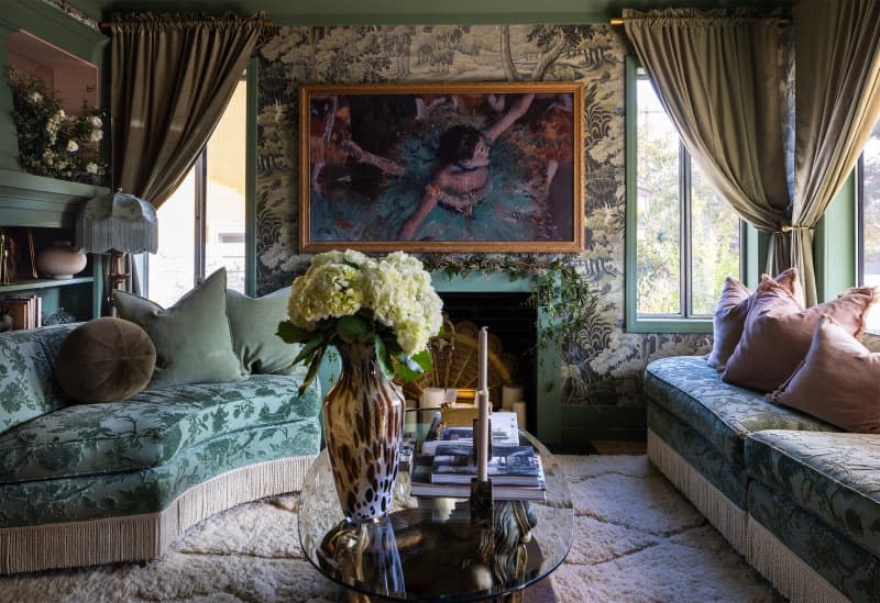
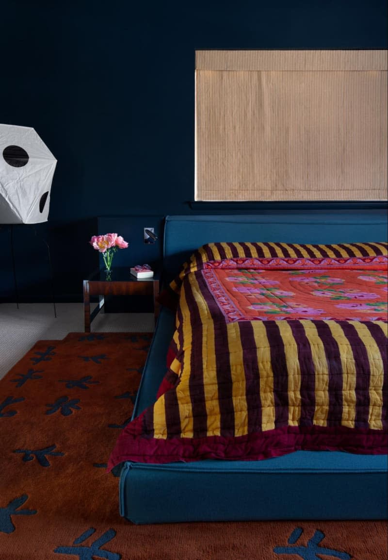
“A dining room with floral wallpaper and mismatched floral upholstered chairs would be magical,” she says. “A den with a floral sofa that mixes patterns with the window treatments would be a hit! We recently designed a bedroom to have a floral quilt and a floral motif rug and the results are so incredible, too.”
But if Velten-Lattrell could only design with flower patterns in a single area of a home, she’d pick the living room for one reason: All the possibilities in upholstery. “Soft finishes in chairs, ottomans, and window treatments can do a lot, and won’t feel as wild as some may fear if there’s a sense of harmony,” she says. “Choose one color story.”
Heller recommends House of Hackney for its bold and colorful fabrics, but if you’re on a tighter budget, Velten-Lattrell says to look for a local remnant warehouse to sift through.
Play Around with Scale
Figuring out the scale of the floral patterns in your space is of utmost importance, because it will make your layers feel dimensional rather than one-note. Try to picture some of the most beautiful flower vases you’ve seen — they likely have different-sized flowers, and so should your space!
Generally, if a larger floral pattern appears as the focal point of a design, Velten-Lattrell notes, then balance it with a smaller one in the details. Flip that rule when the options are reversed. “Another way to pair floral patterns is to find the same pattern at different scales, like a wallpaper with a small repeated floral pattern paired with the same pattern, only much larger, for upholstery and windows,” Heller adds.

Take in the Full Palette
This trend can be accommodating to a range of colors, but if you need help narrowing it down, Velten-Lattrell sticks to a few guidelines. “We often stay away from white or black backgrounds, because it can feel too stark,” she says. “And even if you’re planning on a multi-color palette, you want to avoid high contrast so it all flows more easily together.”
Heller likes to tease out one overarching neutral shade to help match one floral pattern to the other, too, creating consistency while also avoiding results that may feel too juvenile. “Find patterns that have multiple colorways or some dark tones in them so you can draw on a full palette, versus the more common pinks or reds,” she says. To add even more dimension, Velten-Lattrell would mix lightweight and heavier fabrics together, as well.
If all else fails or “you feel overwhelmed, take a photo of the artwork in the room and build a scheme off it,” Velten-Lattrell adds. “Pull the color palette from the artwork, and when mixing patterns, reference one or two similar colors. A jute rug can ground a wild mix!”

