Apparently Steve Jobs hated the Google logo on his iPhone

- Oops!Something went wrong.Please try again later.
Steve Jobs was notoriously exacting when it came to aesthetics, so it's no surprise that Apple has become famous for its design over the years. But as a recently unearthed anecdote demonstrates, Jobs wasn't just particular about Apple's own design – he even had a few thoughts about his competitors' too. Particularly when it appeared on an iPhone screen.
Back in 2008, in the very earliest days of the iPhone, Jobs personally called Google’s vice president of engineering on a Sunday evening to request an urgent update to the Google logo on its iOS app icon. The problem? A slightly incorrect yellow gradient. (If you're looking for design inspiration, check out the best logos of all time.)
Back in 2011, Vic Gundotra shared the story with 9to5Mac. "So Vic," Jobs apparently told him. "We have an urgent issue, one that I need addressed right away. I’ve already assigned someone from my team to help you, and I hope you can fix this tomorrow. I’ve been looking at the Google logo on the iPhone and I’m not happy with the icon. The second O in Google doesn’t have the right yellow gradient. It’s just wrong and I’m going to have Greg fix it tomorrow. Is that okay with you?" Jobs then followed up with an email with the subtle subject line, 'Icon ambulance'.
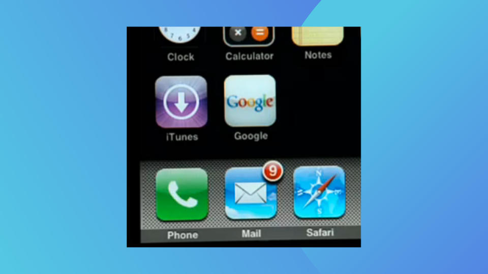
9to5Mac even managed to find an image of what the icon looked like in 2008 (above). Of course, Google now simply uses its 'G' monogram, but back then the four colour wordmark was everywhere. Take a look at our full roundup of the history of the Google logo for every iteration of the design in one place.

