This animal optical illusion logo just made me double take
We love a good optical illusion, but incorporating them into a logo design can be hit-and-miss. A clever logo with a little secret that makes you do a double take can be very effective, but sometimes an optical illusion can make a design confusing.
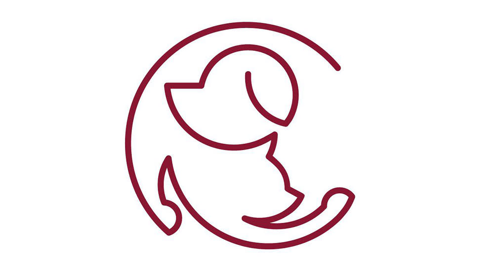
There's some debate about where on that spectrum this optical illusion logo falls. It's apparently the logo for an animal hospital, and it can be interpreted as showing both a sting dog and a cat playing. But it takes a moment to understand, making us think it's more deserving of a place in our roundup of optical illusions than our pick of the best logos.
Some logos have accidental optical illusions (see the Sonic X logo), while many have intended hidden secrets that don't necessarily need to be seen to understand the design (see the clever Minnesota Wild logo) The difficulty with this optical illusion logo shared on Reddit, is that reading the logo depends on getting the optical illusion, and that can take more than a single glance.
The logo design is generating some negative responses as a result. "I love the idea of this, but I don't know, it's not quite enough of a dog or cat for me to love the execution," one person says. "I feel like if I saw this without the title I would be staring at it for a second to figure out what it’s supposed to be," someone else adds, while one person even suggests the design looks like a "half-baked silhouette of Earth".
One person has suggested that the illusion could immediately be made clearer by the addition of eyes, but someone else thinks the idea has already been used too often. "Four out of five pet products I own contain variations of this exact logo, they wrote. "Great idea, nice execution, entirely unusable," someone else summed up (that's almost as harsh as some of the criticism of the new Twitter X logo).

