The Android rebrand is finally here (and we love it)

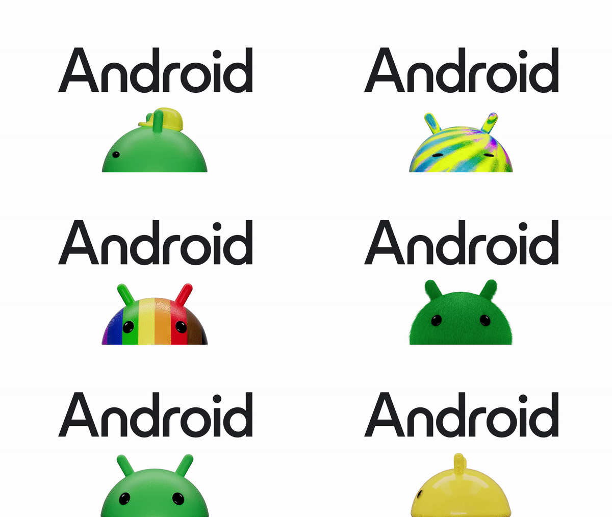
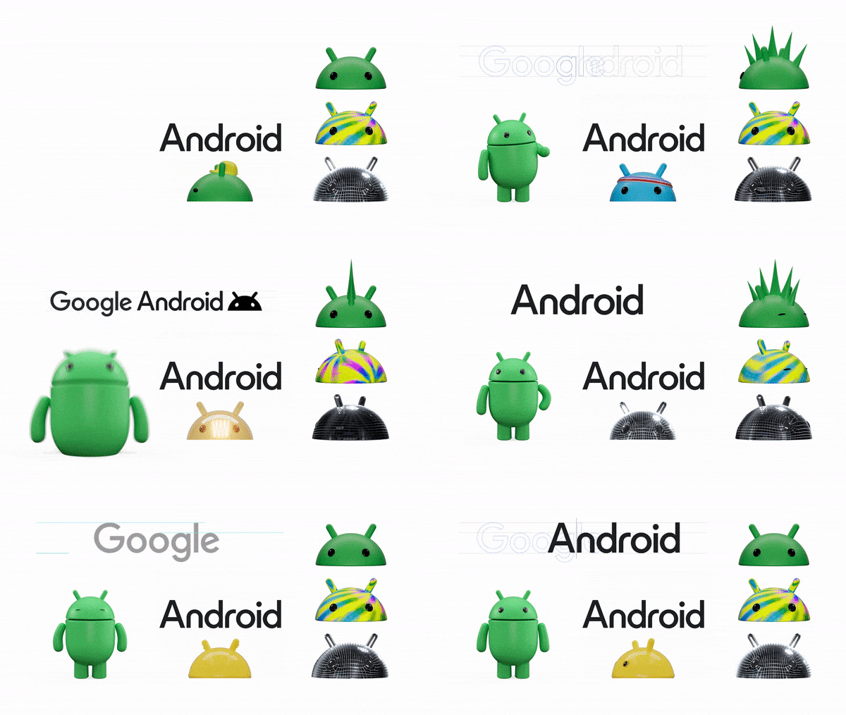
We first reported on the new Android logo back in June and gave an A+ grade to a revamp that might initially seem to pull in two different directions. The Android rebrand introduces a new font with a pointy uppercase A for Android, giving the mobile operating system a more mature feel. But at the same time, the robot mascot's transformation into a 3D character bucks the flat design trends and gives the brand more personality.
Now Android's revealed imagery of more applications as it prepares to roll out the new identity on phones. And it looks just as good as we anticipated (see our pick of the best new logos for more inspiration).

The new Android logo has only appeared in presentations and ads on YouTube so far but it's now going to be rolled out on boot screens and in other places in Android 14, which was expected this week but has reportedly been delayed to October. As we commented before, the new logo seems to try to combine the best of both worlds combining super-rounded letters with an enormous pointy 'A' towering way above them. Perhaps it shouldn't work, but it does, presenting a mature but modern and expressive brand.
The intention of the rebrand, conducted with R/GA, was also to make a more obvious connection between Android and Google. In a blog post, Jason Fournier, director of Android Consumer Brand Management, writes: "We’re elevating the Android logo by capitalizing the “A,” adding more weight to its appearance when placed next to Google’s logo. While we’ve added more curves and personality unique to Android, the new Android stylization more closely mirrors Google’s logo and creates balance between the two."
Meanwhile, a 3D design allows the Android robot and 'bugdroid' (the robot head, apparently) to take on different personalities for different applications, and it now has a lot more character. "As a visual signifier of our brand, we wanted the bugdroid to appear as dynamic as Android itself," Fournier says. "We've also updated the robot’s full-body appearance to ensure it can easily transition between digital and real-life environments, making it a versatile and reliable companion across channels, platforms and contexts."

The robot makes me think of the recent LG rebrand. The tech company also introduced animated 3D characters that aim to make the brand more fun and to appeal to a younger audience. It seems that 3D mascots is becoming something of a trend (also see our guide to the hot logo design trends in 2023).
