The America250 logo aims to recapture the excitement of the Bicentennial
It was always going to be hard to pack the United States semiquincentennial celebrations into a neat, elegant logo design that people could get behind. After all, many of us can't even pronounce the word.
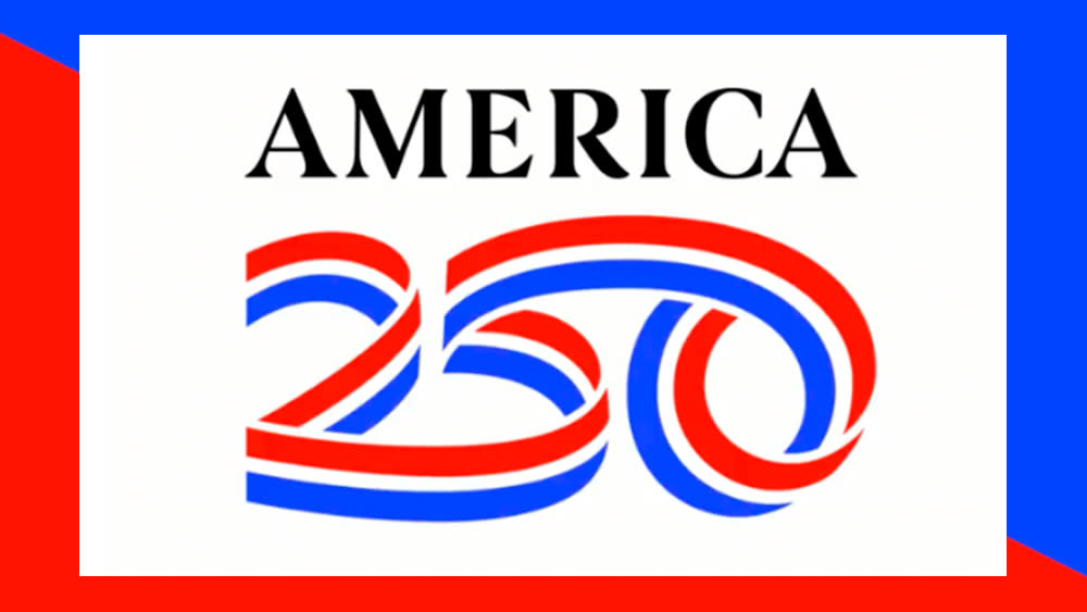
The America250 design aims to be celebratory while keeping things simple and playing it safe (although inevitably some are already seeing unintended NSFW references). There are ribbons. They spell out the numbers 250. The US colours are also in there... or are they? (see our piece on the importance of choosing the perfect logo colour).
The nonpartisan committee tasked with organising the celebrations ahead of the 250th anniversary of the US on 4 July 2026 has sensibly opted to leave the word word 'semiquincentennial' out of its name and logo. Instead, it's going with the more succinct America250.
The logo, as seen in the animated version above, shows the number 250 drawn out by a ribbon in a single continuous path. It was designed with Chermayeff & Geismar & Haviv, the same firm that created the US Bicentennial logo back in 1976 (see below), and that choice was very deliberate.
In a letter announcing the logo's launch, the former US treasurer Rosie Rios, chair of America250, says she hoped the new design would create the same excitement that she felt when she saw the star-shaped Bicentennial logo as child. That logo was "vibrant, dynamic, and became a symbol for what our nation stood for," she writes, noting that "it was everywhere, from postage stamps to t-shirts to space shuttles on Mars."
A post shared by Chermayeff & Geismar & Haviv (@chermayeff_geismar_haviv)
A photo posted by on
The America250 logo clearly takes inspiration from traditional patriotic iconography, but intentionally avoids using the nation's flag itself. Instead, it opts for ribbons, evoking medals of honor and parades. But are they the right colours? Some people are wondering if it's another county that's celebrating.
"Is it too late to change the colors to match the colors on the US flag? Right now it looks like it’s a logo for the 250th anniversary of the Netherlands," one person wrote in response to the logo launch on Instagram. I think the colours of the Dutch flag are also slightly darker hues, as are those of Russia, and France changed the blue of its flag a couple of years ago. The logo appears to be closer to the electric shades of Slovenia.

Some people aren't convinced by the design either...
The colours certainly aren't those used in official US flags. According to the Department of State Bureau of Education Cultural Affairs' design guide, the official shades are Pantone 282C / RGB 104997 (Old Glory Blue) and Pantone 193C / RGB 179,25,66 (Old Glory Red). The America250 colours are quite a way off. But does it matter?
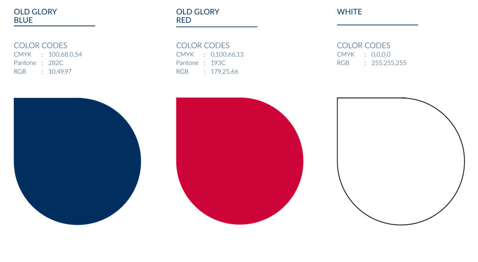
There are numerous variations in shades used in copies of the US flag and related bunting, badges, posters and more all over the country. The official colours are darker than a lot of people probably remember, while the semiquincentennial (there, I said it) hues are brighter, perhaps more celebratory. And as I mentioned, it seems that there was an intentional decision to stay away from the flag.
Rios says the design’s ribbons are intended to "evoke a sense of commemoration, celebration, and purpose" while the flowing continuous line stands for the "unity, cooperation, and harmony we strive for as a country". That's a big ask for a logo design, but I think it might grow on people.
For more logo design inspiration, see our piece on the subtle logo changes that made a big difference. Wondering what other designs were around during the Bicentennial? See our roundup of the best logos of the 1970s.

