10 Perfect Dark Paint Colors, According to Interior Designers
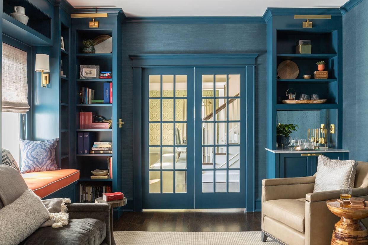
Photo: Mimi & Hill
Out of all the hues on the color wheel, we firmly believe that the darker shades are the most misunderstood. For many, inky blues, deep charcoals, and pure blacks are off-limits when considering interior paint colors. According to designers, homeowners should reconsider dismissing this range of colors before considering how amazing your space can look with a bold, rich paint color.
When used appropriately, darker paints can open up a space. Since they're more dynamic than over-used whites and neutrals, they offer a unique character to your home. The key, of course, is finding the right shade. Finding the perfect paint color for your room can be exhausting, with so many nuanced paint fan decks to sift through. We asked several designers to share their tried-and-true dark paint colors to make your decision process a little easier.
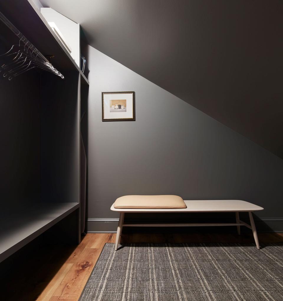
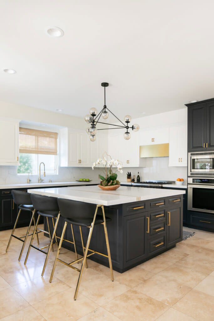
Asphalt
Ready to make a statement? Turn the brightness down with deep charcoal. "I recently used Benjamin Moore Asphalt CC-548 in a walk-in closet, and I loved the way it turned out," shares Shawna Underwood. But, for the DC-based designer, how you use your dark color is just as important as the shade you select in the first place. "When using a dark wall color, try painting the trim and ceiling the same color for a moody and luxurious look," she adds.
Get the Color: Asphalt (CC-548) by Benjamin Moore; benjaminmoore.com.
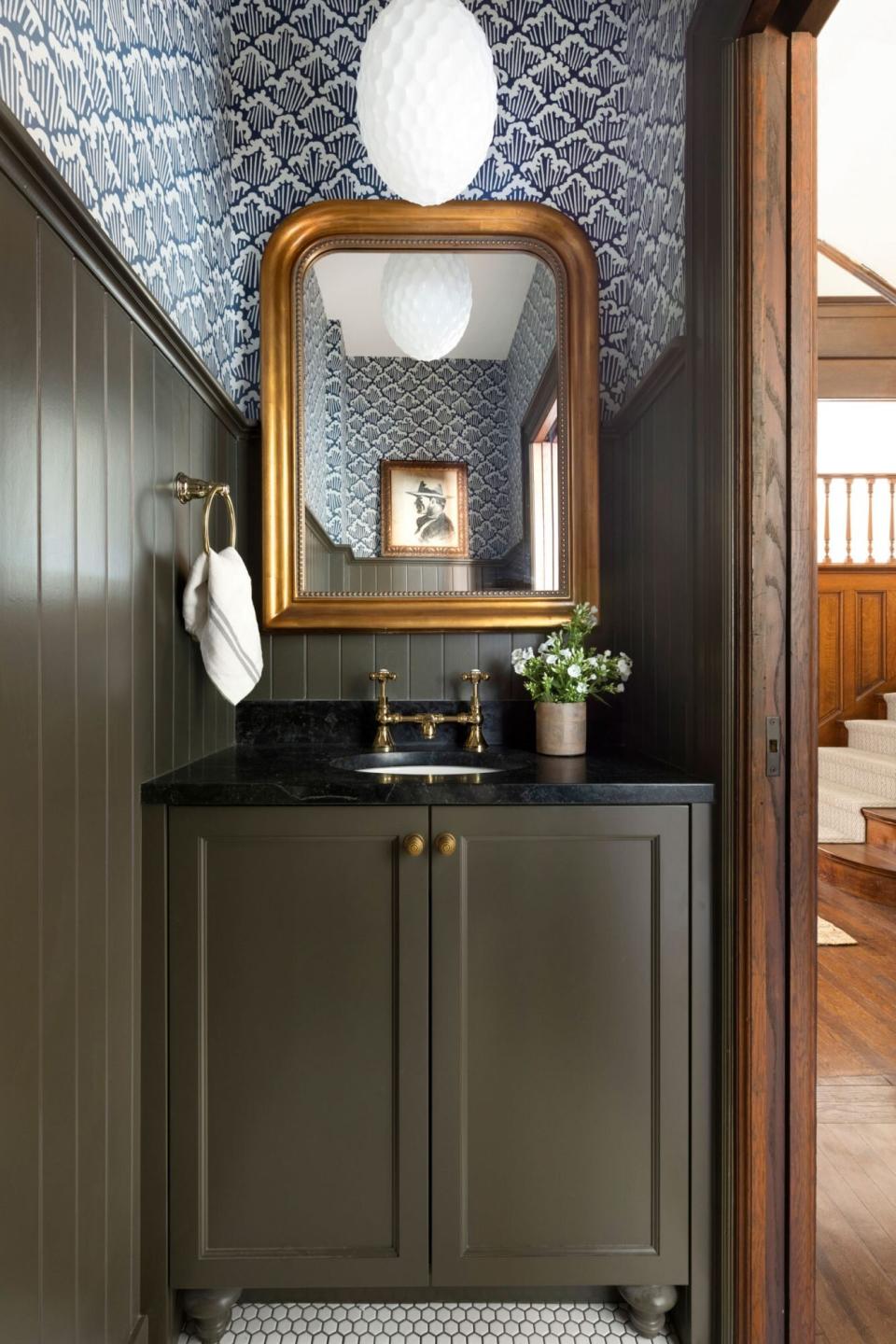
Southern Vine
Anyone looking for a pop of color in a sea of darkness will find a lot to love about Benjamin Moore's Southern Vine. "We love this shade of green because it has a slight gray undertone which makes it feel a bit historic and vintage," explains Bria Hammel. "We find that it's really such a versatile color to use in any space; moody enough for a showstopping powder bathroom or timeless enough to use on kitchen cabinetry!"
Get the Color: Southern Vine (2138-10) by Benjamin Moore; benjaminmoore.com.
Tricorn Black
When painting a bathroom or kitchen, you'll need to consider how your dark hue pairs with your hardware. That's precisely why Breegan Jane is so fond of Sherwin-Williams' Tricorn, a fabulous black shade that works well with gold and silver. "This is ideal for me as a designer, as no two clients desire the same look in their spaces," she shares. "I can apply Tricorn without the worry of any selected hardware clashing because of varying undertones. This paint color isn't just neutral. It's extremely versatile."
Get the Color: Tricorn Black (SW 6258) by Sherwin-Williams; sherwin-williams.com.
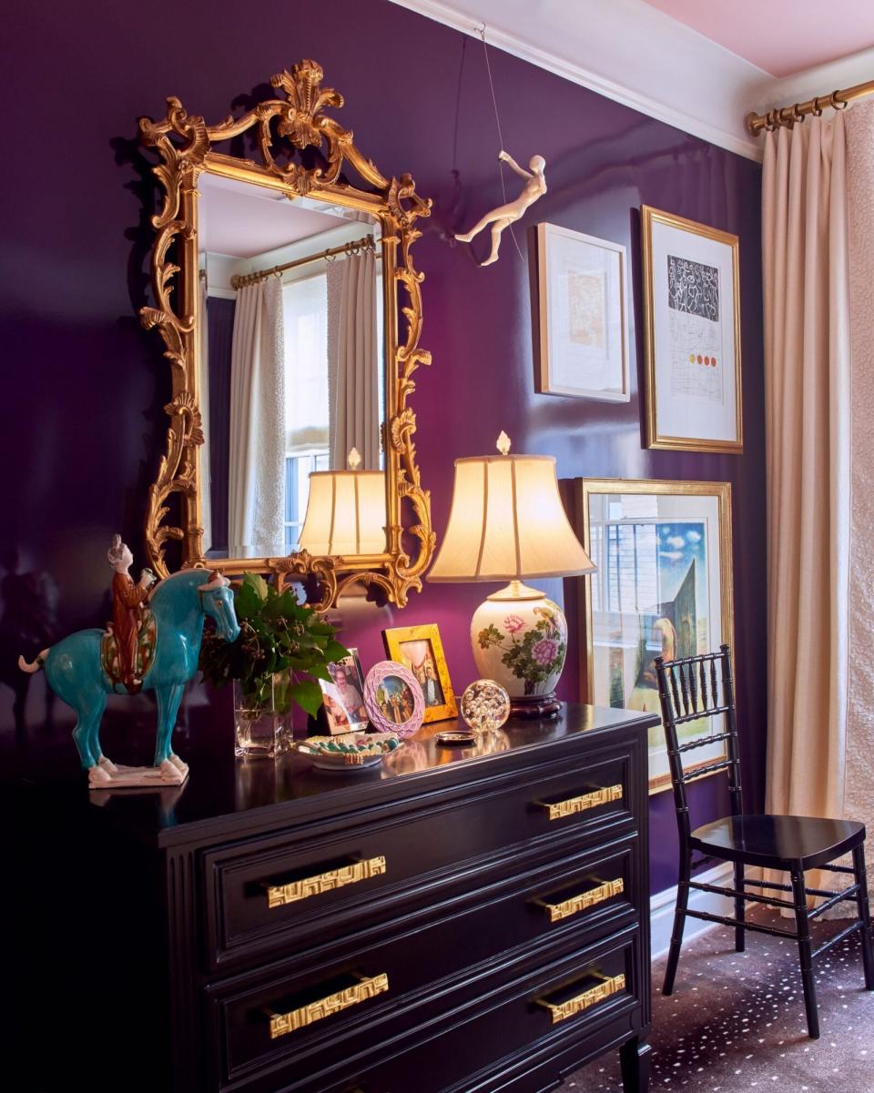
Brinjal
Move over, black and gray because there's a new dark power hue in town. "People often go right to grey, navy, and brown when thinking about dark paint colors, but I am a big fan of purple as a glamorous alternative," shares designer Phillip Thomas. Using a deep eggplant purple on the walls adds warmth to the space while maintaining the dark enveloped atmosphere.
Try the Color: Brinjal (No. 222) by Farrow & Ball; farrow-ball.com.
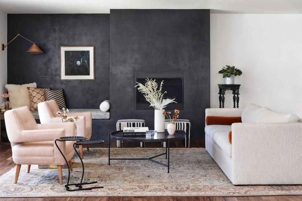
Fade To Black
If you didn't get the memo, dark paint colors can be warm and inviting. "Today's industrial look still has that edginess that drew us all in originally, but it isn't as basic as reclaimed wood and steel trim," Stefani Stein says. "It's less cold and more inviting—especially right now when we all just want to be a bit more cozy. One of my all-time favorites is Portola Paints and Glazes' Fade to Black' Roman Clay." Stein loves to pair this hue with softer tones and cozy textures for the perfect finishing touch.
Get the Color: Fade To Black by Portola Paints & Glazes; portolapaints.com.
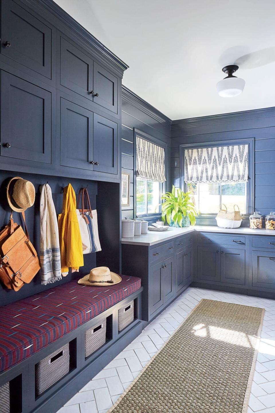
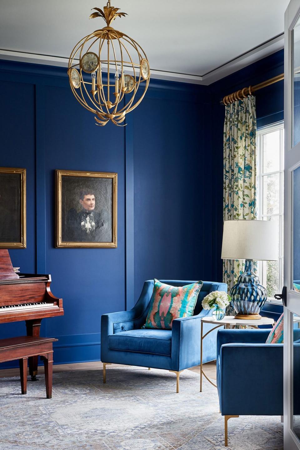
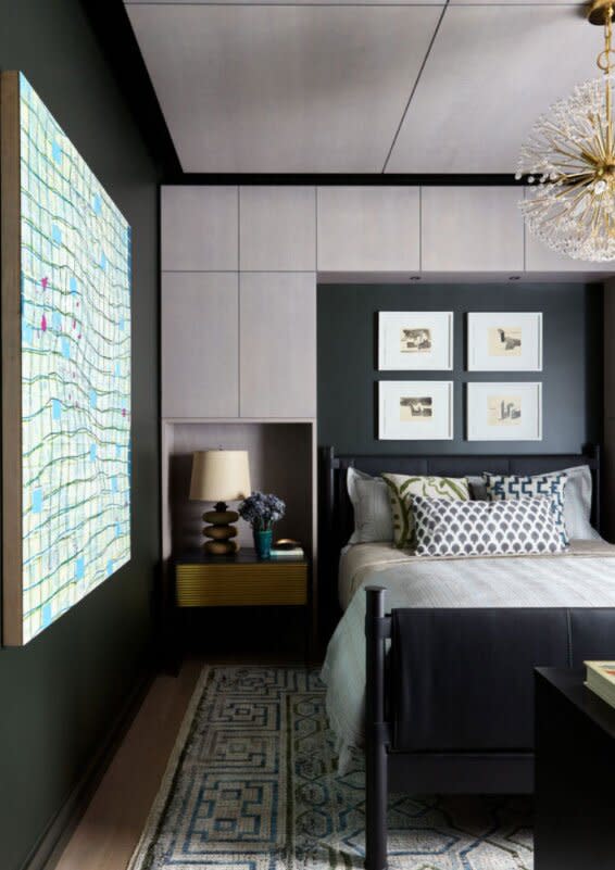
Seaworthy
For Mimi & Hill's Hillary Kaplan, Sherwin-Williams' Seaworthy is the happy medium between dark and bold. "It provides a bit more nuance and character than a traditional navy and pairs beautifully with the gold accents," she explains. If you want to give this power shade a sophisticated edge, take a cue from Kaplan, who paired it with a jute rug and textured wallpaper.
Get the Color: Seaworthy (SW 7620) by Sherwin-Williams; sherwin-williams.com.

Downpour Blue
Navy is the perfect shade for anyone who wants to go to the dark side but isn't ready to commit to an inky black or charcoal. However, finding the right one can be tricky with so many shades. When in doubt, look to Benjamin Moore's Downpour Blue, which will bring a "wow" factor to any room. But "[It's] an amazing shade of navy that we recently used in a client's music room," share Zandy Gammons and Liles Dunnigan, the co-owners of the Warehouse Interiors in North Carolina. "The paint color gave the room such a warm, comforting feel that makes you never want to leave."
Get the Color: Downpour Blue (2063-20) by Benjamin Moore; benjaminmoore.com.
Waller Green
According to designer Kati Curtis, you can't go wrong with Benjamin Moore's Waller Green. For this shade, the magic lies in its iridescent-like glow. "It's a deep, moody green that goes greenish blue [or] black in some lighting," she shares. "I love the richness it brings and the fact that it's almost a neutral, but the green tones give it much more interest. It's super-versatile." Curtis loves to incorporate this in smaller spaces such as a study or guest bedroom, thanks to its subtle masculine edge.
Get the Color: Waller Green (CW-510) by Benjamin Moore; benjaminmoore.com.
Peppercorn
Try this moody shade for a dark neutral that works with your space. "[It] provides the perfect foundation for a cozy and moody palette," explained Kim Williams and Janelle Hughes, co-founders of KJ Design and Mortar Styling. "What [we] love most about it is the way it transforms to pick up a more brown, black, or grey feeling depending on the light distribution or time of day." Whether you want to accent with bold pops of color or keep the decor neutral, this is one paint shade with unlimited possibilities.
Get the Color: Peppercorn (SW 7674) by Sherwin-Williams; sherwin-williams.com.
Stiffkey Blue
Blue is a soothing color and a natural paint color choice when considering the lighter shades, but this comforting quality extends to the darker blue fan desk as well. When using a dusty blue, such as Farrow & Ball's Stiffkey Blue, it brings in the familiar blue paint color but enriches the space with its grey undertones. Since blue is so versatile, this color acts as a neutral but also pairs well with creams and whites.
Try the Color: Stiffkey Blue (No. 281) by Farrow & Ball; farrow-ball.com.