The 8 Rules for Dark Entryways — How Designers Perfect the Art of the Moody First Impression
The entryway is the first piece of your interior design puzzle, it introduces your style and sets the tone for the rest of your home. As a result, the first impression counts in this case and many tend to err on the side of caution, opting for softer beiges of open and airy whites to light up this small space. But, in doing so, we lose a little of the magic that entryway can bring to your home.
Darker tones are not only more entrancing and enigmatic, but they can also help transport you and your guests somewhere more warm and more welcoming than their pristine and pale alternatives. They are also a practical choice as they hide stains and marks better in these high-traffic zones, so you’re not left constantly touching up your walls.
Depending on your dark hue, you can create a moodier and mesmerizing entryway or something soft yet striking. To offer you some inspiration, we’ve collated our favorite examples of interior designers and color experts, asking them how to perfect this small yet captivating space.
1. BRING IN ONE ELEMENT OF PATTERN

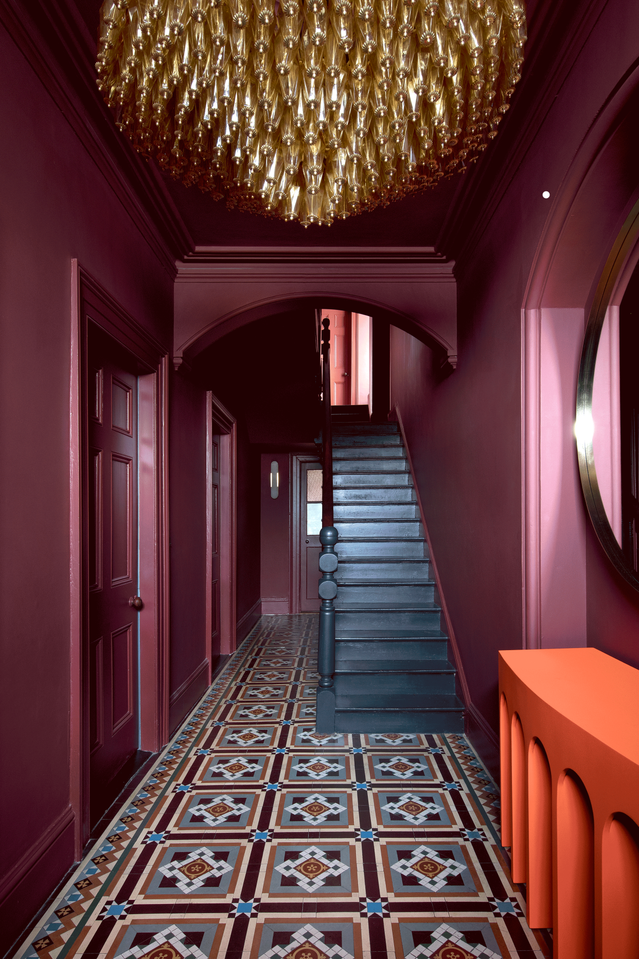
This entryway evokes the jewel-like color of berries with its jam like hue. The color feel modern yet romantic as its covers each corner of this space. The warmth of the color is complemented by the black staircase and colorful tiles, both work in synergy with this charming shade.
“For this project we really wanted to make a feature of the entryway as the main entrance and accentuate the beautiful original tiling that we retained. The entryway didn’t get a lot of natural light like other areas in the house, so we deliberately went rich, dark and moody with it. It creates a dramatic and inviting entrance to this family home. The vibrant orange of the console really pops against the tone of the paint and the space is completed with rich red artwork reflected in the large round KLD design mirror and the warm tones of amber glass from the vintage Murano glass chandelier,” says Roisin Lafferty, founder of Kingston Lafferty Design. This project serves as a reminder that dark entryways can also be filled with pops of vibrant color and pattern whilst presenting a calm and cohesive aesthetic.

Alana Media Console
Price: $299

Travers Red
Price: from $52.99 a gallon

Tuscan Peel & Stick Floor Tiles Flooring Materials
Price: $1.40/sq ft
2. Look for gray tones to soften the darkness
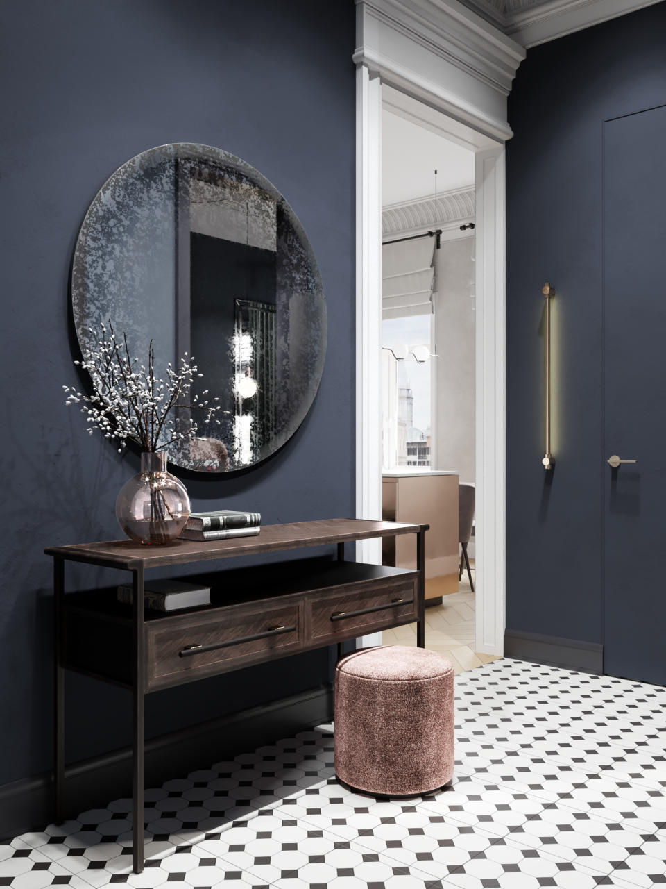
For those seeking a dark entryway that brings together crisp color and a solid neutral, this gray-filled blue entryway is an example of best in class. The richness of the blue is giving a calming edge with the elegant gray.
“The idea was to incorporate a deep blueberry shade at the entrance of the house, which we also extended into the bedroom. The kitchen-living area and the bathroom are in lighter tones, creating a diverse atmosphere in the spaces,” reveals Vlada Peterson from Make Interiors. Notice the tiling choice in this scheme, the lighter tiles cleverly add light and pattern to this entryway, reducing the risk of too much darkness. Take all of the surrounding elements into account when choosing your dark entryway color to ensure the final result feels balanced in terms of lighting, composition and color.
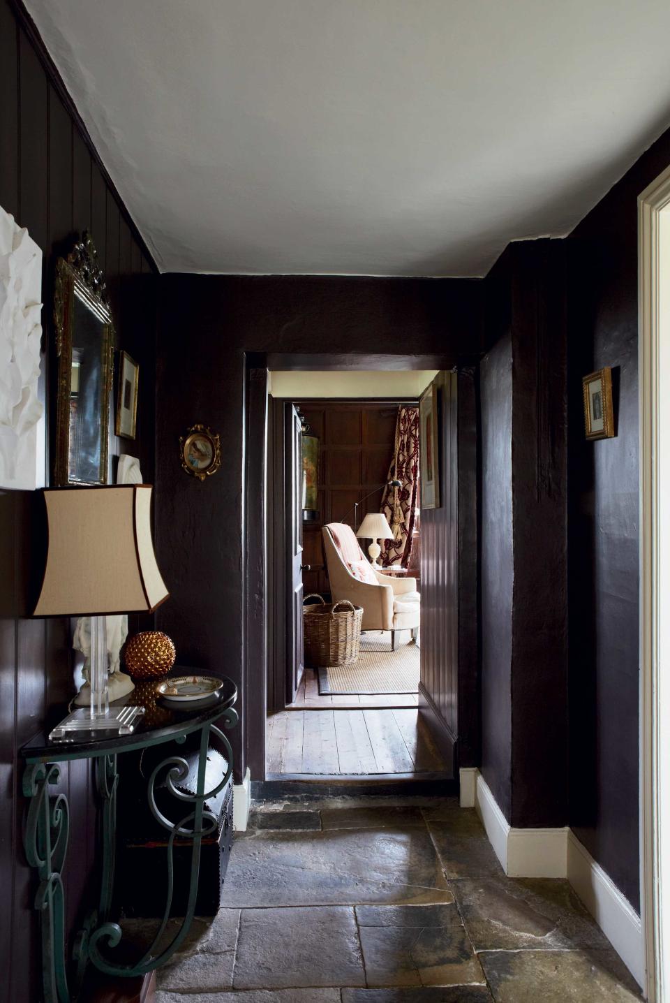
3. ADD DEPTH AND HEAT WITH BRICK-RED
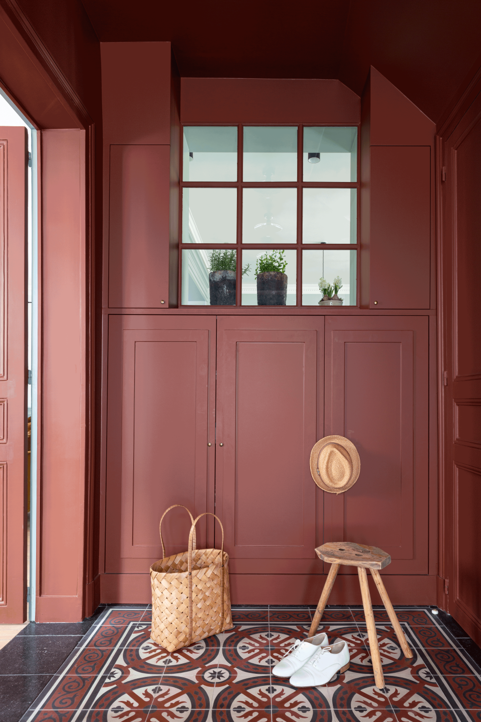
Don’t forget that there are depths to the darkness, and you can play to the tones that appeal to you and your space best. This rich and warm red toned featured in Marianne Evennou’s Parisian apartment project feelings enveloping but doesn’t feel overwhelming in its darkness. The patterned tiles and sweet wooden stool give this charming interior an added sense of playfulness, again rejecting the traditional assumptions that dark spaces are always serious and somber.
“I like the idea of making theatrical entrances. it’s the first impression when you enter a house, but it remains a place of passage and distribution. It is only used for a sufficiently short period of time. You won’t feel oppressed as you just get in and get out. So, we might as well play with these small spaces and make them extravagant,” says Paris-based interior designer Marianne Evennou.
She highlights a key factor that sets apart your entryway from a room like your bedroom or lounge, it’s a fleeting moment of joy and designing it with this in mind is bound to bear fruit. “A simple way to have a powerful impact is to use a strong color on the walls as well as on the ceiling and create a dialogue with a graphic design of tiles. It’s not more complicated. The red I used in this entrance is SL26 Ecorce from Ressource and the tiles on the floor are from Mosaic Del Sur,” adds Evennou.
4. Take pattern to the walls
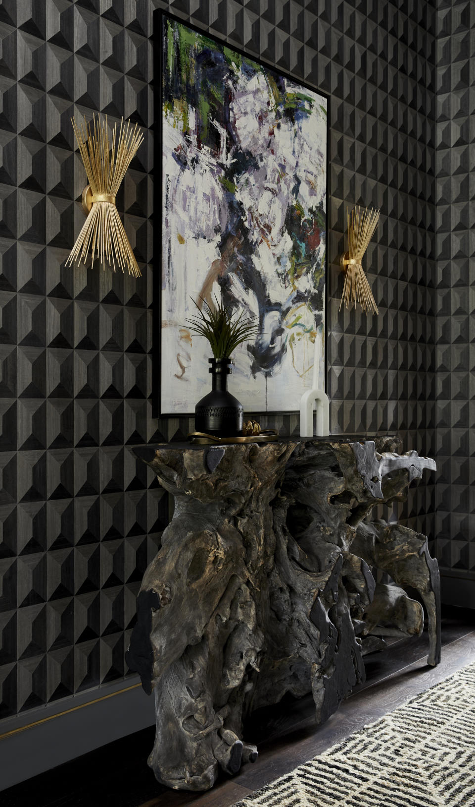
Whilst it’s perfectly fair to go with a plain paint color for your entryway, a patterned dark entryway provided an instant statement for your home. The tile like effect of this charcoal wallcovering in Seattle and New-York based interior designer Allison Lind’s lakeside project gives the entryway a heightened sense of drama and intrigue. It also picks up on the tones of the sculptural oak console that sits alongside it.
“I always think of an entry as your home’s first impression – what do you want to say to guests when they arrive? Bright and cheery? Enveloping and sexy? Before entering this home, you experience a long shady drive through towering trees. The drive ends by opening up into an expansive, open driveway. I loved the idea of recreating that feeling with the entry – a sort of sexy, glamorous tunnel that leads you into a bright, open great room. The wood veneer wallpaper (by Phillip Jeffries) modernizes the forest element, while the teak root table quite literally captures the notion,” says Allison .
Take on Lind’s advice and consider how your entryway works in conjunction with your exterior surroundings, thinking about what can you highlight about where you live and the landscape whilst you welcome your guests through the door.
5. Wrap the space in color
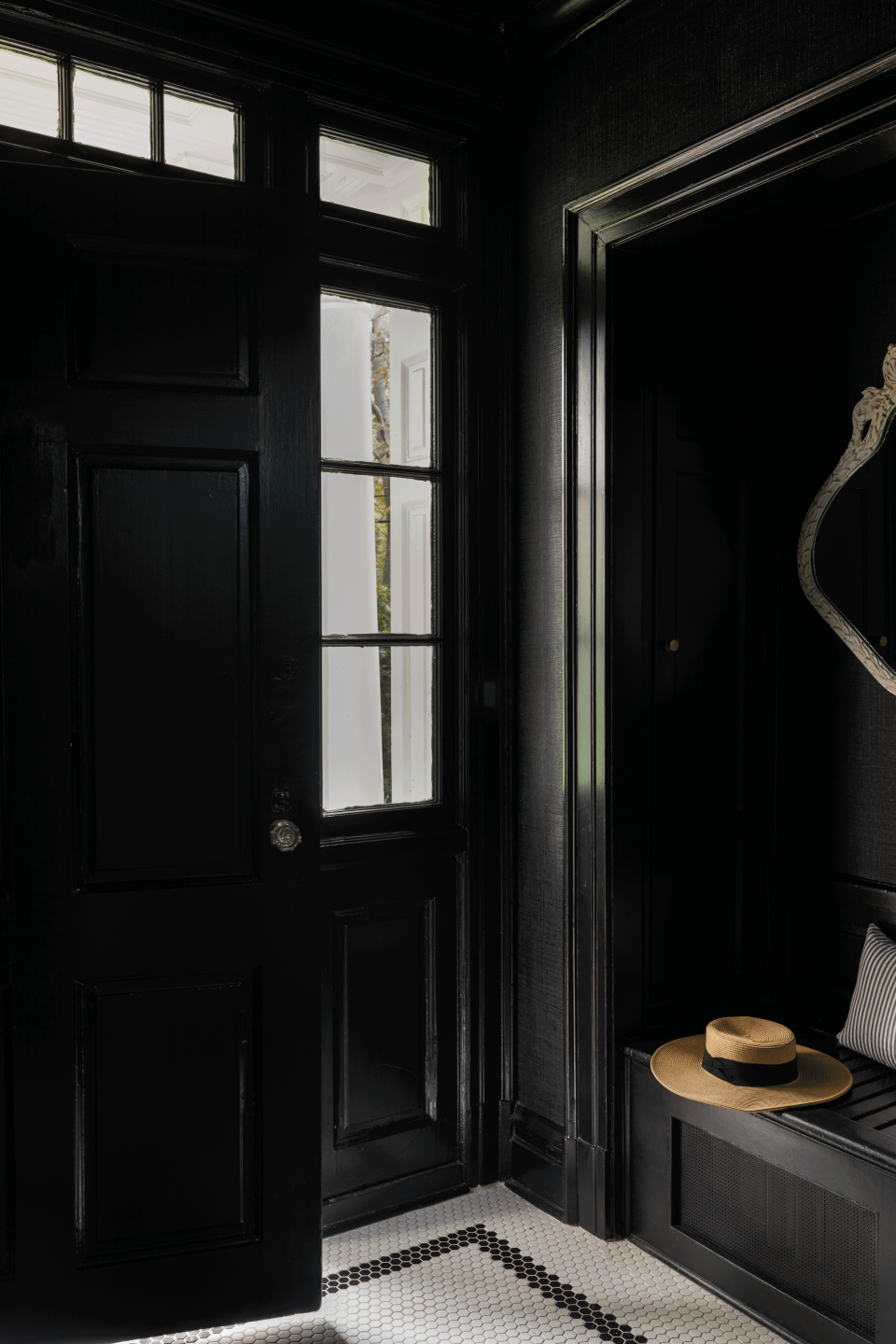
Black is a fan favorite for a reason, it’s proven to be a timeless hue that offers practical benefits too, hiding awkwardly placed architectural features as well as stains and marks. Featured in their Highland Park project, Chicago-based design studio, Caroline Turner Interiors makes the case for blacker in our lives with this majestic ink entryway. Filling the space from floor to ceiling, the black creates an exciting contrast with the light lending windows that surround the doorway.
“We wanted a dark and moody entry to juxtapose the brightness of the rest of the home you are walking into. Contrast is key and makes all of our design decisions more impactful. When in doubt, drench the space in the same deep tone with different finishes to keep it dynamic,” explains Caroline Turner. Black is also a bit of a style chameleon so you can apply this look to more traditional interiors as well contemporary and modern aesthetics. For a touch of contrasting color, consider a bold and vibrant choice for your flooring tiles or artwork.
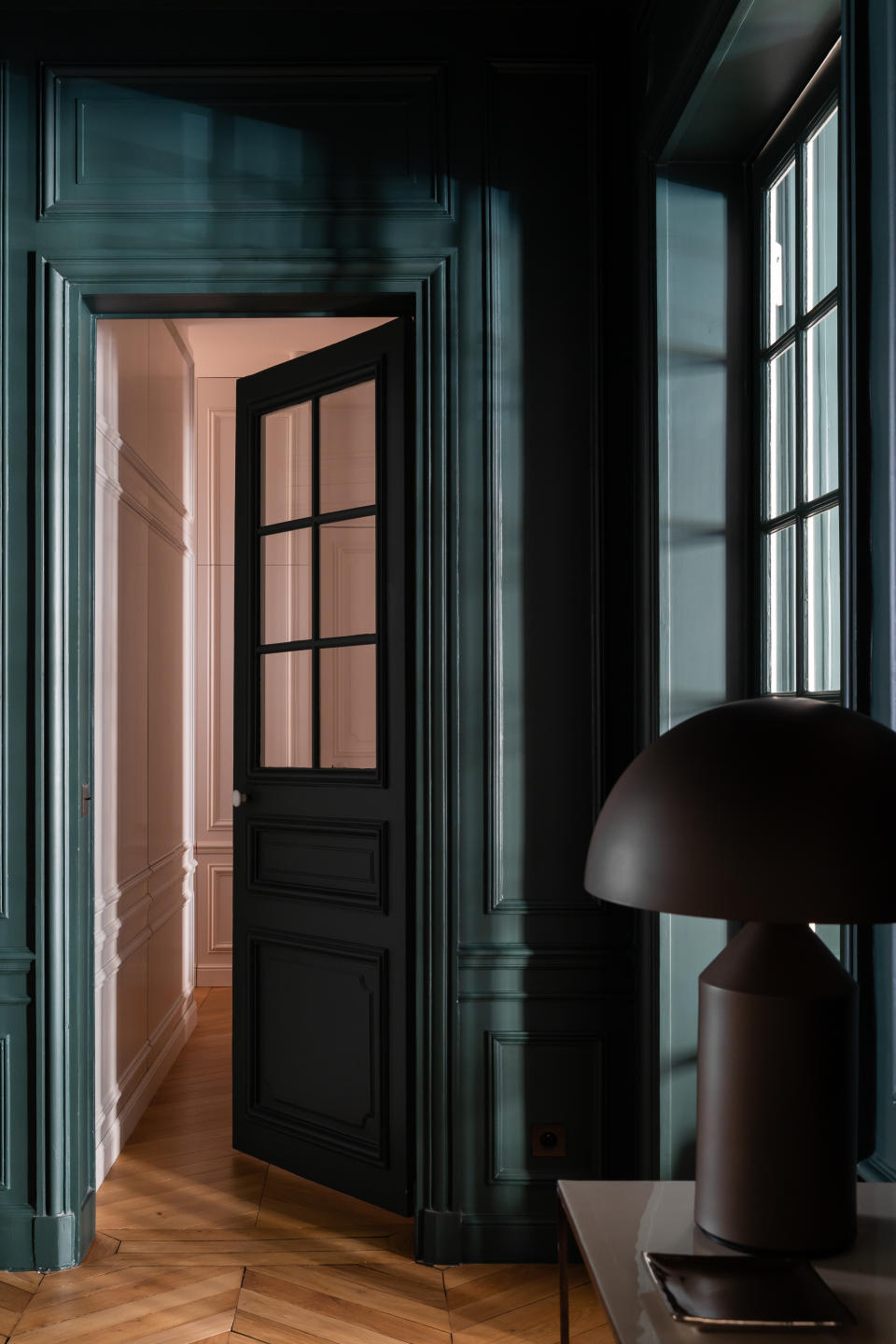
6. DON'T BE AFRAID TO GO DARK BLUE

Contrast doesn’t just work within a singular interior; it can elevate the effect of your home as a whole and your entryway is the perfect place to start. This deep Dutch blue provides a cool and contemporary welcome for its clients.
“In this Parisian apartment entryway, we used Hague Blue paint from Farrow & Ball on the walls and ceiling that instantly delivers a smart and chic look. The entryway becomes a transitional space between the entrance and the leaving room by creating a “chiaroscuro” effect to better highlight the brightness of the living room. A bench provides a seat for lacing up, waiting on visitors or chilling,” says Sonia Lazowski, interior designer at Virajo. Consider how you can create a moment of contrast between your dark entryway and the surrounding rooms.
7. BLEND TOGETHER Contrasting shades
This peacock green entry way brings together all of the modernity of blue with the refreshing and soothing tendencies of green. The dark paint also highlights the panelling and traditional architectural features of this space, drawing the eye in closer. The designer shares her thoughts on the enduring appeal of dark entryways.
“Choose a dark entryway for the strong transition aspect. The moment when you arrive at home or at someone else's house is a moment of transition between the outside world, you change your attitude in a matter of seconds. For the contrast with the light of the rooms you are about to enter....de ombre à la lumiere....it makes you appreciate the light in the living rooms all the more,” says French interior designer, Camille Hermand of Camille Hermand Architectures.
Lighting is an important factor to consider as darker backdrops can give your lighting a candle like glow, further emphasizing the drama of this scene. “An entrance is a way of making contact with your interior, so the dark side immediately conveys the assertive character of what you're doing and the character of what you want to show. We also need to be able to modulate the lighting ambience the time of day, and dark walls allow for subdued lighting and mysterious lighting moods. What could be worse than finishing dinner and then turning on the hall light again when leaving a friend's house!” adds Camille.
8. err towards warmer shades
Purple has long been famed for its decadence and nobility and its no different when it comes to your entryway. Opting for a rich and deeply colored hue like this Mahogany No.36 shade from color experts, Farrow & Ball ensures your home starts things off on the right note. The depth of the purple is great for contrasting with white ceilings as shown but can be made that much more dramatic when used from the ceiling to the floor.
"To embrace a dark entryway, lean into the transient, cozy feel by cocooning the space in a colour-drench and painting the walls, trim, and ceiling all one shade. When starved of natural light, most people tend to address this by painting their space a shade of white, but this can often be a big no-no. What can happen is you end up with a cold and gloomy space. Instead, err towards warmer shades, essentially anything with underlying red and yellow tones (these can still be neutrals). If your natural sensibility is to consider more dramatic colours, then go dark - it always works a treat when you play with the limitations of the space, not fight them. Choosing a darker color also helps create contrast with the rooms coming off the entry, making them appear larger and lighter," says Patrick O’Donnell, Farrow & Ball Color Consultant.

