8 Paint Colors Inspired By Natural Surroundings
The 2023 Southern Living Idea House is brimming with the colors of Tennessee.
Through and through, this year’s Southern Living Idea House is at one with nature. It’s a harmonious and picturesque retreat infused with the beauty of its surroundings—from the music culture of Nashville to the hues of Tennessee’s lush landscape. This inspiration is evident in every layer of the home’s interior design, beginning with fresh paint as a nearby-nature-fueled foundation and culminating in thoughtful choices for art and decor.
“I was definitely inspired by the surroundings,” says Idea House interior designer Laura Hodges. “We pulled a lot of pictures of the area, and Nashville in general, from different times of year. Specifically, the late summer and early fall when leaves are starting to change.”
Meet The Expert
Laura Hodges is an interior designer based in Baltimore, Maryland and Washington D.C., and the designer of Southern Living's 2023 Idea House.
In every room, Hodges let nature guide her paint choices to reflect cues just beyond the home’s wide windows. The result is a collection of colors that pay tribute to the sky, ground, trees, as well as different times of day and multiple seasons. While these tones pay homage to the many shades of Middle Tennessee, the design lesson is wider-spread: Bring nature’s colors inside for a house that’s at home with its surroundings. Here’s eight good-natured Sherwin-Williams paint colors from the 2023 Idea House for inspiration.
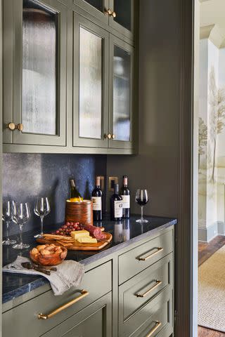
Sherwin-Williams Hidden Trail (SW9525)
Laurey W. Glenn; Stylist: Matthew Gleason
In the wine pantry, lovely deep green paint is plucked right from the color of the home’s sprawling yard. Inspired by the property’s grassy expanse of land, this rich shade might be considered neutral, but still packs a punch, making way for a serene and stylish space with big inspiration in limited quarters.
“When you're in this space, you’re enveloped in this lovely deep green, which is pulled from the home’s acres of nature,” says Hodges. “It really made sense for me to pull in this really deep, indulgent color in such a small space.”
Sherwin-Williams Rookwood Red (SW2802)

Photo: Laurey W. Glenn, Stylist: Matthew Gleason
Of anywhere in the house, the powder room is the place for a pop of color. It’s a curious nook with ample opportunity to decorate boldly, like the jewelbox of the property. Embracing the space while sticking to the house’s Tennessee roots, Hodges chose a deep burgundy. While a bright red or trendy pink may be a controversial choice in paint color, this muted, moodier shade is timelessly elegant. However, while the powder room won’t be going out of style any time soon, the paint choice was inspired by one specific moment in time.
“We wanted to bring in a lot of the colors that you'd see as the colors as the seasons change,” says Hodges. “That dark burgundy is reflective of the changing leaves in the fall.”
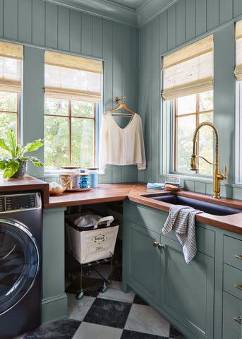
Sherwin-Williams Portsmouth (SW9644)
Laurey W. Glenn; Stylist: Matthew Gleason
Another hard-working room transformed with nature-inspired paint in the laundry room. There, blue-gray walls sing with depth that Hodges says is reminiscent of “the sky at dusk.” It’s a color that is calming like twilight but remains dazzling no matter the time of day.
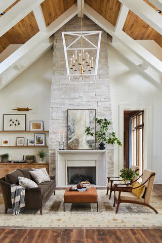
Sherwin-Williams Whitetail (SW7103)
Laurey W. Glenn; Styling: Matthew Gleason
To offset other rooms painted boldly, a grounding neutral gracing the walls is just the thing to balance out a home. In many rooms, including the entryway, living room, kitchen, and primary bedroom, Hodges opted for this creamy shade of white as a neutral base. Still going with the wind (and the sky, ground, flora, and fauna), Hodges was careful not to choose a shade too stark as to disrupt the other nature-soaked colors throughout.
“Whitetail is beautiful because it doesn't really lean too yellow or too gray or too pink, like a lot of different whites do,” explains Hodges. “Whitetail felt relatively neutral. It has a warm undertone so it still feels very welcoming and it can support a lot of different color palettes.”
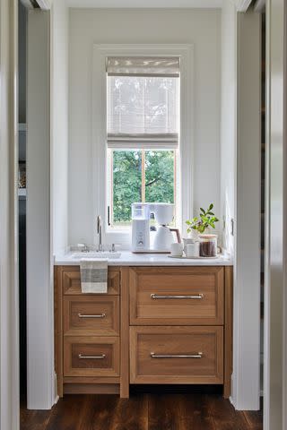
Sherwin-Williams Winter Walk (SW9628)
Laurey W. Glenn; Styling: Matthew Gleason
This refined shade is reserved for just one small corner of the Idea House: the closet just off the primary bedroom. Whereas some colors in this home shine with rays of summer heat and humid sunsets, this shade takes a turn for cooler temperatures. The shade itself, however, is still effortlessly warm, just like closet's coffee station. Hodges says that Sherwin-Williams’ Winter Walk is "complementary to the sky on an overcast day.”
“One day when I was down there [in Nashville], it was pouring down rain and it had this beautiful soft gray color to the sky,” Hodges tells us. “That’s what this looks like.”
Sherwin-Williams Nocturne (SW9520)

Laurey W. Glenn; Stylist: Matthew Gleason
Depending on the time of day, different degrees of natural light will sweep into the billiards room and music lounge, changing how the deep hue on the walls are perceived. In the evening, this deep green may blend right into the greenery outside. During the day, Sherwin-Williams’ Nocturne goes the distance in creating a moody, nature-fueled sanctuary.
Sherwin-Williams Greenblack (SW6994)
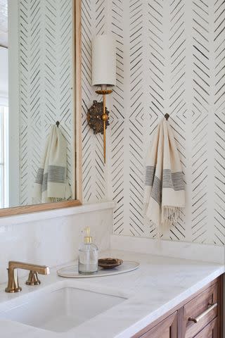
Laurey W. Glenn; Stylist: Matthew Gleason
Painted in Sherwin-Williams’ Creamy (SW7012), the twin bathroom is embellished with this off-black shade painted using a decorative stencil. Not only does this add immeasurable interest to the otherwise all-white bathroom, but it inserts a hint of nature-inspiration without straying from neutral tones. Rather than a pure black, this slightly green shade is infused with warming natural sensibilities and ties in hints of green on the walls and in the decor of the rest of the house.
Sherwin-Williams Meander (SW9522)
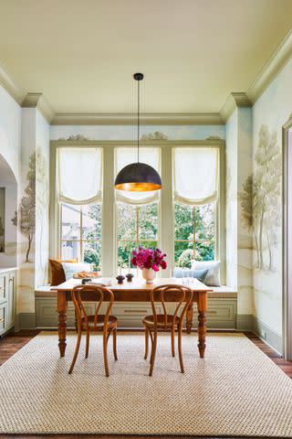
Laurey W. Glenn; Stylist: Matthew Gleason
Greige is a color family that will always be in our wheelhouse, but this woodsy shade is especially lovely, if we do say so ourselves. A lighter version of Sherwin-Williams’ Hidden Trails, Meander is similarly muted and can be found on cabinetry and trim in the breakfast nook. Hodges prefers these soft tones reminiscent of nature, she says, to bright greens that are a more precise color match to well-watered grass in Spring.
“I tend not to go with super bright colors,” she says, “because they can be harder to live with long term. I love more subtle, nuanced colors like this one.”
For more Southern Living news, make sure to sign up for our newsletter!
Read the original article on Southern Living.

